How to Master Grid-Based Design: Choose the Right Grid, Use It Well, and Know When to Break It
 Yifan Zhao読了 11 分 ·
To master grid-based design, you need to turn content, typography, spacing, and hierarchy into a repeatable visual system. The goal is not to memorize grid types, but to understand why a grid fits the content, how it should adapt, and when breaking it improves the composition.
The real challenge is that many designers can create columns and guides but still struggle with column count, margins, gutters, type alignment, and intentional grid breaks. Our review of recurring design questions shows that this gap between theory and real layout decisions is where most layout design problems begin, especially when design principles and visual hierarchy have to work together.
Virse helps turn those principles into faster visual exploration inside a shared AI design canvas. Paid plans include unlimited use of 40+ models such as Nano Banana 2 and GPT Image 2, plus unlimited seats. New users also receive free credits that can cover up to 10 Nano Banana 2 images or one Seedance 2.0 video, while Seedance 2.5, Seedance 2.0, and MiniMax H3 are available for broader image and video workflows.

How Do You Master Grid-Based Design?
You master grid-based design when you can explain why each major alignment, column, margin, spacing interval, and exception exists.
A grid is not simply a set of boxes. It is a system of relationships between text, images, whitespace, and repeated elements. A useful grid should help answer:
- Which elements should align?
- Which content needs the same width?
- Where should hierarchy change?
- Which spacing intervals should repeat?
- What happens when text becomes longer?
- Can the system survive several pages or screen sizes?
This gives grid mastery four practical levels:
Level | What You Can Do |
|---|---|
Beginner | Follow existing guides and alignments |
Intermediate | Build grids from content and hierarchy |
Advanced | Create systems that survive content variation |
Expert | Break or adapt the system without losing coherence |
The shift from beginner to expert is simple: stop asking which template to use and start asking what relationships the content requires.
Which Grid Systems Should You Understand?
The main systems are:
Grid Type | Best For | Main Strength |
|---|---|---|
Manuscript grid | Books and long-form text | Reading consistency |
Column grid | Editorial, web, marketing | Flexible content widths |
Modular grid | Publications and dashboards | Vertical and horizontal control |
Baseline grid | Typography-heavy layouts | Consistent vertical rhythm |
Hierarchical grid | Posters and irregular interfaces | Flexible content priority |
Knowing these types matters, but choosing between them based on real content matters more.
How Do You Choose the Right Grid for a Design?
Start with content, not column count.
Before drawing guides, evaluate five constraints:
- Format: poster, mobile UI, desktop page, book, packaging, or campaign asset.
- Content: headlines, body text, photography, cards, charts, captions, or navigation.
- Hierarchy: what viewers should notice first, second, and third.
- Repetition: which elements recur and need stable alignment.
- Variation: how many different compositions the system must support.
Consider an editorial feature with body copy, large photography, captions, and pull quotes. A two-column layout may handle text well but provide few image combinations. A six-column system allows body copy to span two or three columns, imagery to span four or six, and captions to use one or two.
Six columns are not inherently better. They are better only when those extra relationships solve the content problem.
How Many Columns Should a Grid Use?
There is no ideal column count. Use the smallest number that creates enough useful layout combinations without producing unnecessary choices.
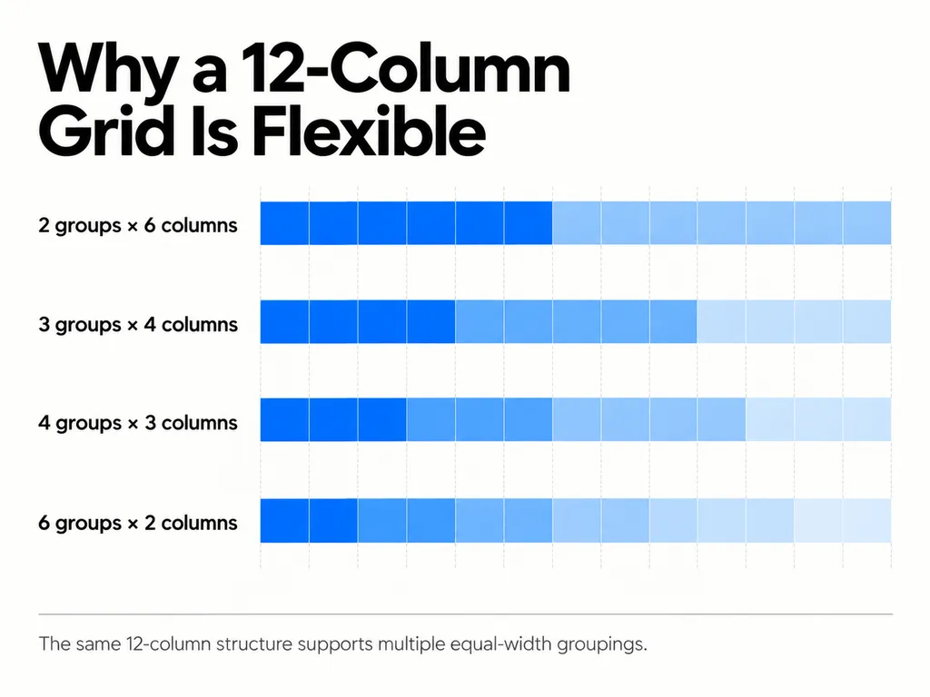
A 12-column grid is common in UI because it divides cleanly into:
- 2 groups of 6
- 3 groups of 4
- 4 groups of 3
- 6 groups of 2
That supports layouts such as 6/6, 8/4, three equal cards, or four equal cards.
But a poster with one image, headline, and information block may be stronger with three or four divisions.
A practical test is to create three layouts with identical content. If the grid cannot produce meaningful variation, it may be too restrictive. If dozens of nearly identical alignments seem equally valid, it may be too complex.
How Should Margins, Gutters, and Whitespace Work?
Margins, gutters, and whitespace should create hierarchy and rhythm, not simply fill unused space.
Margins
Margins define the relationship between the composition and its boundary. Narrow margins often feel denser and more energetic; generous margins can create focus and slower visual pacing.
Gutters
Gutters separate adjacent content areas. Their width should respond to text size, line length, image density, and the strength of grouping you want.
Whitespace
A common beginner mistake is filling every available module. In practice, unused space can carry as much compositional weight as occupied space.
Try creating one dense version of a layout and another that leaves a major grid area empty. The second often produces stronger hierarchy because the empty region gives important elements more visual weight.
How Do Typography and Baseline Grids Work Together?
Typography should be designed with the grid because leading, line length, type size, and module size affect one another.
A useful example comes from a 5.5 × 5.5-inch document using a 6 × 6 modular grid and 14-point leading.
The 5.5-inch dimension equals 396 points.
396 ÷ 6 = 66 points per module
With 14-point leading:
66 ÷ 14 = 4.714
The text rhythm does not divide cleanly into the module.
At 13.2-point leading:
66 ÷ 13.2 = 5
Each module now accommodates exactly five lines.
The lesson is not to use 13.2-point leading everywhere. It is that grid dimensions and typography should be treated as one system.
The same principle applies to UI design. Spacing tokens, component heights, type scales, and card dimensions become easier to maintain when their vertical relationships are predictable.
How Should You Practice Grid-Based Design to Build Real Mastery?
The fastest way to improve is progressive constraint training: keep the content stable while gradually increasing the number of design decisions.
Case Study 1: The 90-Layout Exercise
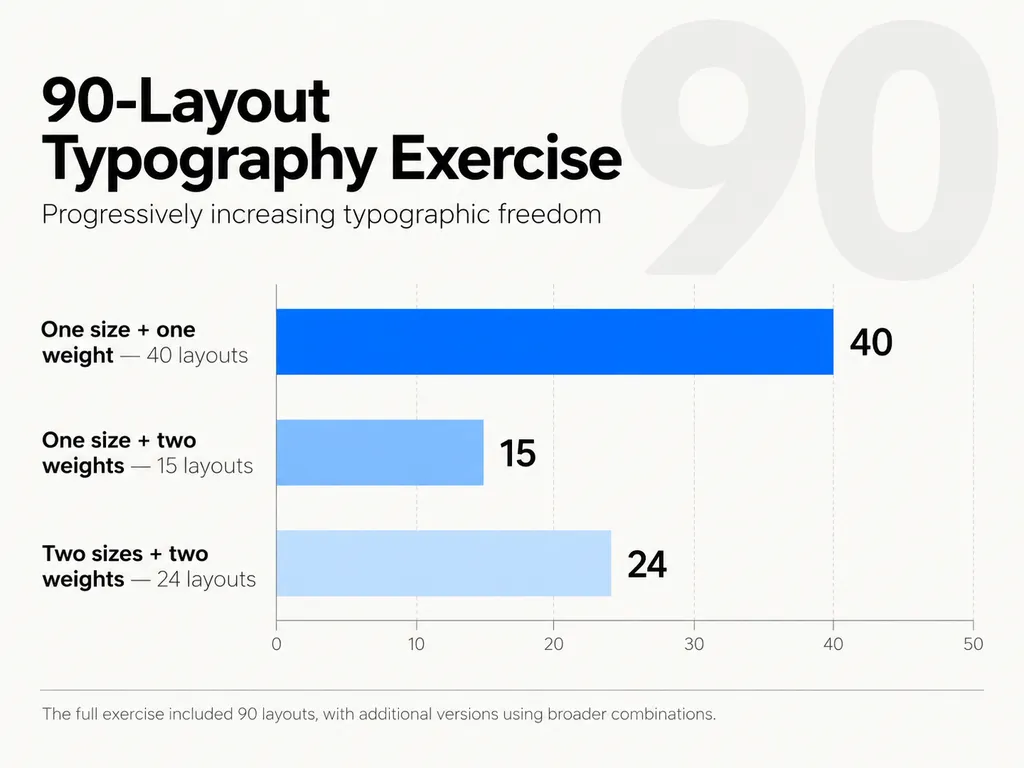
One documented typography exercise involved 90 layout variations:
- 40 with one point size and one weight
- 15 with one point size and two weights
- 24 with two point sizes and two weights
- additional versions with broader combinations
The progression can continue through:
size → weight → rules → second typeface → color → imagery
The value is repetition. At first, you ask, “Where should this text go?” After enough iterations, you begin asking, “Which spatial relationship creates the strongest hierarchy?”
That is a much more useful design question.
Case Study 2: Redesign 2–10 Magazine Pages
Another effective exercise is redesigning 2–3 spreads or roughly 10 pages of real editorial content.
Real content introduces constraints that placeholder text hides:
- long headlines
- uneven paragraph lengths
- different image ratios
- captions
- dense and sparse pages
- continuity across spreads
A single poster lets you optimize one composition. A multi-page project tests whether the grid functions as a system.
The real question is not whether page one works. It is whether the grid still works on page seven.
Case Study 3: Redesign the Same 160-Page Book
A more advanced exercise is to reinterpret the same book several times. One example in our research used a roughly 160-page book redesigned five or six times.
You do not need to rebuild every page. Select representative sections and test different systems:
- compact reading
- larger margins
- stronger modular structure
- image-led composition
- more aggressive whitespace
This teaches an important lesson: the same content can support different valid grids depending on the intended reading experience.
Case Study 4: Reverse-Engineer Existing Layouts
Choose a strong poster, magazine spread, website, or package and identify:
- repeated edges
- recurring image widths
- text baselines
- empty regions
- vertical intervals
- intentional misalignments
Then replace the original content with a longer headline, different image ratio, or extra text.
If the layout collapses, you copied its appearance. If the structure adapts, you understood the system.
How Do You Make Grid-Based Design Look Less Generic?
Grid-based design becomes generic when consistency turns into repetition.
Create variation through four techniques:
Change Span
Let different elements occupy one, two, three, or more columns while preserving shared alignments.
Change Density
Place dense information beside quieter areas instead of distributing content evenly.
Use Controlled Asymmetry
A six-column grid could place text in columns one to three, leave column four empty, and position imagery in five and six. The result is asymmetric but still structured.
Repeat Rules, Not Layouts
A strong system may repeat only a few rules: caption widths, image edges, type scales, and spacing intervals. New compositions emerge from recombining those rules.
How Does Grid-Based Design Apply to UI, Brand, and AI Workflows?
The more assets a system must support, the more valuable a grid becomes.
In UI design, grids coordinate containers, cards, navigation, responsive breakpoints, typography, and spacing tokens.
In brand systems, grids help translate a visual language across social graphics, landing pages, presentations, banners, and campaign assets without forcing every format to look identical.
AI introduces the same challenge at a larger scale. Generative tools can produce many variations quickly, but outputs can drift in spacing, hierarchy, density, and brand logic.
A stronger workflow is:
define the visual system → generate variations → compare against the system → refine intentional exceptions
This is where Virse fits naturally into a professional workflow. Instead of treating each generation as an isolated prompt, Virse is built around a shared visual canvas, multiple collaborating agents, and project context, making it better suited to workflows where visual consistency and iterative design decisions matter.
When Should You Break the Grid?
Break the grid when the exception creates clearer emphasis, stronger hierarchy, better pacing, or meaningful visual tension.
The principle is simple:
Establish the pattern before breaking the pattern.
If photographs consistently occupy four columns, expanding one important image across all six creates emphasis because viewers already understand the normal rule.
A grid break is usually weak when:
- content simply does not fit
- the grid was poorly chosen
- random misalignment is being used as decoration
- every major element becomes an exception
The goal is not rigid consistency or total freedom. It is controlled deviation from a clear system.
What Are the Most Common Grid-Based Design Mistakes?
Building the Grid Before Understanding Content
If the content constantly fights the structure, redesign the structure.
Filling Every Module
Available space is not required space. Whitespace is part of the hierarchy.
Ignoring Typography
Columns cannot compensate for inconsistent leading, line length, and paragraph rhythm.
Using Too Many Columns
More options can create more arbitrary decisions. Add divisions only when they solve a real relationship.
Designing Only One Ideal Layout
Stress-test the grid with longer text, different images, missing assets, and alternate page types.
What Is the Best Workflow for Mastering Grid-Based Design?
Use this six-step process:
- Audit the content. Identify hierarchy, repetition, image ratios, and difficult content.
- Define constraints. Set format, typography, margins, spacing, and responsive needs.
- Build the simplest useful grid. Add complexity only when content requires it.
- Create three variations. Change spans, density, whitespace, and hierarchy.
- Stress-test the system. Introduce longer headlines, extra copy, and different image ratios.
- Add controlled exceptions. Break the grid only when the deviation improves communication.
This turns grid design from a styling technique into a repeatable decision framework.
FAQ
How do I know which grid to use for a specific design?
Start with the content, format, hierarchy, and number of variations the project needs. A text-heavy book may need a manuscript or simple column grid, while an editorial project with images, quotations, and captions may benefit from a modular structure. Choose the simplest grid that supports the required relationships.
How many columns should I use, and how do I choose margins and gutters?
There is no universal number. Use enough columns to support useful spans without making the system unnecessarily complex. Margins define the outer rhythm, while gutters separate neighboring content. A 12-column grid is flexible for UI, but posters and editorial layouts often work well with fewer divisions.
When should I break the grid?
Break the grid only after establishing a recognizable pattern. Good reasons include emphasis, hierarchy, pacing, tension, or a meaningful section change. If an element breaks alignment only because it does not fit, the problem is usually the grid or content treatment.
What exercises improve grid and layout skills?
The most effective exercises use repeated real content. Strong examples include a 90-layout typography exercise, redesigning 2–10 magazine pages, reverse-engineering professional layouts, and redesigning a roughly 160-page book five or six times. These train your ability to build and adapt systems rather than imitate one finished composition.
Conclusion
Mastering grid-based design is not about finding a perfect column count or following a rigid template. It is the ability to turn content, typography, spacing, hierarchy, and format into a coherent system, test that system against real variation, and know when an exception improves communication. Practice with repeated content, multi-page layouts, real typography, and difficult edge cases until every major column, margin, span, and grid break has a reason. At that point, you are no longer simply using a grid; you are controlling a design system.