
12 idiomas de forma nativa
Tipografía renderizada como lenguaje en lugar de decoración con forma de caracteres.
Qwen Image 3.0 Pro de Alibaba renderiza la tipografía como lenguaje en una docena de sistemas de escritura, manteniendo la legibilidad hasta diez píxeles en diseños densos.
Abre esta página en un navegador de escritorio para empezar a crear.
Qwen Image 3.0 Pro es el modelo de imagen de Alibaba, y la capacidad en torno a la que está construido es el texto; concretamente, texto que no está en inglés.
Pide a la mayoría de los modelos un rótulo en chino, una etiqueta de producto japonesa o un texto de envase coreano y lo que obtendrás será decoración con forma de caracteres: convincente a primera vista, sin sentido para cualquiera que lea la escritura. Qwen Image 3.0 renderiza de forma nativa en doce idiomas y más de veinte fuentes, con tipografía que se mantiene legible hasta diez píxeles, que es lo que hace viables los diseños con alta densidad de información en lugar de meramente decorativos.
Usa Qwen Image 3.0 Pro cuando el texto importe. Crea envases bilingües, señalización regional, creatividades de campaña localizadas, diseños de estilo periodístico, maquetas de interfaces e infografías cuyas etiquetas tengan que resistir la lectura.
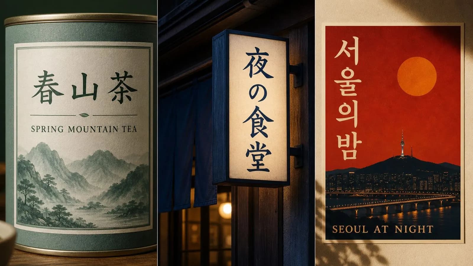
Qwen Image 3.0 Pro es un modelo de generación de imágenes con IA desarrollado por Alibaba y lanzado en julio de 2026. Genera a partir de descripciones escritas en estilos fotográficos e ilustrativos, y destaca dentro de su categoría por cómo trata la tipografía.
El modelo se basa en tres grandes fortalezas:
Alibaba también cita la simulación realista de interfaces como páginas web, juegos y superposiciones de retransmisiones en directo, junto con detalles finos hasta hebras individuales de cabello. La ventana de 4500 tokens es unas cuatro veces y media mayor que la de su predecesor, lo que permite respetar una especificación de maquetación con varias partes en una sola pasada.
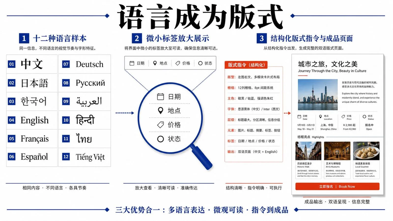
Tipografía renderizada como lenguaje en lugar de decoración con forma de caracteres.
Suficiente variedad tipográfica para diseños que necesitan más de una voz.
Los diseños densos se mantienen legibles en lugar de convertirse en textura.
Aproximadamente 4,5 veces más que su predecesor, dimensionada para instrucciones de diseño de varias partes.
Páginas web, juegos y superposiciones de retransmisiones en directo reproducidos de forma convincente.
1K y 2K, seleccionados por generación.
Los caracteres chinos, japoneses y coreanos se devuelven como lenguaje. La mayoría de los modelos tratan CJK como algo secundario y producen formas que solo parecen correctas a quienes no pueden leerlas.
Las composiciones que contienen dos escrituras a la vez son donde la mayoría de los modelos fallan más, porque los dos sistemas tipográficos tienen ritmo, peso y espaciado distintos. Este maneja ambos en el mismo encuadre.
El umbral de texto pequeño es lo que separa un diseño decorativo de uno utilizable. A diez píxeles, las páginas de periódico, las infografías densas y las maquetas de interfaz pasan a ser alcanzables en lugar de aproximadas.
Alrededor de 4,500 tokens es suficiente para especificar cada bloque de texto, su posición y su tamaño relativo sin recortar la instrucción para que quepa.
Las páginas web, la interfaz de aplicaciones, las pantallas de juegos y las superposiciones para streaming entran explícitamente dentro del alcance, algo poco habitual y directamente útil para imágenes de marketing de producto.
Más allá de la tipografía, el modelo resuelve texturas finas —hasta mechones de pelo individuales—, de modo que un diseño con un elemento fotográfico no tiene que renunciar a ello.
El trabajo localizado se multiplica. Una imagen visual clave se convierte en seis versiones para distintos mercados, cada una con un texto diferente y cada una necesitando a un lector que pueda revisarla. Virse mantiene la familia unida. El diseño base y cada variante lingüística se colocan lado a lado en un mismo lienzo, que es la única forma práctica de detectar que la versión cuatro tiene el salto de línea equivocado.
Consulta todas las versiones localizadas a la vez en lugar de abrir seis archivos para compararlas.
Coloca el texto aprobado junto a la salida para que la corrección se haga contra la fuente en lugar de depender de la memoria.
Cambia entre Qwen Image 3.0 Pro y más de 30 modelos de imagen y vídeo sin salir del lienzo ni reescribir el briefing.
Reutiliza el mismo briefing compositivo y cambia solo el texto, para que el conjunto mantenga la coherencia visual entre idiomas.
Diseños de frontal de envase que llevan tanto un nombre de producto en alfabeto latino como en CJK.
Escenas callejeras y escaparates cuya señalización se lea correctamente para una persona local.
Un visual clave reconstruido para el texto de cada mercado sin rediseñarlo.
Pantallas de aplicaciones, páginas web y superposiciones con texto en pantalla legible.
Páginas de estilo periódico y gráficos informativos con etiquetas pequeñas legibles.
Imágenes que combinan detalle fotográfico fino con un titular dentro de la imagen.
Escribe el sistema de escritura que quieres que se renderice. Las transliteraciones y las descripciones no lo producirán.
Nombra cada cadena, dónde se sitúa y qué tamaño tiene en relación con las demás.
Crea el borrador al tamaño más pequeño y, después, vuelve a ejecutarlo a 2K una vez confirmado el texto.
Legible y correcto son cosas distintas. Pide a un hablante nativo que lea el resultado.
Un prompt útil de Qwen Image 3.0 Pro suele incluir cuatro elementos:
En lugar de escribir
El escaparate de una tienda japonesa de ramen por la noche con un letrero, atmosférico.
Escribe
Un estrecho escaparate de una tienda de ramen por la noche. Una cortina noren horizontal sobre la entrada dice 一番ラーメン en blanco sobre índigo intenso. A la izquierda, un letrero vertical de madera dice 営業中 en caracteres negros de pincel. Luz cálida saliendo desde el interior, pavimento mojado reflejándola. Fotográfico, tomado de frente desde el otro lado de la calle.
Una lata de té fotografiada en plano cenital sobre un fondo pálido. El frontal lleva 明前龍井 en grandes caracteres con trazo de pincel, centrados en la mitad superior, con "Pre-Qingming Longjing" debajo en una pequeña serifa latina de aproximadamente un tercio del tamaño. Lata de color verde jade apagado, una fina línea dorada entre las dos líneas de texto, sin otros gráficos. Iluminación suave y uniforme, recorte cuadrado.
Una pantalla de aplicación móvil mostrada de frente, llenando el encuadre. El encabezado dice 我的订单 con un peso medio. Debajo, tres filas de lista, cada una con un nombre de producto a la izquierda y un precio a la derecha en estilo de cifras tabulares. Barra de navegación inferior con cuatro etiquetas: 首页, 分类, 购物车, 我的. Interfaz plana, un único acento azul, fondo blanco, toda la tipografía nítida y legible.
Un póster de evento minimalista en formato vertical. El titular dice 静水 en una sans moderna y gruesa, centrado en el tercio superior. Debajo, mucho más pequeño: "Slow Water · Photographs by Ana Reyes". Fondo plano de color arena, una fina línea horizontal bajo el titular, sin imágenes. Márgenes amplios en los cuatro lados.
| Dimensión | Qwen Image 3.0 Pro | Ideogram 4.0 |
|---|---|---|
| Punto fuerte tipográfico | Sistemas de escritura no latinos y composiciones bilingües | Tipografía latina y estructura de composición |
| Control de colocación | Descrito en las instrucciones | Cuadros delimitadores e instrucciones JSON |
| Texto pequeño | Legible hasta 10 píxeles | Legible a 2K nativo |
| Ventana de instrucciones | ~4,500 tokens | Campos de prompt estructurados |
| También destaca en | Detalle fotográfico, maquetas de interfaz | Logotipos, carteles, control del color de marca |
| Elígelo cuando | El texto no está en alfabeto latino | La entrega es una composición en alfabeto latino |
"Un cartel que dice 営業中" funciona. "Un cartel que dice abierto en japonés" no.
La señalización, los nombres de producto y los titulares son el rango fiable. Los párrafos van más allá de lo que cualquier modelo de imagen actual puede sostener.
"A un tercio del tamaño del titular" es una indicación práctica de una forma en que "más pequeño" no lo es, y resulta aún más importante en composiciones bilingües en las que dos sistemas de escritura compiten.
La legibilidad y la corrección son fallos distintos. Un lector detecta los que a ti te parecen bien.
Explora herramientas especializadas para crear, editar y preparar recursos de diseño.

Las letras talladas en madera se comportan de forma distinta bajo la luz que las letras fundidas en metal líquido, y ningún prompt consigue ambas cosas bien por accidente. Escribe tu texto, indica el material y recibe un efecto que mantiene intactas las palabras mientras calcula cómo debería captar realmente la luz ese material. Los créditos gratuitos te dan la primera versión.
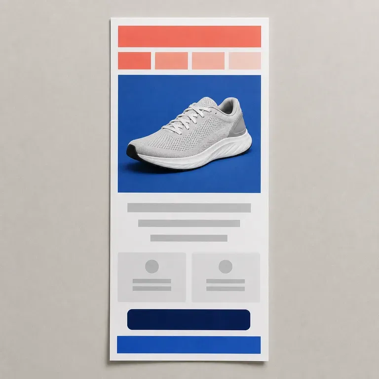
Un email se la juega en los dos primeros segundos de desplazamiento con el pulgar, mucho antes de que alguien abra una plataforma de email para crearlo. Dale el objetivo de tu campaña y fotos de producto, y previsualiza el diseño completo, promoción, selección o newsletter, para que la lista de envío solo vea la versión que merece la pena crear, empezando con créditos gratuitos de Virse.
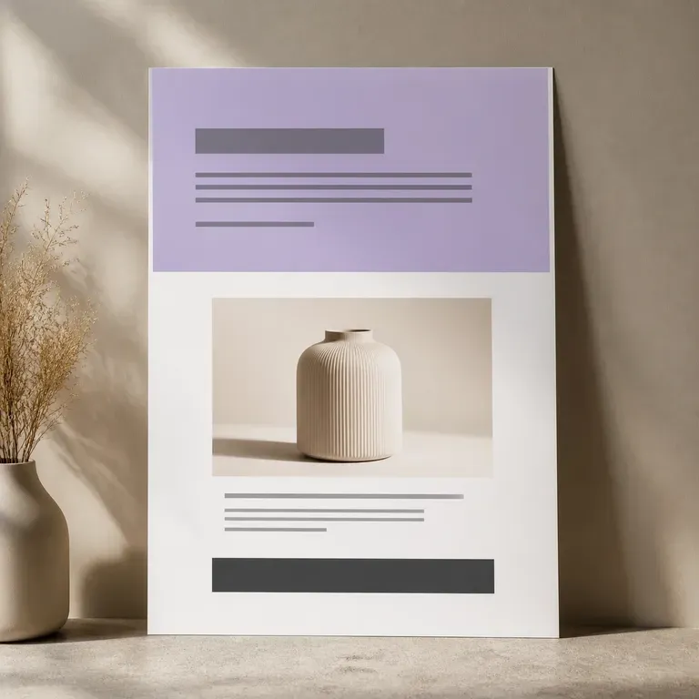
Una página que nunca se construye no le cuesta una semana a un desarrollador. Sube tus fotos de producto y argumentos de venta, y visualiza la página completa antes de que nadie toque un constructor de páginas: imagen principal, bloques de beneficios, oferta final, todo en un solo scroll, y la primera versión va por cuenta de la casa.
GPT Image 2.0 de OpenAI lee un briefing de cien palabras e intenta cumplirlo por completo, con controles independientes de calidad y resolución de 1K a 4K.
Un modelo fundacional de texto a imagen entrenado desde cero en torno a la maquetación, con colocación mediante cuadros delimitadores, condicionamiento por color hexadecimal y salida nativa en 2K.
El modelo de segunda generación de Reve AI construye un diseño direccionable de elementos posicionados antes de renderizar, de modo que una disposición especificada vuelve dispuesta correctamente.
Pega el texto que necesites, mantén las cadenas breves y haz que alguien que lo lea revise el resultado antes de publicarlo.