
Control de maquetación con cuadros delimitadores
Colocación de elementos aprendida durante el entrenamiento, no aproximada en el momento de la renderización.
Un modelo fundacional de texto a imagen entrenado desde cero en torno a la maquetación, con colocación mediante cuadros delimitadores, condicionamiento por color hexadecimal y salida nativa en 2K.
Abre esta página en un navegador de escritorio para empezar a crear.
Ideogram 4.0 aborda la tipografía desde la dirección opuesta a la mayoría de los modelos de imagen, y la diferencia es arquitectónica más que estilística.
Se entrenó con cajas delimitadoras asociadas a descripciones en lenguaje sencillo, lo que significa que el modelo aprende dónde debe ir cada objeto, región de texto y elemento de maquetación antes de renderizar nada. Si le pides a un modelo fotográfico un cartel de concierto, por lo general obtienes una fotografía con texto colocado encima. Si se lo pides a este, obtienes una maquetación: tipografía dimensionada en función del espacio que ocupa, imágenes dispuestas para dejarle sitio y una jerarquía entre el titular y el texto de apoyo.
Usa Ideogram 4.0 cuando el entregable sea una pieza de diseño. Crea pósteres, logotipos tipográficos, frontales de envases, creatividades publicitarias, gráficos para redes sociales y cualquier cosa en la que las palabras sean el diseño, en lugar de una etiqueta añadida a él.
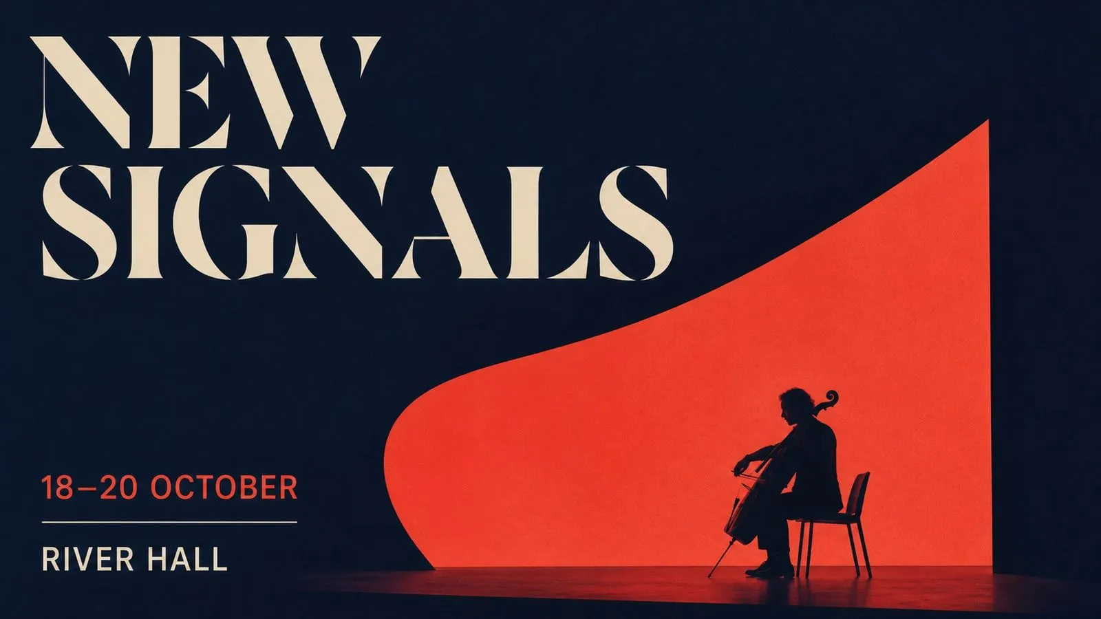
Ideogram 4.0 es un modelo fundacional de texto a imagen entrenado desde cero, con un conjunto de funciones orientado al trabajo de diseño más que a la fotografía.
El modelo se basa en tres grandes fortalezas:
La salida es 2K nativo, lista para impresión sin un paso de reescalado independiente. La colocación puede indicarse en lenguaje corriente — título arriba, sujeto centrado, logotipo abajo a la derecha — o especificarse con exactitud mediante cajas delimitadoras en un brief estructurado en JSON, que es la vía fiable cuando un elemento debe situarse en una posición precisa.
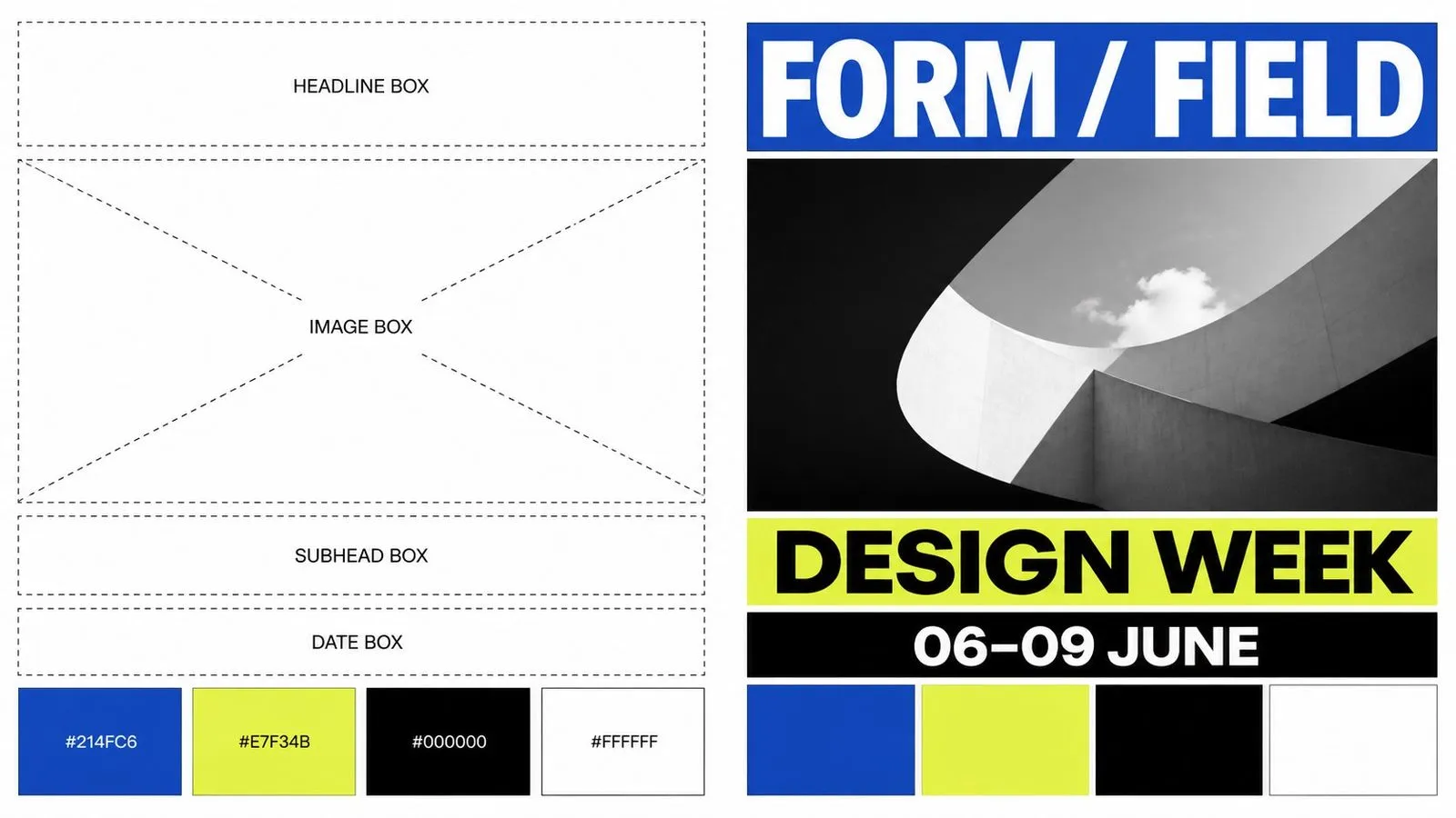
Colocación de elementos aprendida durante el entrenamiento, no aproximada en el momento de la renderización.
Especifica posiciones y valores exactos en lugar de describirlos.
Indica un color de marca por valor y obtén ese color.
Listo para impresión sin un paso de escalado independiente.
Tipografía de display y de apoyo en más de un sistema de escritura.
Un modelo fundacional creado para este propósito, no adaptado a él mediante ajuste fino.
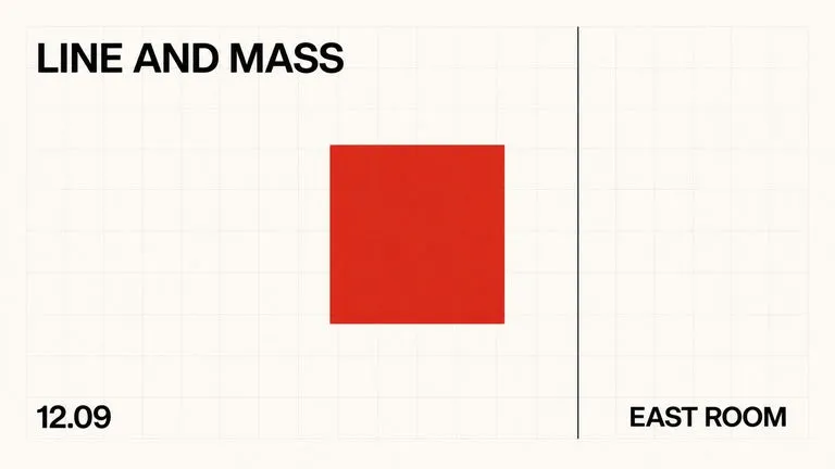
Como el entrenamiento emparejó cajas con descripciones, la posición es algo que el modelo entiende en lugar de inferir. Un briefing JSON con cajas delimitadoras coloca un elemento donde indicaste, que es la diferencia entre generar un póster y diseñarlo.
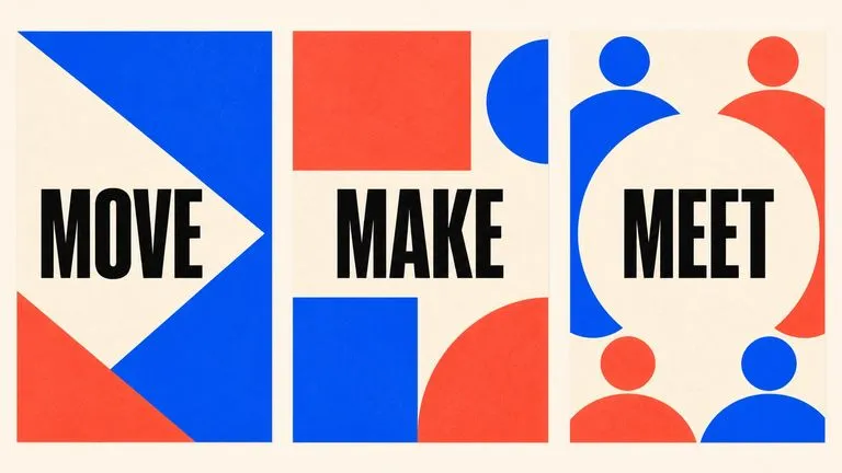
El condicionamiento hexadecimal elimina el paso de ida y vuelta en el que un diseñador explica que el azul no es el azul adecuado. Indica el valor y aparece, que es lo que hace que una salida precisa para la campaña sea repetible en todo un conjunto.
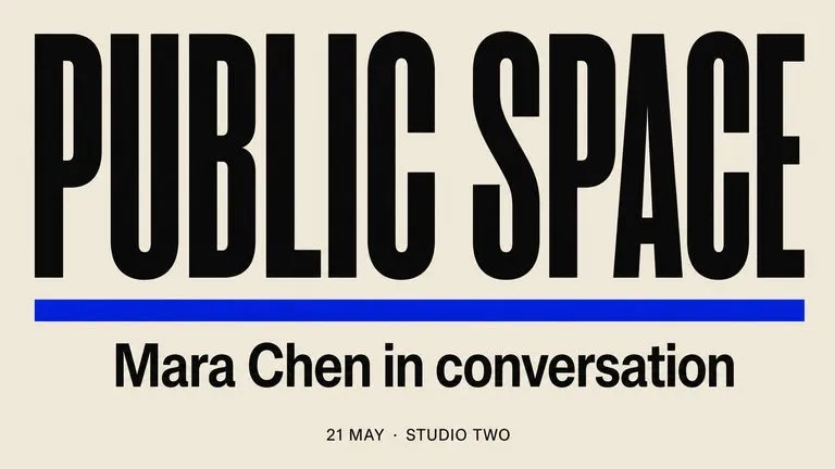
El titular, el subtítulo y el texto de apoyo vuelven con grosores y tamaños sensiblemente distintos, en lugar de como tres cadenas a una escala similar compitiendo por la misma atención.
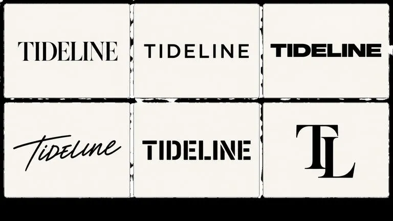
La exploración de logotipos en volumen es uno de los usos prácticos. La salida es ráster en lugar de vectorial, así que una dirección elegida aún necesita redibujarse para producción, pero encontrar la dirección es la parte cara.
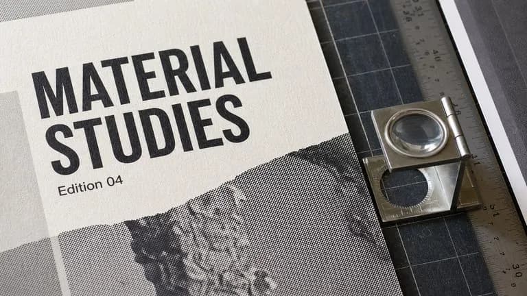
El 2K nativo significa que el trabajo de pósteres y packaging sale del modelo con un tamaño utilizable, en lugar de necesitar un paso de reescalado que suaviza la tipografía.
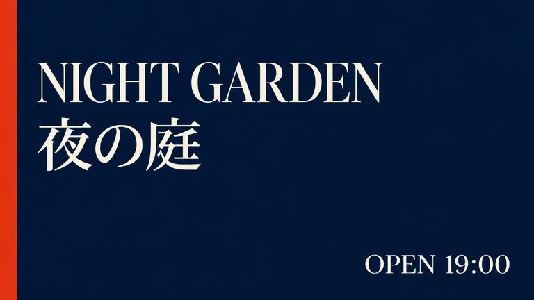
La tipografía multilingüe significa que una maquetación de campaña puede llevar una segunda escritura sin que la estructura se desmorone a su alrededor.
El trabajo de maquetación es comparativo. Nadie elige una línea de cartel a partir de una sola renderización, y nadie elige un logotipo tipográfico entre menos de una docena. Virse dispone todo el conjunto a la vez. Treinta propuestas de logotipo se muestran en una cuadrícula que puedes examinar, y el brief en JSON que las produjo permanece junto a los resultados, de modo que modificar un valor y volver a ejecutarlo es un pequeño ajuste en lugar de una reconstrucción.
Genera un abanico de direcciones de maquetación y júzgalas en conjunto, que es la única forma en que realmente se toma este tipo de decisión.
Deja el briefing estructurado junto a los renderizados para que cambiar una caja delimitadora o un valor hexadecimal sea una edición in situ.
Muévete entre Ideogram 4.0 y más de 30 modelos de imagen y vídeo sin salir del lienzo ni reescribir el briefing.
Envía un póster aprobado a FLUX Kontext para un cambio específico, o a un modelo de vídeo como fotograma inicial.
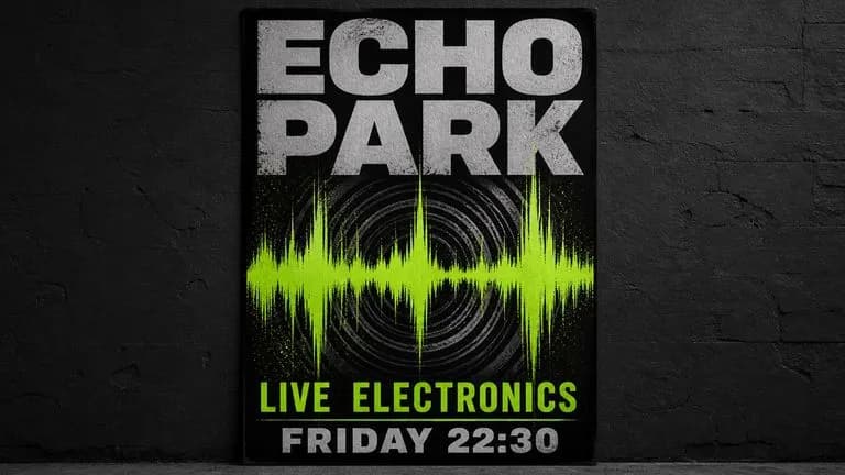
Pósteres de conciertos, carteles de festivales y anuncios de exposiciones con una jerarquía funcional.
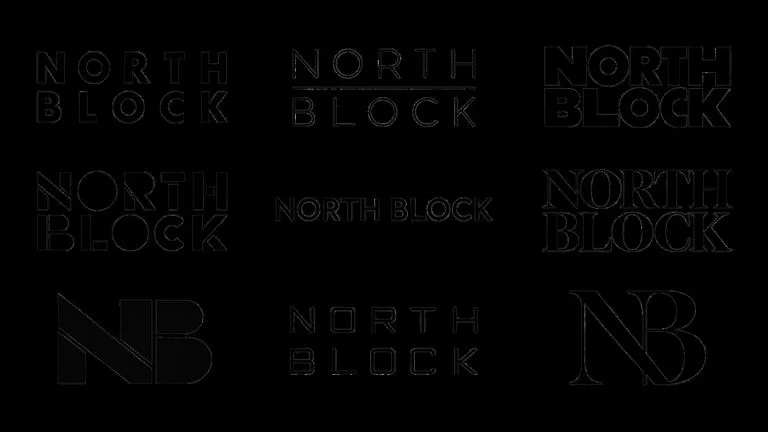
Decenas de direcciones tipográficas entre las que elegir antes de comprometerse con una.
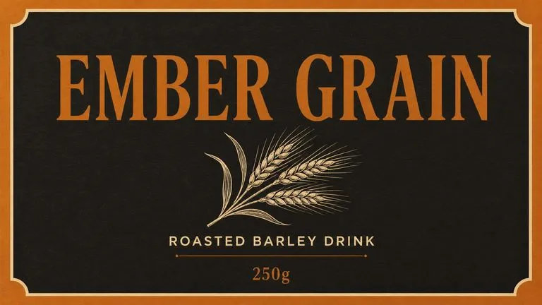
Nombre de producto, descriptor y volumen en tamaños relativos plausibles.
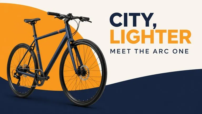
Anuncios display creados según los valores de color de marca a partir de un único briefing estructurado.
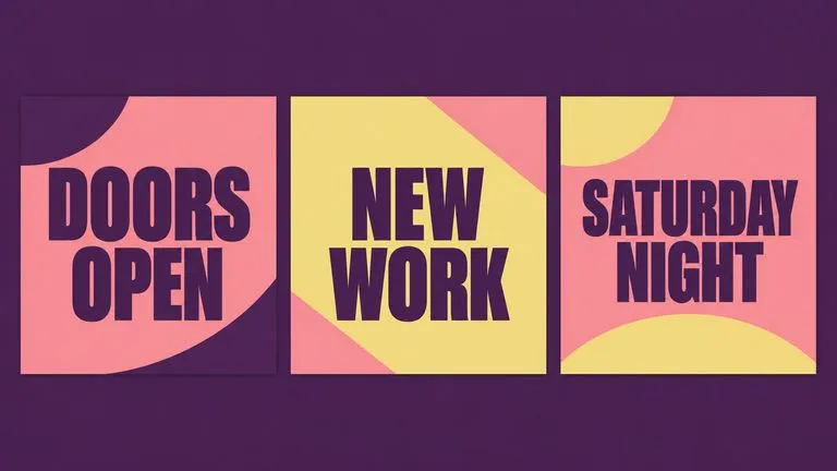
Tarjetas con citas, anuncios y publicaciones de campaña que llevan una línea de texto.
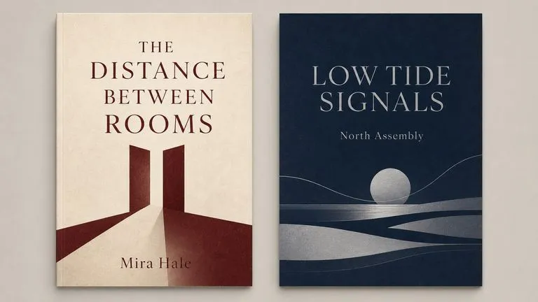
Composiciones guiadas por el título en las que la tipografía es el elemento visual principal.
Escribe cada palabra que deba aparecer, entre comillas. El modelo compone lo que le proporcionas e inventa lo que no.
Indica qué línea es el titular y cuánto más grande debe ser que el resto.
Describe las posiciones con lenguaje sencillo, o especifica cuadros delimitadores y valores hexadecimales en un brief JSON.
Genera una tanda y compara, porque las decisiones de maquetación se toman mirando opciones.
Un prompt útil de Ideogram 4.0 suele incluir cuatro elementos:
En lugar de escribir
Un cartel atractivo para un concierto de jazz con el nombre de la banda y la fecha, buena tipografía.
Escribe
Un cartel de concierto. El titular dice MERIDIAN QUARTET en una sans-serif alta y condensada, dispuesto en dos líneas y ocupando el tercio superior. Debajo, mucho más pequeño, 'Jueves 14 de noviembre · Union Chapel'. En la esquina inferior izquierda, aún más pequeño, 'Apertura de puertas 19:00'. Fondo azul marino intenso, una forma ocre cálida detrás del titular, sin fotografía. Márgenes amplios en los cuatro lados.
Un cartel de exposición en formato vertical. El titular dice SLOW WATER en una sans geométrica gruesa, todo en mayúsculas, en dos líneas, ocupando el cuarto superior. Debajo, en versalitas y a aproximadamente una quinta parte del tamaño: "Fotografías de Ana Reyes · 3 de marzo – 12 de abril". En el borde inferior, en el tamaño más pequeño: "Corran Gallery, Edinburgh". Fondo plano gris pálido con una banda horizontal azul intenso que pasa por detrás del titular. Sin imágenes. Márgenes generosos en todos los lados, todo el texto alineado a la izquierda con un margen común.
Un logotipo tipográfico para un tostador de café llamado NORTHBOUND. Una sola línea, todo en mayúsculas, una serif de alto contraste con transiciones grueso-fino pronunciadas y remates angulosos con enlace. Espaciado de letras ajustado. Negro puro sobre blanco, nada más en el encuadre, sin icono, sin forma contenedora, sin eslogan. Centrado con el mismo espacio arriba y abajo.
Un diseño frontal de envase para una lata de té de hojas sueltas, mostrado en plano en lugar de como render de producto. Centrado y en el tamaño más grande: ASSAM SECOND FLUSH. Directamente debajo, a la mitad del tamaño: "Té negro en hojas sueltas". En el borde inferior, pequeño: "100g". Fondo en #B4593C, una fina línea crema separando el nombre del producto del descriptor. Ilustración lineal sencilla de una hoja de té sobre el nombre, sin sombreado.
| Dimensión | Ideogram 4.0 | Nano Banana Pro |
|---|---|---|
| Enfoque de la tipografía | Compone la maquetación alrededor de ello | Lo renderiza dentro de una imagen |
| Control de la colocación | Cuadros delimitadores y briefs JSON | Descrito en el prompt |
| Control del color | Condicionamiento por valores hexadecimales | Descrito en el prompt |
| Salida nativa | 2K, listo para imprimir | Hasta 4K |
| Mejor entregable | Carteles, wordmarks, maquetaciones | Imágenes fotográficas que contienen palabras |
| Gestión de referencias | Orientado a la maquetación | Fusión de múltiples imágenes con roles |
El modelo compone el texto que le proporcionas e inventa el texto que no. Proporciónalo todo, incluida la letra pequeña.
"La mitad del tamaño del titular" es algo accionable. "Más pequeño" es una suposición que el modelo tiene que hacer por ti.
Los nombres específicos de tipografías no son fiables. Describir la forma de la letra —sans condensada, serif de alto contraste, grotesca geométrica— sí lo es.
Los márgenes y el espacio negativo son la mitad de la maquetación, y un modelo dejado a su aire los rellenará.
Explora herramientas específicas para crear, editar y preparar recursos de diseño.
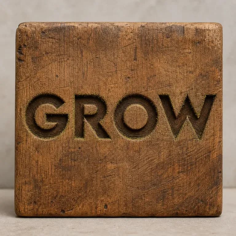
Las letras talladas en madera se comportan de forma distinta bajo la luz que las letras fundidas en metal líquido, y ningún prompt consigue ambas cosas bien por accidente. Escribe tu texto, indica el material y recibe un efecto que mantiene intactas las palabras mientras calcula cómo debería captar realmente la luz ese material. Los créditos gratuitos te dan la primera versión.
Amplía imágenes de muestras tipográficas hasta convertirlas en un conjunto completo de hojas de muestra con tablas de caracteres — alfabeto, números, puntuación, latín extendido — trasladando las características de diseño de la tipografía a cada carácter. Los resultados son imágenes de muestras de diseño tipográfico, no un archivo de fuente instalable.
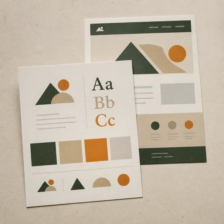
La mayoría de los trabajos de identidad empiezan de cero; este parte de lo que ya existe. Indícale un sitio web activo o describe la marca desde cero, y recibirás un panel que cubre la dirección del logotipo, el color y la tipografía extraídos de lo que realmente hay. Los créditos gratuitos bastan para ver la primera interpretación.
Qwen Image 3.0 Pro de Alibaba renderiza la tipografía como lenguaje en una docena de sistemas de escritura, manteniendo la legibilidad hasta diez píxeles en diseños densos.
El modelo de segunda generación de Reve AI construye un diseño direccionable de elementos posicionados antes de renderizar, de modo que una disposición especificada vuelve dispuesta correctamente.
GPT Image 2.0 de OpenAI lee un briefing de cien palabras e intenta cumplirlo por completo, con controles independientes de calidad y resolución de 1K a 4K.
Escribe las palabras, indica los tamaños, coloca los bloques — y el modelo los compondrá en lugar de adivinarlos.