
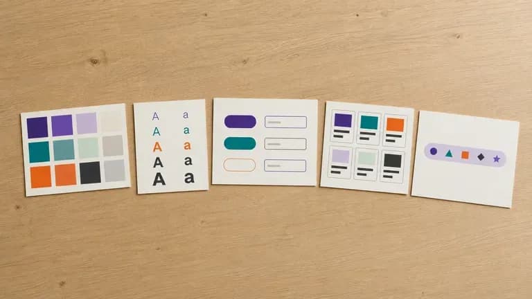
Free
Start with Free Generations
Try your first design system draft on Virse credits. New users can generate up to 10 images, enough to see whether the direction fits before committing a full documentation effort to it.
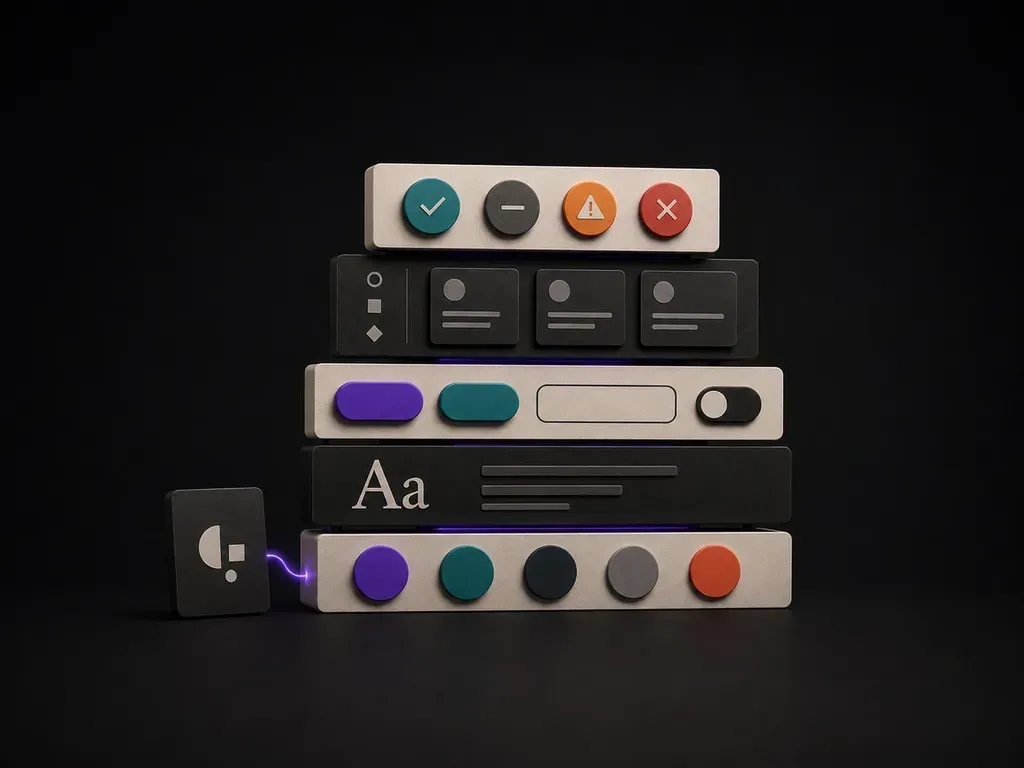
Upload your brand guidelines or existing screens, list the UI components you need, and generate a concrete visual component draft your team can build from, starting on free Virse credits.
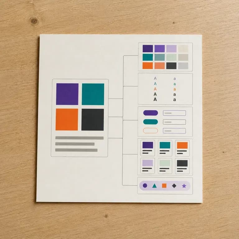
An AI design system generator turns brand guidelines and existing screens into a visual draft covering colour, type, spacing and common components. In Virse you upload what you have, describe the components you need, and refine the draft into a reference your product team can follow—built around three core workflow advantages:
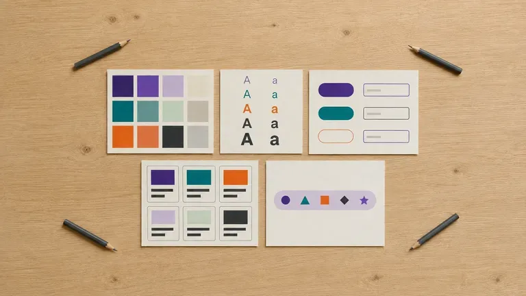
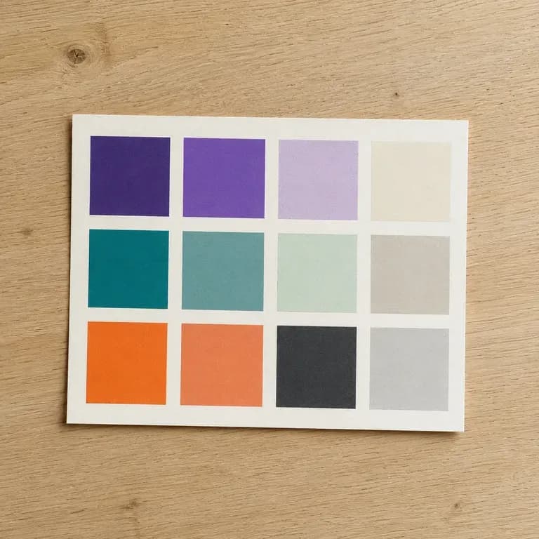
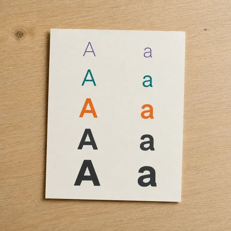
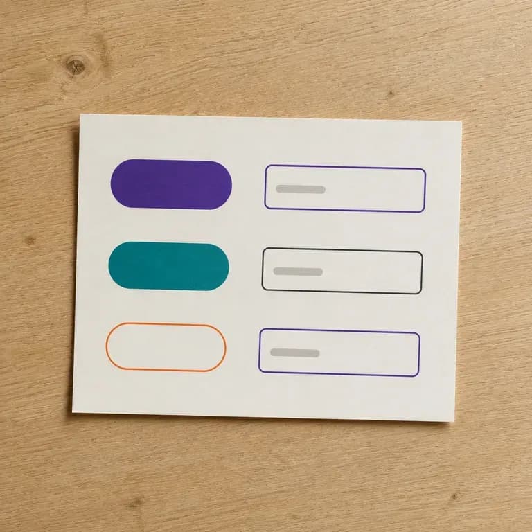
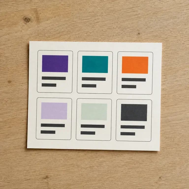
· Tokens + components together: Visualizes colour palettes, typography scales, elevation shadows, buttons, inputs, and cards on one sheet.
· Starts from guidelines or screens: Upload an existing brand book or live product screenshot to extract and standardize its UI language.
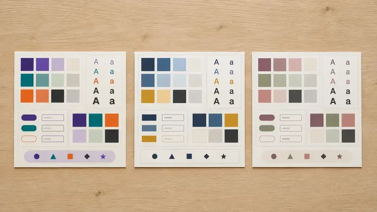
· Developer & designer alignment: Compare light/dark mode directions and component density before building a full Figma library.
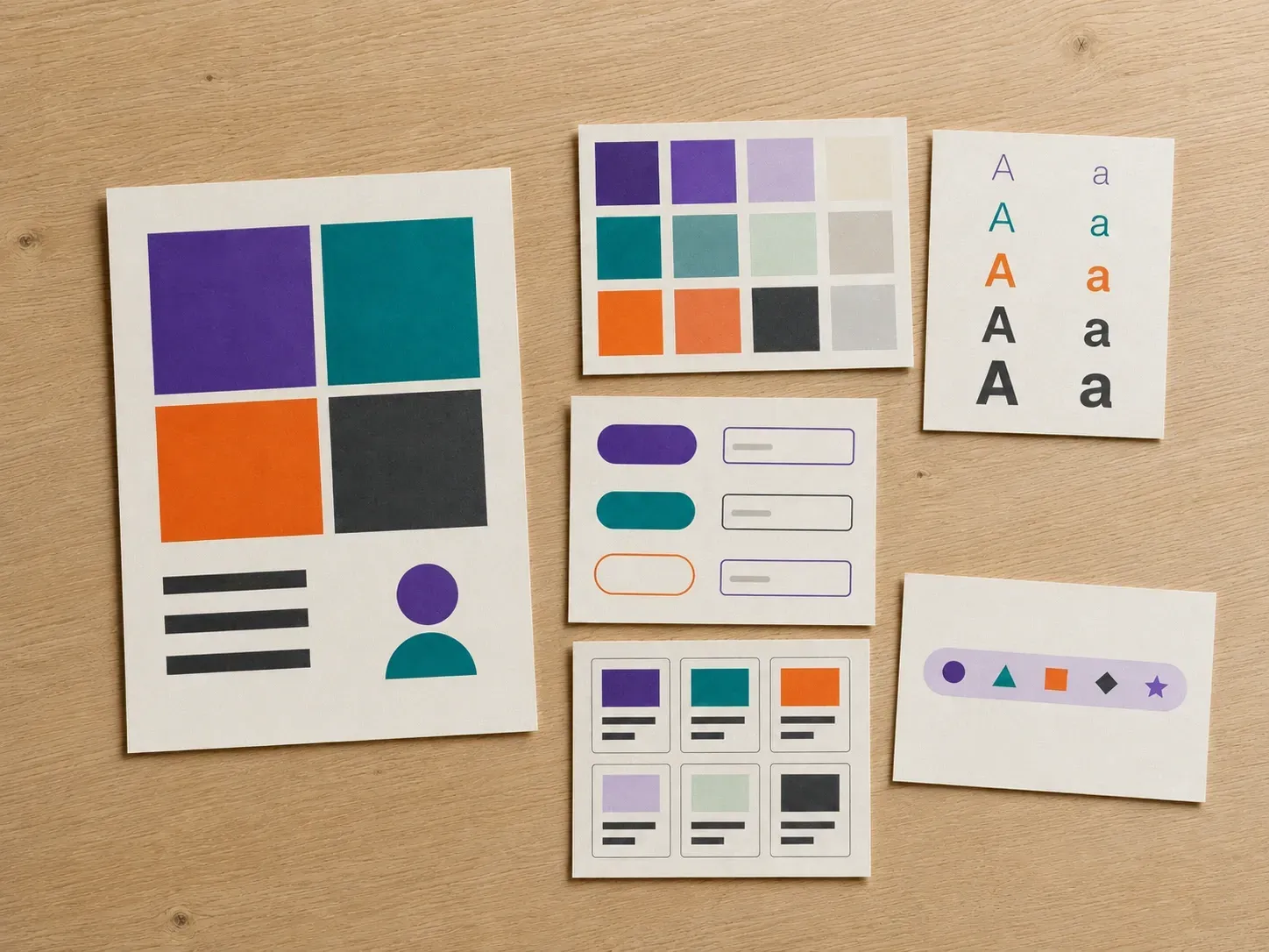
A design system exists so nobody has to reinvent a button. A clear visual starting point is what gets teams there faster.
Try your first design system draft on Virse credits. New users can generate up to 10 images, enough to see whether the direction fits before committing a full documentation effort to it.
Virse brings 40+ AI models into one workspace with unlimited usage on paid plans to compare how different models style your components.
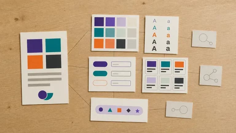
Guidelines, screens, generated drafts and alternate directions stay together on an infinite canvas so each component page stays consistent.
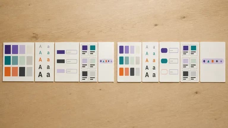
Compare weeks of manual component setup against fast visual design system boards on the Virse canvas.
Manual Component Library Setup First
Virse Design System Builder
Add your brand guidelines, or screens from a product that already exists, so the generator has something concrete to work from.
Describe the component types to cover, such as buttons, form fields, cards or navigation, so the draft matches your actual product surface.
Run an available AI image model and let it produce a draft covering colour, type, spacing and the components you listed.
Adjust the pieces that need work, then keep the draft on the canvas as the visual reference your product and engineering teams build from.
Upload your brand guidelines or an existing app screenshot, and list the core UI components and theme mood:
· B2B analytics dark-mode system: Deep carbon surface #0B0F17, indigo primary action, 6px border radius, buttons, data table badges, KPI cards, and search inputs.
· Consumer fintech mobile UI kit: High-contrast warm white surface, forest green primary, pill buttons, numeric keypad, transaction list rows, and alert banners.
· Editorial publishing design system: Paper-tinted light mode, serif display headers + clean sans UI controls, tag pills, article cards, and newsletter signup module.
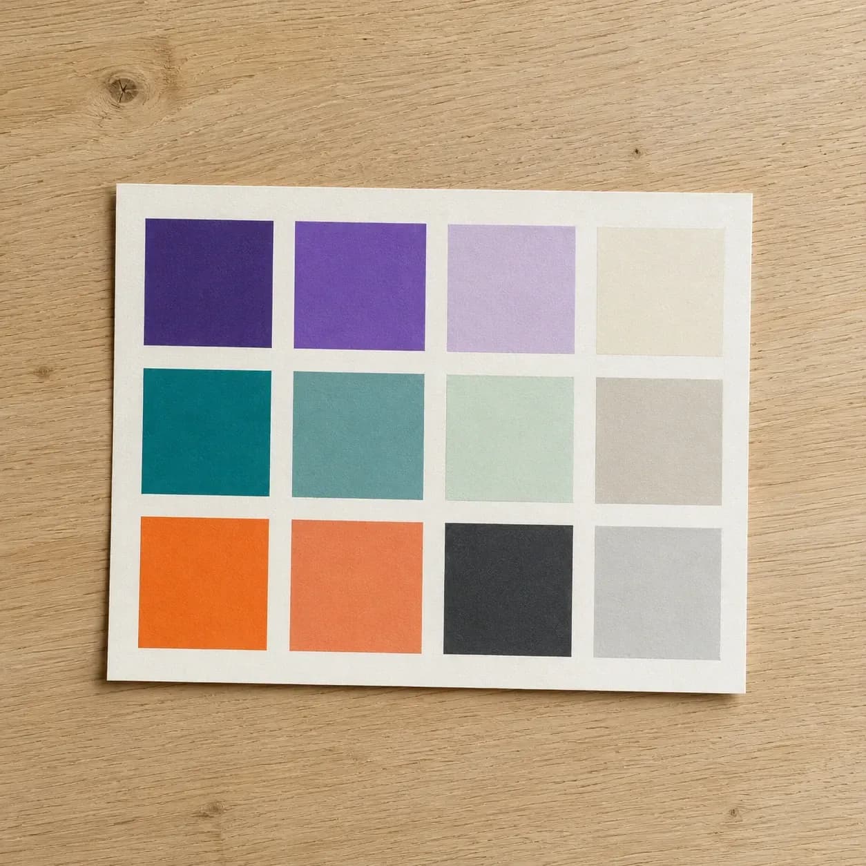
Teams that need a shared visual language before more screens get built.
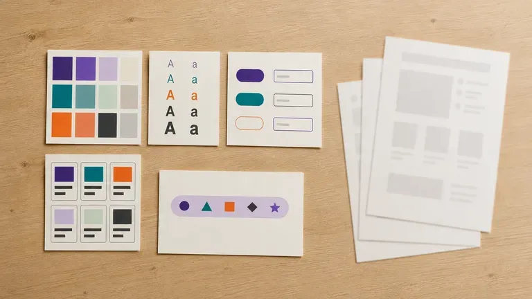
Turn brand rules into a component draft before formalising a full design system in a design tool.
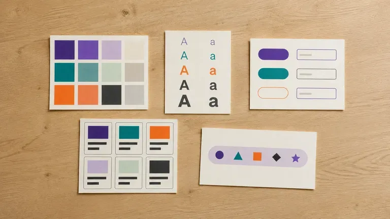
Get a starting visual system without a dedicated design systems team.
Align a growing team around a shared visual language before inconsistency sets in.
Produce a starting design system for a client product before the full build phase.
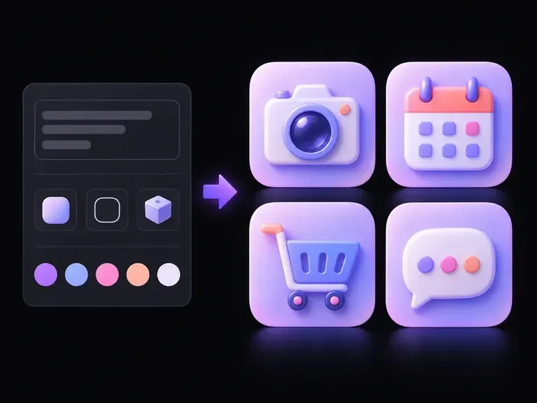
A camera, calendar, or gear can read as a crisp outline, flat geometric badge, or tactile 3D object. Describe your symbol and style, and this AI icon generator builds icon artwork you can compare on one canvas for mobile apps and UI sets.
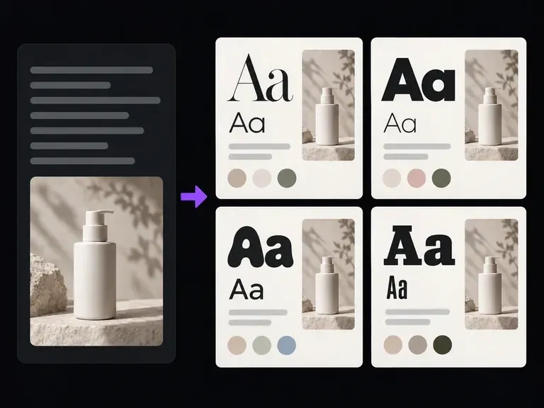
Describe your project, target audience, and mood to generate illustrated typography specimen boards alongside named heading and body font recommendations. This font pairing generator previews serif and sans-serif contrast for editorial, SaaS, and brand briefs.
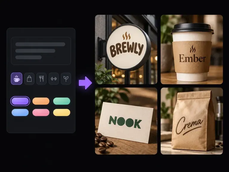
Describe what your business offers, who it serves, and the tone you want to project. Virse's AI business name generator returns a structured shortlist with written rationale and wordmark concepts on your canvas so you can evaluate how each name sounds and looks.
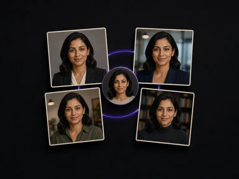
Upload one photo and get a set of studio-grade professional headshots, each in a different scene, outfit and tone. Your face stays unchanged. There is no training step and no batch of images to gather first.
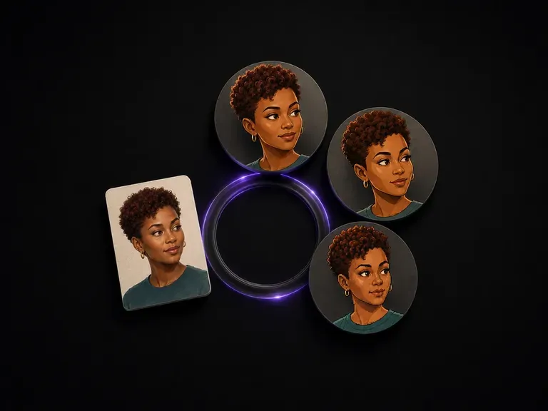
Upload one portrait and pick a style. Six fixed options, from a Pixar-like 3D look through to pixel art. The style is allowed to change completely. The features that make you recognisable are not.
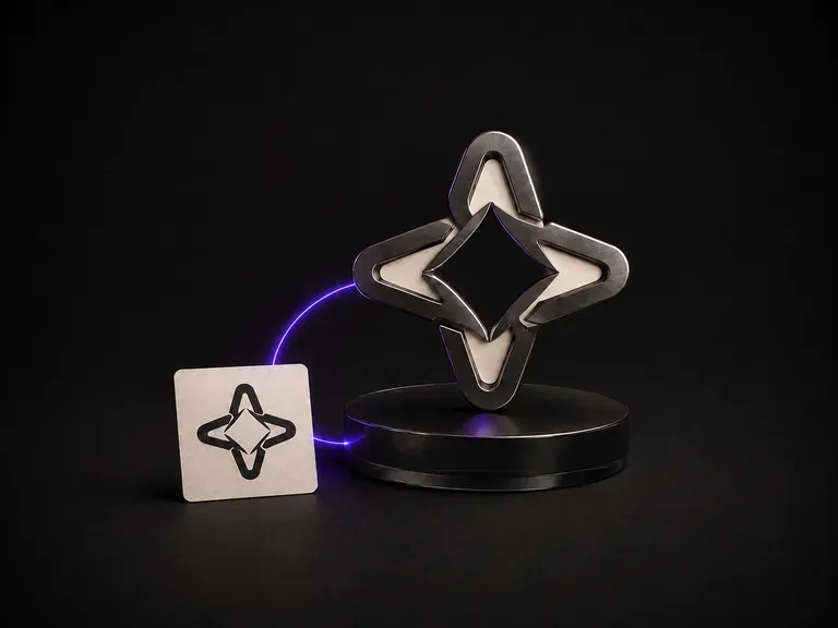
Give it a flat logo and a material reference. Brushed metal, cast glass, walnut, anything you have photographed. It renders the mark as a dimensional object in that material, with the silhouette and the letterforms exactly as drawn.
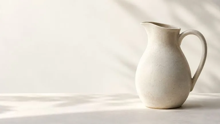
Create and edit stills with FLUX 3 Image at 1K, 2K or 4K. Switch to FLUX 3 Video for 5–20-second scenes at 720P or 1080P with native audio, on the same Virse canvas.

Generate and edit images with Nano Banana 2.1 in Virse. Choose 1K, 2K or 4K output and use up to 14 reference images to guide the subject, setting and materials.
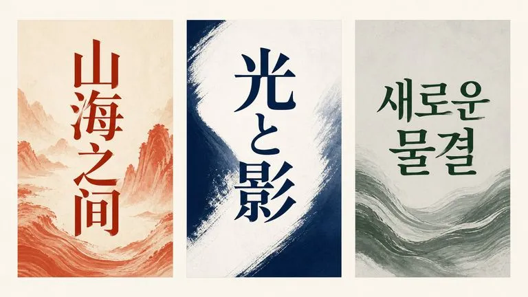
Alibaba's Qwen Image 3.0 Pro renders type as language across a dozen scripts, holding legibility down to ten pixels in dense layouts.
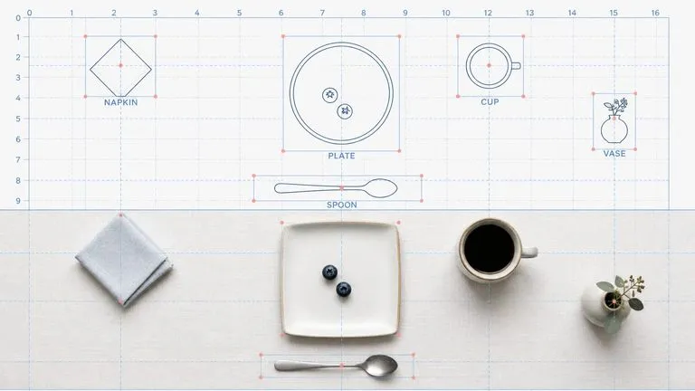
Reve AI's second-generation model builds an addressable layout of positioned elements before it renders, so a specified arrangement comes back arranged.
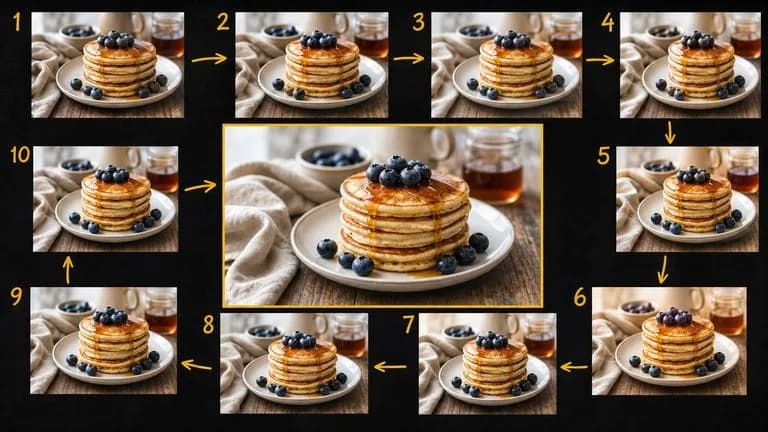
Google's Gemini 2.5 Flash Image — the original Nano Banana — generates and edits pictures at conversation speed, so a correction takes a sentence instead of a session.
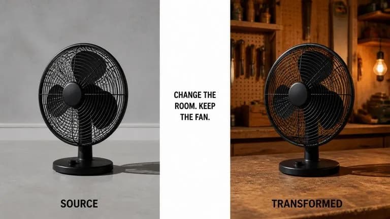
ByteDance's Seedream 4.0 and Seedream 4.5 generate from written descriptions and from images you supply, turning one source picture into as many directions as a project needs.
Upload your brand guidelines or existing screens, generate a component draft, and refine it into the reference your team builds from.