How to Make a Mockup Look Realistic (Without the “Sticker” Look)
Vincent読了 11 分 ·
To make a mockup look realistic, the artwork must feel physically part of the photographed product—not like a flat sticker placed on top. Match the scale, perspective, curvature, folds, lighting, shadows, texture, reflections, color, grain, and sharpness of the original scene.
The “sticker” look usually appears when a mockup fixes placement but ignores physical and photographic consistency. A logo may be positioned correctly yet still look fake if it does not follow the product’s shape, inherit its shadows and highlights, interact with the material, or match the camera’s grain and sharpness. Adding more effects will not fix a mockup if the geometry, lighting, and surface behavior are wrong.
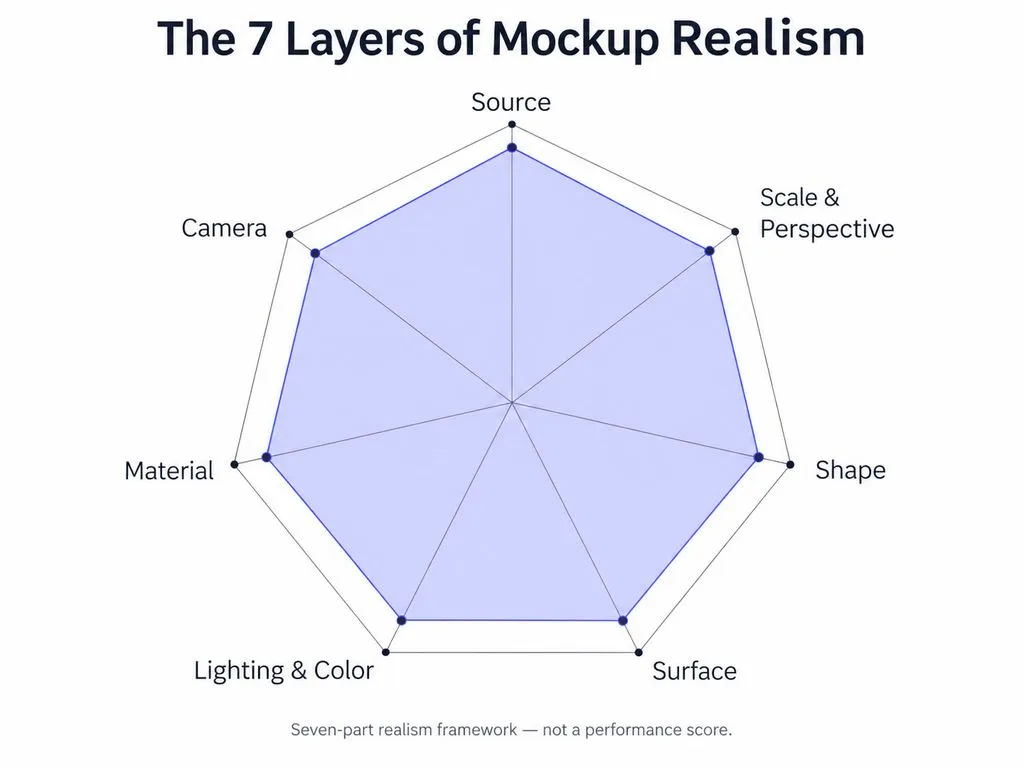
A reliable mockup workflow is Source → Scale & Perspective → Shape → Surface → Lighting & Color → Material → Camera. For teams creating mockups at scale, Virse brings references, assets, AI agents, and shared project context into one infinite canvas, helping maintain visual consistency across repeated variations and refinements.
Why Does a Mockup Look Fake?
A mockup usually looks fake because the artwork and the photograph communicate different physical information.
Our research review of 30 recurring mockup questions repeatedly surfaced the same problems: incorrect perspective, unrealistic scale, graphics that ignore folds, inconsistent shadows, mismatched lighting, and artwork that looks noticeably cleaner than the source image.
Perspective, Lighting, and Material Must Agree
Imagine a logo placed on a product mockup. It can be perfectly centered and still fail if its edges do not follow the package perspective, a highlight disappears underneath it, or the print is much sharper than the surrounding material.
This is why adding a Drop Shadow rarely solves an unrealistic mockup. The problem is usually not a missing effect. It is missing physical consistency.
A better diagnostic question is: What would have happened to this artwork if it had actually been printed, illuminated, photographed, and captured through the same lens?
That question provides the logic for every correction that follows.
How to Choose the Right Source Image for a Realistic Mockup
The source image sets the quality ceiling for the entire mockup. A poor camera angle or unsuitable lighting can create more work than the artwork itself.
Match Camera Angle, Scale, and Lighting First
Before editing, check:
- Camera angle and perspective
- Real-world scale
- Light direction and shadow softness
- Surface complexity
- Image resolution
- Existing graphics that need removal
If the viewpoint fundamentally conflicts with the design, texture and color adjustments will not rescue the composite. Replacing the photograph can be more efficient than forcing incompatible perspectives together.
Custom Photography Can Beat a Generic Template
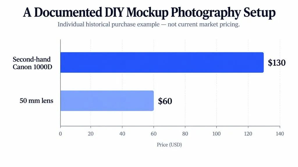
Our research includes one documented setup built around a second-hand Canon 1000D purchased for about $130 and a 50 mm lens for about $60. These are historical individual purchase figures, not current equipment prices, but the case illustrates an important point: controlling the camera angle, lighting, and product position can matter more than using an expensive generic template.
For apparel, moderate natural folds can actually help because they provide believable surface information. Excessive wrinkles, however, make displacement and masking substantially harder.
How to Build a Reusable Photoshop Mockup With Smart Objects
A professional mockup should be both convincing and reusable.
A Smart Object does not make artwork realistic by itself. Its purpose is to separate replaceable design content from perspective, masks, lighting, and material effects.
Create the Smart Object Before Distortion
A reliable mockup workflow is:
- Create a placeholder that matches the artwork ratio.
- Convert it to a Smart Object.
- Apply Perspective, Distort, or Warp externally.
- Mask the printable area.
- Build shadows, highlights, texture, and reflections around it.
- Replace the artwork inside the Smart Object when needed.
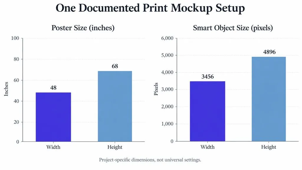
One documented print workflow used a 48 × 68-inch poster, a 3456 × 4896 px Smart Object, and a 2 px selection expansion during masking. These values are project-specific rather than universal Photoshop settings, but the underlying structure is broadly reusable.
Smart Objects Make Mockup Production Scalable
This architecture becomes more valuable when one design turns into 20 packaging versions or hundreds of product images.
Our research includes automation workflows designed to replace Smart Object contents across hundreds of mockups. No controlled time-saving benchmark was available, so claiming a specific productivity percentage would be unsupported.
The practical advantage is simple: build the physical behavior once and keep the artwork replaceable.
How to Match Scale, Perspective, Warp, and Displacement
Realistic mockups solve geometry in the correct order.
Technique | Best For | Main Job |
Scale | All mockups | Keeps artwork physically plausible |
Perspective / Distort | Posters, screens, flat packaging | Matches the viewing plane |
Warp | Shirts, bottles, curved packaging | Matches large surface curves |
Displacement Map | Fabric, paper, uneven surfaces | Matches small folds and wrinkles |
Match Real-World Scale Before Fine Adjustments
A technically correct perspective can still look wrong if the artwork is physically implausible. An oversized chest print or typography that exceeds a realistic printable area can make an otherwise polished mockup feel artificial.
Establish believable proportions before refining deformation.
Use Warp for Large Curves and Displacement for Small Detail
The simplest distinction is:
Perspective defines the plane. Warp defines the large shape. Displacement defines the small surface.
A bottle label may need perspective plus Warp. A T-shirt often needs Warp plus displacement because broad chest curvature and small wrinkles are separate geometric problems, especially when building a product mockup.
Trying to solve all three with one tool is a common reason mockups remain flat.
How to Make a T-Shirt Mockup Look Realistic
T-shirt mockups combine nearly every realism challenge: curvature, folds, fabric texture, shadows, highlights, and print behavior.
Use a Layered T-Shirt Mockup Workflow
A practical sequence is:
- Place the artwork inside a Smart Object.
- Match its scale and perspective.
- Warp it around the garment volume.
- Apply displacement for smaller wrinkles.
- Mask seams, buttons, or overlapping fabric.
- Restore the original shadows and highlights.
- Reintroduce fabric texture.
- Match grain and sharpness.
If a graphic still looks flat after Warp, macro shape has probably been corrected while surface detail and lighting have not.
Preserve Fabric Shadows and Highlights
Multiply can help carry selected shadow information through the design, while Screen can restore highlights. Levels, clipping masks, and Blend If provide more selective control.
But Multiply is not a universal realism setting.
One packaging case in our research showed that Multiply allowed graphics already printed on the source package to remain visible beneath the replacement artwork. The better approach is to isolate the useful shading or clean the original surface first.
How to Create Realistic Shadows That Stop a Mockup From Floating
Shadows explain both where the light comes from and whether the object is physically touching its environment.
Separate Contact Shadows From Cast Shadows
A contact shadow is concentrated where an object meets another surface. A cast shadow extends away from the object according to the direction and size of the light source.
A bottle can have a large cast shadow and still appear to float if its contact area remains too bright.
The contact region should normally be tighter and more concentrated before transitioning into the broader cast shadow. Its direction and softness must also match the original scene.
This is particularly important for packaging, devices, vehicles, and other objects that need to feel grounded.
How to Match Texture, Reflections, Color, Grain, and Sharpness
Once geometry and major lighting are correct, the remaining realism comes from material and camera consistency.
Make the Artwork Inherit the Material
Different surfaces affect artwork differently:
- Fabric introduces fibers, folds, stretching, and soft tonal variation.
- Paper introduces grain and subtle surface irregularity.
- Glossy packaging produces stronger highlights and reflections.
- Glass carries environmental reflections across whatever appears behind it.
If a reflection exists across a glass surface, it should not suddenly stop when it reaches the inserted artwork.
Match Color and Camera Characteristics
Artwork can also look fake because it is too digitally perfect.
Compare its exposure, color temperature, contrast, blur, noise, grain, and edge sharpness with the surrounding photograph.
The goal is not to degrade the artwork randomly. It is to make the design appear captured through the same material, lighting conditions, lens, and image-processing pipeline as everything around it.
Photoshop vs Illustrator vs Blender vs AI: Which Is Best for Realistic Mockups?
There is no single best mockup tool. The right choice depends on what must remain controllable.
Workflow | Best For | Main Advantage | Main Limitation |
Photoshop | Photo-based mockups | Precise compositing and reuse | Limited by source photography |
Illustrator | Fast vector mapping | Rapid surface placement | Material realism may need extra work |
Photography | Custom realistic scenes | Native light and texture | Viewpoint is fixed after shooting |
Blender / 3D | Custom products and angles | Full geometry and lighting control | Higher setup and learning cost |
AI + Photoshop | Rapid scene exploration | Flexible environment generation | Brand fidelity can vary |
Illustrator Can Accelerate Simple Surface Mapping
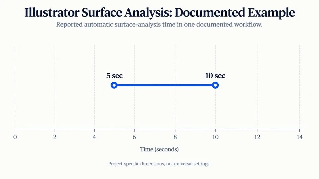
One documented Illustrator workflow reported approximately 5–10 seconds for automatic surface analysis before the vector artwork could be moved, scaled, and rotated.
That is an individual workflow observation rather than a universal performance benchmark. Automatic mapping can still look artificial if the material, lighting, and texture remain disconnected.
Use 3D When Photography Becomes the Constraint
Blender becomes more valuable when you need custom geometry, unrestricted viewpoints, controlled studio lighting, or materials that cannot be sourced photographically.
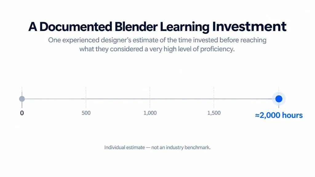
The learning investment can be substantial. One experienced designer in our research estimated spending around 2,000 hours before reaching what they considered a very high level of Blender proficiency. This is an individual experience, not an industry learning-time benchmark.
A practical hybrid is 3D plus Photoshop: establish the product, camera, lighting, and materials in 3D, then create replaceable design layers in Photoshop for future variations.
Use AI for Scene Exploration, Not Uncontrolled Brand Execution
AI is useful for rapidly exploring products, environments, and creative directions, but brand fidelity remains a key limitation.
Our review of AI mockup problems repeatedly surfaced altered logos, changed typography, inconsistent design details, and visual artifacts.
For brand-sensitive work, a more controlled workflow is:
Generate the blank product or environment with AI → insert the approved artwork → rebuild perspective, lighting, and material interaction.
This keeps exact brand execution under designer control.
Realistic Mockup Checklist: What Should You Check Before Exporting?
Review the mockup in the same order it was constructed.
Check the Seven Layers of Mockup Realism
- Source: Is the photograph suitable for the design?
- Scale & Perspective: Does the artwork have believable proportions and occupy the correct plane?
- Shape: Does it follow large curves?
- Surface: Does it respond to folds and irregularities?
- Lighting & Color: Do light direction, shadows, exposure, and color temperature agree?
- Material: Do texture and reflections affect the artwork naturally?
- Camera: Do blur, grain, noise, and sharpness match?
The order matters because geometry errors are structural, while many finishing errors are cosmetic. Correct grain cannot rescue incorrect perspective.
FAQ
Why does my mockup look fake or like a sticker?
The artwork is probably not inheriting enough information from the object underneath it. Check scale, perspective, curvature, folds, shadows, highlights, texture, reflections, color, grain, and sharpness. A realistic mockup should behave like part of the material rather than a clean digital layer placed above it.
Should I create a Smart Object before or after distortion?
Create the Smart Object before applying Perspective, Distort, or Warp externally. This keeps the artwork replaceable while preserving the transformation, making the mockup much easier to reuse across new designs and product variations.
Should I use Warp or a Displacement Map for a T-shirt mockup?
Use Warp for large garment curvature and a Displacement Map for smaller folds and wrinkles. They solve different problems and often work best together. After deformation, restore the shirt's shadows, highlights, and texture so the artwork feels printed on the fabric rather than placed above it, which is especially important for a convincing product mockup.
Do I need Blender or AI to make a realistic mockup?
No. Photoshop is sufficient for many posters, packaging designs, screens, and apparel mockups when the source photography is appropriate. Use Blender for custom geometry or unrestricted camera control and AI for rapid scene exploration, while keeping exact logos and typography under controlled editing.
Conclusion
Making a mockup look realistic is ultimately a problem of physical and photographic consistency. Start with the right source image, establish believable scale and perspective, use Warp for large curves and displacement for fine surface detail, preserve real lighting and contact shadows, then match the object's material, reflections, color, grain, blur, and sharpness. Whether the workflow uses Photoshop, Illustrator, photography, 3D, or AI, the standard is the same: the artwork should look as though it physically belonged to the object before the camera captured the scene.