8 Best Design System Tools to Keep Design, Code, and Teams in Sync
 Yifan Zhao読了 26 分 ·
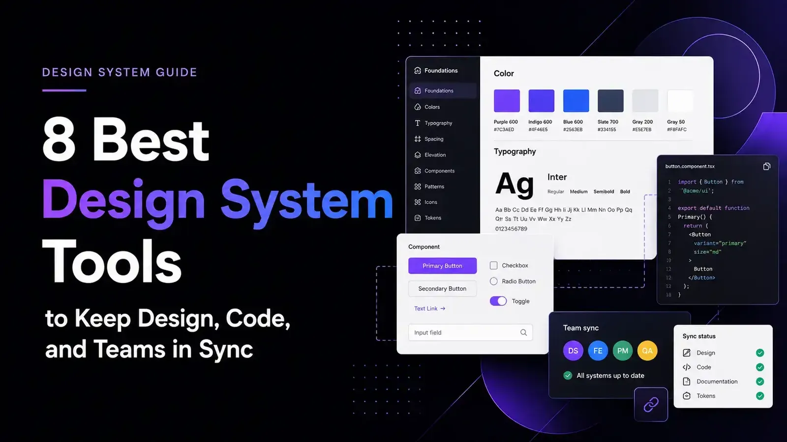
The best design system tools keep design libraries, production components, tokens, documentation, tests, and team workflows aligned. Figma, Storybook, zeroheight, Tokens Studio, Supernova, Chromatic, UXPin Merge, and Virse each solve a different part of that problem, so the right choice depends on where your design system is breaking—not on which platform has the longest feature list.
When those responsibilities are unclear, design files drift from code, tokens split into conflicting sources, documentation becomes outdated, and teams spend more time checking, recreating, and correcting work. Adding more software can make the problem worse unless every tool has a defined role, owner, and update process. A clearer process for creating and maintaining a design system helps reduce that fragmentation.
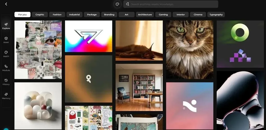
For teams whose consistency challenge extends beyond UI into campaigns, packaging, e-commerce assets, and product visualization, Virse brings references, creative directions, shared project context, and multiple AI design agents onto one infinite canvas—helping designers explore and extend approved visual directions while retaining control over editing, review, and delivery. This is especially relevant when teams need stronger brand consistency across AI-assisted creative.
What Are the Best Design System Tools?
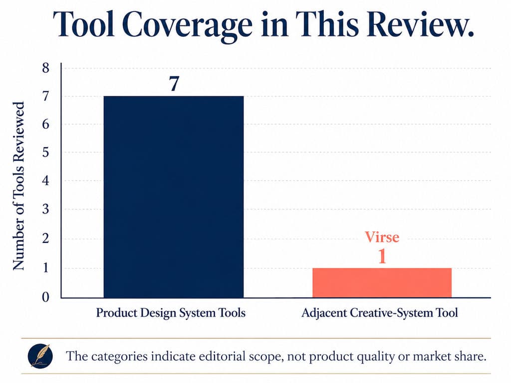
The eight best design system tools in this review are:
- Figma for shared design libraries and variables
- Storybook for developing and documenting code components
- zeroheight for cross-functional design system documentation
- Tokens Studio for designer-led token management
- Supernova for multi-brand and multi-platform delivery
- Chromatic for visual regression testing and UI review
- UXPin Merge for prototyping with production components
- Virse as an adjacent tool for AI-assisted creative consistency
The first seven primarily support digital product design systems. Virse addresses an adjacent problem: maintaining project context, visual direction, and brand consistency across campaign, packaging, e-commerce, and product-visualization work. It does not replace a UI component library, token pipeline, documentation portal, or testing platform.
The Best Design System Tools at a Glance
Tool | Best for | Primary role | Main limitation |
Figma | Shared visual libraries | Components, styles, variables, and design intent | Does not govern production behavior or automated tests |
Storybook | Working UI components | Code-based components, states, documentation, and tests | Usually requires developer ownership |
zeroheight | Cross-functional documentation | Guidelines, patterns, governance, and system knowledge | Documentation can still drift without release ownership |
Tokens Studio | Designer-led token workflows | Token creation, themes, aliases, and repository synchronization | Adds architecture and Git complexity |
Supernova | Multi-brand, multi-platform systems | Tokens, documentation, code pipelines, and AI context | May be excessive for small teams |
Chromatic | UI regression prevention | Visual baselines, review, and CI checks | Unstable stories create noisy results and higher usage |
UXPin Merge | Code-backed prototyping | Interactive prototypes built from production components | Direct repository integrations primarily target React |
Virse | AI-assisted creative consistency | Adjacent creative-system context, references, and controlled variants | Does not manage UI code, tokens, documentation, or testing |
Figma is the strongest default starting point for visual design. Storybook is the strongest foundation for teams treating the component library as a software product. zeroheight is most useful when documentation must be maintained by people outside engineering.
Tokens Studio and Supernova become more valuable as token, theme, brand, and platform complexity increases. Chromatic is a natural addition once Storybook stories become release-critical. UXPin Merge fits organizations that already have mature production components.
Virse becomes relevant when consistency must extend beyond product UI into campaign adaptation, multi-SKU packaging, e-commerce assets, localized creative production, or product concept visualization.
Why Do Design Systems Fall Out of Sync?
Design systems fall out of sync because different decisions live in different tools and are updated by different people.
A designer may change a component in Figma while its React implementation remains unchanged. A developer may introduce a new prop without updating the design library. A token may be renamed in one source but continue to exist in CSS, native applications, and documentation. A component may be deprecated in code while the documentation portal still recommends it.
This creates four recurring forms of drift:
- Design-code drift: Visual specifications and production behavior disagree.
- Token drift: Names, values, aliases, or themes differ across design and platforms.
- Documentation drift: Published guidance no longer reflects current components.
- Workflow drift: Teams create local workarounds because approved assets are difficult to find or use.
A publicly documented workflow in our research material connected Tokens Studio to GitHub, stored tokens as JSON, and then used Style Dictionary or custom scripts to generate CSS or Tailwind outputs. The example demonstrates why a token tool is only one part of the system: the team still needs naming rules, repository ownership, transformations, reviews, and release processes.
The example did not disclose implementation time, long-term maintenance cost, or measured ROI, so it should be treated as a workflow illustration rather than performance evidence.
Another public scenario involved maintaining more than 1,400 icons. At that scale, manually updating previews, statuses, names, and documentation becomes difficult to sustain. The lesson is not that one particular platform automatically solves icon governance. It is that asset volume eventually turns documentation, discovery, versioning, and deprecation into operational problems rather than simple design-file organization problems.

A reliable design system therefore needs explicit authority for each layer:
Layer | Recommended authority |
Visual design | Approved Figma libraries |
Runtime behavior | Production repository and Storybook |
Tokens | Governed token repository or token platform |
Documentation | Maintained portal or code-based documentation |
Visual baselines | Automated UI-testing system |
Creative context | Approved references, guidelines, and project canvas |
A single source of truth does not mean storing everything in one application. It means each kind of decision has one recognized owner, and supporting tools consume or reference that decision instead of recreating it independently.
How Were These Design System Tools Evaluated?
This review used official product documentation, current pricing pages, release notes, product help centers, and recurring public workflow questions available through July 2026.
It was not a controlled hands-on benchmark of all eight products. The tools were not assigned numerical scores because they solve different tasks and cannot be fairly compared by feature count.
Claims about speed, ROI, adoption, or efficiency were excluded unless the available evidence clearly described the source and conditions.
A product was included when it met the following criteria:
- It remains actively available and documented.
- It solves a distinct design-system or adjacent creative-system problem.
- Its core capabilities can be verified from primary sources.
- It provides meaningful decision value without duplicating another selection.
- Its limitations can be explained clearly enough to identify unsuitable teams.
Core Features and Source-of-Truth Role
Each tool was assessed according to the information it can realistically own or maintain:
- Design components and variables
- Production UI components
- Tokens and themes
- Documentation and usage guidance
- Test baselines
- Code delivery
- Multi-brand or multi-platform structures
- AI-readable design-system context
- Creative references and related variants
The review distinguishes between authoring, publishing, synchronizing, and testing.
A tool that displays tokens is not necessarily the system that creates them. A platform that embeds Storybook does not become the owner of the production components. A tool that generates visually consistent assets does not automatically enforce UI code or accessibility rules.
Collaboration, Integrations, and Adoption
Collaboration was evaluated through practical questions:
- Who can edit the system?
- Does editing require code or Git knowledge?
- Can changes be reviewed?
- Can information be connected to its original source?
- What must be updated manually?
- Does the tool fit existing design and engineering workflows?
- Can data be exported in an open or usable format?
Code-based tools tend to stay closer to production but can exclude non-technical contributors. No-code platforms broaden access but require disciplined publishing workflows to avoid documentation drift.
Enterprise platforms can connect more layers, but they also demand migration, configuration, training, and governance.
Pricing, Implementation, and Maintenance
The review considers total cost, not subscription price alone:
- License or subscription fees
- Initial integration and migration
- Engineering and DesignOps work
- Documentation and test maintenance
- Training and contribution support
- Switching and data-export risk
One public implementation example used open-source Nextra and Storybook for an internal portal. Although the software did not require a SaaS license, the team still had to build, deploy, maintain, and support the system. The example did not quantify those internal costs.
A free tool can therefore cost more than a paid platform when engineering attention is scarce. Conversely, a broad enterprise platform can be wasteful when a team has one product, one brand, and a small component library.
Figma: Best for Shared Design Libraries and Variables
Introduction and Key Features
Figma is best for product teams that need a shared visual source of truth for components, styles, variables, layouts, and interaction intent.
A Figma library can contain reusable components, styles, and variables that are distributed across files and projects. Variables store reusable values, support aliases, and can be applied to design properties and prototype actions. Figma also provides component properties, library publishing, usage analytics on applicable plans, and APIs for managing variables at scale.
Key features include:
- Shared component libraries
- Variants and component properties
- Styles and variables
- Variable collections, modes, and aliases
- Prototyping
- Dev Mode
- Library publishing and updates
- Variable APIs
- Component-to-code mapping support
A practical Figma workflow treats the design library as the authority for appearance and intended states. The production component remains responsible for actual behavior, accessibility semantics, data handling, and framework implementation.
For example, a Figma input component may define default, focus, error, disabled, and filled states. The production component still needs keyboard support, labels, validation logic, error announcements, and application integration.
Advantages and Disadvantages
Advantages
Figma places design-system work inside the same environment used for interface design and prototyping. Designers do not need to switch to a separate administrative platform to create, inspect, and apply shared assets.
Variables and modes can represent:
- Light and dark themes
- Semantic color roles
- Brand variations
- Density options
- Product-specific contexts
- Reusable prototype values
Its broad adoption also reduces the training barrier for many product organizations.
Disadvantages
Figma does not guarantee code synchronization. A published component update can remain unimplemented in production, while a code change can remain undocumented in Figma.
Variables do not create a sound token architecture automatically. Teams can still produce:
- Duplicated primitives
- Ambiguous semantic names
- Excessive modes
- Broken alias relationships
- Collections that do not map cleanly to code
Figma is also not a complete component-testing or governance platform. It cannot independently verify runtime accessibility, browser behavior, interaction logic, or visual regressions.
Large organizations may experience library sprawl when teams duplicate files, maintain local variants, or delay adopting approved updates.
Who Should—and Should Not—Use Figma?
Recommended for:
- Product design teams
- Organizations building shared UI libraries
- Teams using variables and themes
- Designers who need a familiar collaborative workspace
- Teams that can connect Figma to code, documentation, and testing workflows
Not sufficient by itself for:
- Production component development
- Automated UI testing
- Cross-platform token compilation
- Detailed contribution and release governance
- Campaign, packaging, or high-volume creative production
Verdict: Figma is the best visual foundation for most product design systems, but it should be treated as one authoritative layer rather than the entire system.
Storybook: Best for Building and Documenting Code Components
Introduction and Key Features
Storybook is best for engineering-led teams that need to build, document, test, and review working UI components in isolation.
Stories render real components outside the application and capture specific states, props, data conditions, and edge cases. Storybook is open source and supports component development, documentation, interaction testing, accessibility workflows, and visual-testing integrations.
Key features include:
- Isolated component development
- Stories for component states
- Generated documentation
- MDX documentation
- Interaction tests
- Accessibility-related testing
- Mocked dependencies
- Broad framework support
- Visual-testing integrations
- Shareable component catalogs
Storybook is particularly valuable for documenting states that are difficult to reach inside a running application:
- Loading
- Empty data
- Long translated text
- Validation errors
- Disabled controls
- Permission restrictions
- Dark themes
- Responsive layouts
- Unusual content combinations
In 2026, Storybook added MCP support so compatible AI agents can inspect component and documentation context. As of July 2026, the official MCP implementation requires Storybook 10.3 or later and is available for React projects; support for additional frameworks is still developing.
Advantages and Disadvantages
Advantages
Storybook keeps examples close to production implementation. A rendered story shows the actual component rather than an illustration of how it might work.
It is useful for:
- Developer documentation
- QA review
- Accessibility checks
- Edge-case coverage
- Component API review
- Visual regression testing
- AI access to approved components
Stories can also function as reusable test fixtures. The same error-state story used during development can be reviewed visually and executed in automated tests.
Disadvantages
Storybook usually remains developer-led. Non-technical contributors may need help to update MDX, fixtures, or stories through Git and pull requests.
Stories can become outdated. If the team changes a component without maintaining representative stories, the catalog may no longer reflect important states.
Storybook also does not replace wider design-system documentation. Teams still need guidance on:
- Pattern selection
- Content design
- Accessibility rationale
- Contribution rules
- Release policies
- Migration
- Deprecation
- Ownership
MCP access is promising, but it should not be treated as universally available across Storybook frameworks while the official implementation remains React-specific.
Who Should—and Should Not—Use Storybook?
Recommended for:
- Teams maintaining reusable frontend components
- Engineering-led design systems
- Organizations documenting real component states
- Teams planning automated UI testing
- React teams experimenting with component-aware AI agents
- Products with complex states and edge cases
Not recommended as the primary platform for:
- Teams without reusable code components
- Documentation programs led mainly by non-developers
- Brand and campaign asset management
- Organizations unwilling to maintain stories during releases
Verdict: Storybook is the strongest code-side design system foundation when stories are treated as maintained product assets rather than optional demos.
zeroheight: Best for Cross-Functional Design System Documentation
Introduction and Key Features
zeroheight is best for organizations that need designers, developers, product managers, writers, accessibility specialists, and other contributors to maintain design-system guidance without making every edit through code.
Its platform centers on documentation, delivery, measurement, and management. It can connect to design and code sources such as Figma and Storybook, helping teams publish foundations, components, patterns, content rules, accessibility guidance, and governance information in one portal.
Key features include:
- No-code documentation editing
- Structured design-system sites
- Figma and Storybook connections
- Token and component documentation
- Search
- Review and collaboration workflows
- Public or private portals
- Usage and adoption insights on applicable plans
- Governance and management features
- AI and agent-context use cases
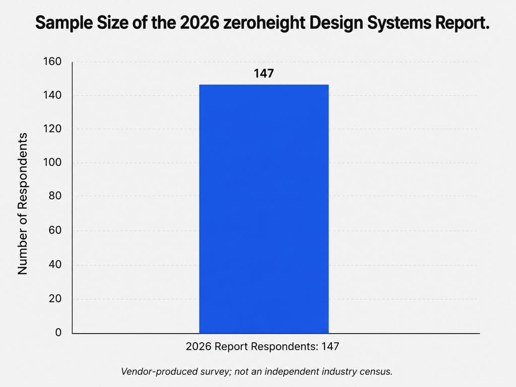
zeroheight’s 2026 Design Systems Report drew responses from 147 design-system practitioners. Because zeroheight produced the report, it should not be treated as an independent industry census, but it provides a current snapshot of issues reported by practitioners working directly with design systems.
Advantages and Disadvantages
Advantages
zeroheight lowers the editorial barrier compared with code-only documentation. A content designer can clarify voice guidance, an accessibility specialist can add requirements, and a product designer can update usage examples without necessarily editing a repository.
It is well suited to content that goes beyond component APIs:
- When to use a pattern
- When not to use it
- UX writing guidance
- Accessibility expectations
- Research rationale
- Contribution instructions
- Migration notes
- Ownership and support information
Its integrations can reduce duplication by referencing Figma and Storybook rather than recreating every asset manually.
Disadvantages
A documentation platform cannot guarantee that its content remains accurate. Teams still need to connect documentation updates to design and code releases.
A sustainable workflow must define:
- Page owners
- Reviewers
- Publishing rights
- Required release updates
- Deprecation labels
- Archiving rules
- Generated versus manually maintained content
zeroheight may overlap with Storybook, Notion, Confluence, or a custom portal. Adding it without retiring or narrowing other documentation sources can increase confusion.
Features related to delivery, measurement, management, and agent context may vary by plan and configuration. Enterprise teams should verify permissions, SSO, audit, privacy, and support requirements directly.
Who Should—and Should Not—Use zeroheight?
Recommended for:
- Cross-functional design-system teams
- Organizations with non-technical documentation owners
- Public or internal documentation portals
- Systems with substantial accessibility and content guidance
- Multi-product organizations that need measurable adoption
- Teams willing to link documentation updates to releases
May not be necessary for:
- Small teams comfortable with Storybook and MDX
- Organizations with an effective existing portal
- Teams without documentation ownership
- Groups expecting software to solve governance automatically
Verdict: zeroheight is most valuable when access to documentation is the bottleneck. It cannot compensate for an absent publishing and ownership process.
Tokens Studio: Best for Designer-Led Token Management
Introduction and Key Features
Tokens Studio is best for teams that want designers to create and manage structured design tokens while connecting those decisions to Figma, repositories, releases, and production outputs.
Its platform supports token workflows, themes, aliases, repository synchronization, exports, branching, and versioned releases.
Because pricing can change by plan, region, seats, and billing cycle, teams should verify the current official pricing page before purchasing rather than relying on an older comparison article.
Key features include:
- Token and variable management
- Primitive and semantic aliases
- Token sets and themes
- Figma synchronization
- Repository synchronization
- Branching and releases
- CSS and custom-format exports
- DTCG-compatible workflows
- Documentation and asset features on applicable plans
- AI and MCP-related features on selected plans
The Design Tokens Community Group published the first stable version of its vendor-neutral token specification on October 28, 2025. The specification defines a file format for exchanging design tokens between tools, although it is a Community Group specification rather than a W3C Standard.
Advantages and Disadvantages
Advantages
Tokens Studio gives designers a more direct role in token work than a code-only JSON repository.
It is particularly valuable for:
- Multiple brands
- Multiple themes
- Semantic color systems
- Theme inheritance
- Designer-engineer collaboration
- Versioned token releases
- Figma-to-repository workflows
Support for structured, portable formats can also make it easier to connect design decisions with downstream transformations.
Disadvantages
Tokens Studio does not design the token architecture for the team. A poorly organized system remains poorly organized after it is synchronized.
Complexity increases through:
- Primitive and semantic layers
- Deep aliases
- Theme combinations
- Platform transformations
- Repository branches
- Merge conflicts
- Release dependencies
- Duplicate Figma variables
The tool can also overlap with native Figma variables. Before adding it, teams should identify which requirements cannot be handled by their current variable and repository workflow.
The subscription is only part of the cost. Engineering still needs to own output formats, transformations, package distribution, compatibility, and production rollout.
Who Should—and Should Not—Use Tokens Studio?
Recommended for:
- Teams with mature token requirements
- Designers participating in token governance
- Multi-brand and multi-theme products
- Organizations connecting Figma with Git
- Teams adopting portable token formats
- Groups with engineering support for delivery
Not recommended for:
- Small libraries with a few basic variables
- Teams without naming and ownership rules
- Organizations expecting an automatic token architecture
- Code-first teams already satisfied with a repository-native pipeline
Verdict: Tokens Studio is a strong design-facing token layer, but it should be introduced only after the team understands ownership, naming, transformations, and releases.
Supernova: Best for Multi-Brand and Multi-Platform Delivery
Introduction and Key Features
Supernova is best for organizations that need to connect design tokens, documentation, components, assets, code delivery, and AI context across multiple brands, products, or technical platforms.
Its platform includes token management, collaborative documentation, code pipelines, integrations, analytics, enterprise controls, and structured context for AI agents.
Key features include:
- Design token management
- Multi-brand and multi-theme structures
- Collaborative documentation
- Code automation pipelines
- Platform-specific exports
- Component governance
- Documentation analytics
- Data imports and integrations
- Enterprise permissions
- AI and MCP access to design-system data
Supernova’s pipelines can apply separate export logic by brand, platform, theme, or team. For example, one token source can feed different web, iOS, Android, or brand-specific outputs without requiring every consumer to interpret the raw data independently.
Advantages and Disadvantages
Advantages
Supernova can reduce fragmentation in organizations where tokens, documentation, and code delivery have become separate operational systems.
It is particularly suited to:
- Multi-brand systems
- Web and native platforms
- Distributed teams
- Complex token overrides
- Automated code outputs
- Centralized design-system knowledge
- AI workflows that need structured system context
Its AI positioning is grounded in exposing structured information—tokens, components, documentation, assets, and code patterns—to agents rather than asking models to infer the system from screenshots alone.
Disadvantages
A broad platform requires a significant implementation commitment. Teams may need to:
- Restructure token data
- Configure imports
- Build export pipelines
- Migrate documentation
- Connect repositories
- Define permissions
- Train contributors
- Establish release governance
A small team with one product may not benefit enough to justify that work.
Centralization also introduces platform dependency. Before adoption, teams should evaluate export formats, APIs, repository ownership, security, data access, and migration options.
Published customer stories can illustrate possible workflows, but they are vendor-produced and should not be treated as controlled evidence of universal ROI.
Who Should—and Should Not—Use Supernova?
Recommended for:
- Multi-brand organizations
- Web, iOS, and Android product portfolios
- Enterprise design-system programs
- Teams needing token-to-code automation
- Organizations preparing trusted design-system context for AI agents
- Groups with dedicated DesignOps or system ownership
Not recommended for:
- Small single-product teams
- Organizations needing only documentation
- Teams seeking only a Figma token plugin
- Groups without resources for implementation and governance
Verdict: Supernova is strongest when design-system fragmentation is already an organizational problem. It is unnecessary overhead when the system is still small and structurally simple.
Chromatic: Best for Visual Regression Testing and UI Review
Introduction and Key Features
Chromatic is best for teams using Storybook that need repeatable visual regression testing, browser coverage, UI review, and pull-request checks.
It renders stories in the cloud, compares them with approved baselines, and flags visual changes before code is merged.
Key features include:
- Automated visual snapshots
- Storybook integration
- Git and CI integration
- Pull-request checks
- Cross-browser coverage
- Theme and viewport testing
- UI change review
- Baseline approval
- UI version history
- TurboSnap optimization
Pricing is affected by snapshot volume, browser coverage, and plan features. Teams should use Chromatic’s current pricing page and snapshot calculator to estimate the cost of their actual combination of components, states, themes, browsers, and branches.
Advantages and Disadvantages
Advantages
Chromatic turns visual review into a release process rather than an informal check.
It is valuable when one component change can affect:
- Many products
- Multiple brands
- Several breakpoints
- Light and dark modes
- Different browsers
- Localized interfaces
- Large numbers of states
Because Chromatic uses Storybook stories, the same component examples used for development become reviewable test cases.
Chromatic can participate in visual, interaction, and accessibility workflows. However, a passed visual snapshot alone does not demonstrate that an interface is usable or accessibility-compliant.
Disadvantages
The system depends on stable stories. Dynamic timestamps, random data, animations, remote assets, asynchronous rendering, or inconsistent fonts can create noisy differences.
Snapshot volume can grow rapidly when a team multiplies:
- Components
- States
- Themes
- Browsers
- Viewports
- Branches
This affects both review workload and cost. TurboSnap can reduce unnecessary snapshots, but the team still needs a deliberate coverage strategy.
Visual regression cannot replace functional, accessibility, usability, or content review.
Who Should—and Should Not—Use Chromatic?
Recommended for:
- Teams already maintaining Storybook
- Shared component libraries
- Multi-theme or multi-brand systems
- Products with frequent UI releases
- Teams requiring browser coverage
- Organizations integrating UI review into CI
Not recommended for:
- Teams without stable stories
- Very small products with infrequent UI changes
- Organizations expecting screenshots to replace functional testing
- Teams unwilling to maintain baselines
Verdict: Chromatic is a strong testing layer once stories are reliable. Introducing it before stabilizing Storybook often produces noise rather than confidence.
UXPin Merge: Best for Prototyping with Production Components
Introduction and Key Features
UXPin Merge is best for teams that want designers to build high-fidelity prototypes using coded production components rather than detached visual copies.
Its direct repository integrations primarily target React components. UXPin also provides a Storybook integration that can bring interactive components from supported frameworks into the design environment, so teams should verify which integration path best matches their stack.
Key features include:
- Importing coded components
- React repository integration
- Storybook integration
- Visual editing of component properties
- Interactive component behavior
- Code-backed design-system libraries
- Git and CI workflows
- Component documentation links
- AI-assisted workflows using connected component libraries
For a team with an established React system, designers can assemble realistic forms, menus, tables, and application flows using the same component APIs developers maintain.
Advantages and Disadvantages
Advantages
UXPin Merge directly reduces one source of design-code drift: maintaining a visual imitation of a component that already exists in production.
Designers can work with:
- Real properties
- Real interactions
- Supported variants
- Actual layout behavior
- Production component constraints
This improves prototype fidelity and can expose missing component capabilities before development begins.
It is especially useful for flows involving data tables, forms, validation, menus, and other interactions that are difficult to communicate through static screens.
Disadvantages
Direct custom-library setup requires engineering work. The team must prepare components, expose properties, maintain integrations, and support updates.
Framework support needs careful interpretation. UXPin’s direct repository workflow centers on React, while its Storybook integration broadens the possible sources. Teams should not assume every framework provides the same setup, code output, or maintenance experience.
Using production components can also constrain early exploration. That is useful during delivery but may be limiting when designers are still questioning the component model itself.
UXPin Merge does not replace:
- Storybook
- Token governance
- Automated regression testing
- Broader system documentation
- Code review
Vendor claims about dramatic speed improvements should be treated as customer-specific marketing evidence, not universal performance data.
Who Should—and Should Not—Use UXPin Merge?
Recommended for:
- Teams with mature React component libraries
- Organizations using compatible Storybook libraries
- Products suffering from prototype-to-code drift
- Designers needing realistic interactive prototypes
- Enterprises with engineering support for integration
- Teams exploring AI generation constrained to approved components
Not recommended for:
- Teams without reusable production components
- Products with unstable UI architecture
- Organizations lacking integration support
- Early exploration requiring unconstrained visual experimentation
- Teams seeking automatic production code from arbitrary designs
Verdict: UXPin Merge is most valuable when the component library is mature enough to become a reliable design input rather than merely an engineering output.
Virse: Best Adjacent Tool for AI-Assisted Creative Consistency
Introduction and Key Features
Virse is not a traditional UI design-system platform. It is an adjacent AI design operating system for professional designers, studios, brand creative teams, e-commerce teams, packaging designers, and product design teams that need to maintain shared visual context across creative work.
Its product positioning is based on AI assisting professional designers rather than replacing them through a single prompt.
Confirmed capabilities include:
- Organizing, connecting, comparing, and editing assets on an infinite canvas
- Using wider canvas context rather than an isolated prompt
- Running multiple agents on related project tasks
- Sharing context between agents
- Visual reference analysis
- Creative exploration
- Maintaining continuity across iterations
- Producing related creative variants
- Asset organization
- Multi-round revision
- Keeping designers in control of direction, editing, review, and delivery
Virse’s agents can share project context across tasks such as reference analysis, creative exploration, packaging work, and marketing-material generation. The product is positioned as an AI design operating system for professional teams rather than a one-click substitute for professional creators.
Advantages and Disadvantages
Advantages
Brand consistency often breaks outside the product UI.
A campaign team may need to extend one hero visual across:
- Social media
- E-commerce
- OOH
- EDM
- Different markets
- Seasonal variants
A packaging team may need one approved direction adapted across flavors, sizes, bundles, and limited editions. An e-commerce team may need many related visual variants without rebuilding every asset independently.
Virse’s internal JTBD analysis identifies campaign extension, production of related assets, multi-market localization, packaging-series expansion, multi-SKU work, and high-volume e-commerce variation as recurring workflow pressures. These are internal product-research findings, not industry statistics or verified performance claims.
The infinite canvas is also better suited to visual comparison than a series of disconnected chat sessions. Designers can arrange references, inspect alternatives, connect outputs, and retain more of the project’s visual reasoning.
Shared agent context can help divide tasks such as reference analysis, direction exploration, packaging development, and marketing adaptation without resetting the project context for every task.
Disadvantages
Virse does not replace:
- Figma libraries
- Storybook
- Design-token infrastructure
- Production components
- Documentation portals
- Visual regression testing
- Accessibility validation
- Engineering verification
- Brand approval
- Print proofing
AI-generated outputs still require professional judgment. Brand consistency depends on hierarchy, tone, audience, market context, product accuracy, legal requirements, and production constraints.
Available materials do not support claims that Virse guarantees faster delivery, higher conversion, improved approval rates, or a specific volume of production. It should therefore be evaluated by workflow fit, not promised business outcomes.
Who Should—and Should Not—Use Virse?
Recommended for:
- Professional designers and studios
- Brand creative teams
- Campaign adaptation workflows
- Packaging and multi-SKU exploration
- E-commerce creative production
- Product and industrial concept visualization
- Teams needing shared context across multiple AI-assisted tasks
- Designers who want to retain creative control
Not recommended as the primary platform for:
- UI component governance
- Token-to-code delivery
- Frontend development
- Design-system documentation
- Visual regression testing
- Accessibility or engineering validation
- Replacing designers or brand reviewers
Verdict: Virse is useful when the consistency problem extends beyond UI into professional creative production. It should complement, not replace, the product design-system stack.
How Should You Choose a Design System Tool Stack?
Choose tools according to the failure you need to prevent, the people who must contribute, and the complexity the team can sustain.
Match the Tool to the Broken Layer
Use this decision sequence:
- Design assets are inconsistent: Start with Figma.
- Code components are hard to discover or test: Add Storybook.
- Non-developers cannot maintain guidance: Consider zeroheight.
- Tokens need themes, Git synchronization, or designer ownership: Evaluate Tokens Studio.
- Multiple brands and platforms need connected delivery: Evaluate Supernova.
- UI changes frequently introduce regressions: Add Chromatic.
- Prototypes repeatedly diverge from production components: Evaluate UXPin Merge.
- Brand creative production loses context or visual continuity: Evaluate Virse as an adjacent layer.
Match Complexity to Team Maturity
A small product team may need only:
- Figma
- Storybook
- A simple token file
- Documentation close to code
A growing cross-functional team may add:
- zeroheight
- Tokens Studio
- Chromatic
A multi-brand or multi-platform organization may add:
- Supernova
- UXPin Merge
- Enterprise permissions and audit controls
- Formal contribution and deprecation workflows
A creative organization may add Virse when campaign, packaging, localization, or asset-variation work becomes difficult to coordinate through isolated design files and prompts.
Tool complexity should follow proven organizational complexity. Buying the broadest platform before defining ownership usually creates another underused repository.
Calculate Total Cost, Not Just Subscription Price
Evaluate six cost categories:
- Subscription
- Integration
- Migration
- Maintenance
- Training
- Switching
Also verify:
- SSO and RBAC
- Audit logs
- Private documentation
- Data access and export
- Repository ownership
- API availability
- Vendor support
- Data residency where relevant
A lower subscription price can be offset by extensive engineering work. A higher subscription may be justified when it removes a persistent operational bottleneck. Neither outcome should be assumed without estimating the team’s actual contribution and maintenance model.
Make Updates Part of the Release Definition
A component should not be considered complete only because its code was merged.
Depending on the system, a release may also require:
- Updated Figma assets
- Representative Storybook stories
- Documentation changes
- Token release notes
- Approved visual baselines
- Accessibility review
- Migration guidance
- Deprecation notices
This prevents tools from becoming disconnected archives. Software can automate checks and publishing, but accountability still belongs to the team.
Frequently Asked Questions About Design System Tools
Is Figma enough for a DS?
Figma is enough for a visual DS that includes components, styles, variables, and prototypes. It is not enough when the team also needs production component development, automated testing, cross-platform token delivery, detailed governance, or cross-functional documentation. Most established product teams connect Figma to Storybook and add token, documentation, or testing tools as complexity grows.
What is the difference between Storybook and zeroheight?
Storybook documents and tests working code components, so it is closest to engineering and production behavior. zeroheight publishes broader guidance that designers, writers, product managers, accessibility specialists, and other contributors can maintain more easily. Storybook is usually the code-side authority; zeroheight is a documentation and governance layer.
Do we need a separate token tool?
A separate token tool is useful when the team has multiple brands, themes, platforms, semantic token layers, repository synchronization, or designer-led token management. A small team with limited variables may be able to use Figma and a simple code repository. Add Tokens Studio or Supernova only when the additional workflow solves a documented scaling problem.
Can Virse replace a traditional DS platform?
No. Virse does not replace Figma libraries, Storybook, token infrastructure, documentation platforms, production components, or regression testing. It supports an adjacent workflow: maintaining project context, visual direction, and related creative variants across campaign, packaging, e-commerce, and product-visualization work.
Conclusion
The best design system stack is the smallest set of tools that gives each decision a clear owner and prevents important information from drifting. Figma anchors visual design, Storybook anchors production components, zeroheight broadens documentation access, Tokens Studio structures designer-led token work, Supernova supports complex delivery, Chromatic protects UI changes, UXPin Merge connects prototypes to coded components, and Virse extends shared context into professional creative production. Add a tool only when it removes a specific source of inconsistency, delay, or repeated work—and make maintenance part of the system’s operating model rather than an afterthought.