20 Brand Guidelines Examples and What They Get Right
Vincent19 min read ·
The best brand guidelines examples show how successful companies turn their identities into consistent, repeatable design systems. They define how logos, colors, typography, imagery, and brand voice work together across websites, marketing campaigns, products, and social media. Dropbox, IBM, Netflix, and DAZN demonstrate different ways to make these rules practical. These principles also connect closely with creating a design system that teams can reuse across different products and channels.
However, creating a recognizable brand is only half the challenge. Scattered assets, inconsistent visual styles, and repeated manual adjustments make it difficult to maintain the same identity across different channels. The problem becomes even more noticeable when multiple people or AI tools produce branded content without clear creative direction. This is a challenge explored further in AI advertising creative and brand consistency.
Virse makes exploring and refining brand visuals easier with its Infinite Canvas, access to 50+ AI models, and reference-image workflows. You can bring visual references into one creative workspace, experiment with different styles, compare generated results, and refine images using different models without constantly switching between separate tools. Whether you're developing a new brand identity or producing marketing visuals, Virse gives you a flexible creative environment to turn ideas into polished brand assets. You can also explore the AI Style Guide Generator to help develop a more structured brand identity.
What Should Good Brand Guidelines Include?
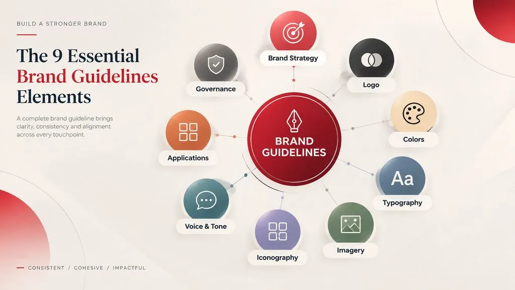
Brand guidelines translate a company's identity into practical rules that designers, marketers, developers, and external partners can follow. A useful brand style guide should explain not only what brand assets look like but also how to apply them consistently.
Element | What to Include | Why It Matters |
|---|---|---|
Brand strategy | Mission, positioning, values, personality | Establishes creative direction |
Logo | Variations, clear space, minimum size, restrictions | Protects brand recognition |
Colors | Primary, secondary, and supporting color values | Maintains visual consistency |
Typography | Font families, weights, and hierarchy | Creates recognizable communication |
Imagery | Photography, illustration, and visual direction | Establishes a consistent aesthetic |
Iconography | Icon styles, proportions, and applications | Connects visual elements |
Voice and tone | Writing personality, messaging, and examples | Makes communication recognizable |
Applications | Website, social media, advertising, and print | Shows how rules work in practice |
Governance | Asset ownership, permissions, and update procedures | Prevents outdated or unauthorized usage |
The strongest brand guidelines also provide downloadable assets, reusable templates, accessibility requirements, and examples of correct and incorrect applications.
An important distinction is that a brand kit contains reusable brand assets, while brand guidelines explain how those assets should be used. A design system extends this further by defining reusable components, design tokens, and implementation rules.
For a small business, a concise PDF with logos, colors, fonts, and usage examples may be sufficient. A global organization may need a searchable brand portal, downloadable templates, permission controls, and regular updates.
20 Best Brand Guidelines Examples from Leading Companies
These 20 examples cover different industries and approaches to brand management. Some demonstrate comprehensive visual identity systems, while others offer particularly useful lessons in accessibility, communication, asset management, and creative collaboration.
1. Bang & Olufsen: Premium Brand Presentation
Best for: Premium visual identity
Bang & Olufsen demonstrates how a brand resource experience can reflect its own design philosophy. Its brand resources present logos, downloadable fonts, and templates through an elegant visual environment.
What makes it effective: The documentation reinforces the restrained, premium identity associated with the brand rather than looking like a generic corporate document.
What to learn: Your brand guideline portal should reflect the same design principles as your products and marketing materials. Premium branding depends on presentation, spacing, typography, and visual restraint working together.
2. Cash App: Interactive Brand Guidelines
Best for: Creative exploration
Cash App uses an infinite, zoomable canvas to present visual assets, including 2D and 3D icons. This makes brand documentation feel more like an interactive creative environment than a traditional PDF.
What makes it effective: The format encourages visual exploration and communicates creative direction through the assets themselves.
What to learn: Interactive documentation can make extensive visual libraries easier to explore, especially when a brand uses multiple illustration styles, dimensions, and motion assets. Building a visual reference board can also help organize these creative directions, as explained in this guide to what a moodboard is.
3. IBM: Enterprise Design Consistency
Best for: Complex product ecosystems
IBM connects brand identity with practical product design resources, including typography and data visualization. Its design resources help teams apply consistent visual principles across products and technical communication.
What makes it effective: IBM recognizes that brand consistency must extend beyond advertising into interfaces, dashboards, and information-heavy experiences.
What to learn: Companies with multiple digital products should document how brand identity translates into interface components, charts, typography, and product experiences.
4. Herman Miller: Brand Templates and Applications
Best for: Practical implementation
Herman Miller demonstrates the value of connecting brand identity with reusable templates and everyday communication materials.
Its approach emphasizes making approved resources available for people who need to create branded materials without designing everything from scratch.
What makes it effective: It connects brand documentation with actual production needs.
What to learn: Provide reusable presentation, email, and digital templates. A guideline becomes more useful when people can apply its rules immediately.
5. Kansas City Chiefs: Brand Management at Scale
Best for: Centralized brand asset management
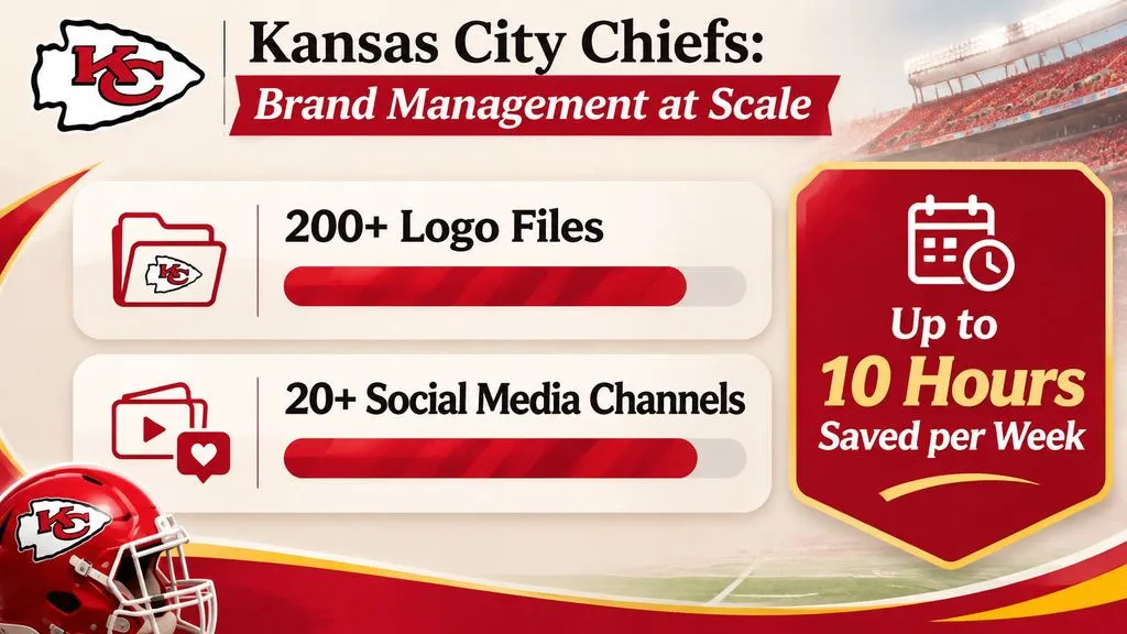
The Kansas City Chiefs faced the challenge of maintaining brand consistency across international markets, partners, and more than 20 social media channels.
Their Frontify platform centralized 200+ logo files and made approved assets accessible to internal teams and external partners.
According to the published customer case study, the brand team saves up to 10 hours per week by reducing repeated asset requests and improving collaboration.
The operational improvement is particularly important. Instead of sending logo files and campaign materials through repeated email requests, stakeholders can access the appropriate approved resources themselves.
What makes it effective: The system combines asset organization, permissions, brand education, and partner collaboration.
What to learn: A brand guideline should function as a self-service resource. Give employees and partners access to the assets they are authorized to use, rather than making designers responsible for every file request.
6. Nestlé: Managing Multiple Brands
Best for: Global brand governance
Nestlé demonstrates the complexity of maintaining consistent brand identities across a large portfolio and international markets.
Its centralized brand resources help different stakeholders access relevant guidelines and approved materials.
What makes it effective: Brand documentation becomes an organized resource rather than a collection of disconnected files.
What to learn: Multi-brand organizations need structured documentation, clear ownership, appropriate access permissions, and separate rules where individual brands have different identities.
7. Netflix: Logo Usage and Partner Guidelines
Best for: External brand protection
Netflix provides specific rules for using its logo and brand materials in promotional and partner communications.
Its guidelines explain that third-party usage should not modify the original brand assets or suggest unauthorized sponsorship or affiliation.
What makes it effective: It recognizes that external organizations also influence how customers perceive a brand.
What to learn: Define clear co-branding and logo usage rules for agencies, affiliates, publishers, and business partners. Explain logo placement, modifications, and situations that require approval.
8. Vodafone: A Data-Driven Brand Portal
Best for: Large-scale collaboration
Vodafone Germany provides one of the strongest examples of centralized brand resource management.
Its Frontify platform brings brand guidelines and media assets together for internal teams and external partners.
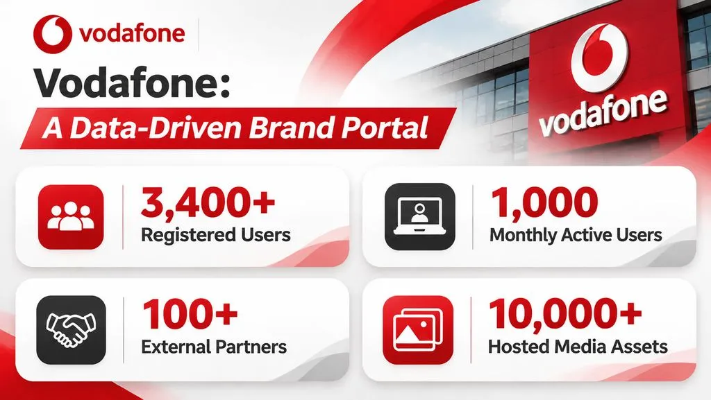
The published customer case study reports:
- 3,400+ registered brand platform users.
- 1,000 monthly active users.
- 100+ external partners.
- 10,000+ hosted media assets.
These figures illustrate how extensively the platform is integrated into Vodafone's brand operations.
What makes it effective: It connects brand strategy, design resources, and collaboration within one shared environment. The case study also emphasizes the importance of brand guardianship across departments and external partners.
What to learn: Measure brand management through platform adoption, asset accessibility, and stakeholder engagement. A brand portal should be useful enough that employees and partners return to it as part of their everyday work.
9. Trustpilot: Partner-Friendly Brand Guidelines
Best for: Co-branding and localization
Trustpilot provides downloadable logos, icons, video assets, and guidance for using its ratings in external marketing materials.
Its approach addresses the practical challenges of maintaining consistency when different companies use the same brand assets.
What makes it effective: It considers how brand elements appear in real partnership scenarios rather than focusing exclusively on internal design work.
What to learn: Include localization and partner-specific instructions when your identity appears across different markets and organizations.
10. Mastercard: Accessible Brand Resources
Best for: Brand asset discovery
Mastercard's brand center organizes guidelines, downloadable artwork, and frequently asked questions.
This makes essential brand information easier for external users and partners to access.
What makes it effective: It prioritizes accessibility of information rather than assuming every user already understands the brand.
What to learn: Organize resources around common user needs. Make logos, artwork, and frequently requested information easy to locate, and communicate important guideline updates.
11. Tonies: Accessibility-First Brand Guidelines
Best for: Inclusive visual design
Tonies incorporates accessibility guidance into its brand resources, including WCAG-related requirements and practical design examples.
What makes it effective: Accessibility is treated as part of brand quality rather than simply a technical requirement.
What to learn: Include readable typography, appropriate color contrast, and accessible interface requirements in your brand system. A visually attractive design should also work for people with different visual and accessibility needs.
12. Sinch: Practical Brand Voice Examples
Best for: SaaS and technical communication
Sinch combines visual identity guidance with voice-and-tone documentation. Its approach to functional messages, including technical error messages, demonstrates how brand personality can extend into product communication.
What makes it effective: It shows how writing principles translate into real customer interactions instead of remaining abstract descriptions.
What to learn: Provide before-and-after copy examples. Explain why one version better represents the brand and how the same voice should adapt to different situations.
13. DevRev: Simplified Brand Asset Access
Best for: Growing creative teams
DevRev organizes brand resources around logos, colors, voice, and tone, making essential materials easier to locate and reuse.
What makes it effective: It reduces friction between finding a brand asset and applying it correctly.
What to learn: Organize brand resources around the tasks users need to complete. Essential assets should be easy to download without navigating multiple unrelated sections.
14. Dropbox: A Complete Brand Identity System
Best for: Visual and verbal identity
Dropbox connects its design framework with voice and tone, logos, typography, iconography, colors, imagery, and motion.
Its four design principles are humanity, clarity, action, and delight.
Its voice-and-tone framework also emphasizes being simple, helpful, human, and magical. This connects how the brand looks with how it communicates.
What makes it effective: Dropbox connects abstract brand values with specific design and communication decisions. Its framework covers both visual and verbal identity rather than treating them as separate projects.
What to learn: Document how your brand should look, feel, and sound. Designers and writers should work from the same creative principles. These principles should also be reflected in your broader design principles.
15. Instacart: Visual Asset Organization
Best for: Organizing creative resources
Instacart uses visual navigation to organize resources such as colors, illustrations, and icons.
Its documentation approach makes it easier to discover relevant visual elements without reading extensive instructions.
What makes it effective: The information architecture reflects how designers search for assets.
What to learn: Use searchable libraries, visual previews, and intuitive categories to improve asset discovery. Users should be able to find a color specification or icon without reading the entire brand manual.
16. Airbus: Application-Specific Brand Rules
Best for: Complex physical and digital applications
Airbus provides brand guidance for different applications, including aircraft liveries, posters, and UI/UX design.
What makes it effective: It recognizes that a consistent identity must work across different environments and production requirements.
What to learn: Build application-specific rules for packaging, advertising, digital products, physical environments, and other important touchpoints. The requirements for a website interface are not necessarily the same as those for a large physical installation.
17. Firefox: Clear Logo and Color Restrictions
Best for: Visual identity protection
Firefox provides guidance for logos, icons, colors, and imagery. Its approach demonstrates why approved and prohibited applications should be documented together.
What makes it effective: Visual restrictions help protect recognition across different marketing and communication materials.
What to learn: Show incorrect logo modifications and color combinations so users can recognize mistakes immediately. Visual examples often communicate restrictions more clearly than paragraphs of instructions.
18. Klarna: Distinctive Visual Identity
Best for: Brand personality and visual direction
Klarna organizes its visual identity around its Curiously Bold personality. Its guidelines cover typography, brand colors, layout, art direction, and motion.
The brand also distinguishes between its badge, wordmark, and icon, with specific rules for clear space, color, and appropriate applications.
What makes it effective: Its visual personality is supported by precise rules rather than relying on a recognizable pink color alone.
What to learn: Translate brand personality into concrete rules for typography, composition, imagery, and logo usage. A distinctive identity needs a consistent visual language, not just a signature color.
19. Mailchimp: Brand Voice and Content Style
Best for: Content marketing teams
Mailchimp's Content Style Guide is a particularly useful reference for organizations producing large amounts of written content.
It explains the difference between voice and tone: voice represents a consistent brand personality, while tone adapts to the audience, context, and situation.
Its writing principles emphasize being plainspoken, genuine, informative, and subtly humorous.
What makes it effective: It turns abstract brand personality into practical editorial decisions that writers can apply across websites, emails, and customer communications.
What to learn: Include headlines, product descriptions, error messages, and social media examples to make brand voice easier to reproduce.
20. DAZN: Scaling Brand Production with Templates
Best for: High-volume content production
DAZN demonstrates how brand guidelines can become part of an operational content production system.
Its global creative teams needed to produce content quickly while maintaining brand consistency across sports, markets, and partners. With a 24/7 sports schedule, waiting for a designer to create every promotional asset would create unnecessary production bottlenecks.
According to Frontify's published customer case study:
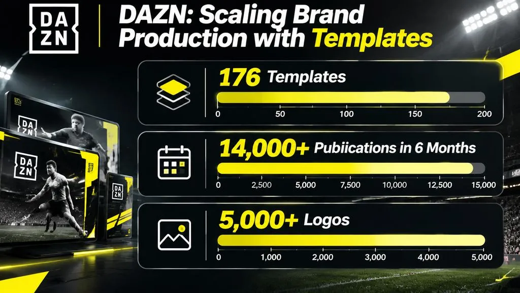
- 176 templates were used to create more than 14,000 publications in six months.
- More than 5,000 logos were organized on the platform.
- The case study estimates more than 13,300 hours saved during that period.
- Frontify reports an estimated five-minute template-to-publication workflow compared with an estimated hour using a traditional process.
The time-saving figure is a vendor-reported estimate, not an independently verified performance benchmark.
What makes it effective: The system gives non-designers access to approved templates and brand assets, allowing them to create content without requiring designers to manage every production request.
What to learn: The most useful brand systems do more than store assets. They help people produce approved content using reusable templates, predefined layouts, and clear brand rules.
What Do These Brand Guidelines Examples Teach Us About Brand Consistency?
Our review of brand management workflows and user questions highlights three recurring challenges that traditional brand manuals often fail to address.
1. Organize Scattered Brand Assets into One Brand Kit
A typical small business may store its logo in one folder, fonts in another, and social media templates in a separate design workspace.
Our review of user questions identified recurring requirements around organizing existing logos, colors, typography, variations, and social media assets into one reusable collection.
A practical brand system should combine documentation with a centralized asset library.
It is also important to distinguish between two deliverables:
- Brand Kit: The collection of logos, colors, fonts, icons, images, and reusable assets.
- Brand Guidelines: The instructions explaining how those elements should be applied.
A business may have a complete brand kit but still lack clear usage rules. For example, having several logo variations does not explain which version belongs on a dark background or how much space should surround the logo.
2. Make AI-Generated Content Follow Brand Guidelines
AI-generated images and marketing materials do not automatically follow an existing brand identity.
Our review of user questions identified recurring requirements around visual references, brand colors, typography, voice, and explicit usage restrictions.
For example, a school marketing team needs more than an instruction to create professional promotional images. It also needs rules about approved visual styles, realistic campus imagery, logo protection, and content requiring human approval.
A practical AI brand workflow should include:
- Import the existing brand guidelines.
- Define approved colors, typography, and visual references.
- Specify permitted and prohibited content.
- Generate content for the intended channel.
- Review visual and messaging consistency.
- Refine and approve the final material.
The important lesson is to define both what AI can generate and what it must avoid. Human review remains necessary when accuracy, brand reputation, or regulatory requirements are involved.
3. Turn Brand Guidelines into an AI-Ready Design System
Traditional PDF guidelines are designed primarily for human readers. AI-assisted design and development workflows also benefit from structured design instructions.
A modern brand system can organize:
- Color tokens: Primary, secondary, background, and accent colors.
- Typography tokens: Font families, sizes, weights, and hierarchy.
- Semantic design rules: How components and visual elements should be used.
- CSS variables: Reusable values for frontend implementation.
- Component conventions: Buttons, cards, navigation, forms, and layouts.
- Brand restrictions: Rules that AI-generated designs must follow.
One useful workflow is Website to Design System:
Stage | Input or Output | Purpose |
|---|---|---|
Website analysis | Existing website URL | Identify visual patterns |
Design extraction | Colors, fonts, spacing, and components | Document existing design decisions |
Token organization | Semantic design tokens | Create reusable design rules |
Structured documentation | DESIGN.md | Explain design conventions to AI tools |
Implementation | Cursor, Claude, v0, or Lovable | Apply the documented design system |
Human review | Rendered pages and components | Check accuracy and consistency |
For example, a developer can use an existing website as a reference, identify its typography and color system, and organize those decisions into reusable instructions for an AI coding workflow.
However, automatically extracted website styles are not necessarily approved brand standards. Designers should verify colors, fonts, component behavior, and responsive rules against the original design before using them as authoritative references.
This creates a bridge between traditional brand guidelines and AI-ready design systems, making brand documentation useful for both creative production and software development. For a broader look at the tools supporting this process, see our guide to the best design system tools.
How to Create Brand Guidelines with AI
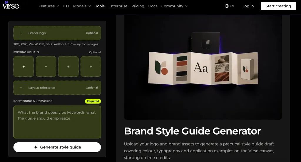
You can use AI to organize existing brand assets and create a preliminary brand style guide without building every element manually. The following workflow works as a starting point for founders, marketers, and small creative teams. If you want to streamline the process, try the AI Style Guide Generator.
Step 1: Upload Your Existing Brand Assets
Start with your logo, existing marketing materials, website screenshots, and any available brand documents.
Use original files whenever possible. Low-resolution screenshots may make it difficult to identify exact colors and fonts.
Step 2: Extract Brand Colors and Typography
Identify the existing palette and font hierarchy. Separate confirmed brand assets from AI recommendations.
For example, a website may use a primary color, a neutral background, and a contrasting accent. Document where each should appear instead of simply listing hexadecimal values.
Step 3: Define Logo Usage Rules
Document logo variations, clear space, minimum sizes, backgrounds, and prohibited modifications.
Include examples showing how the logo should appear on light and dark backgrounds.
Step 4: Establish Visual Direction
Describe photography, illustration, composition, lighting, and visual style.
Use actual brand references to make the direction more concrete. Terms such as modern or premium are useful starting points, but visual examples communicate expectations more precisely. A clear art direction framework can help translate these visual preferences into consistent creative decisions.
Step 5: Create Voice and Tone Rules
Define the brand's writing personality, preferred language, messaging principles, and words to avoid.
Include examples of website headlines, product descriptions, and social media copy.
Step 6: Generate Application Examples
Create sample website sections, social media visuals, presentations, and marketing materials.
Check whether these applications follow the documented rules instead of evaluating each design only by appearance.
Step 7: Review and Export
Have a brand owner or designer verify the guidelines. Organize approved assets into a reusable library and maintain a clear update process.
For AI-powered visual production, Virse offers an Infinite Canvas, reference-image workflows, and access to 50+ AI models. These capabilities help designers explore brand directions, compare visual treatments, and refine creative assets within one workspace.
You can also use the Virse AI Style Guide Generator to explore a more structured approach to developing your brand style guide.
FAQ:
What are the best brand guidelines examples?
Dropbox, IBM, GitHub, Mailchimp, Cash App, and DAZN are useful references for different purposes. Dropbox demonstrates comprehensive brand documentation, Mailchimp excels at voice and tone, Cash App explores interactive documentation, and DAZN shows how guidelines can support large-scale content production.
What should a brand style guide include?
A brand style guide should include logos, color palettes, typography, imagery, iconography, voice and tone, and practical application examples. More advanced guidelines can include accessibility, co-branding, reusable templates, and digital design system specifications.
Can AI generate brand guidelines from a logo?
Yes. AI can help extract colors, analyze visual characteristics, recommend typography, and organize logo variations into a preliminary brand guide. However, the final result should be reviewed to verify brand accuracy, font identification, logo integrity, and usage restrictions.
What is the difference between brand guidelines and a design system?
Brand guidelines explain how a brand should look and communicate. A design system defines reusable design tokens, interface components, interaction patterns, and implementation rules. Both can work together to maintain consistency across marketing and digital products.
Conclusion
The best brand guidelines examples demonstrate that successful branding requires more than a recognizable logo and attractive color palette. It depends on clear rules, accessible resources, reusable templates, and consistent implementation across every touchpoint. Whether you are building a small business identity or managing a global brand, the most valuable approach is to create guidelines that people can actually use. As AI becomes increasingly integrated into creative workflows, turning traditional brand rules into structured, reusable design systems will become an important part of maintaining brand consistency.