
What Are Design Principles? 9 Rules That Make Good Design Easier to Explain
 Yifan Zhao10 min read ·

Design principles are reusable rules that help designers organize visual elements, information, and interactions so a design is clear, usable, consistent, and purposeful. They turn subjective choices about hierarchy, spacing, typography, contrast, and alignment into repeatable design decisions that support a more human-centered design process.
The problem is that many designers and developers know how to build an interface but still struggle to explain why one version works better than another. Without clear principles, layouts become inconsistent, reviews rely on personal taste, and AI-generated options can multiply faster than teams can evaluate them. This is especially difficult when teams lack a reusable design system or need to preserve design accuracy across iterations.
Virse helps professional creative teams turn design intent into repeatable AI-assisted workflows rather than isolated prompts. Its paid plans include unlimited use of 40+ models such as Nano Banana 2 and GPT Image 2, plus unlimited seats. Seedance 2.5, Seedance 2.0, and MiniMax H3 are also available, while new users receive signup credits that can cover about 10 Nano Banana 2 images or one Seedance 2.0 video.

What Are the 9 Core Design Principles for UI/UX and Visual Design?
There is no single universal list of design principles. Graphic design, UI design, UX, and product design use overlapping frameworks because they solve different parts of the same problem: how to make information understandable and interactions predictable.
For digital products, these nine principles cover the most common visual and usability decisions:
Principle | What It Does |
|---|---|
Hierarchy | Establishes what users notice first, second, and third |
Contrast | Creates meaningful differences between elements |
Alignment | Builds visible relationships and structure |
Proximity | Groups related information together |
White space | Separates content and improves focus |
Typography | Organizes information for reading and scanning |
Consistency | Makes patterns and interactions predictable |
Balance | Distributes visual weight across a composition |
Clarity | Reduces unnecessary interpretation |
These principles work together rather than independently. A weak hierarchy may actually come from insufficient contrast, poor typography, or inconsistent spacing.
How do visual design principles differ from UI/UX principles?
Traditional visual design frameworks may also emphasize repetition, emphasis, proportion, rhythm, movement, and unity. UI/UX adds another layer: feedback, interaction conventions, accessibility, error prevention, and task completion.
Gestalt principles such as proximity and similarity help explain how people perceive relationships, while UX heuristics help evaluate how an interface behaves. Design principles sit between them by translating perception and usability into practical design decisions.
How Do Visual Hierarchy and Contrast Improve Design?
Visual hierarchy determines the order in which users notice information, while contrast makes that order visible.
On a pricing page, for example, the plan name establishes context, the price receives stronger emphasis, supporting details are quieter, and the primary CTA stands apart from secondary actions. Users should not need to inspect every element with equal effort.
Visual hierarchy should follow the user’s task
Hierarchy can be created through size, font weight, position, color, spacing, imagery, and contrast. The strongest hierarchy starts with the intended information sequence rather than decorative styling.
A useful structure is:
Primary message → primary action → supporting information → secondary details
One common failure is giving too many elements equal emphasis. Multiple bright buttons, badges, large headings, and promotional cards can create visual activity without creating direction.
Contrast can be measured, not just debated
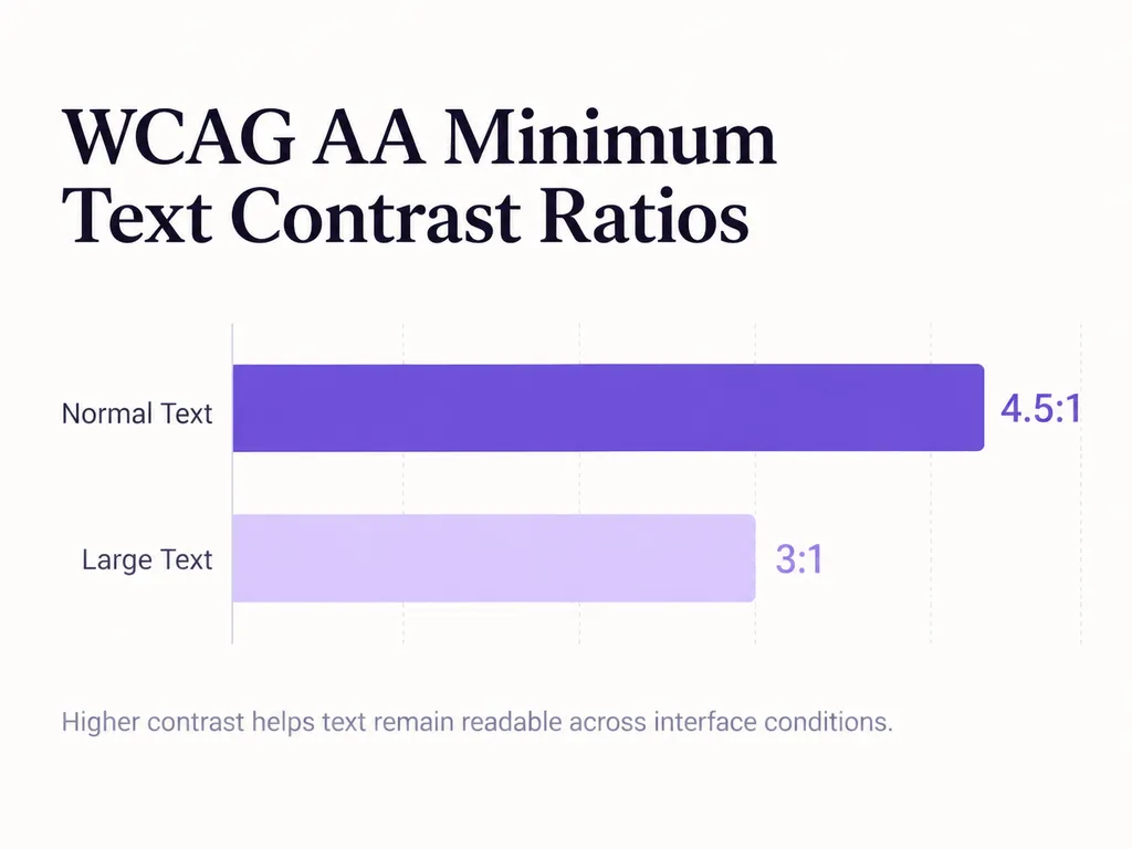
Contrast shows why design judgment is not purely subjective. WCAG 2.2 requires a minimum 4.5:1 contrast ratio for normal text and 3:1 for qualifying large text at Level AA. These thresholds give teams a measurable way to evaluate readability rather than relying only on aesthetic preference.
Contrast also exists in size, weight, shape, density, and spacing. A visually subtle interface is not successful if subtlety makes important information difficult to identify.
How Do Spacing, Proximity, Alignment, and Typography Create Professional UI?
In our review of public practitioner discussions and recurring user questions, developers frequently described the same gap: they could build functional interfaces but struggled to make them feel visually coherent.
The problem usually involved spacing, typography, hierarchy, and alignment, not missing decorative effects.
Proximity and alignment communicate relationships
Proximity tells users what belongs together. A label close to an input appears connected to it; a larger gap before the next group communicates separation.
Alignment performs a similar role. Shared edges between headings, cards, fields, and content create an invisible structure that helps users scan the interface.
Space is therefore not empty decoration. It carries information.
A spacing system replaces arbitrary decisions
Without a system, different screens gradually accumulate slightly different margins and padding values.
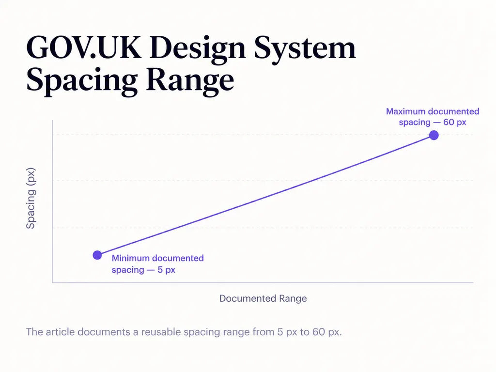
The GOV.UK Design System demonstrates a production-scale alternative. Its spacing system uses reusable units from 5px to 60px, with responsive values for different screen sizes. The important lesson is not to copy those exact numbers; it is to restrict recurring decisions to a deliberate system.
Typography benefits from the same approach. GOV.UK describes its type scale as a collection of font sizes and line heights designed to maintain consistent vertical rhythm and readability across devices.
A practical type hierarchy should define predictable roles for page titles, section headings, body text, supporting text, labels, and actions. The goal is not maximum variety. It is faster interpretation.
Why Are Consistency and Design Systems Essential UI Design Principles?
Consistency allows users to reuse what they have already learned. If identical patterns behave differently across screens, every inconsistency creates another decision for the user.
NN/g's Consistency and Standards heuristic states that users should not need to wonder whether different words, situations, or actions mean the same thing, and distinguishes both internal consistency and established external conventions.
Consistency includes more than visual style. Problems can appear when:
- the same color represents different states
- identical actions appear in different locations
- similar buttons behave differently
- recurring cards use different spacing
- terminology changes between screens
A polished screenshot can therefore hide an inconsistent interaction model.
Practitioner scenario: when a developer becomes the designer
One recurring scenario in our review involved developers at small teams becoming responsible for higher-level UI decisions without a dedicated designer.
The difficult questions were not technical: Why this spacing? Why this hierarchy? Which component should be reused? How should multiple pages stay consistent?
A design system changes the workflow by defining typography, spacing, colors, components, and interaction patterns in advance. Instead of solving every screen from scratch, the team chooses from established decisions.
No reliable before-and-after performance data was reported in the reviewed discussions, so claiming a percentage improvement would be misleading. The defensible lesson is simpler: design systems reduce unnecessary decisions and make consistency easier to maintain.
How Do Design Principles Solve Real UI/UX Problems?
Design principles become valuable when they turn vague feedback into decisions that can be explained and repeated.
Practitioner scenario: “I can build it, but it still looks wrong”
A repeated question in our review came from developers already comfortable with frontend technologies and interface tools. They could reproduce a layout but could not reliably diagnose why it looked unfinished.
Their questions repeatedly returned to typography, spacing, hierarchy, color, composition, and consistency.
This exposes a fundamental difference:
Tool proficiency answers “How can I build this?” Design principles answer “Why should it be built this way?”
That distinction becomes more important as AI lowers the cost of visual execution.
Practitioner scenario: replacing gut feeling with design reasoning
Another recurring problem appears during design reviews:
“This feels too empty.”
“Make the button bigger.”
“The page looks boring.”
These statements describe preferences but do not explain the design problem.
Principle-based feedback is more actionable:
“Increasing this button creates two competing primary actions.”
“This spacing separates two different information groups.”
“This text treatment weakens readability.”
Design principles do not eliminate subjectivity. They make the reasoning behind a design decision visible and discussable.
How Should You Apply Design Principles in AI Design Workflows?
AI makes design principles more valuable because generating more options does not make evaluation easier.
A generative model can quickly produce multiple campaign assets, landing pages, product concepts, or visual directions. Designers still need to decide which output maintains hierarchy, readable typography, appropriate spacing, component consistency, and brand intent.
A better AI workflow turns principles into evaluation constraints:
- Define one dominant goal or CTA.
- Preserve the approved type hierarchy.
- Reuse established spacing rules.
- Group related information through proximity.
- Maintain component and interaction consistency.
- Validate readability and accessibility.
- Remove elements that compete with the primary task.
This is more precise than asking AI to make something “clean,” “premium,” or “professional.”
Virse follows this workflow-oriented approach: Agents work with references and project materials on an infinite canvas, multiple Agents can collaborate across tasks, and shared context helps creative work remain connected rather than restarting from isolated prompts. The product is positioned as a collaborative system for professional designers, not a one-prompt replacement for design judgment.
How Can You Evaluate a Design Using Design Principles?
A useful design review can follow five checks.
1. Clarity: Can a new user understand the primary message or task?
2. Hierarchy: Is it obvious what should be noticed first, second, and third?
3. Relationships: Do proximity, alignment, typography, and spacing accurately show which elements belong together?
4. Consistency: Do components, terminology, colors, spacing, and interactions follow established patterns?
5. Usability and accessibility: Is the content readable and are controls practical to interact with? WCAG 2.2, for example, defines a 24 by 24 CSS pixel minimum target size at Level AA, with documented exceptions.
A useful priority order is clarity → usability → consistency → aesthetics. It is not a universal law, but it prevents visual preference from hiding functional problems.
Conclusion: Design Principles Turn Taste Into Repeatable Decisions
Design principles are valuable because they turn visual judgment into repeatable decisions. Hierarchy controls attention, contrast creates differentiation, proximity and spacing communicate relationships, typography organizes information, alignment creates structure, and consistency makes interfaces easier to learn. They do not remove creativity or guarantee good design; they provide a framework for explaining, testing, and improving decisions. As AI makes visual production faster, this framework becomes even more important because the scarce skill is increasingly not generating another option, but deciding which option communicates clearly, fits the system, and deserves to move forward.
FAQ
What UI/UX design principles should beginners learn first?
Start with hierarchy, spacing, typography, contrast, alignment, proximity, and consistency. Together, these principles address many of the problems that make beginner interfaces feel confusing or unfinished. Focus first on information priority and relationships between elements before adding decorative effects or following visual trends.
How can I keep multiple UI pages consistent without a designer?
Create a small design system before producing more screens. Define typography roles, spacing values, color roles, buttons, forms, cards, navigation, and common interaction states. Reuse those decisions rather than redesigning each screen independently. An established system such as Material Design can also provide a baseline when internal design resources are limited.
How can I explain a UI decision instead of saying “it looks better”?
Connect the decision to a design principle and an observable outcome. Explain that stronger contrast clarifies an action, increased spacing separates unrelated groups, consistent components reduce relearning, or stronger hierarchy improves scanning. This moves the discussion from personal preference toward communication, usability, and consistency.
What is the difference between design principles, UX heuristics, and Gestalt principles?
Design principles guide how visual elements and interactions are organized. UX heuristics provide broader criteria for evaluating usability, including consistency, feedback, error prevention, and user control. Gestalt principles describe perceptual tendencies such as grouping by proximity or similarity. They overlap, but each addresses a different layer of the design problem.
More from the Virse Blog
Inspiration

What Is an AI-Powered Design System for Brands?
August 8, 2026 by Vincent
Inspiration

MiniMax H3 Reddit Review: What Real Users Think After Local Testing
August 7, 2026 by Yifan Zhao
Inspiration

What Is Art Direction? Definition, Examples, and How to Create an Art Direction
August 6, 2026 by Yifan Zhao