
30 Best Poster Design Ideas for Every Style and Occasion
 Yifan Zhao20 min read ·
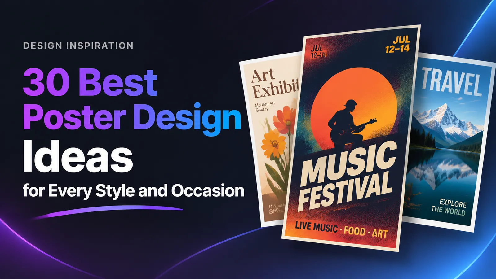
The best poster design ideas combine distinctive visual concepts, readable typography, balanced layouts, and purposeful color choices. Whether you're designing a concert poster, promoting an event, creating an art exhibition announcement, or decorating a room, the right visual style helps your message stand out. Understanding the fundamentals of graphic design can help you make more effective visual decisions.
One of the biggest challenges in poster design is balancing creativity with communication. Oversized typography, experimental compositions, and textured illustrations can make a poster memorable, but they can also make important details difficult to read. Understanding design principles helps you establish a stronger visual hierarchy.
In this guide, Yifan Zhao, AI design workflow strategist and creative technology advisor, explores 30 poster design ideas, practical design techniques, and AI poster design tools to help you turn visual inspiration into finished designs.
Bold and Creative Poster Design Ideas
Bold poster designs use oversized elements, strong contrast, unconventional compositions, and expressive typography to attract attention. They are particularly effective for concerts, festivals, creative campaigns, and contemporary exhibitions.
1. Oversized Typography Poster
Best for: Music events, fashion campaigns, creative exhibitions.
Make typography the main visual element rather than treating it as supporting information. Use extremely large letters, cropped words, and contrasting font weights to create an immediate focal point.
Visual direction: Place a single oversized word across the center of the poster. Let some letters extend beyond the edges while keeping the complete headline understandable.
Design tip: Pair expressive display typography with a clean sans-serif font for dates, locations, and other essential information.
2. High-Contrast Color Poster
Best for: Promotions, festivals, youth-oriented campaigns.
Combine colors with strong visual contrast, such as electric blue and orange, black and yellow, or red and cream.
A limited palette helps prevent the composition from becoming visually overwhelming.
Visual direction: Use a saturated background, a contrasting headline, and one dominant graphic element.
Design tip: Reserve the strongest contrast for the headline and primary call to action.
3. Experimental Lettering Poster
Best for: Art exhibitions, experimental music, design portfolios.
Experiment with distorted letters, stretched typography, overlapping characters, and unconventional text arrangements.
Visual direction: Build the composition around one expressive typographic treatment, such as curved lettering or vertically stacked words.
Design tip: Use experimental lettering for short headlines while keeping supporting information in a conventional typeface.
4. Abstract Geometric Poster
Best for: Technology events, modern exhibitions, architecture.
Build the composition using circles, triangles, rectangles, lines, and overlapping geometric shapes.
Visual direction: Create a recognizable visual system using repeated circles, intersecting lines, or asymmetrical geometric blocks.
Design tip: Use geometry to establish movement and structure rather than placing shapes randomly.
5. Dynamic Diagonal Layout
Best for: Sports events, product launches, entertainment.
Replace traditional horizontal and vertical arrangements with diagonal lines, tilted images, and angled typography.
Visual direction: Place the main subject along a diagonal axis, then use angled text blocks to direct attention toward the event name.
Design tip: Keep essential information aligned and readable even when the surrounding composition is dynamic.
6. Mixed-Media Collage Poster
Best for: Independent art, cultural events, music promotions.
Combine photography, scanned paper, illustrations, textures, and typography into one composition.
Visual direction: Layer a photographic subject over torn-paper textures, hand-drawn elements, and contrasting graphic shapes.
Design tip: Establish one dominant image or subject so the collage remains visually organized.
Minimalist and Modern Poster Design Ideas
Minimalist poster designs communicate ideas using fewer visual elements. They rely on spacing, typography, alignment, and carefully selected colors rather than decorative complexity.
7. Swiss Grid Poster
Best for: Corporate events, architecture, educational announcements.
Inspired by Swiss International Typographic Style, this approach uses structured grids, clean typography, and precise alignment.
Visual direction: Divide the poster into columns and arrange the headline, image, and supporting information along consistent grid lines.
Design tip: Use asymmetrical alignment and a limited type system to create a modern editorial appearance.
8. Black-and-White Poster
Best for: Photography exhibitions, film screenings, editorial projects.
Use black, white, and carefully selected shades of gray. Without color, the composition depends more heavily on contrast, scale, texture, and visual balance.
Visual direction: Combine a monochrome photograph with bold black typography and generous white space.
Design tip: Use different font weights and image tones to create depth without introducing unnecessary decorative elements.
9. Negative Space Poster
Best for: Luxury branding, galleries, contemporary exhibitions.
Make empty space an intentional part of the composition. Rather than filling every available area, place a small number of visual elements strategically.
Visual direction: Position a small central illustration or headline within a large empty background.
Design tip: Give the main subject enough breathing room to become the natural focal point.
10. Clean Editorial Poster
Best for: Conferences, book launches, cultural events.
Borrow visual principles from magazine layouts: strong headlines, structured text blocks, captions, and organized image placement.
Visual direction: Use a large headline at the top, a supporting image in the middle, and compact event information at the bottom.
Design tip: Establish distinct typographic roles for the title, subtitle, captions, and supporting information.
11. Minimal Photography Poster
Best for: Film festivals, photography shows, product promotions.
Let one photograph communicate the central idea. Avoid unnecessary decorations that compete with the image.
Visual direction: Use a single portrait, architectural photograph, or product image with carefully positioned typography.
Design tip: Use negative space around the photograph to accommodate the headline and event information.
12. Asymmetric Layout Poster
Best for: Creative studios, modern art, fashion campaigns.
Place text, images, and shapes at different visual weights rather than centering everything.
Visual direction: Position a large image on one side and a smaller, tightly organized text block on the opposite side.
Design tip: Balance large elements with smaller details instead of making every section equal.
Retro and Artistic Poster Design Ideas
Retro and artistic posters use visual references from different periods, printmaking techniques, and traditional illustration styles.
13. 80s Retro Poster
Best for: Music events, gaming, entertainment promotions.
Use neon gradients, geometric grids, glowing effects, and dramatic typography inspired by 1980s visual culture.
Visual direction: Combine a dark background, a glowing sunset gradient, geometric perspective lines, and oversized display lettering.
Design tip: Limit the neon palette to a few dominant colors so the composition remains cohesive.
14. Vintage Print Poster
Best for: Cafés, travel promotions, cultural campaigns.
Recreate traditional printed posters using muted colors, aged paper textures, classic lettering, and simplified illustrations.
Visual direction: Use cream-colored backgrounds, faded red or green accents, and illustrated objects with slightly imperfect edges.
Design tip: Apply subtle imperfections rather than aging every element equally.
15. Psychedelic Typography Poster
Best for: Music festivals, alternative art, creative events.
Use curved lettering, unusual color combinations, and flowing shapes to create an expressive composition.
Visual direction: Arrange large, wavy letters around an organic central illustration.
Design tip: Keep secondary information outside the most visually complex areas.
16. Grunge Texture Poster
Best for: Rock concerts, underground music, streetwear.
Combine distressed textures, rough edges, photocopy effects, and irregular typography.
Visual direction: Layer monochrome photographs with torn-paper effects, grain, and bold condensed lettering.
Design tip: Apply texture selectively. If every element is distressed, the poster loses its visual hierarchy.
17. Hand-Drawn Illustration Poster
Best for: Community events, children's activities, independent brands.
Use original drawings, sketch-like lettering, and imperfect lines to create a personal visual identity.
Visual direction: Build the composition around a central hand-drawn character or object, supported by simple decorative illustrations.
Design tip: Maintain consistency in illustration style, line weight, and color treatment.
18. Experimental Art Poster
Best for: Contemporary exhibitions, design festivals, cultural projects.
Combine unconventional typography, abstract imagery, unusual proportions, and layered visual elements.
Visual direction: Experiment with overlapping photographic subjects, fragmented lettering, and unexpected image crops.
Design tip: Give experimental elements a clear conceptual purpose. An unusual composition should reinforce the message, not obscure it.
Event and Promotional Poster Design Ideas
Event posters have a specific communication objective: attract attention and help people understand what is happening, when it happens, and where to participate.
19. Concert Poster
Best for: Live music, independent bands, venue promotions.
Use expressive typography, artist photography, dramatic lighting, and strong visual contrast.
Visual direction: Place the performer or band name prominently, with the concert date and venue in a clearly separated information block.
Design tip: Make the performer or event title the dominant element. Keep ticket information easy to find.
20. Music Festival Poster
Best for: Multi-day festivals and entertainment events.
Combine multiple performers, colorful illustrations, and layered information blocks.
Visual direction: Use a large festival title at the top, a central illustration or photograph, and organized performer listings below.
Design tip: Group performers into clear categories instead of displaying every name at the same visual size.
21. Art Exhibition Poster
Best for: Galleries, museums, independent exhibitions.
Use conceptual imagery, abstract compositions, and restrained typography to reflect the exhibition's theme.
Visual direction: Let the artwork dominate the composition, with the exhibition title and venue placed in a secondary information area.
Design tip: Balance artistic expression with essential information, including the exhibition title, venue, and opening date.
22. College Event Poster
Best for: University clubs, student organizations, campus activities.
Use energetic colors, illustrations, photography, and approachable typography.
Visual direction: Combine a bold event headline with student-oriented imagery and a prominent registration area.
Design tip: Make the event name, date, location, and registration instructions easy to identify at a glance.
23. Community Event Poster
Best for: Local festivals, neighborhood activities, public events.
Choose friendly illustrations, accessible typography, and recognizable local imagery.
Visual direction: Use a welcoming central illustration, a clear event title, and a simple block of practical information.
Design tip: Prioritize useful details over decorative elements, particularly when the poster is intended for public noticeboards.
24. Nonprofit Campaign Poster
Best for: Awareness campaigns, fundraising, social initiatives.
Use emotionally meaningful photography, simple headlines, and a clear action message.
Visual direction: Focus on one human-centered photograph or symbolic image, supported by a concise headline.
Design tip: Make the intended action obvious, whether it is donating, volunteering, registering, or learning more.
Digital and Experimental Poster Design Ideas
Digital design techniques expand the possibilities of poster creation through image manipulation, gradients, dimensional typography, and AI-assisted visual exploration.
25. 3D Typography Poster
Best for: Technology events, entertainment, product launches.
Create dimensional letters using perspective, shadows, lighting, and depth effects.
Visual direction: Use large extruded lettering as the main subject, with directional lighting and a contrasting background.
Design tip: Ensure the headline remains recognizable when viewed at a distance.
26. Gradient Poster
Best for: Technology brands, digital campaigns, modern events.
Use smooth color transitions to establish atmosphere and visual depth.
Visual direction: Combine a multi-color gradient background with simple typography and a small number of geometric elements.
Design tip: Choose gradient colors that support the poster's message and provide sufficient contrast for text.
27. Layered Photography Poster
Best for: Film promotions, fashion campaigns, artistic exhibitions.
Combine multiple photographs using transparency, masking, cropping, and overlapping compositions.
Visual direction: Layer a portrait with an architectural image or environmental texture to create a visual narrative.
Design tip: Maintain a clear primary subject so viewers understand the visual concept immediately.
28. Distorted Text Poster
Best for: Experimental music, alternative fashion, contemporary art.
Apply perspective transformations, displacement effects, and controlled distortion to typography.
Visual direction: Use distorted headline lettering as a visual texture while placing the event details in a clean, readable area.
Design tip: Keep the most important information recognizable.
29. AI-Assisted Poster
Best for: Concept exploration, visual experimentation, creative campaigns.
Use AI image generation to explore different artistic directions, compositions, textures, and visual concepts. You can explore different AI design tools to find workflows that fit your creative requirements.
For example, you could generate several interpretations of a music festival theme before choosing one to develop into a finished poster.
Visual direction: Explore different art styles, lighting treatments, background concepts, and compositions before committing to a final direction. Developing a clear art direction helps keep the generated visuals consistent with your intended message.
Design tip: Treat AI-generated images as creative starting points. Review typography, layout, factual information, and image consistency before publishing.
30. Mixed Vector and Photo Poster
Best for: Brand campaigns, editorial design, product advertising.
Combine photographic subjects with vector shapes, graphic lines, illustrations, and geometric overlays.
Visual direction: Place a cutout product photograph over a geometric background, then add vector elements to guide the viewer's attention.
Design tip: Use vector elements to support the main photographic subject rather than competing with it.
How to Choose the Right Poster Design Style
The best poster style depends on the audience, purpose, distribution environment, and message. A concert poster has different requirements from a corporate conference announcement or a minimalist art print.
Poster Style | Best Use Case | Main Visual Element | Design Priority |
|---|---|---|---|
Bold typography | Concerts and promotions | Large lettering | Immediate attention |
Minimalist | Galleries and luxury brands | Negative space | Clarity |
Swiss grid | Corporate and educational events | Structured typography | Organization |
Retro | Entertainment and cultural events | Vintage colors and textures | Nostalgia |
Grunge | Rock and alternative music | Distressed graphics | Personality |
Collage | Creative exhibitions | Mixed imagery | Visual storytelling |
Photography | Film and fashion | Main photograph | Emotional impact |
Geometric | Technology and architecture | Shapes and patterns | Visual structure |
Illustrated | Community and children's events | Original drawings | Approachability |
AI-assisted | Creative concept development | Generated imagery | Exploration |
A useful rule: Choose the design style based on what the audience needs to understand and feel, not simply what looks attractive.
How to Make a Poster That Stands Out Without Sacrificing Readability
A successful poster needs both visual impact and information hierarchy. A practical way to achieve this is to establish the message first, build a visual system around it, and then review the design at its intended viewing size.
Start With the Most Important Message
Identify the single message viewers should remember.
For an event poster, this might be the event name. For a product advertisement, it could be the product or its main benefit.
Avoid giving every piece of information equal visual importance.
Establish a Clear Visual Hierarchy
Organize information according to importance.
A typical event poster follows this order:
- Main headline or event name.
- Primary image or visual concept.
- Date and location.
- Supporting information.
- Registration details or call to action.
The headline should attract attention, while practical information should remain easy to locate.
Choose a Consistent Color Palette
Start with a limited selection of colors.
Consider complementary colors for strong contrast, analogous colors for visual harmony, monochromatic palettes for minimalist designs, and muted colors for vintage aesthetics.
Check text contrast, especially for smaller information.
Select Typography Carefully
Use typefaces that reinforce the poster's visual identity.
A practical approach is to combine one expressive display typeface for the headline with one readable typeface for supporting information.
Avoid using too many unrelated fonts. Typography should establish hierarchy rather than create unnecessary competition.
Build the Layout
Choose between a structured grid and a more experimental composition.
A grid is useful when the poster contains multiple information blocks. A freeform layout works well when the central concept is primarily visual.
Regardless of the approach, maintain consistent margins and deliberate alignment.
Review at Different Viewing Sizes
A poster that looks attractive on a large monitor may become difficult to read as a thumbnail or from across a room.
Check whether the headline is recognizable, whether important details remain legible, whether the main subject is visually dominant, and whether the composition has enough negative space.
Prepare the Final File
Before printing or publishing, confirm:
- Correct poster dimensions.
- Appropriate image resolution.
- Correct color mode and print profile.
- Bleed and safe margins where required.
- Embedded or outlined fonts when appropriate.
- Correct spelling, dates, locations, and contact details.
For professional printing, confirm the printer's specific PDF, color, and bleed requirements rather than assuming every printer uses the same specifications.
How to Create Poster Designs With AI
AI can help designers explore visual directions faster, particularly when they need to compare multiple concepts before committing to a final composition.
However, generating an attractive image and producing a finished communication poster are different tasks. A professional workflow needs to account for reference materials, visual consistency, typography, and final production.
Generate Multiple Visual Concepts
Start with a specific creative direction rather than a generic prompt.
For example:
Create a contemporary music festival poster inspired by 1980s visual culture. Use neon orange and electric blue, oversized geometric typography, abstract grid patterns, dramatic lighting, and a dark background. Leave a clear area for event information.
Explore different visual treatments and compare their composition, color, and atmosphere.
The objective is not simply to generate more images. It is to identify a visual direction that supports the intended message.
Organize Reference Images and Design Materials
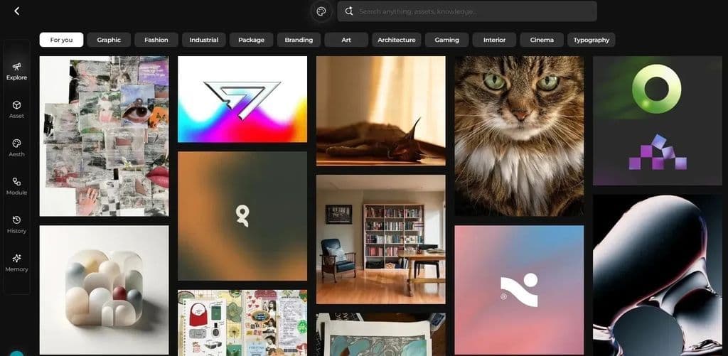
Collect references for typography, color palettes, photography, illustrations, background textures, and layout inspiration.
Keeping references organized makes it easier to maintain visual consistency across multiple design iterations.
For projects involving several poster variations, organize the materials by concept or design direction rather than treating every reference as an isolated input.
Refine the Composition With an AI Canvas Workflow
An AI-assisted canvas workflow can help designers move beyond isolated text prompts.
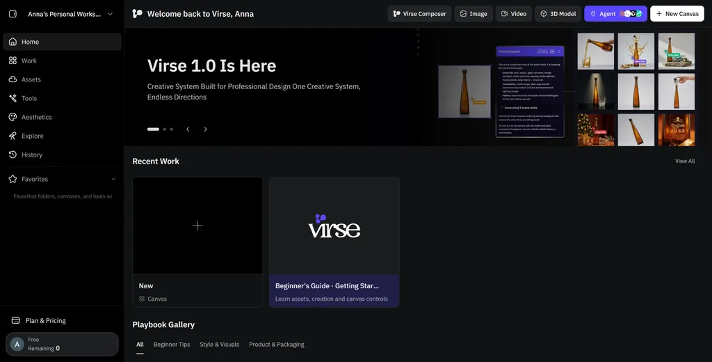
For example, Virse uses an Infinite Canvas approach that allows designers to organize visual materials, connect references, and work with AI agents in the context of a broader creative project.
Its workflow supports several useful capabilities:
- Canvas-based interaction: Organize references, visual elements, and project materials directly on a shared canvas.
- Multi-Agent collaboration: Run different agents on separate creative tasks, such as reference analysis, visual generation, and marketing asset development.
- Shared project context: Let agents work with related project materials rather than treating every request as an independent conversation.
- Long-term creative context: Retain relevant design preferences, brand guidelines, and project knowledge to support more consistent workflows.
For a poster campaign, a designer could organize reference images, explore different visual directions, develop a central illustration, and create related promotional variations within the same project.
The important distinction is that AI supports the design process rather than replacing professional creative judgment.
Finalize Typography and Information
Do not assume that an AI-generated image contains publication-ready text.
Review and refine:
- Headline spelling.
- Font selection.
- Text alignment.
- Event details.
- Image positioning.
- Brand consistency.
For professional posters, use a dedicated design editor when precise typography and print-ready output are required.
AI Poster Design vs. Traditional Design Software
Approach | Best For | Advantages | Limitations |
|---|---|---|---|
AI image generation | Visual exploration | Rapid concept development | Text may require correction |
AI canvas workflows | Multi-reference creative projects | Contextual iteration and visual organization | Requires design review |
Canva | Simple promotional posters | Accessible templates and editing | Less flexible for complex custom compositions |
Photoshop | Photo manipulation | Detailed image editing | Primarily raster-based |
Illustrator | Vector poster design | Scalable graphics and typography | Requires design knowledge |
InDesign | Information-heavy layouts | Precise typography and document structure | More setup for simple compositions |
The most effective approach is often a combination: use AI to explore concepts, then use design software to refine the final layout.
A Practical Example: Designing a Music Festival Poster From Concept to Print
Consider a hypothetical independent music festival that needs a promotional poster for both social media and physical display.
The project has three main requirements: attract attention, communicate event details, and maintain a visual identity that can be reused across promotional materials.
Creative direction: An energetic retro-futuristic design inspired by 1980s music posters.
Visual system:
- Dark navy background.
- Neon orange and electric blue accents.
- Oversized condensed headline typography.
- Geometric grid elements.
- A central photographic or illustrated performer.
Information hierarchy:
Element | Design Treatment | Purpose |
|---|---|---|
Festival name | Oversized display typography | Capture attention |
Main visual | Central illustration or photograph | Establish identity |
Date and venue | High-contrast information block | Communicate logistics |
Performer lineup | Organized text columns | Improve scanning |
Ticket information | Clearly separated CTA | Encourage action |
Production workflow:
- Gather reference images for retro typography, neon color palettes, and geometric compositions.
- Generate alternative visual concepts and select the strongest direction.
- Organize the selected references and generated assets on a creative canvas.
- Refine the background, lighting, central subject, and composition.
- Add accurate event information in a dedicated design editor.
- Check readability at social media and physical poster sizes.
- Prepare the appropriate digital and print exports.
The same visual system can then be adapted into social media graphics, event banners, and other campaign materials.
This demonstrates why poster design is more than generating one attractive image: it requires a consistent creative direction and a reliable production process.
Common Poster Design Mistakes to Avoid
Even a visually impressive poster can fail if its information is difficult to understand.
Common Mistake | Why It Happens | How to Fix It |
|---|---|---|
Too many fonts | Trying to make every section distinctive | Establish a consistent type system |
Weak information hierarchy | Every element competes for attention | Prioritize the headline and key details |
Poor color contrast | Choosing colors based only on appearance | Check text-background contrast |
Overcrowded layout | Adding unnecessary decorative elements | Remove elements that do not support the message |
Inconsistent alignment | Positioning elements independently | Use a grid or alignment guides |
Excessive texture | Applying effects to every element | Keep texture selective |
Unreadable experimental text | Prioritizing visual effects over communication | Reserve decorative typography for short headlines |
Incorrect print preparation | Designing only for screen viewing | Confirm dimensions, bleed, resolution, and output settings |
The most important principle: A poster should communicate its main message quickly. Visual creativity should strengthen that communication, not compete with it.
Frequently Asked Questions About Poster Design
What makes a good poster design?
A good poster combines a clear headline, strong visual hierarchy, readable typography, balanced composition, and an appropriate color palette. It should communicate its primary message quickly while using imagery and visual elements that match its purpose.
What are the most popular poster design styles?
Common poster design styles include minimalist, Swiss grid, retro, vintage, typography-focused, geometric, collage, illustrated, and photographic designs. The best choice depends on the audience and the purpose of the poster.
How do I make my poster stand out?
Use one dominant visual element, strong contrast, distinctive typography, and a clear composition. Avoid filling every available space with decorative elements. A memorable poster usually has a recognizable focal point and a straightforward message.
Which fonts are best for poster design?
Bold sans-serif fonts are commonly used for modern promotional posters, while serif fonts can create a more editorial or traditional appearance. Display fonts work well for short headlines. Supporting information should use highly readable typefaces.
What is the best layout for a poster?
There is no single best layout. Grid-based layouts are useful for information-heavy posters, while asymmetric and experimental layouts work well for artistic projects. The layout should establish a clear reading order and maintain visual balance.
Can AI create professional poster designs?
AI can help generate visual concepts, illustrations, backgrounds, and stylistic variations. However, professional poster production still requires checking typography, factual information, alignment, and print specifications. AI works best as part of a broader design workflow.
What software is best for creating posters?
Canva is useful for accessible template-based designs. Photoshop works well for photo manipulation, Illustrator for vector graphics, and InDesign for structured typography and information-heavy layouts. AI-assisted tools can complement these applications during concept development.
What size should a poster be?
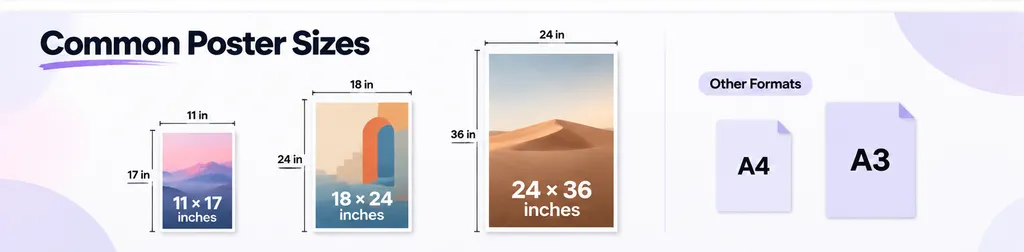
Common poster sizes include 11 × 17 inches, 18 × 24 inches, and 24 × 36 inches in North America. A4 and A3 are common in international paper-size systems. Always confirm the intended display environment and printer requirements before selecting dimensions.
Final Thoughts
The best poster designs are not necessarily the most complicated. They are the ones that combine a distinctive visual identity with a clear message and a composition that works in its intended environment.
From oversized typography and minimalist grids to retro textures, photographic compositions, and AI-assisted concepts, these 30 ideas offer different starting points for creative projects.
For designers, the most effective workflow is to explore multiple visual directions, select a strong concept, refine the composition, and carefully review typography and information hierarchy before publishing.
AI can make concept exploration and visual experimentation more flexible, while professional design tools remain important for precise editing and production.
Ultimately, great poster design is the balance between creative expression and effective communication.
Written by Yifan Zhao — AI design workflow strategist and creative technology advisor.
More from the Virse Blog
Inspiration
Wine Label Design: Legal Requirements + 30 Creative Examples
November 18, 2026 by Yifan Zhao
Inspiration
Product Photo Backgrounds: 15 Ideas & Materials Compared
November 18, 2026 by Yifan Zhao
Inspiration
Lifestyle Product Photography: 20 Creative Ideas, Examples, and Tips
November 18, 2026 by Yifan Zhao