
What Is Layout Design? Principles, Grids, Hierarchy & Real Examples
 Yifan Zhao17 min de lecture ·
Layout design is the process of organizing text, images, graphics, and white space so people can understand information quickly and in the right order. Strong layouts combine design principles such as hierarchy, alignment, scale, and spacing with the elements of design to make every visual relationship feel intentional rather than randomly placed.
The difficult part is turning those fundamentals into real decisions. Designers still have to decide where elements belong, how many columns to use, how much white space to leave, and how to keep multiple formats consistent without making every page feel generic. A repeatable approach to choosing design layouts, supported by a clear design system and intentional art direction, makes those choices easier to evaluate and scale.
Virse helps designers explore layouts, references, imagery, and creative directions inside a canvas-based AI design workflow without giving up creative control. Paid plans include unlimited use of 40+ models such as Nano Banana 2 and GPT Image 2, plus unlimited seats; new users also receive signup credits for up to 10 Nano Banana 2 images or one Seedance 2.0 video, while Seedance 2.5, Seedance 2.0, and MiniMax H3 are already available on the model page.
What Is Layout Design in Graphic Design?
In graphic design, layout design controls the spatial relationship between visual elements.
A layout may include:
- headlines,
- subheadings,
- body copy,
- photographs,
- illustrations,
- captions,
- logos,
- CTAs,
- navigation,
- metadata,
- white space.
The designer's job is not simply to fit all of these elements onto a page. The goal is to decide which information deserves attention, which elements belong together, and how the viewer should move through the composition.
Consider an event poster containing a title, date, location, speaker names, a photograph, and sponsor logos.
If every element is similar in size and visual weight, the viewer has to work out what matters. A stronger layout might:
- make the event title dominant,
- group the date and location,
- use the photograph as a secondary focal point,
- reduce the scale of supporting information,
- keep sponsor logos visible without letting them compete with the main message.
The content has not changed. The layout has changed the communication.
That same principle applies to editorial design, websites, apps, packaging, advertising, presentations, brand systems, and product interfaces.
What Is the Purpose of Layout Design?
The purpose of layout design is to make information easier to understand while guiding attention in a deliberate sequence.
In professional design workflows, a layout usually needs to solve five questions:
- What should the viewer notice first?
- Which information belongs together?
- What should the viewer read next?
- Which visual relationships should stay consistent?
- Where should the design intentionally create contrast or variation?
This means layout should start with communication goals rather than decoration.
A product landing page may need users to understand the core benefit before they see technical details. A magazine article must support comfortable reading over several minutes. A poster may need its main message to remain understandable from several meters away.
The communication task changes, so the layout must change too.
From a design workflow perspective, I treat layout first as an information-priority problem. When priority is unclear, adding more styling usually makes the page more complicated rather than more effective.
What Are the Most Important Layout Design Principles?
The most important layout design principles are visual hierarchy, grid structure, alignment, proximity, white space, typography, scale, contrast, and repetition.
They work together as a system.
Layout Principle | What It Controls | Practical Question |
|---|---|---|
Visual hierarchy | Reading priority | What should people notice first? |
Grid | Structural consistency | Where can elements align? |
Alignment | Visual relationships | Which edges should connect? |
Proximity | Grouping | Which information belongs together? |
White space | Separation and emphasis | Where does the layout need breathing room? |
Typography | Reading structure | How should text levels differ? |
Scale | Relative importance | Which element should dominate? |
Contrast | Differentiation | What needs stronger emphasis? |
Repetition | Consistency | Which patterns should repeat? |
A page can follow a precise grid and still feel weak if everything has similar scale. A layout can have perfect alignment but poor hierarchy. Attractive typography cannot rescue a composition in which every element competes for attention.
Good layout design comes from the interaction between these principles, not from following one rule correctly.
How Does Visual Hierarchy Improve Layout Design?
Visual hierarchy determines the order in which viewers perceive information.
Before deciding where an element should go, designers should decide how important it is.
Primary Content
Primary content is the information that must be understood immediately.
Examples include:
- a campaign headline,
- a product value proposition,
- an event title,
- a hero image.
Secondary Content
Secondary content explains or supports the main message.
Examples include:
- subtitles,
- supporting copy,
- event details,
- secondary images,
- product descriptions.
Tertiary Content
Tertiary content remains available but should not dominate.
Examples include:
- captions,
- legal copy,
- metadata,
- sponsor information,
- secondary navigation.
One of the most common layout problems in our review of user questions is simple: designers know what content they have but do not know where to place it.
The more useful question is not:
“Where should this go?”
It is:
“How important is this compared with everything else?”
Once hierarchy is clear, decisions about size, position, spacing, and contrast become easier.
In practice, many weak layouts are not placement problems at all. They are hierarchy problems disguised as placement problems.
What Is a Grid in Layout Design?
A grid is an underlying system of columns, rows, margins, modules, or guides that helps designers organize content consistently.
A grid is not the finished design. It is a structure that reduces arbitrary placement and makes relationships easier to repeat.
Our editorial research into layout questions shows a recurring problem: many designers understand how to follow a grid but struggle to understand why a particular grid should exist in the first place.
A useful grid should solve practical problems such as:
- aligning images and text,
- maintaining consistent margins,
- supporting repeatable column widths,
- creating reusable page structures,
- connecting multiple screens or pages,
- supporting several content combinations.
The grid is therefore a decision-making system, not a decorative overlay.
Why 12-Column Grids Are Common in Layout Design
A 12-column grid is flexible because 12 can be divided into 1, 2, 3, 4, 6, or 12 equal sections. This gives designers several ways to organize content while keeping the same underlying structure.
For example:
- 1 section: 12 columns
- 2 sections: 6 columns each
- 3 sections: 4 columns each
- 4 sections: 3 columns each
- 6 sections: 2 columns each
- 12 sections: 1 column each
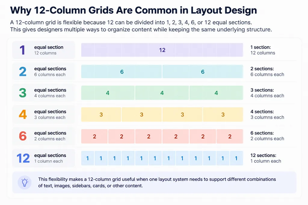
This allows one structure to support many different combinations.
For example:
- two 6-column sections,
- three 4-column sections,
- four 3-column sections,
- an 8-column main area with a 4-column sidebar.
That flexibility is one reason 12-column systems are widely used in digital and editorial design.
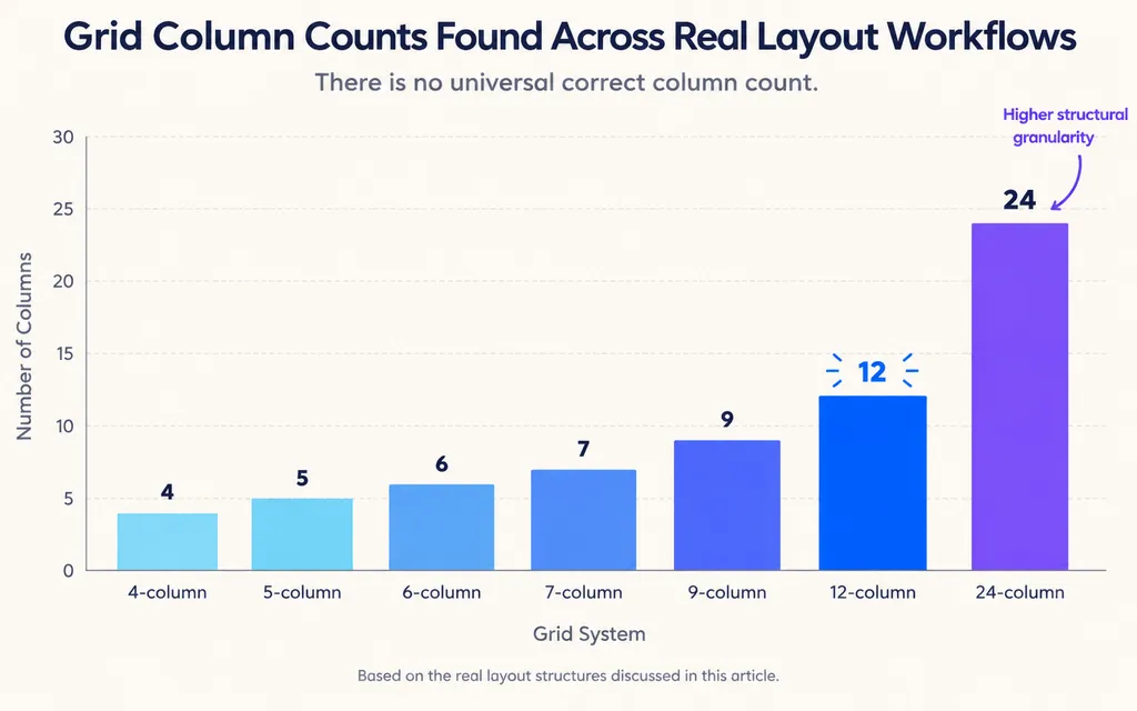
Our review of real design discussions also found layouts built around 4-, 5-, 6-, 7-, 9-, 12-, and 24-column systems.
The important lesson is not that one number is better.
There is no universal correct number of columns. The grid should respond to the content and the relationships the design needs to support.
When a 24-Column Grid Makes Sense
A 24-column grid gives designers smaller structural units.
That can be useful when a complex design needs:
- narrow supporting columns,
- multiple image widths,
- side notes,
- nested modules,
- irregular content combinations.
However, more columns do not automatically create a better layout.
For a simple poster, a 24-column system may introduce unnecessary complexity.
A practical rule is:
Use the simplest grid that gives the content enough flexibility.
How Many Columns Should a Layout Grid Have?
There is no fixed number of columns that makes a layout professional.
The right choice depends on:
- content density,
- page or screen width,
- number of hierarchy levels,
- image proportions,
- required flexibility,
- responsive behavior.
One editorial case from our research illustrates this clearly.
The design contained photography, typography, and modular content, and the initial decision was whether to use a 6-column or 9-column grid.
That sounds like a numerical question, but the real questions were:
- How wide should the body copy be?
- How many image sizes are required?
- Are captions or side notes needed?
- How many hierarchy levels must the page support?
- Does the composition need symmetry or controlled asymmetry?
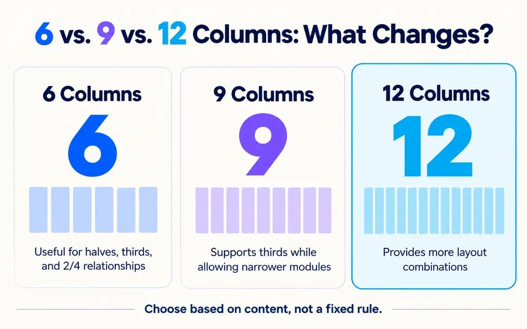
A 6-column grid can work well when the layout needs halves, thirds, or 2/4 relationships.
A 9-column grid can support thirds while also creating narrower modules.
A 12-column grid provides even more combinations.
A 5- or 7-column grid can create less predictable divisions when the visual direction benefits from asymmetry.
The correct grid is the one that supports the actual content with the fewest unnecessary exceptions.
This is why I recommend testing real content before committing to a structure. Empty columns may look convincing, but only actual headlines, paragraphs, captions, and images reveal whether the grid works.
Is Layout Design Mathematical?
Layout design can use mathematical systems, but effective layouts are usually driven by content rather than formulas.
Designers sometimes assume that a professional grid must come from complex calculations.
It can, but it does not have to.
Mathematical tools may include:
- proportional systems,
- modular grids,
- baseline grids,
- spacing scales,
- column ratios.
However, a mathematically elegant layout can still fail if the text is difficult to read or the hierarchy is unclear.
Imagine a proportionally balanced structure that creates a text column too narrow for comfortable reading. The geometry may be consistent, but the communication is weak.
In practice, a stronger sequence is usually:
content → hierarchy → structure → proportion → refinement
rather than:
formula → content placement
The grid provides order. Design judgment determines whether that order actually improves communication.
How Do Typography and Layout Work Together?
Typography is part of layout structure, not a layer added after the layout is finished.
Text changes the physical composition.
A different font size changes line breaks.
A narrower column increases the number of lines.
A larger headline changes the balance between text and image.
More paragraph spacing increases vertical length.
That means typography and layout should develop together.
Important typographic variables include:
- font size,
- font weight,
- heading scale,
- line length,
- line height,
- paragraph spacing,
- alignment,
- captions,
- labels,
- fine print.
In our review of layout exercises, technically correct grids often still produced generic compositions. The most useful improvements consistently involved:
- stronger typographic hierarchy,
- more intentional white space,
- clearer secondary text,
- greater variation in scale,
- more realistic content instead of placeholder copy.
The lesson is straightforward:
The grid organizes the page. Typography creates hierarchy and rhythm inside that structure.
Why Is White Space Important in Layout Design?
White space is the intentionally unoccupied area around and between design elements.
It is not wasted space.
It controls three important parts of a layout.
White Space Creates Grouping
Elements placed close together are usually understood as related.
A product price placed near the product name feels connected to it. Move that price too far away and the relationship becomes less obvious.
White Space Creates Separation
Larger gaps can signal a change in topic, function, or hierarchy.
For example, separating product benefits from technical specifications makes the page easier to scan.
White Space Creates Emphasis
An element surrounded by empty space can become more prominent without becoming larger.
This is especially effective in editorial design, branding, product presentation, and premium visual systems.
A common beginner mistake is to treat empty areas as unfinished areas.
In professional layouts, the opposite is often true.
The absence of content can be an active design decision.
Instead of asking, “Can I fit something here?” ask:
“What does this space help the viewer understand?”
Why Does a Layout Still Look Boring After Using a Grid?
A grid creates consistency, but it does not automatically create visual hierarchy or character.
This explains why designers can correctly follow grid rules and still produce layouts that feel generic.
In one recurring layout-practice scenario from our research, the structure was already technically organized, yet the composition still lacked energy.
The most useful improvements were:
- stronger differences between headline and body text,
- more variation in scale,
- more deliberate white space,
- clearer supporting typography,
- stronger image proportions,
- more intentional contrast.
The designer did not need a more complicated grid.
The designer needed more deliberate hierarchy.
A grid answers:
“What can align with what?”
It does not answer:
- What should dominate?
- What should feel quiet?
- Where should tension appear?
- Which element should break the pattern?
- How much contrast is enough?
Those decisions create the composition.
What Is the Difference Between Grid, Layout, and Composition?
A grid, layout, and composition are related but not identical.
Term | Meaning | Example |
|---|---|---|
Grid | Underlying structural system | A 12-column framework |
Layout | Arrangement of actual content | Text across 4 columns, image across 8 |
Composition | Overall visual relationship | Asymmetrical, spacious, image-dominant |
Two designers can use the same grid and create completely different compositions.
For example, both may start with a six-column structure.
One designer may place an image across four columns and use two columns for text.
Another may place a small image in one column, stretch a headline across five columns, and create a large field of white space.
The grid is similar.
The visual experience is completely different.
This is why learning grids is not the same as learning layout.
How Do You Create a Good Layout From a Blank Page?
Our review of recurring user questions consistently identifies the blank-canvas problem as one of the strongest layout pain points.
Designers may know how to use Figma, InDesign, Illustrator, Photoshop, or Canva and still have no idea what to do first.
A more reliable workflow is to turn the blank page into a sequence of decisions.
1. Define the Communication Goal
Determine what the viewer needs to understand or do.
A poster may need immediate recognition.
An editorial page may need comfortable reading.
A landing page may need to communicate value and guide users toward a CTA.
2. Inventory the Content
List everything the design must contain.
For example:
- headline,
- subtitle,
- image,
- body copy,
- CTA,
- caption,
- logo,
- metadata.
This prevents important information from appearing late and breaking the composition.
3. Rank the Information
Divide the content into primary, secondary, and tertiary levels.
This establishes hierarchy before styling begins.
4. Choose a Basic Grid
Select columns and margins based on the actual content.
Do not choose 12 columns simply because 12-column grids are common.
5. Build Large Relationships First
Use simple blocks to represent:
- large images,
- text areas,
- headlines,
- supporting modules.
Ignore small details initially.
6. Create Several Layout Variations
Test different directions:
- image-dominant,
- typography-dominant,
- symmetrical,
- asymmetrical,
- dense,
- spacious.
This prevents the first workable idea from becoming the default final answer.
7. Develop Typography and Spacing
Once the large structure works, refine:
- heading scale,
- line length,
- line spacing,
- paragraph gaps,
- image captions,
- alignment.
8. Test the Reading Order
Reduce the design to thumbnail size.
You should still be able to identify what is first, second, and third.
If everything has similar prominence, the hierarchy needs more work.
This workflow turns a vague creative problem into a repeatable process:
function → content → hierarchy → grid → composition → refinement
Can You Break the Grid in Layout Design?
Yes. Designers can break a grid when the exception is intentional and the underlying structure remains understandable.
Common examples include:
- extending an image beyond a column,
- allowing a headline to cross several modules,
- overlapping elements,
- placing a focal graphic beyond a normal margin,
- creating an intentionally irregular section.
The key question is whether the viewer can still perceive a system.
If every element follows a different alignment, the layout feels arbitrary.
If most elements create consistency and one element breaks that pattern, the exception creates emphasis.
This is why “learn the grid before breaking the grid” remains useful advice.
Breaking a rule works best when the designer understands what expectation that rule created.
What Does a Real Editorial Layout Process Look Like?
Editorial design is a strong example because it combines long-form typography, photography, captions, hierarchy, and repeated structures.
A practical editorial layout process might begin with a choice between a 6-column and 9-column system.
Instead of choosing by appearance alone, test both systems against real requirements.
Ask:
- How wide should the body text be?
- How many image sizes are required?
- Are captions or side notes needed?
- How many hierarchy levels exist?
- Does the editorial direction require symmetry or asymmetry?
- Can the same grid support multiple page types?
Our review of editorial design discussions surfaced examples using 4-, 5-, 6-, 7-, 9-, and 12-column grids.
That variety is valuable because it shows that professional layout design is not about discovering one correct grid.
It is about finding a structure that produces useful relationships.
For example:
- 5 columns can create unusual asymmetrical divisions.
- 6 columns make halves and thirds easy.
- 9 columns support thirds while allowing narrower modules.
- 12 columns provide high flexibility for mixed content.
The practical lesson is simple:
Choose the grid after understanding the editorial system, not before.
How Should Beginners Practice Layout Design?
The fastest way to improve layout design is to practice structural decisions, not just software operations.
Our review of user questions shows that software knowledge and layout knowledge are very different skills.
Software tells you how to move an object.
Layout knowledge tells you why the object should be there.
A useful practice method is to study real posters, websites, magazines, books, and interfaces and ask:
- What do I notice first?
- What is the likely grid?
- Which edges align?
- Where does the designer break alignment?
- How many typography levels are present?
- How is white space distributed?
- Which elements are grouped?
- Where does contrast occur?
Then recreate the structure using different content.
Another useful exercise is to take exactly the same copy and image and create five different compositions:
- image-dominant,
- type-dominant,
- symmetrical,
- asymmetrical,
- minimal.
This forces you to solve the same communication problem through different spatial relationships.
Several established books are especially useful for developing these skills, including Josef Müller-Brockmann's Grid Systems in Graphic Design, Timothy Samara's Making and Breaking the Grid, Ellen Lupton's Thinking with Type, and Kimberly Elam's Grid Systems: Principles of Organizing Type.
The goal is not to collect more rules.
Layout skill develops by repeatedly making choices, comparing alternatives, and understanding why one composition communicates more effectively than another.
How Is AI Changing Layout Design Workflows?
AI can accelerate layout exploration, but it does not replace the fundamentals of hierarchy, typography, spacing, and composition.
Useful applications include:
- generating alternative visual directions,
- exploring image variations,
- adapting layouts to multiple sizes,
- analyzing reference material,
- generating repeated assets,
- maintaining visual consistency.
From a product design perspective, the most useful AI workflows are not always prompt-only systems.
Layout is spatial, so designers often communicate intent through:
- where an asset is placed,
- which images are grouped,
- which elements are connected,
- what reference sits nearby,
- what visual direction is already established.
Canvas-based AI workflows can preserve more of this design context than a standalone chat interaction.
Virse approaches AI as a collaborative design system built around an infinite canvas rather than only a prompt box. Designers can organize assets spatially, connect elements, and run multiple Agents across different parts of a project while maintaining shared project context.
For layout work, the broader lesson matters most:
AI can generate more options faster, but designers still need layout knowledge to judge which option communicates clearly and which one only looks visually complex.
Conclusion
Layout design is ultimately the process of turning information priorities into visual relationships. Grids provide structure, hierarchy determines reading order, typography shapes rhythm, white space controls grouping and emphasis, and composition determines the overall visual experience. Strong layouts do not come from mechanically following a grid or finding a universal number of columns. They come from understanding the content, identifying what matters most, testing multiple structures, and refining the relationships until the intended message becomes visually obvious. As design tools become faster and more automated, these fundamentals become even more valuable because designers still need the judgment to decide whether a layout actually works.
FAQ
What is layout design in simple terms?
Layout design is the process of arranging text, images, graphics, and white space so information is visually organized and easy to understand. It controls what viewers notice first, how different elements relate to one another, and how people move through a page, screen, poster, or other visual format.
How do you start a layout design?
Start by defining the communication goal, listing all required content, and ranking that content by importance. Then choose a basic grid, block out the largest visual relationships, create several composition variations, and refine typography and spacing. Hierarchy should come before detailed styling.
How many columns should a layout grid have?
There is no single correct number. Our review of design workflows found practical examples using 4, 5, 6, 7, 9, 12, and 24 columns. The best choice depends on content density, page size, image proportions, hierarchy, and required flexibility. A 12-column grid is especially adaptable because 12 divides evenly into 1, 2, 3, 4, and 6.
What is the difference between a grid and a layout?
A grid is the structural framework used to organize content, while a layout is the actual arrangement of content within that structure. For example, the same 12-column grid can support several completely different layouts depending on how text, images, and white space span those columns.
Plus d’articles du blog Virse
Inspiration
What Are Design Principles? 9 Rules That Make Good Design Easier to Explain
23 septembre 2026 by Yifan Zhao
Inspiration

What Is an AI-Powered Design System for Brands?
8 août 2026 by Vincent
Inspiration

MiniMax H3 Reddit Review: What Real Users Think After Local Testing
7 août 2026 by Yifan Zhao