
What Are the 7 Elements of Design? Examples and How to Use Them
 Yifan Zhao12 min read ·
The seven elements of design are line, shape, form, color, texture, space, and value. They are the basic visual building blocks designers use to create hierarchy, organize information, guide attention, and shape how a composition feels.
The challenge is that knowing the definitions does not mean you know how to use them. Many beginners understand color, shape, or space in theory but still struggle with learning graphic design, white space, balance, and making different elements work together in a real composition.
That is where Virse can help turn design principles into practice. Virse uses a canvas-based workflow with collaborative AI agents rather than treating AI as a one-prompt replacement for designers. Paid plans include unlimited use of 40+ models such as Nano Banana 2 and GPT Image 2, plus unlimited seats. New users also receive free credits, enough to create up to 10 Nano Banana 2 images or one Seedance 2.0 video, while Seedance 2.5, Seedance 2.0, and MiniMax H3 are available on the model page.
What Are the 7 Elements of Design?
The seven basic elements of design provide a practical vocabulary for analyzing almost any visual composition.
Element | Meaning | Main Design Function | Example |
|---|---|---|---|
Line | A visual path or boundary | Direction, separation, movement | A diagonal guiding the eye |
Shape | A two-dimensional area | Grouping, identity, structure | A circle, icon, card, or block |
Form | Three-dimensional volume | Depth, realism, visualization | A bottle, sphere, or 3D object |
Color | Hue and color relationships | Emphasis, identity, organization | An accent color on a neutral layout |
Texture | Surface quality | Material expression, atmosphere | Paper grain or brushed metal |
Space | Areas within and around objects | Grouping, clarity, hierarchy | Empty space around a headline |
Value | Lightness and darkness | Contrast, depth, priority | Dark text on a light background |
A headline may stand out because it is larger, darker, more saturated, and surrounded by more space than the elements around it. Good design comes from how these elements interact, not from using each one independently.
Why Do Some Lists of Design Elements Look Different?
Different design disciplines sometimes use slightly different frameworks. Traditional visual design commonly teaches line, shape, form, color, texture, space, and value, while digital design may also emphasize typography or motion.
This article uses the traditional seven-element framework because it provides a clear foundation across graphic, product, brand, and digital design.
How Does Line Work as an Element of Design?
Line is a visual path that divides space, connects information, creates movement, or guides attention.
Lines can be literal, such as borders and strokes, or implied through photography, alignment, perspective, and repeated objects.
How Designers Use Line in Real Compositions
A road disappearing toward the horizon creates a directional line even when no stroke has been drawn. Building edges, bridges, shadows, and rows of objects can create the same effect.
In posters, diagonal structures can lead the eye toward a focal point. In interfaces, subtle horizontal lines can separate information without becoming dominant.
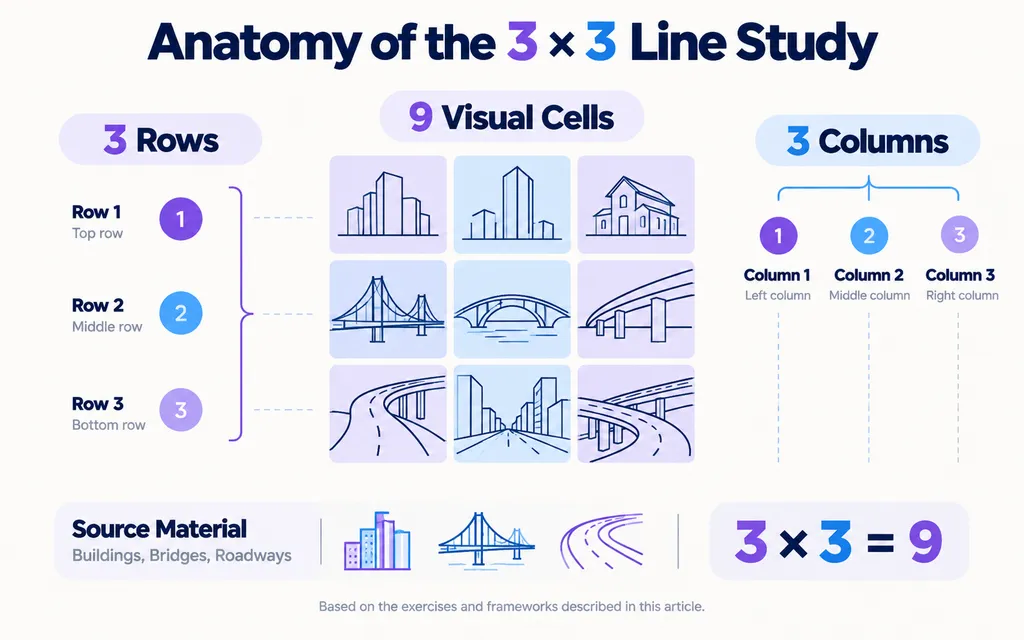
One practical exercise reviewed in our research used fragments from buildings, bridges, and roadways to create a 3 × 3 line study. The exercise turned line from an abstract concept into something that could be identified, extracted, arranged, and evaluated.
The key lesson is that line does not have one fixed emotional meaning. Its effect depends on context, orientation, scale, color, and surrounding elements.
How Does Shape Work as an Element of Design?
Shape is a two-dimensional area defined by an edge, contrast, color, or negative space.
Shapes help designers group information, build identities, structure layouts, and create recognizable patterns.
Geometric, Organic, and Functional Shapes
Designers commonly work with:
- geometric shapes such as circles and rectangles
- organic shapes with irregular contours
- symbolic shapes such as icons
- typographic shapes created by letters
- negative shapes created by empty space
A rectangle in a UI can become a card that tells users which information belongs together. A repeated curve in a brand system can create consistency across packaging, advertising, and digital assets.
A common beginner mistake is adding circles, blobs, or decorative graphics simply because a layout feels empty. A better question is:
What is this shape doing?
If removing it changes nothing, it may be decoration rather than communication.
What Is Form in the Elements of Design?
Form is the three-dimensional quality of an object, whether that volume is physically real or visually simulated.
A circle is a shape. A sphere is a form.
Designers communicate form using perspective, shadows, highlights, gradients, overlap, scale, and material cues.
How Form Works in Product and Visual Design
Form is especially important in industrial design, packaging, product visualization, and 3D workflows.
Consider a bottle concept. Its outline creates shape, but its curvature, reflections, lighting, and volume create form. Two products can share a similar silhouette while feeling very different because one appears heavy and solid while another feels soft and lightweight.
From a product design perspective, form helps answer practical questions:
- Does the object look stable?
- Are the proportions balanced?
- Is the material believable?
- Does the geometry communicate the intended character?
AI-assisted visualization can generate many form variations quickly, but designers still need to evaluate whether the geometry and volume are coherent rather than simply polished.
How Does Color Work as an Element of Design?
Color helps create emphasis, organize information, reinforce identity, and shape the character of a composition.
Color works through relationships.
A bright orange button may dominate a muted interface but disappear in a layout filled with equally saturated colors.
Designers therefore evaluate:
- surrounding colors
- contrast
- occupied area
- value
- repetition
- consistency
Why Designers Often Start in Black and White
A useful beginner workflow is to design in black and white first, use a grid, simplify the composition, and add color only after the structure works.
Removing color forces the designer to rely on:
- value
- shape
- space
- typography
- scale
- composition
This makes structural problems easier to see. If hierarchy fails in grayscale, color often hides the issue instead of solving it.
What Is Texture as an Element of Design?
Texture describes the visual or physical quality of a surface.
It can communicate material, depth, atmosphere, craft, or contrast.
Examples include paper grain, fabric, concrete, glass, brushed metal, paint, and digital noise.
How Designers Use Texture
In packaging, subtle paper grain can create a crafted impression. In industrial design, material differences may depend heavily on texture, reflection, and light. In graphic design, restrained grain can soften overly clean digital surfaces.
Texture works best when it supports the visual direction.
One learning exercise reviewed in our research involved creating seven separate collages, one for each design element. Isolating texture in its own study made it easier to compare smooth, rough, reflective, patterned, and irregular surfaces directly.
The value of the exercise is not memorization. It is visual sensitivity.
Why Is Space an Important Element of Design?
Space is the area inside, around, and between visual elements. It controls grouping, clarity, readability, and hierarchy.
Space may look like an absence of design, but it is one of the strongest organizational tools.
Positive Space and Negative Space
Positive space contains visible content.
Negative space is the unoccupied area around it.
Two text blocks placed close together may appear related. Increase the distance between them and they may become separate groups.
Nothing changed except space.
A recurring beginner problem is the urge to fill empty areas with extra shapes, text, icons, gradients, or effects. In practice, white space is not unused space. It can increase emphasis, reduce competition, and make relationships easier to understand.
What Is Value in Design?
Value is the relative lightness or darkness of a visual element.
It plays a major role in contrast, depth, readability, and visual priority.
Imagine a poster with a dark headline, medium-gray supporting text, and a pale background. The difference in value creates a natural reading order.
If everything moves toward the same brightness, hierarchy becomes weaker.
A Simple Value Test
Convert a design to grayscale and ask:
- Can you still identify the focal point?
- Is the headline clearly dominant?
- Does foreground separate from background?
- Do secondary elements remain secondary?
This test is especially useful with AI-generated visuals. An image can look impressive but still fail as a design asset because the background, subject, and text area compete at similar intensity.
What Is the Difference Between Elements and Principles of Design?
Elements of design are the visual materials used to build a composition. Principles of design describe how those materials are organized.
Elements of Design | Principles of Design |
|---|---|
Line | Contrast |
Shape | Balance |
Form | Hierarchy |
Color | Alignment |
Texture | Proximity |
Space | Repetition |
Value | Rhythm and movement |
Elements Are the Materials; Principles Are the Decisions
Imagine designing an event poster.
You might use rectangular shapes, a photograph, red and black colors, negative space, and different values. Those are elements.
You then decide which information should have the strongest contrast, how content aligns to a grid, and where extra space should create emphasis. Those are principles.
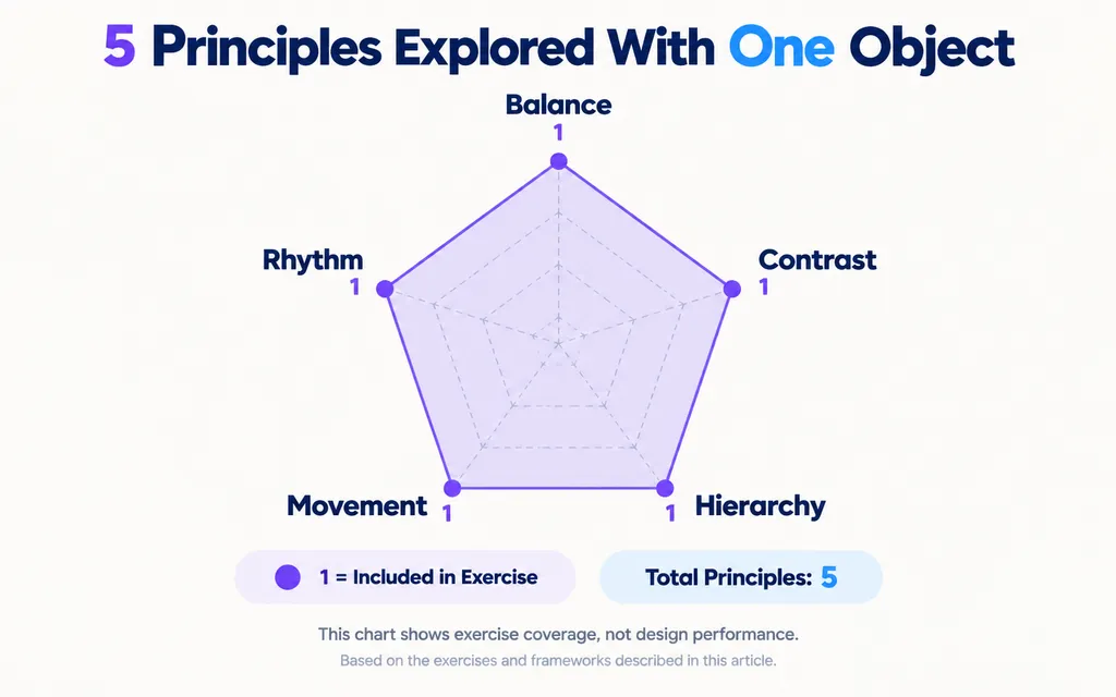
A useful exercise is to take one everyday object and create multiple compositions focused on balance, contrast, hierarchy, movement, and rhythm.
Using the same object removes content as a variable and forces you to change the actual design relationships.
How Do the Elements of Design Create Visual Hierarchy?
Visual hierarchy is created by varying elements such as size, color, value, shape, position, and space so viewers know what to notice first, second, and third.
A design often feels flat when everything has similar visual weight.
Common symptoms include:
- the headline does not dominate
- the background competes with content
- decorative elements attract too much attention
- spacing is too uniform
- too many colors compete at once
A practical solution is to choose one focal point first.
Then evaluate the design through the seven elements:
Shape: Is it visually distinct?
Color: Does it separate from surrounding content?
Space: Does it have enough breathing room?
Value: Does it remain dominant in grayscale?
Line: Does visual direction support it?
Texture: Does detail help or compete?
Form: If dimensional, does lighting emphasize the right area?
This makes hierarchy easier to diagnose than simply asking whether a design “feels right.”
How Do You Use the Elements of Design in a Real Composition?
A professional design process starts with communication rather than decoration.
Step 1: Decide What Matters Most
Identify what the viewer should notice first.
Step 2: Build With Shape and Space
Establish large blocks, grouping, proportions, and negative space before polishing details.
Step 3: Establish Value and Hierarchy
Check whether the focal point works in grayscale.
Step 4: Add Color With a Purpose
Use color to emphasize, categorize, identify, or communicate state.
Step 5: Refine With Line, Texture, and Form
Use secondary elements to guide attention, reinforce material character, and create dimensional emphasis.
This order prevents decoration from replacing design decisions.
How Should Beginners Practice the 7 Elements of Design?
The most effective way to learn the elements is to turn each one into a visual exercise.
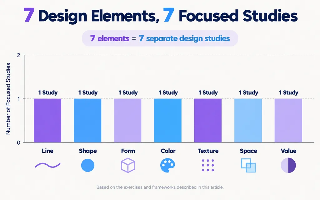
Create 7 Separate Design Studies
Make one composition for each element:
- Line
- Shape
- Form
- Color
- Texture
- Space
- Value
This isolates the variable and makes each element easier to recognize.
Make One Poster Per Day
Daily poster practice creates repeated opportunities to identify problems in:
- hierarchy
- spacing
- flow
- proportion
- focal points
- unnecessary decoration
The value comes from the feedback loop, not from producing perfect work.
Use One Object in Multiple Compositions
Keep the source content identical and redesign it around contrast, balance, hierarchy, rhythm, or movement.
This reveals how composition changes perception without relying on new imagery.
Why Do the Elements of Design Still Matter in AI Design?
AI can accelerate image generation, concept exploration, asset production, and visual iteration, but faster execution makes design judgment more important, not less.
A designer who once explored three directions may now generate dozens.
The challenge shifts from producing another option to deciding which option communicates better.
AI Generates Variations; Designers Evaluate Them
Generative systems can quickly produce shapes, colors, textures, compositions, backgrounds, and product forms.
Creative teams still need to evaluate:
- hierarchy
- spacing
- value
- consistency
- form
- focal points
- visual system compatibility
This is where design fundamentals become valuable.
Instead of saying, “Version B looks better,” a designer can explain that it uses stronger value contrast, clearer negative space, and less competing texture.
That makes feedback more precise and creative systems easier to scale.
What Should You Learn After the Elements of Design?
After learning the seven elements, the next step is understanding how to organize them.
A practical progression is:
- Elements of design
- Principles of design
- Composition and grids
- Typography
- Color theory
- Real projects and critique
This should not be treated as a rigid curriculum.
You understand space more deeply by building layouts. You understand value by testing hierarchy. You understand shape differently after working with typography.
Learn the fundamentals through making, not memorization alone.
Conclusion
The seven elements of design are line, shape, form, color, texture, space, and value, but strong design depends on how they work together. These elements help designers create hierarchy, clarity, visual relationships, and meaning across graphic, product, brand, and digital work. The fastest way to understand them is through practice: isolate each element, test compositions in grayscale, compare variations, and evaluate what changes. As AI makes visual production faster, these fundamentals become even more valuable because they give designers a clear framework for judging which ideas are actually worth keeping.
FAQ
What are the 7 elements of design?
The 7 elements of design are line, shape, form, color, texture, space, and value. They are the fundamental visual components designers use to build compositions and create hierarchy, structure, contrast, and visual meaning.
What is the difference between elements and principles of design?
Elements are what designers work with, while principles describe how those elements are organized. Line, shape, form, color, texture, space, and value are elements. Contrast, hierarchy, balance, alignment, proximity, repetition, rhythm, and movement are principles.
Is white space an element of design?
Yes. White space is part of the design element space. It refers to unoccupied areas around and between objects. Designers use it to improve readability, separate groups, strengthen hierarchy, and reduce unnecessary visual competition.
Should I learn elements or principles of design first?
Learn the elements first so you understand the basic visual components, then study principles such as hierarchy, contrast, balance, and alignment to understand how those components work together. In practice, the best approach is to learn both through real projects and critique.
More from the Virse Blog
Workflow
How to Master Grid-Based Design: Choose the Right Grid, Use It Well, and Know When to Break It
October 7, 2026 by Yifan Zhao
Workflow
How to Choose Design Layouts When You Don’t Know Where to Start
October 7, 2026 by Yifan Zhao
Workflow
How to Design Packaging: From Dieline to Print-Ready Production
October 7, 2026 by Yifan Zhao