
15 Design System Examples: Material, Polaris & Carbon
Vincent13 min read ·
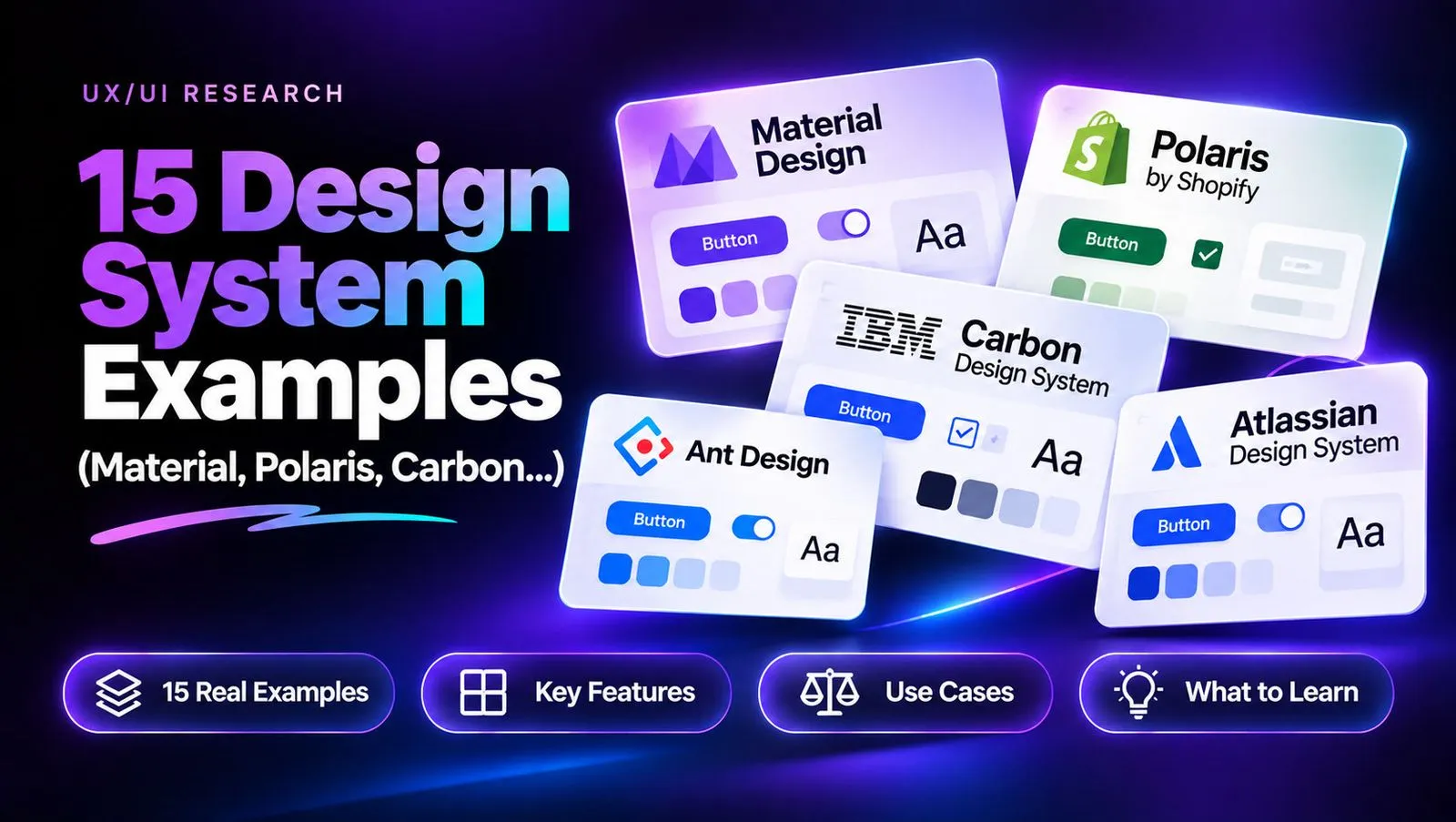
The best design system examples include Google Material Design, Shopify Polaris, IBM Carbon, Atlassian, Adobe Spectrum, and Microsoft Fluent. They demonstrate how reusable UI components, design tokens, and consistent design principles help teams build scalable digital products. Explore these best design systems to understand how established teams organize their visual foundations.
However, creating a design system that works in practice is harder than collecting attractive UI components. Poorly organized tokens, inconsistent visual styles, fragmented design assets, and disconnected workflows can make even well-designed systems difficult to maintain as products grow. Learning how to create a design system can help teams establish a more structured approach from the beginning.
Virse makes visual design exploration easier with an infinite canvas and multiple AI models in one creative workspace. You can explore different visual directions, use reference images, generate and edit visual assets, and organize creative ideas without constantly switching between tools. With unlimited seats and unlimited model usage on paid plans, Virse gives creative teams more room to experiment and develop consistent visual directions. You can also use the AI Design System Generator to explore and develop design-system concepts. Start creating with Virse and turn your design inspiration into polished creative assets.
15 Best Design System Examples for UI and Product Design
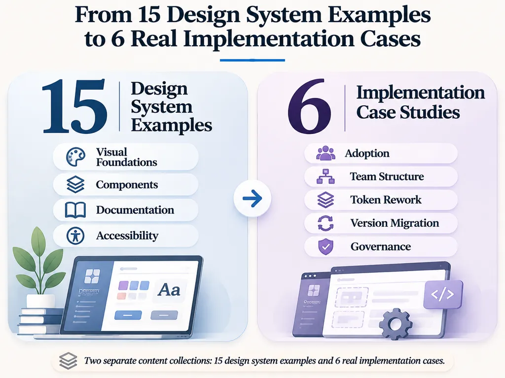
These 15 examples cover different approaches to visual foundations, reusable components, accessibility, documentation, and product workflows. They are selected for their learning value, not presented as an objectively ranked performance list.
Google Material Design: Best for Visual Foundations
Material Design is a comprehensive reference for color, typography, layout, motion, and reusable interface components.
What to study:
- Design principles and visual foundations.
- Color systems and semantic color roles.
- Reusable components and interaction patterns.
- Adaptive layouts across different interfaces.
Practical takeaway: Establish visual principles before building individual components. Adapt Material's approach to your brand instead of copying its visual identity. Its greatest learning value is understanding how consistent design foundations influence an entire interface.
Shopify Polaris: Best for E-Commerce Design Systems
Polaris focuses on merchant-facing workflows and reusable patterns for commerce applications.
What to study:
- Task-oriented interface components.
- Consistent patterns for operational workflows.
- Content and interaction guidance.
- The relationship between design foundations and product requirements.
Practical takeaway: Build components around actual user tasks rather than creating a collection of visually attractive but disconnected elements. Commerce interfaces need to make frequent operational activities understandable and consistent.
IBM Carbon: Best for Enterprise Design System Documentation
Carbon is particularly useful for studying component documentation, theming, accessibility guidance, and enterprise interface patterns.
What to study:
- Component usage instructions.
- Reusable design foundations and themes.
- Documentation connecting design decisions with implementation.
- Consistent patterns for complex applications.
Practical takeaway: Every reusable component needs more than a visual example. Document its purpose, states, behavior, and limitations. This is particularly important when multiple teams share the same system.
Atlassian Design System: Best for Component Organization
Atlassian provides a useful reference for organizing components and design patterns across collaboration products.
What to study:
- Consistent component naming.
- Structured documentation.
- Reusable workflow patterns.
- Design consistency across related products.
Practical takeaway: Clear naming reduces misunderstandings between designers and developers, particularly when products contain many related components.
Adobe Spectrum: Best for Creative Application Interfaces
Spectrum demonstrates how a shared design language can support complex creative applications.
What to study:
- Semantic design decisions.
- Visual hierarchy and color foundations.
- Reusable interface components.
- Consistency across creative workflows.
Practical takeaway: Creative products need consistent controls without sacrificing flexibility for specialized tasks. A shared visual foundation should support different workflows rather than restrict them.
Microsoft Fluent 2: Best for Cross-Platform Design
Fluent 2 provides a useful reference for adaptive interfaces and shared design foundations across platforms.
What to study:
- Global and alias token concepts.
- Typography and color foundations.
- Platform-aware components.
- Theme organization.
Practical takeaway: Separate foundational values from semantic roles so design decisions can be reused across different environments.
GitHub Primer: Best for Developer-Focused Products
Primer offers a reference for building consistent interfaces around developer workflows.
What to study:
- Reusable component foundations.
- Developer-oriented documentation.
- Explanations of design decisions.
- Consistent patterns for technical products.
Practical takeaway: Documentation should explain not only how a component looks, but also why and when developers should use it. This makes design decisions easier to understand and implement.
Uber Base: Best for Scalable Product Interfaces
Uber Base connects design foundations, components, patterns, and specialized extensions across product experiences.
What to study:
- Shared visual foundations.
- Reusable components.
- Product-specific extensions.
- Consistency across different user experiences.
Practical takeaway: A scalable system needs a consistent core without forcing every product into identical workflows.
AWS Cloudscape: Best for Enterprise UI Patterns
Cloudscape is a useful reference for operational interfaces and information-heavy applications.
What to study:
- Complex interface patterns.
- Reusable component guidance.
- Enterprise workflow organization.
- Patterns for presenting operational information.
Practical takeaway: Design reusable patterns around real information requirements rather than focusing exclusively on individual UI elements.
eBay Playbook: Best for Brand Documentation
eBay Playbook is worth examining as a reference for brand expression and design documentation.
What to study:
- Brand-specific design guidance.
- Documentation structure and navigation.
- Visual consistency across digital experiences.
Practical takeaway: A design system should preserve brand recognition while making product interfaces easier to maintain. Brand guidelines and reusable interface foundations should work together.
Nordhealth: Best for Specialized Product Systems
Nordhealth provides another perspective on organizing design and development resources for specialized products.
What to study:
- Reusable design foundations.
- Component documentation.
- Design-to-development organization.
Practical takeaway: Evaluate how a system supports its actual product context instead of assuming that a general-purpose library will fit every industry.
Apple Human Interface Guidelines: Best for Native UX Patterns
Apple Human Interface Guidelines (HIG) focuses on platform conventions and interaction guidance rather than functioning as a conventional cross-platform component library.
What to study:
- Native navigation patterns.
- Platform-specific interactions.
- User expectations and interface behavior.
- Consistency with established platform conventions.
Practical takeaway: Reusable design should respect the environment in which people interact with a product. A web application and a native mobile application do not necessarily need identical interaction patterns.
Ant Design: Best for Enterprise Components
Ant Design is a useful reference for applications involving forms, tables, dashboards, and complex workflows.
What to study:
- Structured component libraries.
- Data-heavy interface patterns.
- Consistent forms and interaction elements.
- Reusable enterprise components.
Practical takeaway: Prioritize frequently reused components before expanding into specialized patterns. This makes a component library more practical to adopt and maintain.
Adobe React Aria: Best for Accessible Components
React Aria provides accessible interaction components and foundations rather than a complete branded design system.
What to study:
- Keyboard interaction.
- Accessibility behavior.
- Separation of interaction logic from visual styling.
- Reusable interaction foundations.
Practical takeaway: Accessibility should be part of component architecture, not an adjustment made after visual design is complete. Separating behavior from appearance also gives teams more flexibility when creating branded interfaces.
Wise Design System: Best for Product-Specific Design Language
Wise is another useful reference for examining how a recognizable product identity translates into digital experiences.
What to study:
- Brand expression.
- Product consistency.
- The relationship between visual foundations and user workflows.
Practical takeaway: Evaluate a design system within its product context. Do not assume that every successful visual approach can be transferred unchanged.
Material vs Polaris vs Carbon: Which Design System Should You Study?
Material, Polaris, and Carbon demonstrate three different approaches to design-system development.
Criteria | Material | Polaris | Carbon |
Primary focus | Visual foundations | Commerce workflows | Enterprise interfaces |
Key learning area | Color and principles | Task-oriented components | Documentation and theming |
Suitable reference | General product design | E-commerce products | Complex applications |
Main consideration | Brand adaptation | Business-specific patterns | Documentation complexity |
There is no universal winner. Study Material when you need stronger visual foundations, Polaris when your product revolves around operational workflows, and Carbon when documentation and enterprise consistency matter most.
For a small SaaS team, studying all three can be more useful than adopting any one system wholesale. Extract the principles that solve your actual product problems rather than reproducing an entire established system.
Design Tokens Examples: How to Organize Colors, Typography, and Spacing
Design tokens are named, reusable values representing design decisions, including colors, typography, spacing, borders, and component properties.
Instead of assigning individual values throughout a product, teams reference shared tokens. This creates a consistent relationship between design decisions and production interfaces.
Primitive, Semantic, and Component Design Tokens
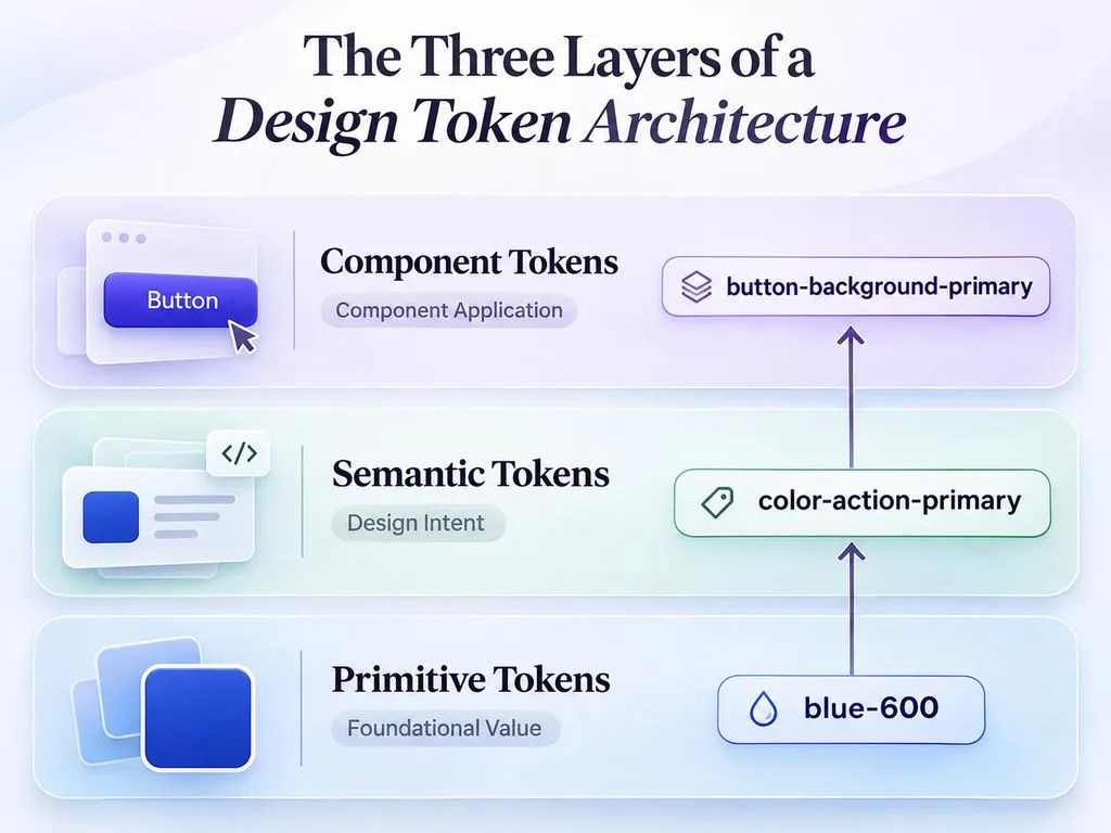
A practical token architecture can use three organizational layers.
Token Layer | Example | Purpose |
Primitive | blue-600 | Stores a foundational value |
Semantic | color-action-primary | Defines design intent |
Component | button-background-primary | Applies a value to a component |
For example, a primary button can reference a semantic color token, which maps to a primitive color. When the brand palette changes, the underlying mapping can be updated without manually changing every button.
Primitive tokens store values, semantic tokens describe intent, and component tokens apply those decisions to specific interface elements.
Not every design system requires all three layers. The architecture should reflect product complexity and the number of teams maintaining it.
Color, Typography, and Spacing Token Examples
Category | Example Token | Purpose |
Color | color-text-primary | Main text |
Color | color-background-primary | Main background |
Typography | font-size-body | Body text |
Typography | font-weight-semibold | Emphasis |
Spacing | spacing-small | Compact gaps |
Spacing | spacing-large | Larger layout gaps |
Radius | radius-medium | Component corners |
These are illustrative naming examples, not verified token values extracted from the featured brands.
How Token Naming Prevents Development Rework
Our research identified token naming and architecture as recurring implementation challenges.
One independent developer described rewriting icon variables twice while organizing a Vanilla CSS design system. The same implementation experience involved Web Components and CSS scroll-snap.
A practical solution is to establish naming conventions before the component library expands.
- Separate foundational values from semantic roles.
- Use consistent category and naming structures.
- Avoid creating multiple tokens for the same design purpose.
- Document relationships between tokens.
- Define how changes affect existing components.
Poor naming is not simply a documentation problem. It can create repeated development work and make future updates harder to manage.
Real Design System Case Studies: Six Implementation Lessons
Our research reviewed practitioner accounts involving adoption, component maintenance, design handoff, token organization, and version management.
These are individual implementation accounts, not independently audited industry statistics. Their value lies in the concrete problems they reveal and the practical lessons that design-system teams can apply.
Case 1: Design System Adoption Across Six Companies
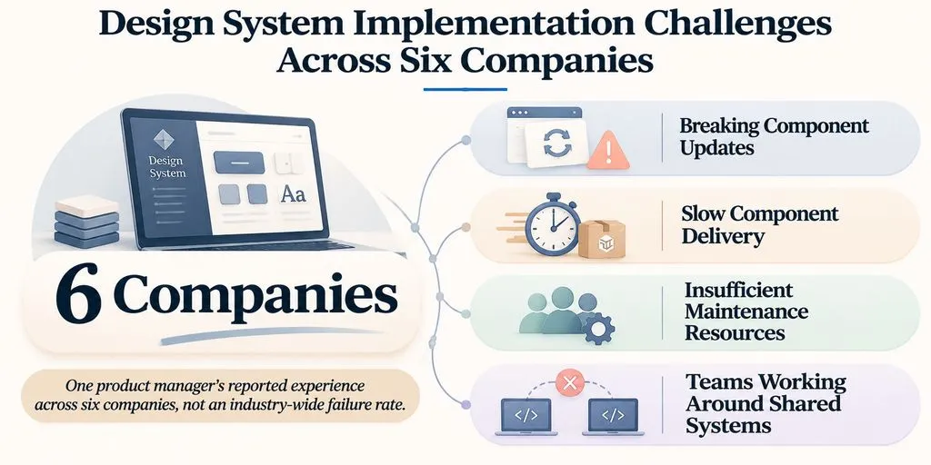
A product manager described unsuccessful design-system implementations across six companies.
The recurring problems included:
- Component updates breaking existing interfaces.
- Slow delivery of requested components.
- Insufficient maintenance resources.
- Teams working around shared systems.
What this reveals: Building a component library does not guarantee adoption. A system needs clear ownership, engineering support, change management, and ongoing maintenance.
Case 2: A Startup Team With 1–2 Designers and 1–2 Engineers
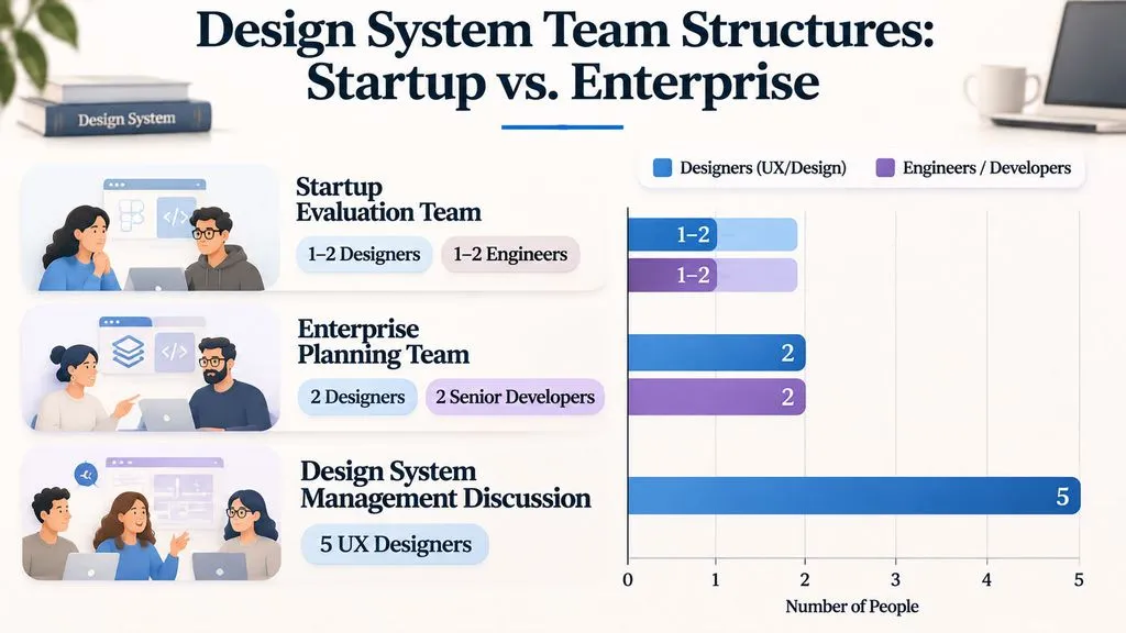
A startup-oriented design discussion involved 1–2 designers and 1–2 engineers evaluating Radix, MUI, and Material Tailwind.
The team wanted to improve an inconsistent Figma workspace. Its evaluation concerns included visual differentiation, dark-mode support, and component coverage.
What this reveals: Small teams should evaluate design flexibility, Figma resources, implementation compatibility, and maintenance requirements before adopting a large system.
The important decision is not how many components a library offers, but whether its components solve the team's actual problems.
Case 3: Figma Delivery Without Developer Adoption
An Angular-based multi-site implementation exposed a disconnect between design delivery and development.
The designer had delivered a design system, but developers continued working without adopting it. Angular and DevExpress were part of the implementation context.
The available account did not establish a completed migration or measurable adoption result.
What this reveals: Design-to-code handoff needs an acceptance process. Both teams should agree on component names, states, implementation responsibilities, and QA requirements.
Case 4: Token Architecture Rewritten Twice
An independent developer described rewriting icon variables twice while organizing a Vanilla CSS design system.
The implementation also involved Web Components and experimentation with CSS scroll-snap.
What this reveals: Token naming and architecture should be planned before the system expands. Foundational variables that are poorly organized can create repeated implementation work.
Case 5: A Nearly Two-Year Version Migration Misinterpreted
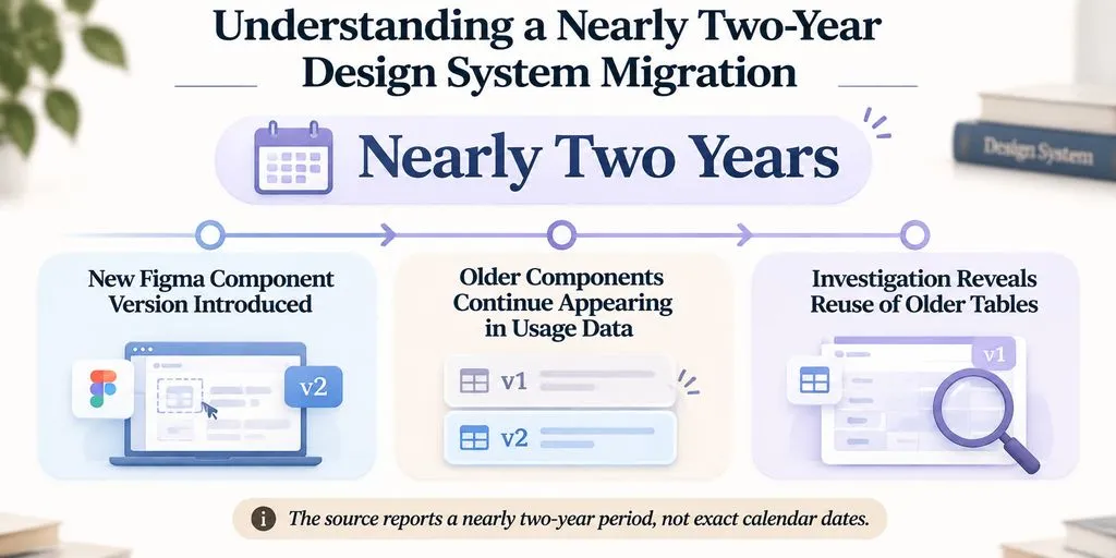
A design-system maintainer described a newer Figma component version introduced nearly two years earlier.
Older components continued appearing in usage data, initially suggesting that migration had not succeeded. Further investigation revealed that users were copying older tables rather than necessarily choosing outdated components.
What this reveals: Component usage counts need behavioral context. High usage of an older version does not automatically prove that users are rejecting migration.
Teams should investigate how components enter files and how people reuse existing assets before deciding that an adoption problem exists.
Case 6: Enterprise Design System Planning With Cross-Functional Teams
An enterprise team planned its design system with four people: two designers and two senior developers.
It considered Ant Design, Carbon, and Material as references while addressing legacy interface requirements.
A separate design-team discussion involved five UX designers exploring Figma, Tokens Studio, and Git for design-system management.
Neither account provided a verified business outcome.
What this reveals: Design-system governance is a shared responsibility. Designers, developers, and product teams need agreed processes for documentation, versioning, and component updates.
How to Choose the Right Design System for Your Team
The best design system depends on team size, product complexity, technical requirements, and maintenance resources.
Team or Project | Recommended References | Main Priority |
Early-stage startup | Material, Polaris | Essential foundations |
E-commerce SaaS | Polaris | Merchant workflows |
Enterprise application | Carbon, Ant Design | Documentation and complex components |
Developer product | Primer, React Aria | Developer usability and accessibility |
Cross-platform product | Fluent 2, Material | Adaptive foundations |
Brand-focused product | eBay Playbook, Spectrum | Visual identity and consistency |
Before adopting a system, evaluate five areas:
- Component coverage: Does it support your actual product workflows?
- Token architecture: Can colors, spacing, and themes be maintained consistently?
- Design-to-code alignment: Can Figma components map clearly to production implementations?
- Accessibility: Are keyboard interactions and component states documented?
- Governance: Does someone own updates, documentation, and maintenance?
A smaller, well-maintained system is often more useful than an extensive library that nobody consistently adopts.
Frequently Asked Questions
What are the best design system examples?
Material Design, Shopify Polaris, IBM Carbon, Atlassian, and Microsoft Fluent 2 are useful references. Each demonstrates different approaches to visual foundations, component organization, documentation, and cross-platform consistency.
What is the difference between design tokens and UI components?
Design tokens define reusable values such as colors, typography, and spacing. UI components are interface elements that use those values, including buttons, cards, forms, and navigation. Tokens establish shared foundations, while components apply them to product interfaces.
Should startups build or adopt a design system?
Startups should evaluate existing systems before building everything from scratch. A small team can begin with essential components and customized tokens, then expand as product requirements and engineering resources grow.
How do you measure design system adoption?
Measure component usage, implementation consistency, migration progress, developer feedback, and maintenance quality. Interpret usage data carefully because older components may remain in files due to copying behavior rather than deliberate rejection of newer versions.
Conclusion
The best design system examples offer more than reusable UI components. Material demonstrates visual foundations, Polaris provides workflow-oriented patterns, and Carbon illustrates documentation and enterprise organization. The other examples offer valuable lessons in branding, accessibility, developer experience, and component architecture. Our research also highlights a critical implementation lesson: token architecture, developer adoption, version management, and clear ownership determine whether a design system remains useful over time. Study established systems, select the patterns your product actually needs, and build a maintainable foundation that connects design decisions with production code.