
Native 2K, 4K Available
Standard output at 2K, with 4K on hand for print and large crops.
OpenAI's GPT Image 2.0 reads a hundred-word brief and attempts all of it, with independent quality and resolution controls from 1K to 4K.
데스크톱 브라우저에서 이 페이지를 열어 창작을 시작하세요.
GPT Image 2 is OpenAI's image model, and its defining behaviour is that a long instruction does not get averaged into a general impression.
Most models degrade as a brief gets longer. Add a fifth requirement and the second one quietly disappears; specify eight objects and you get six. GPT Image 2 was built to hold multi-part constraints together, with OpenAI quoting instruction-following accuracy at around 98 percent, and it renders text at close to character-level precision rather than approximating letterforms.
Use GPT Image 2 when the picture has requirements rather than a vibe. Build regulated packaging comps, spec-driven product imagery, annotated layouts, multi-object still lifes, and anything where a reviewer will check the output against a list.
GPT Image 2 is an AI image generation model developed by OpenAI, the successor to GPT Image 1.5 and GPT Image 1 and the model behind image generation in ChatGPT. Virse exposes it directly, with the quality and resolution controls the chat interface keeps hidden.
The model is built around three major strengths:
GPT Image 2 runs on an autoregressive architecture rather than the diffusion approach most of its peers use, which OpenAI credits for generation three to five times faster than the previous version. Native output is 2K with 4K available, aspect ratios run from 3:1 to 1:3, and rendering quality is selectable at Low, Medium, or High independently of size.
Standard output at 2K, with 4K on hand for print and large crops.
Low, Medium, and High, chosen separately from output size.
1K, 2K, 3K, and 4K, each available at every quality grade.
Multi-part briefs come back with the parts intact.
Wide panoramas through tall verticals from the same brief.
A different generation approach from diffusion, credited with a 3–5x speed gain.
Because the model holds many constraints at once, detail you write is detail you get. A hundred-word specification is not wasted effort here the way it is on models that summarise your intent before generating.
Two controls rather than one means a large draft and a small final are both possible. Most models tie fidelity to output size and leave you no way to separate them.
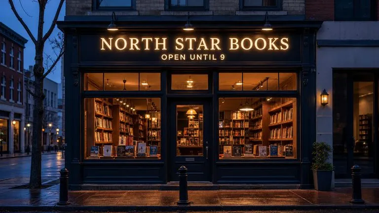
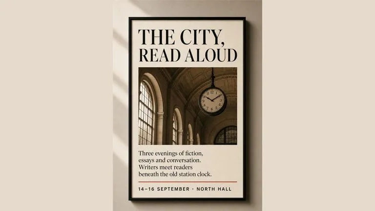
Headlines, labels, and signage come back readable rather than approximated, which puts this among the strongest models here for images that contain words.
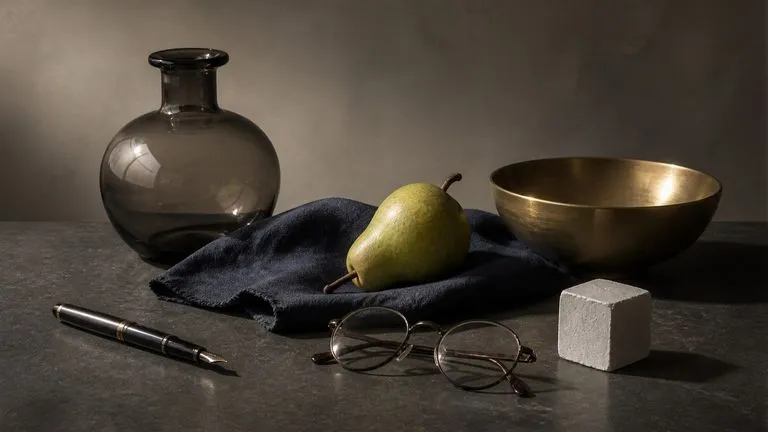
Compositions where several objects must relate correctly — sitting on surfaces, casting matching shadows, sharing one light direction — hold together rather than drifting into physical nonsense.
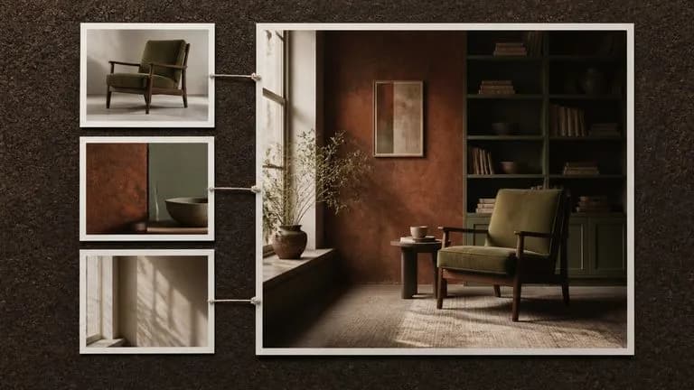
Supply pictures alongside the prompt and the model works from them, preserving what you name and changing what you ask for.
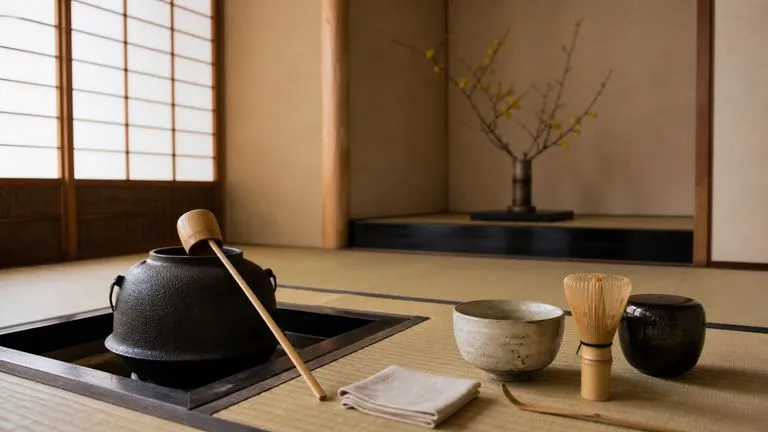
The model draws on the same underlying knowledge as its text siblings, which shows in how it handles real objects, contexts, and conventions without being described from scratch.
Briefs with fixed requirements rarely arrive finished. They get assembled from a spec sheet, a brand guide, a reference photo, and three rounds of feedback. Virse keeps that material next to the output. The brief, the references it came from, and every generation against it stay on one canvas, so checking a result against its requirements does not mean opening a second window.
Park the requirement list on the canvas next to the image so review happens against the source rather than from memory.
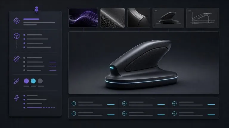
Settle composition at the Low grade, then re-run the identical brief at Medium or High once the content is agreed.
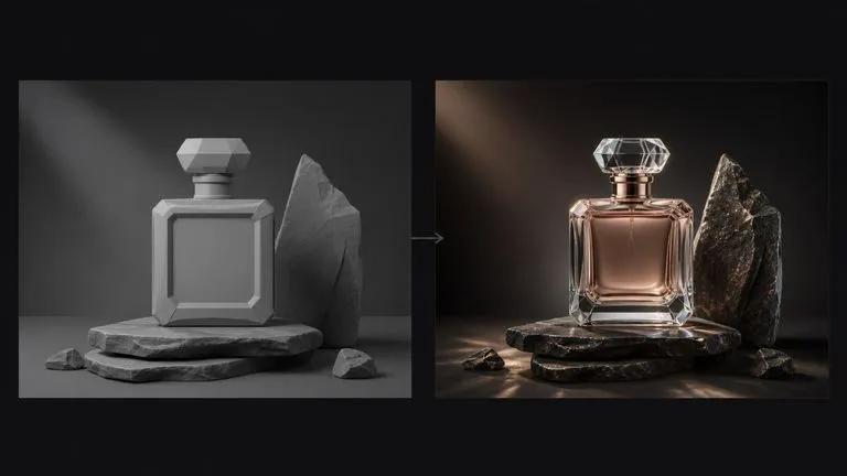
Move between GPT Image 2 and 30+ other image and video models without leaving the canvas or rewriting the brief.
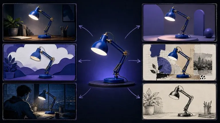
Each round of feedback produces a new generation beside the last, so the trail from first draft to approved asset stays intact.
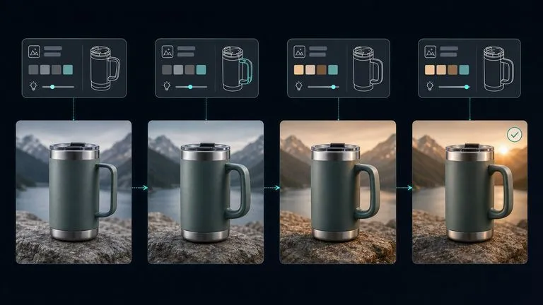
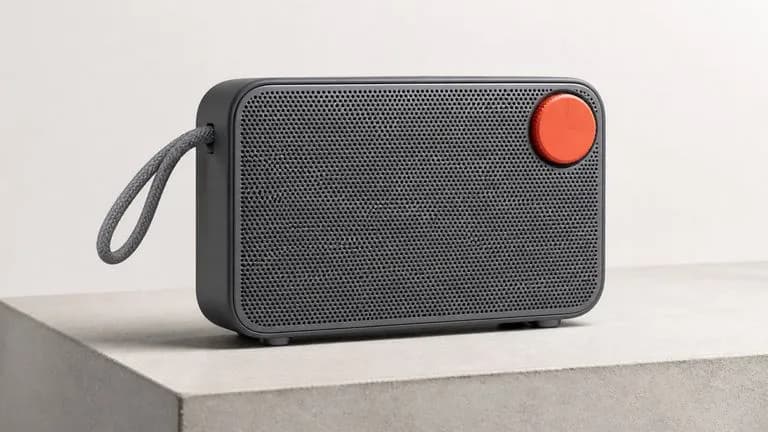
Renders that must match a written specification down to arrangement and finish.
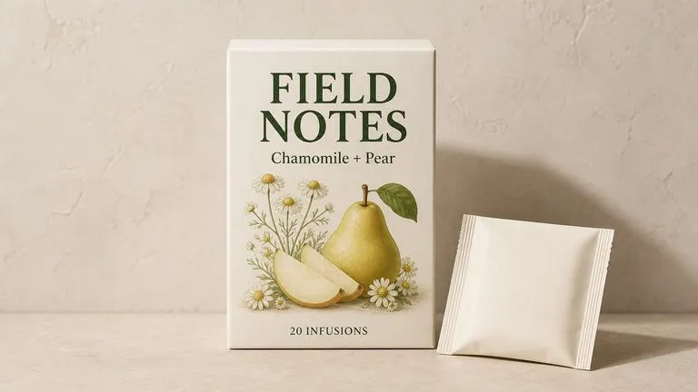
Front-of-pack layouts carrying exact product names, descriptors, and legally required copy.
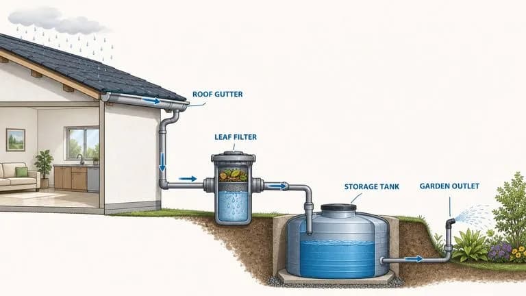
Cross-sections and explanatory graphics whose labels have to be correct, not decorative.
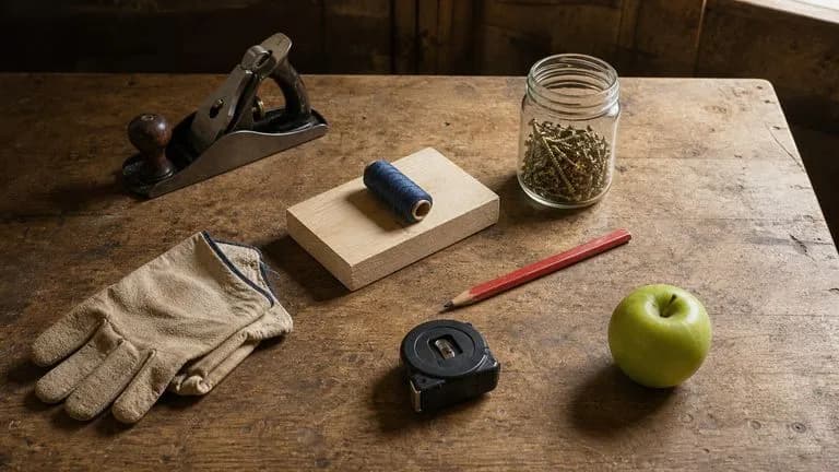
Arrangements where each item's position, scale, and shadow are specified.
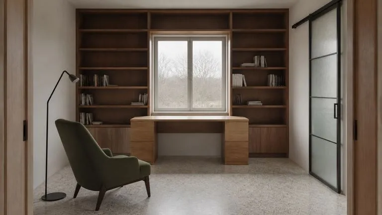
Spaces built to a described plan rather than an approximate mood.
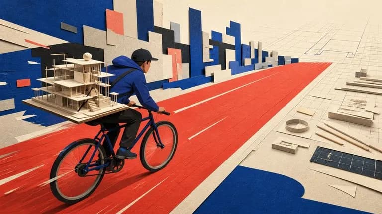
Concept imagery for articles where the brief carries several ideas at once.
Start at the lowest grade while you are still deciding what the picture should contain.
List every element, its position, and anything that must be exactly so. Length is an advantage here.
Compare item by item rather than by overall impression, then add the clause for anything missing.
Take the working brief up to Medium or High at your target size, unchanged.
A useful GPT Image 2 prompt usually includes five elements:
이렇게 쓰는 대신
A cozy reading nook, warm and inviting, beautiful natural light.
이렇게 쓰세요
A window seat built into a bay window, upholstered in faded green velvet, with three mismatched cushions pushed against the left side. A hardback book lies open face-down on the seat. Late afternoon sun enters from the right at a low angle, casting the window frame's shadow across the cushions. Beyond the glass, an out-of-focus garden. Shot straight on from two metres back, the seat filling the lower two-thirds of the frame.
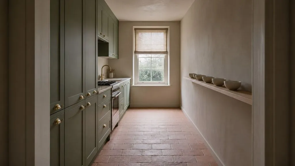
A narrow galley kitchen photographed from the doorway, straight on, at eye level. Cabinets in matte sage green with brass cup handles along the left wall. Open shelving on the right holding six white ceramic bowls in a single row. A window at the far end with the blind halfway down. Overcast daylight from the window only, no artificial light, soft shadows. The floor is unglazed terracotta tile laid in a running bond pattern.
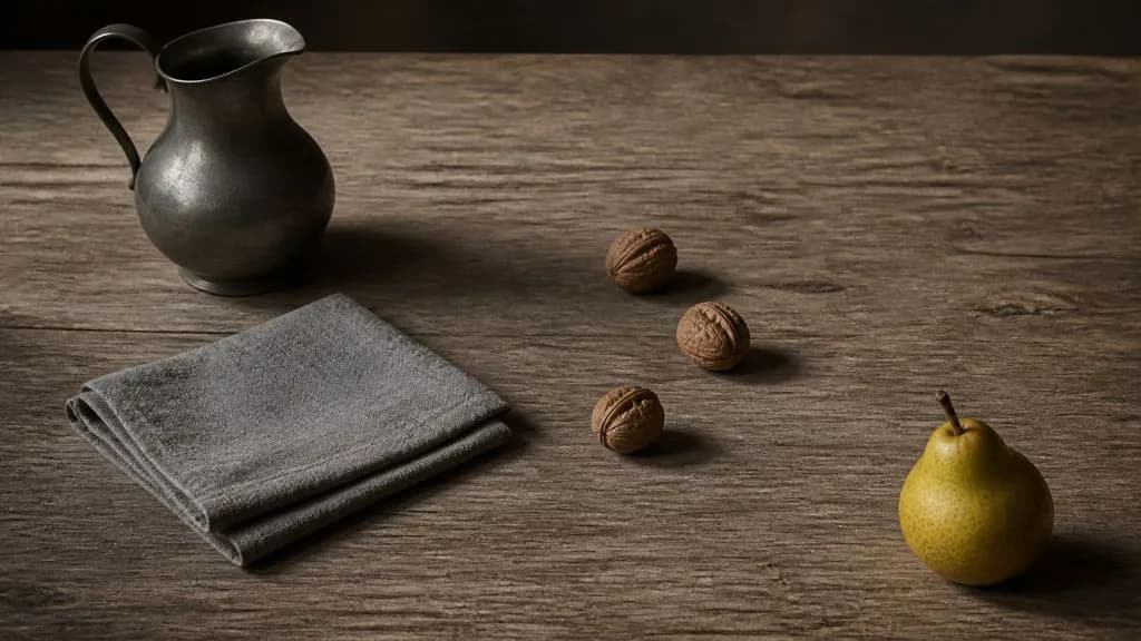
Four objects arranged on a weathered oak table, photographed from 45 degrees above. A pewter jug at the back left, a folded grey linen cloth in front of it, three walnuts scattered to the right of the cloth, and a single pear at the front right corner. Each object casts a shadow consistent with one light source from the upper left. The walnuts sit slightly apart, none touching. Muted palette, restrained contrast, visible wood grain running left to right.
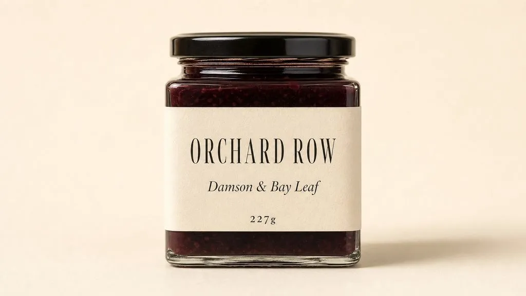
A rectangular jar of preserves photographed straight on against a plain cream background. The front label reads ORCHARD ROW in a narrow serif across the top third, with "Damson & Bay Leaf" beneath it in italic at half the size, and "227g" in small caps at the bottom edge. Warm even light from the front left, one soft shadow to the right of the jar. Label occupies the middle 60 percent of the jar's height, with equal margins either side.
| 비교 항목 | GPT Image 1 | GPT Image 1.5 | GPT Image 2 |
|---|---|---|---|
| Quality control | None | None | Low / Medium / High |
| Resolution control | None | None | 1K / 2K / 3K / 4K |
| Architecture | Diffusion-era | Diffusion-era | Autoregressive |
| Generation speed | Baseline | Baseline | 3–5x faster than predecessor |
| Text rendering | Approximate | Improved | Near character-level |
| Still worth using for | Matching an existing asset set | Matching an existing asset set | All new work |
This is the rare model where a longer brief returns a better image. Detail you leave out is detail the model chooses for you.
"A jug at the back left" is actionable. "A jug" leaves placement to chance, and placement is usually what the review comments are about.
Words that should appear in the image have to appear in the prompt. Described text becomes invented text.
Quality changes how well the picture is rendered; size changes how large it is. Changing both at once makes it impossible to tell which produced the difference.
Explore focused tools for creating, editing, and preparing design assets.
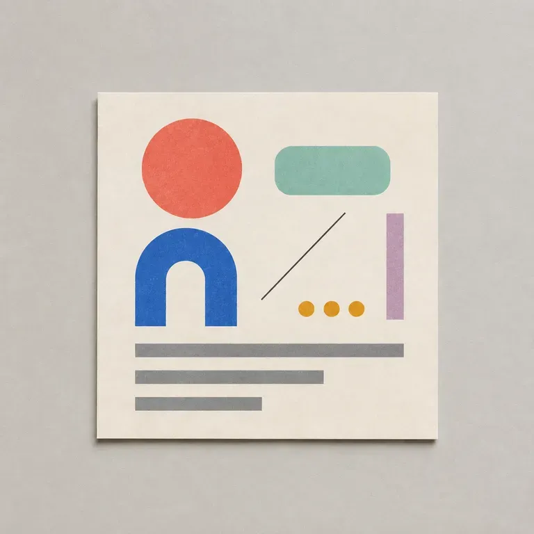
대부분의 디자인 프롬프트는 지루해 보이는 세부 사항에서 실패합니다. 잘못된 화면 비율, 빠진 브랜드 색상, 어떤 텍스트가 어디에 들어가야 하는지에 대한 언급 없음 등이죠. 목표, 대상, 형식, 제약 조건을 나열하면, 이미지 모델이 실제로 이 모든 것을 놓치지 않도록 구조화된 프롬프트를 작성해 드립니다. 무료 Virse 크레딧으로 시작할 수 있습니다.
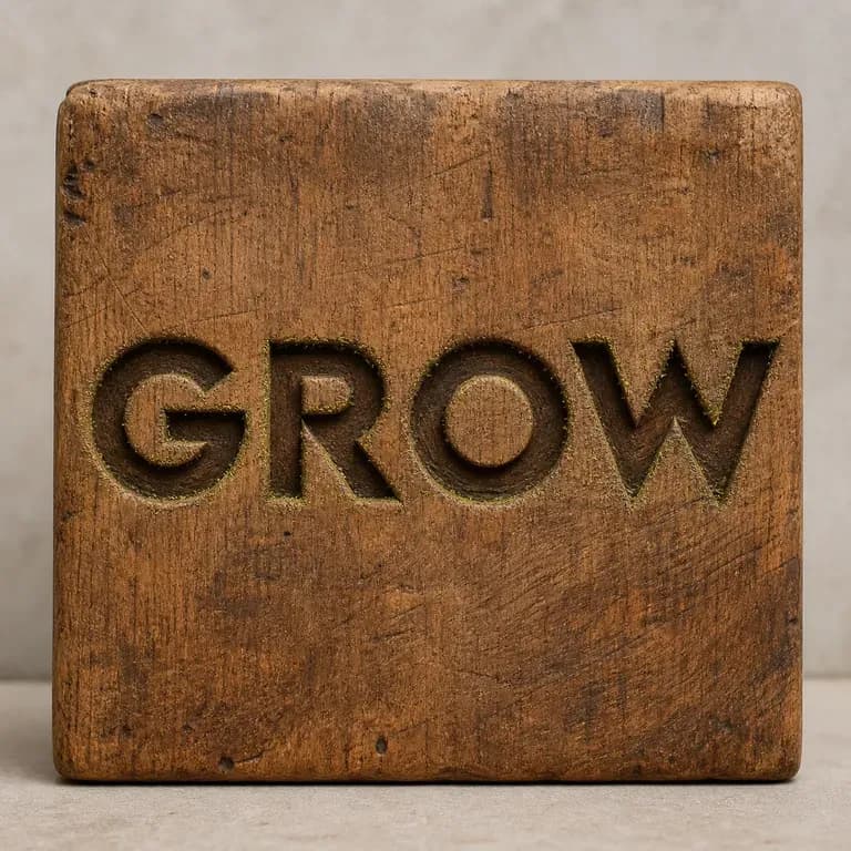
나무에 새겨진 글자는 액체 금속으로 주조된 글자와 빛 아래에서 다르게 반응하며, 하나의 프롬프트가 우연히 둘 다 정확히 구현해 내기는 어렵습니다. 텍스트를 입력하고 소재를 지정하면, 문구는 그대로 유지하면서 해당 소재가 실제로 빛을 어떻게 받아야 하는지 계산한 효과를 받아볼 수 있습니다. 무료 크레딧으로 첫 번째 버전을 만들어 보세요.
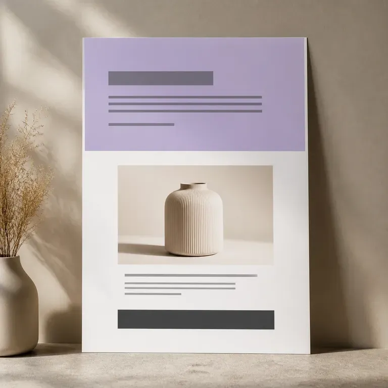
끝내 제작되지 않을 페이지라면 개발자의 일주일을 쓸 필요가 없습니다. 제품 사진과 판매 포인트를 업로드하면, 누군가 페이지 빌더를 건드리기 전에 히어로 샷, 혜택 블록, 마무리 오퍼까지 한 번의 스크롤에 담긴 전체 페이지 비주얼을 확인할 수 있으며, 첫 버전은 무료입니다.
Generate studio-grade 4K images with Nano Banana Pro, blending multiple references while holding characters, products, and typography consistent.
Alibaba's Qwen Image 3.0 Pro renders type as language across a dozen scripts, holding legibility down to ten pixels in dense layouts.
Reve AI's second-generation model builds an addressable layout of positioned elements before it renders, so a specified arrangement comes back arranged.
Write the requirement list, hand the whole thing over, and review the result against the list rather than against a feeling.