Font Pairing: 25 Combinations That Work and Why
Vincent13 min read ·
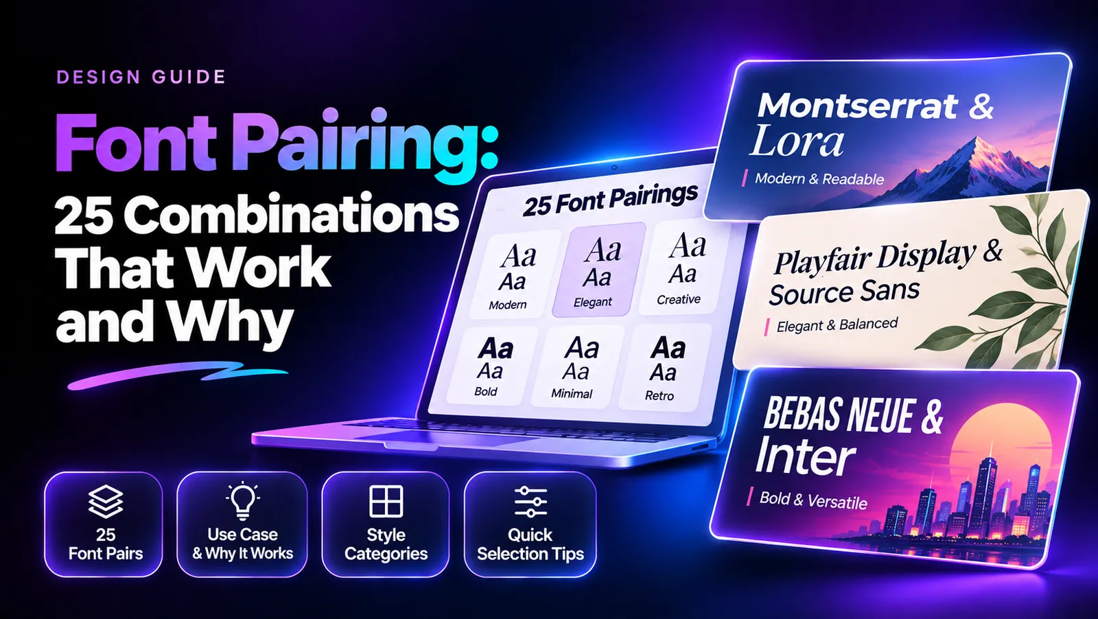
Font pairing is the process of combining two typefaces to create a balanced, readable, and visually consistent design. The best combinations give each font a distinct role, typically using one for headings and another for body text. Successful pairings balance contrast, x-height, proportions, and visual weight without making the typography feel disconnected.
Finding that balance is harder than it looks. Two fonts may look beautiful individually but clash when placed together, while overly similar typefaces can make headings and body text difficult to distinguish. Whether you're designing a website, building a brand identity, or creating an editorial layout, choosing the wrong combination can weaken the entire visual presentation.
Once you've found a font pairing that fits your direction, bring the rest of your design to life with Virse. Its Infinite Canvas lets you explore ideas freely, work with multiple AI models in one creative workspace, and use reference images to guide your designs. You can refine backgrounds, lighting, and composition while experimenting with different visual directions, making it easier to turn a typography concept into a cohesive, polished design. This connected approach also supports a more flexible AI design workflow.
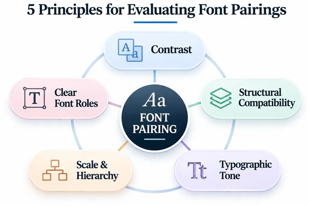
What Makes a Good Font Pairing? 5 Principles Behind Effective Typography
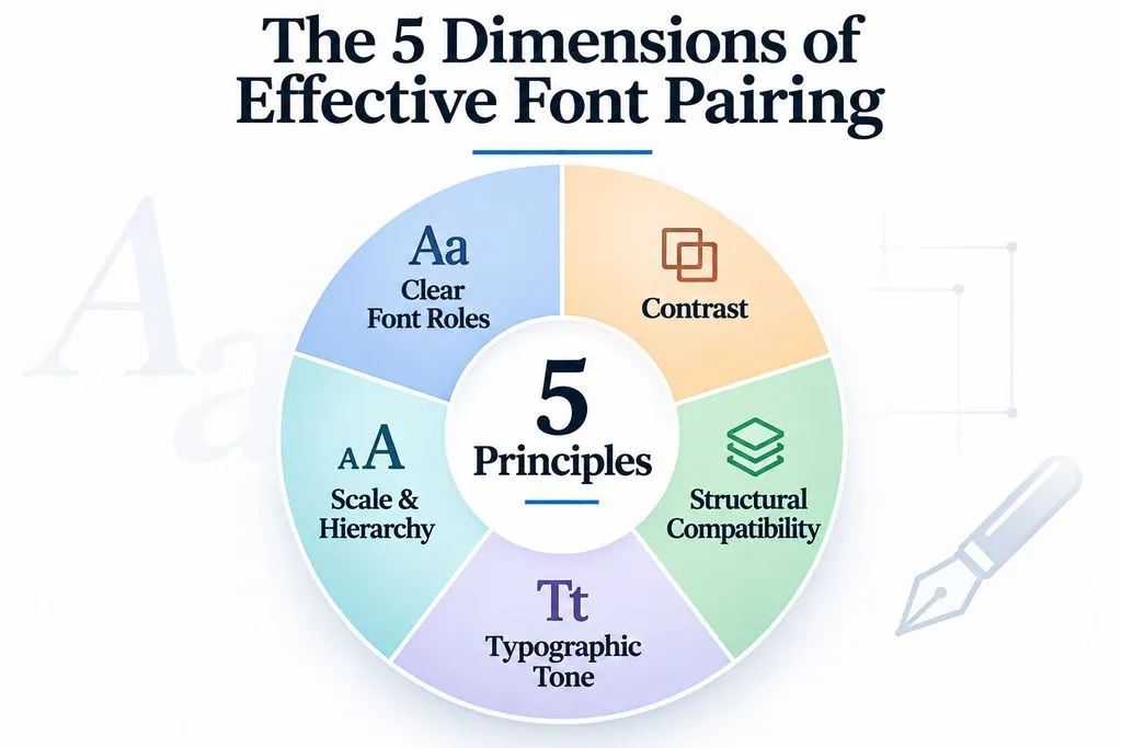
A good font pairing balances contrast, consistency, readability, visual personality, and hierarchy. Instead of choosing fonts based only on appearance, evaluate how their structural characteristics interact within the same design.
Contrast Without Clashing
Contrast helps readers distinguish headings from supporting content. A serif headline paired with a sans-serif body font is a familiar approach because the two styles create an immediate visual distinction.
For example, Playfair Display + Montserrat combines expressive serif letterforms with a geometric sans-serif structure. The result gives headlines an editorial personality while keeping supporting content visually straightforward.
However, contrast does not require mixing different font classifications. Two sans-serif fonts can work when their width, weight, or proportions create sufficiently distinct roles.
Compare x-Height, Letter Width, and Visual Weight
Three structural characteristics deserve particular attention:
- x-Height: The height of lowercase letters relative to uppercase letters, influencing perceived size and visual consistency.
- Letter Width: Condensed and wide fonts create different visual rhythms.
- Stroke Weight: Differences in thickness help establish hierarchy.
For example, pairing a condensed display font with a wider body font can create a clear distinction. However, if the headline becomes excessively narrow or heavy, it may overwhelm the supporting text.
Practical tip: Compare both fonts at their intended sizes instead of judging them only through isolated alphabet samples.
Consider Typographic Tone and Brand Personality
Fonts communicate personality beyond their technical classifications.
- Elegant: High-contrast serifs such as Bodoni Moda.
- Traditional: Serif families such as EB Garamond.
- Modern: Geometric sans-serifs such as Montserrat.
- Technical: Functional sans-serifs such as IBM Plex Sans.
- Friendly: Rounded styles such as Nunito Sans.
- Expressive: Display fonts such as Syne.
A luxury fashion website and a technology platform may both need strong headings, but their typography should communicate different personalities.
The goal is to select fonts that support the same brand identity without looking identical.
Balance Font Size, Scale, and Hierarchy
Even compatible typefaces can look unbalanced when their sizes and weights are poorly chosen.
Consider how the combination works across H1, H2, H3, body text, buttons, and captions. A large display heading may need a restrained body font, while a smaller heading may benefit from stronger weight contrast.
The relationship between fonts matters as much as the fonts themselves.
Give Every Font a Clear Role
A typography system should assign responsibilities rather than use different fonts simply for decoration.
Element | Recommended Role |
H1 | Distinctive display typography |
H2 and H3 | Clear structural hierarchy |
Body | Comfortable long-form reading |
Buttons | Legible interface typography |
Captions | Visually secondary information |
If one font family already offers enough weights and styles, introducing another typeface may be unnecessary.
A consistent approach to typography also contributes to a maintainable design system.
25 Best Font Pairings for Websites, Branding, and Editorial Design
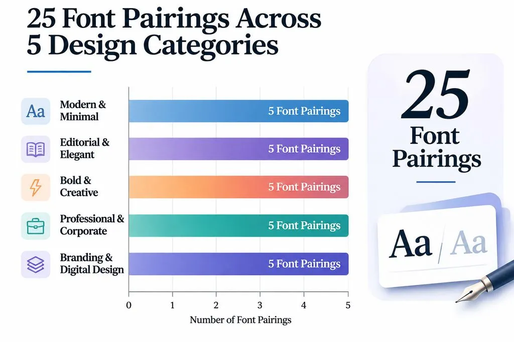
The following combinations are curated design recommendations, organized by visual personality and application. Each explains its intended roles, why the combination works, and what to consider before using it. They are not ranked by popularity or presented as results of a controlled typography experiment.
Modern and Minimal Font Pairings
- Figtree + Crimson Pro
- Heading: Figtree
- Body: Crimson Pro
- Best for: Modern websites and portfolios.
- Why it works: Contemporary sans-serif headings contrast with traditional serif body typography.
- Watch out for: The serif body font may introduce too much formality into technical interfaces.
- Rubik + Karla
- Heading: Rubik
- Body: Karla
- Best for: Digital products and approachable brands.
- Why it works: Both are sans-serif fonts, but their different proportions create subtle hierarchy.
- Watch out for: Similar weights may weaken the visual distinction.
- DM Serif Display + DM Sans
- Heading: DM Serif Display
- Body: DM Sans
- Best for: Creative agencies and landing pages.
- Why it works: Expressive serif headlines contrast with clean supporting typography.
- Watch out for: Large headings can dominate compact layouts.
- Space Grotesk + Inter
- Heading: Space Grotesk
- Body: Inter
- Best for: Technology brands and SaaS websites.
- Why it works: Space Grotesk introduces personality, while Inter provides a restrained interface foundation.
- Watch out for: Avoid competing geometric elements.
- Outfit + Nunito Sans
- Heading: Outfit
- Body: Nunito Sans
- Best for: Educational platforms and consumer-facing products.
- Why it works: Their rounded, contemporary characteristics create a friendly visual system.
- Watch out for: Use differences in weight and size to establish hierarchy.
Editorial and Elegant Font Pairings
- Playfair Display + Montserrat
- Heading: Playfair Display
- Body: Montserrat
- Best for: Fashion, lifestyle, and editorial websites.
- Why it works: Expressive serif headlines contrast with geometric supporting text.
- Watch out for: The combination is familiar and may need distinctive branding.
- Cormorant Garamond + Lato
- Heading: Cormorant Garamond
- Body: Lato
- Best for: Luxury branding and wedding websites.
- Why it works: Delicate serif letterforms contrast with approachable sans-serif typography.
- Watch out for: Thin styles may lose clarity at small sizes.
- Libre Baskerville + Open Sans
- Heading: Libre Baskerville
- Body: Open Sans
- Best for: Professional publications and business websites.
- Why it works: Traditional serif typography establishes an editorial tone, while Open Sans supports digital reading.
- Watch out for: The combination may feel conservative without distinctive visual elements.
- EB Garamond + IBM Plex Sans
- Heading: EB Garamond
- Body: IBM Plex Sans
- Best for: Academic and technical publications.
- Why it works: Classical typography balances contemporary technical styling.
- Watch out for: Keep decorative elements restrained.
- Bodoni Moda + Raleway
- Heading: Bodoni Moda
- Body: Raleway
- Best for: Fashion campaigns and premium portfolios.
- Why it works: High-contrast serif headlines create a refined visual identity.
- Watch out for: Bodoni-style fonts are unsuitable for small, extended body text.
Bold and Creative Font Pairings
- Oswald + Source Sans 3
- Heading: Oswald
- Body: Source Sans 3
- Best for: Posters, promotional graphics, and editorial headlines.
- Why it works: Condensed headlines create emphasis while the supporting font maintains readability.
- Watch out for: Long headlines can become difficult to scan when excessively condensed.
- Bebas Neue + Lato
- Heading: Bebas Neue
- Body: Lato
- Best for: Sports graphics and promotional campaigns.
- Why it works: Strong uppercase display typography creates a focal point, balanced by a neutral body font.
- Watch out for: Reserve Bebas Neue for short display text.
- Archivo Black + Inter
- Heading: Archivo Black
- Body: Inter
- Best for: Creative agencies and marketing websites.
- Why it works: Heavy headlines create a strong visual anchor, while Inter provides a practical supporting structure.
- Watch out for: Bold headings need sufficient whitespace.
- Syne + Inter
- Heading: Syne
- Body: Inter
- Best for: Experimental portfolios and creative studios.
- Why it works: Syne brings distinctive geometric personality, while Inter keeps supporting content restrained.
- Watch out for: Avoid competing decorative elements.
- Barlow Condensed + Nunito Sans
- Heading: Barlow Condensed
- Body: Nunito Sans
- Best for: Sports and entertainment websites.
- Why it works: Condensed headings create energy, while rounded supporting typography feels approachable.
- Watch out for: The softer body style may not suit formal brands.
Professional and Corporate Font Pairings
- Montserrat + Open Sans
- Heading: Montserrat
- Body: Open Sans
- Best for: Corporate websites and business presentations.
- Why it works: Geometric headlines create distinction while Open Sans supports content-heavy layouts.
- Watch out for: Both fonts are familiar choices, so additional brand elements may be needed.
- Source Sans 3 + Source Serif 4
- Heading: Source Sans 3
- Body: Source Serif 4
- Best for: Professional publications and business documents.
- Why it works: Their related design characteristics create consistency while preserving a serif-and-sans distinction.
- Watch out for: The contrast is more restrained than in unrelated font families.
- Roboto Slab + Roboto
- Heading: Roboto Slab
- Body: Roboto
- Best for: Technical documentation and business websites.
- Why it works: Related structures create a consistent typography system.
- Watch out for: Similar proportions can weaken hierarchy if the weights are too close.
- Prata + Inter
- Heading: Prata
- Body: Inter
- Best for: Premium product websites.
- Why it works: Expressive serif headlines contrast with neutral digital typography.
- Watch out for: The formal appearance may not fit playful brands.
- Vollkorn + Inter
- Heading: Vollkorn
- Body: Inter
- Best for: Research publications and long-form content.
- Why it works: Traditional serif character complements contemporary sans-serif typography.
- Watch out for: Test the actual weights and paragraph density before implementation.
Versatile Font Pairings for Branding and Digital Design
- Playfair Display + Lato
- Heading: Playfair Display
- Body: Lato
- Best for: Editorial designs and lifestyle brands.
- Why it works: Expressive serif headlines contrast with friendly, readable sans-serif text.
- Watch out for: Avoid using delicate display styles for small text.
- Orpheus Pro + Raleway
- Heading: Orpheus Pro
- Body: Raleway
- Best for: Luxury branding and creative portfolios.
- Why it works: The expressive display serif creates a distinctive headline style, while Raleway provides a lighter supporting structure.
- Watch out for: Verify licensing and availability before commercial use.
- Gotham + Caslon
- Heading: Gotham
- Body: Caslon
- Best for: Corporate editorial design and established brands.
- Why it works: Geometric sans-serif headlines contrast with traditional serif typography.
- Watch out for: Check licensing and available font weights.
- Figtree + Montagu Slab
- Heading: Montagu Slab
- Body: Figtree
- Best for: Technology blogs and modern publications.
- Why it works: Slab-serif headings provide character while Figtree keeps supporting content clean.
- Watch out for: The slab style can become visually dominant.
- Lora + Open Sans
- Heading: Lora
- Body: Open Sans
- Best for: Educational websites and professional blogs.
- Why it works: Lora provides editorial character without excessive decoration.
- Watch out for: The combination may need additional visual differentiation for distinctive branding.
Font verification note: These combinations are curated recommendations, not independently tested results. Before commercial use, verify the exact font family, available weights, licensing conditions, and language coverage. A font's availability in a preview tool does not automatically establish permission for every commercial application.
How to Choose the Right Font Pairing: 3 Practical Design Case Studies
A font combination should be evaluated according to its intended use. Our review of documented typography discussions highlights three useful decisions: whether one font is enough, how to balance familiarity and originality, and why physical layout testing matters.
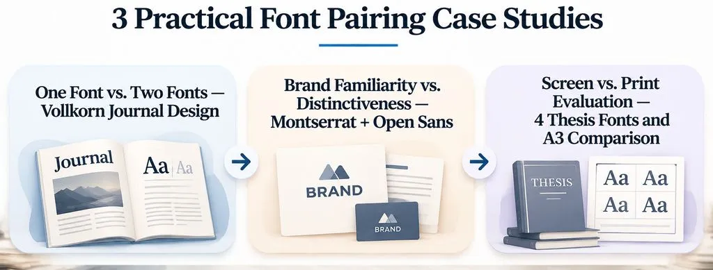
Case Study 1: Can One Font Family Replace Two?
A journal-design discussion explored using Vollkorn throughout an entire publication.
The proposed approach was to establish hierarchy through:
- Different font weights.
- Changes in font size.
- Letter spacing.
- Optical sizing where supported.
The design lesson is straightforward: a second typeface is not essential when one family already provides enough variation.
For simple publications and restrained brand systems, a single family can also reduce the complexity of maintaining consistent typography.
This is a documented design discussion, not a controlled comparison of one-font and two-font publications.
Case Study 2: Montserrat + Open Sans and the Problem of Generic Branding
Our research identified Montserrat + Open Sans as a corporate font combination that prompted different opinions about its visual personality.
The combination is practical, but familiarity introduces a separate branding question: does the typography communicate a distinctive identity?
Consider the trade-off:
- Familiar typefaces can make a brand feel accessible.
- Distinctive combinations can provide more recognizable visual character.
- Neither automatically guarantees stronger brand recognition.
The decision should reflect the wider brand guidelines, not just the font names.
Case Study 3: Why an A3 Print Test Matters
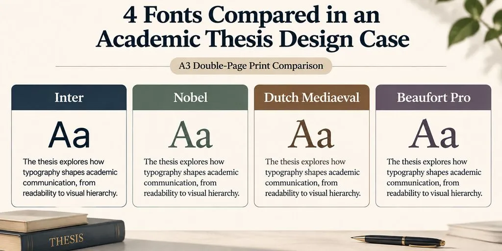
One of the most useful documented examples involved a master's thesis author comparing four typefaces:
- Inter
- Nobel
- Dutch Mediaeval
- Beaufort Pro
The author also used A3 double-page print comparisons to evaluate the typography. Despite examining several candidates and physical output, choosing a final font remained difficult.
This case highlights why isolated font previews are insufficient.
A typeface can look attractive in a short sample but behave differently when applied to actual paragraphs, headings, and full pages.
Practical takeaway: Compare fonts in the complete document and at the intended output size before making a final decision.
How to Test Font Pairings and Choose the Right Font Pairing Tools
A reliable font pairing workflow should include actual content, multiple screen sizes, and the final output environment.
Preview Real Content Instead of Alphabet Samples
Create a representative layout containing:
- One main headline.
- Several subheadings.
- A realistic body paragraph.
- Buttons and navigation.
- Captions and supporting information.
Compare the fonts at their intended sizes and weights. Look for inconsistent visual density, awkward line breaks, and headings that overpower the content.
Test Print, PDF, and Digital Layouts
Our research into academic and editorial typography highlights why screen previews alone may be insufficient.
For print-oriented projects, export the layout and inspect it at the intended page size. An A3 double-page comparison can help reveal differences in page rhythm, heading prominence, and paragraph density.
For websites, repeat the test on desktop and mobile layouts.
Choose Font Pairing Tools That Support Your Own Fonts
A recurring issue in our review of font preview questions is the difference between browsing online font libraries and previewing locally installed typefaces.
Google Fonts and font discovery platforms can help explore combinations, but their available libraries and features differ.
Before selecting a font pairing tool, verify:
- Whether local font uploads are supported.
- Whether custom sample text can be entered.
- Whether heading and body roles can be previewed.
- Whether different weights can be adjusted.
- Whether the tool supports saving or exporting combinations.
- Whether it is currently accessible and functional.
A tool that only displays fonts from its own directory may not meet the needs of designers working with purchased fonts or existing brand assets.
FAQ:
What are the best font pairings?
Playfair Display + Montserrat, DM Serif Display + DM Sans, Figtree + Crimson Pro, and Source Sans 3 + Source Serif 4 are useful starting points. The best choice depends on the project's personality, content length, and intended reading environment.
Can you pair two serif fonts together?
Yes. Two serif fonts can work when they have different visual characteristics and clearly defined roles. A display serif can handle headlines while a more restrained serif supports longer reading. Contrast and hierarchy matter more than following a strict serif-versus-sans rule.
Do you need two fonts for a website?
No. One versatile font family can establish hierarchy through different weights, sizes, spacing, and styles. Introduce another typeface only when it creates a meaningful visual or functional benefit.
How do you know if two fonts work together?
Compare their x-height, letter width, visual weight, and overall personality in a real layout. Test headlines, paragraphs, buttons, and smaller text. A successful combination should create clear hierarchy without sacrificing readability.
Conclusion
Effective font pairing is about creating a consistent relationship between typefaces, not simply choosing two attractive fonts. The strongest combinations balance contrast, readability, proportion, typographic personality, and clearly defined roles. Whether you choose a traditional serif-and-sans pairing, two related typefaces, or one versatile font family, evaluate the result using real content and the final output environment. A good typography system should make a design easier to read, recognize, and maintain.