30 Design Portfolio Examples That Inspire and What Makes Them Work
 Yifan Zhao21 分钟阅读 ·
The best design portfolio examples do more than look impressive. They show what a designer is good at, make projects easy to explore, and give a prospective employer or client a reason to start a conversation. Whether you specialize in graphic design, branding, or UX/UI, a strong portfolio might use a restrained image grid, a detailed case study, or a highly personal visual identity. The right approach depends on the work and the people you want to reach.
But when you are building your first portfolio—or editing years of work into a focused collection—it is hard to know what to copy and what to avoid. How many projects are enough? Should the homepage show polished mockups or explain your process? And how do you choose the right design layout while making coursework or self-initiated projects feel credible without pretending they were paid commissions?
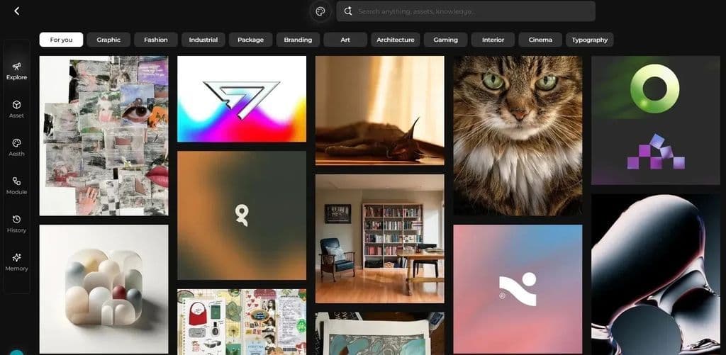
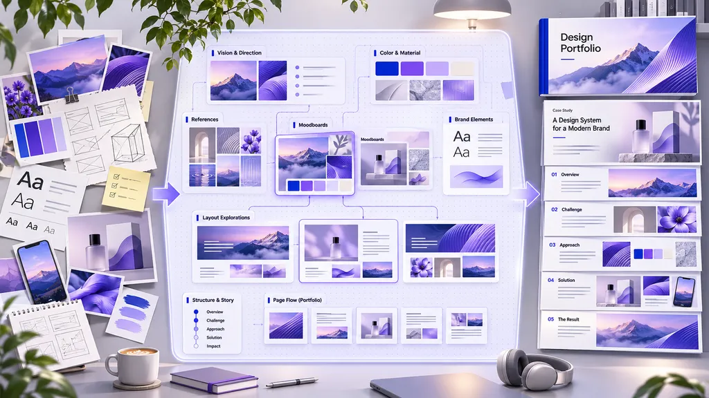
This guide explores 30 real design portfolios, from graphic design and branding to UX/UI and early-career work, with a practical lesson from each. Once you have selected your strongest projects, Virse's Design Portfolio Generator can help turn your images, project notes, and role descriptions into alternative portfolio layouts. Its Infinite Canvas keeps references and layout iterations together, so you can compare directions before developing the final presentation.
How We Selected These Design Portfolio Examples
We selected these examples for a specific lesson a working designer can apply, rather than ranking them by aesthetics or claiming that their owners got hired because of a particular website layout. The shortlist considers four practical criteria: clarity (can visitors identify the discipline and project?), evidence (does the work show a role, brief, process, or outcome when relevant?), navigation (can someone find projects and contact information?), and distinctiveness (does the presentation reflect the designer's practice?).
The examples cover different career stages and disciplines, so there is no universal winner. A book-cover gallery and a healthcare UX case study solve different communication problems. Our observations draw on publicly described portfolio features and the linked portfolio websites; they are editorial assessments, not hiring-performance tests. Page layouts and availability can change, so review the live projects before applying a particular treatment.
Best Design Portfolio Examples at a Glance
Portfolio | Specialty | Best lesson |
|---|---|---|
Portfolio | Specialty | Best lesson |
Mackey Saturday | Brand identity | Start with the problem |
Jessica Hische | Lettering and branding | Make services easy to find |
Linda Huang | Book covers | Let the work lead |
Bráulio Amado | Posters and music art | Develop a recognizable voice |
Kelli Anderson | Print and interaction | Explain inventive projects |
Elizabeth Goodspeed | Editorial and identity | Write readable case studies |
Daniel Brokstad | Branding and illustration | Credit collaborators |
Victoria Escobar | Editorial and early-career | Make your résumé accessible |
Tereza Bettinardi | Editorial design | Make the website feel like your practice |
Ingrid Picanyol | Identity and packaging | Give each project a concept |
Jon Gray | Book-cover design | Use a direct visual grid |
Pablo Delcan | Editorial and motion | Show the range of applications |
Hayley Lim | Art direction | Use an informative project index |
Leandro Assis | Lettering | Give clients a hiring route |
Emil Kozole | Graphic and book design | Put ideas before decoration |
Marie Boulanger | Type design | Connect specialist work to brands |
Elena Miska | Identity and art direction | Write useful project captions |
Christian Meissner | Motion identity | Curate a compact selection |
Joy Li | Graphic design and illustration | Show a personal viewpoint |
Sera Aksoy | Student and early-career | Separate school, work, and personal projects |
Jessica Goldman | Growth UX | Lead with outcomes |
Layor Salami | Fintech and healthcare UX | Turn headings into findings |
Nicole Roberts | Product and e-commerce UX | Summarize results on cards |
Andrew Webb | Content and product design | Explain complex collaboration |
Devayani Gadgil | Early-career AI product design | Be transparent about research |
Ryan Breault | Design systems | Connect projects through a specialty |
Katie McCurdy | Healthcare research | Show how research changed decisions |
Elly Hsieh | B2B product design | Own your career story |
Gloria Ha | Career-change UX | Label concept projects honestly |
Gloria Lo | Product design | Explain prioritization |
Graphic Design Portfolio Examples
Graphic design portfolios often need to communicate visual quality quickly. The strongest examples also reveal specialization, project context, and the designer's own role.
1. Mackey Saturday — Brand Identity With a Clear Problem
The site introduces identity design immediately and uses large project panels to showcase branding work. Individual case studies establish what needed changing before displaying the resulting system. Why it works: the visuals are connected to a design problem, not presented as decoration. What to learn: for each identity project, add a short brief explaining the challenge, your approach, and where the finished identity appears.
A closer look: An identity redesign is easy to misread as a logo makeover. The more persuasive story explains why the previous identity was not working in a specific context, then shows the new mark across real applications. For your own brand project, open with the business or communication problem in one sentence, follow with the main identity visual, and use a tight sequence of applications to demonstrate consistency. If the work was made within an agency, identify the team and your contribution.
2. Jessica Hische — A Portfolio Built Around a Specialty
Lettering, illustration, logos, books, and typefaces are organized around the services and creative disciplines she practices. Visitors can quickly distinguish the work from the ways to commission it. Why it works: her specialization is obvious, while related disciplines remain discoverable. What to learn: group work by the categories your ideal clients understand, and provide a straightforward contact or services path.
3. Linda Huang — Minimal Book-Cover Gallery
A grid of covers carries almost the entire visual argument, with sparse navigation and supporting information elsewhere. Why it works: book covers are self-contained visual artifacts, so heavy case-study scaffolding would compete with them. What to learn: when an object is immediately legible, use consistent thumbnails and concise captions instead of unnecessary explanations.
A closer look: The uniform grid makes different books comparable without forcing them into identical visual styles. The site needs little interface chrome because the artifacts themselves already communicate typography, imagery, composition, and range. That minimalism is less suitable for UX research or system design, where the final screen rarely explains the decisions. Borrow the image-first approach if your outcomes are clear at a glance; still keep basic client, project, and contact information easy to locate. For more on using consistent visual structure, see our guide to grid-based design.
4. Bráulio Amado — Expressive Work, Direct Presentation
Record sleeves, posters, and illustrations form a visually distinctive feed, while simple contextual labels identify projects. Why it works: the personality comes from the work rather than a complex website interface. What to learn: a strong creative voice can connect different clients and formats, but retain enough labels to tell visitors what they are seeing.
5. Kelli Anderson — Experimental Projects Explained
Her interactive books, paper engineering, and design experiments are introduced through a numbered project index, with fuller explanations behind each entry. Why it works: the first page is scannable, and the deeper stories explain unusual ideas. What to learn: add one compelling image and a short summary for each project, then let interested readers explore the process.
A closer look: Experimental work needs two levels of explanation. The index should answer “what is this?” immediately, while the project page should explain how the idea behaves or why the construction matters. For an interactive print object, static beauty shots may not communicate the interaction. Include a short demonstration video or a sequence of images if you have the rights to use them. This lets the viewer appreciate the actual design mechanism, not simply its appearance.
6. Elizabeth Goodspeed — Editorial Case Studies Worth Reading
Branding, packaging, and editorial projects combine rich imagery with substantial written context. Why it works: the writing clarifies the assignment, rather than simply repeating what the images show. What to learn: use specific project background, constraints, and decisions to turn a gallery into evidence of professional thinking.
7. Daniel Brokstad — Transparent Team Credits
His portfolio includes agency collaborations and personal design work, with project pages that identify his contribution. Why it works: clear crediting makes impressive team projects more credible. What to learn: always distinguish the client, agency, collaborators, and your own responsibilities, especially when a large team produced the outcome.
8. Victoria Escobar — An Early-Career Portfolio With Context
Editorial projects appear alongside a readable CV and résumé information. Why it works: a recruiter can see both creative work and relevant education or employment without digging. What to learn: students can make internships, publication work, and relevant coursework easy to evaluate through a simple project index and accessible résumé.
A closer look: An early-career designer does not need to disguise limited professional tenure. A thoughtful mix of editorial work, self-initiated pieces, and clearly labeled experience can show both craft and trajectory. Make the role for each project explicit—designer, art director, illustrator, or collaborator—and separate shipped work from exercises. For a student applying to editorial roles, one well-documented magazine or publication project is more persuasive than several unlabeled mockups.
9. Tereza Bettinardi — A Website That Reflects Editorial Craft
The typographic, letterhead-like presentation reinforces a practice focused on editorial and book design. Why it works: the website behaves like an extension of the designer's discipline. What to learn: express your specialty through typography, spacing, and a clear layout hierarchy without making navigation obscure.
10. Jon Gray — A Covers-First Portfolio
Large rows of recognizable book covers put completed objects ahead of interface flourishes. Why it works: viewers immediately understand the type and caliber of work. What to learn: if your projects share a common format, a disciplined grid can make the collection look stronger than a mixture of decorative layouts.
Branding, Illustration, and Creative Portfolio Examples
These examples show how a portfolio can establish a distinctive point of view while remaining useful to potential clients.
11. Ingrid Picanyol — Concept-Led Branding
Identity, art direction, editorial, and packaging projects are framed through ideas, not only client names. Why it works: visitors are invited to understand a design's organizing concept. What to learn: name or summarize the central idea behind a branding system, then show how it stays consistent across applications. For physical-brand projects, packaging design is a useful way to demonstrate that consistency in context.
12. Pablo Delcan — A Multidisciplinary Showcase
Editorial covers, posters, books, and moving-image work share a broad project archive. Why it works: varied formats still feel connected through a consistent authorial style. What to learn: multidisciplinary designers should indicate the discipline or deliverable on each entry so variety does not become confusion.
13. Hayley Lim — A Project Index as Navigation
A structured, text-led index lists projects with descriptions, disciplines, and dates rather than relying entirely on thumbnails. Why it works: hiring managers can skim the breadth and recency of her work efficiently. What to learn: consider a list view for recruiters and a visual view for inspiration-seeking visitors.
A closer look: A portfolio index is useful when visual thumbnails alone blur the difference between branding, editorial, film, and art direction. Discipline labels tell a reviewer whether a project is relevant before opening it; dates show recency, while a one-line description signals scope. If you have mixed practice areas, create a comparable project metadata system—title, discipline, contribution, year—rather than relying on visitors to decode every image. A structured index is one of several options covered in our guide to choosing design layouts.
14. Leandro Assis — Personality and a Clear Hiring Path
Bold lettering, expressive color, and an easy-to-find hiring action make the presentation memorable. Why it works: a distinct aesthetic supports a clear business purpose. What to learn: do not hide your contact route behind several clicks, especially if your portfolio is also a client-acquisition tool.
15. Emil Kozole — Ideas That Travel Across Formats
Experimental graphic and book-design projects pair substantial images with concise descriptions of their concepts. Why it works: unusual outcomes become understandable when the idea is explained. What to learn: even a highly visual project benefits from one paragraph about the reason it exists.
16. Marie Boulanger — Typeface Design in Context
Custom type work appears alongside art direction and brand applications. Why it works: prospective clients can see both the craft of individual letterforms and their usefulness in larger identities. What to learn: specialists should show a close-up of their skill and at least one real-world application.
17. Elena Miska — Captions That Do Real Work
A staggered project grid introduces identity, editorial, and title-design work with brief service-oriented descriptions. Why it works: the visitor can understand the assignment before opening a case. What to learn: write thumbnail captions that answer what the project was and what you delivered.
18. Christian Meissner — Motion Without an Endless Archive
A compact numbered list provides access to motion-led identity work, with roles and team credits on project pages. Why it works: a focused set helps each selected project receive attention. What to learn: a smaller set of convincing projects is often easier to review than every variation you have made.
19. Joy Li — A Personal Viewpoint Across Client Work
Graphic design and illustration projects reflect cultural interests as well as commissioned work. Why it works: a recognizable viewpoint ties different formats together. What to learn: your portfolio can express who you are without letting personal decoration overshadow deliverables.
20. Sera Aksoy — Organizing Work by Its Origin
Work is organized around professional, university, and personal contexts. Why it works: viewers can understand the background of each project without guessing whether it was commissioned. What to learn: early-career designers should label school exercises and self-directed projects honestly; relevant skills matter, but context matters too.
A closer look: Organizing by origin answers a question that many student portfolios leave ambiguous: which work came from a client, a classroom, or personal exploration? That context need not diminish the work. A self-directed identity can demonstrate concept development and system building, while a professional assignment may demonstrate constraints and collaboration. Keep the categories legible, then explain the skills each project proves.
UI/UX Design Portfolio Examples
For UX and product design, beautiful screens are only the beginning. A strong case study should explain the user problem, what the designer actually did, important trade-offs, and the evidence behind the outcome.
21. Jessica Goldman — Results Before Process
Project titles and previews emphasize business outcomes, helping visitors understand the purpose of each redesign early. Why it works: the case study communicates value before asking for a long read. What to learn: if you have attributable, verifiable results, surface them near the top and explain how they were measured.
A closer look: Outcome-led titles are especially useful when a portfolio competes for attention from non-design stakeholders. A conversion improvement can establish relevance, but a number without a baseline, timeframe, attribution, or explanation is not enough. Present the metric as the project's reported result, clarify the designer's role and other factors, and then show the design decisions that plausibly contributed. If you lack measurable business outcomes, use a concrete deliverable or validated user finding instead of inventing a percentage.
22. Layor Salami — Findings as Section Headings
Product work in complex financial and healthcare settings uses headings that express insights or decisions. Why it works: a reader can follow the argument by scanning the page. What to learn: replace generic headings such as “Research” with informative statements about what the research revealed.
23. Nicole Roberts — Case-Study Cards With Substance
Product previews summarize screens, business context, and impact before users open the full case. Why it works: busy reviewers can judge relevance quickly. What to learn: place a project title, your role, the design challenge, and any substantiated result together in each preview.
24. Andrew Webb — Showing the Difficult Middle
Content and product-design cases address complicated stakeholder and organizational work, not only polished deliverables. Why it works: real product design involves negotiation, constraints, and implementation. What to learn: explain one meaningful trade-off or collaboration challenge rather than presenting a perfectly linear process.
25. Devayani Gadgil — Honest Early-Career Research
Project summaries communicate problems, solutions, and evidence, including cases with limited research samples. Why it works: transparency helps a junior portfolio feel trustworthy. What to learn: describe small studies accurately and state what their findings can—and cannot—support.
A closer look: Early-career research may involve only a few participants or a classroom-scale prototype. Those limitations should shape how the conclusions are written: “three participants encountered this issue” is supportable, whereas “users prefer this design” suggests generalizable evidence that may not exist. Explain the research goal, participant context, what changed after the findings, and what would need further testing. This shows judgment even when the project has not shipped.
26. Ryan Breault — Design Systems as a Clear Specialty
Cases connect system thinking across projects and organizations, with practical categories for exploring the work. Why it works: a specialist portfolio establishes a repeatable strength rather than a series of disconnected screens. What to learn: if you target design-system roles, show governance, component decisions, adoption, and outcomes—not just a UI kit. Our design system creation guide explains the underlying work that such a portfolio should make visible.
27. Katie McCurdy — Research That Leads to Action
Healthcare cases describe research participants, findings, and the subsequent design or product decisions. Why it works: the portfolio connects discovery with impact. What to learn: show what changed because of your research, including artifacts, prototypes, testing, or service improvements.
A closer look: A common UX portfolio mistake is ending the story with an affinity map or interview summary. The reader needs to know what the team did with the evidence. Link a finding to a changed requirement, design principle, prototype decision, or later validation. If decisions were not implemented, say so. The value of a researcher is not simply collecting observations but improving the quality of decisions that follow.
28. Elly Hsieh — A Career Transition as a Strength
Her transition from scientific research to product design is part of the professional story, alongside practical B2B product cases. Why it works: previous experience becomes relevant context rather than something to conceal. What to learn: career changers should explain which transferable skills informed their design decisions.
29. Gloria Ha — Transparent Bootcamp Projects
Coursework scenarios are identified as such, with attention to process and the research behind the work. Why it works: explicit labels preserve credibility while still demonstrating skill. What to learn: a concept project can be valuable if you make the brief, your assumptions, and the limits of validation clear.
A closer look: A simulated brief can demonstrate thoughtful information architecture, testing, and iteration, but it cannot establish a real-world commercial outcome. State that the scenario is conceptual, identify what you personally produced, and avoid fictional client testimonials or invented adoption numbers. Hiring teams can still assess your process when it is grounded in observable artifacts and honest reflection.
30. Gloria Lo — Decisions, Not Just Deliverables
Product-design case studies discuss priorities and scope decisions alongside the finished interface. Why it works: employers see how the designer handles constraints. What to learn: include what you chose not to build, why, and what that decision enabled.
Minimalist vs. Creative Design Portfolios: Which Works Better?
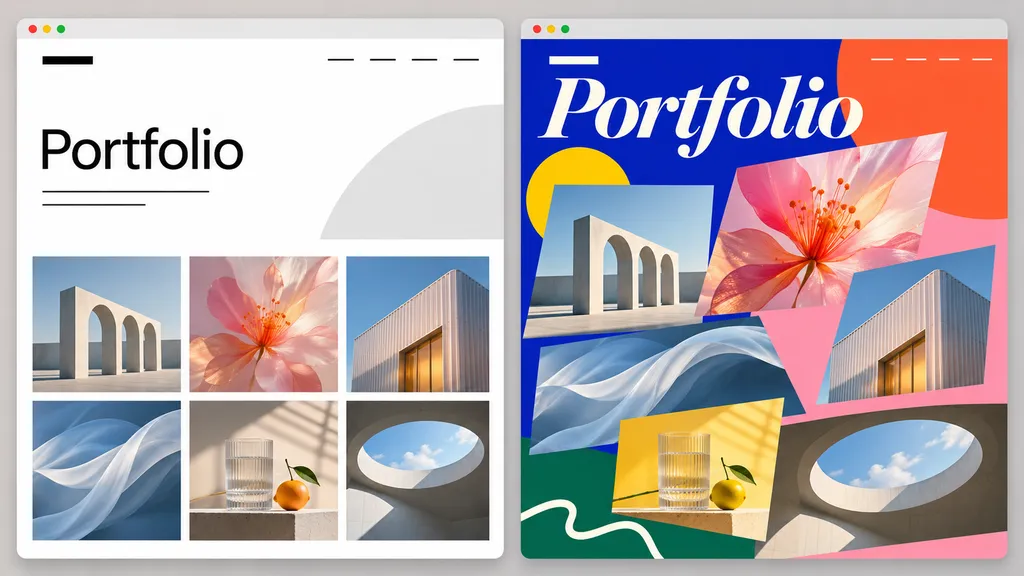
Neither style is inherently better. Choose a presentation that helps your intended audience judge your work.
Approach | Works especially well for | Potential drawback | Useful example |
|---|---|---|---|
Minimal image grid | Covers, posters, illustration | Can omit essential context | Linda Huang |
Expressive visual identity | Lettering, art direction, experimental work | Can compete with the projects | Bráulio Amado |
Structured project index | Mixed disciplines, recent work, junior candidates | May initially feel less visual | Hayley Lim |
Detailed case studies | UX, product, research, complex branding | Can become hard to skim | Katie McCurdy |
A useful test is to ask whether a reviewer can identify your discipline, your strongest project, and the way to contact you within a brief first visit. Add visual experimentation where it supports those tasks—not where it makes them harder.
What Makes a Good Design Portfolio?
A good design portfolio is a curated, role-relevant collection of projects that shows the quality of the work, the designer's contribution, and enough context to understand the decisions. It also makes navigation and contact straightforward.
Choose Projects for the Work You Want
An applicant targeting branding roles should not bury their strongest identities beneath unrelated UI exercises. A product designer should prioritize cases that explain user problems and trade-offs. Multidisciplinary work is valuable when the categories are clear; otherwise, a reviewer may struggle to identify your core strength.
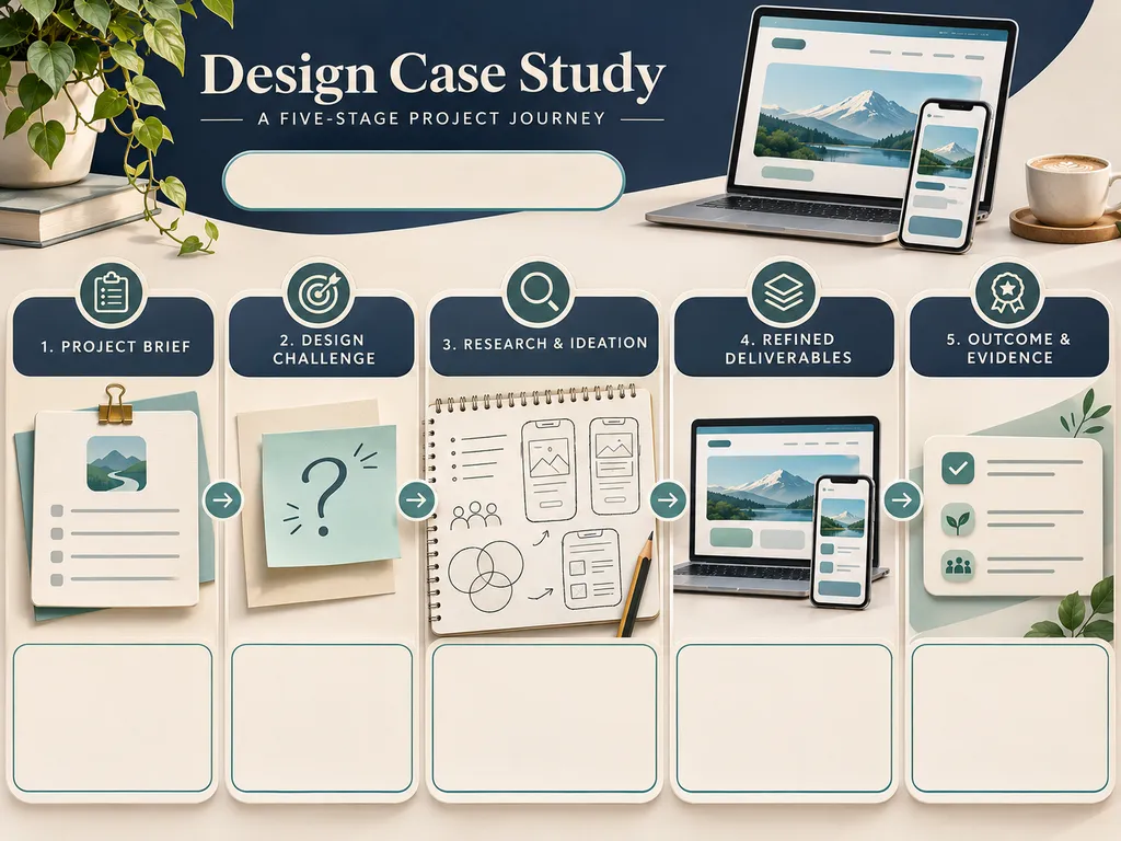
Explain Your Role, Process, and Outcome
For each substantive case, answer five questions: What was the brief? What constraints mattered? What did you personally do? Why did you make those decisions? What changed or was delivered? In UX projects, a clear design thinking process can help you explain how research informed your choices. Use measured outcomes when available, but never invent performance improvements or imply a classroom concept shipped to real customers.
Make the Site Easy to Scan
Lead with strong thumbnails, concise titles, and obvious category labels. Ensure images load at sensible sizes and project pages remain usable on mobile. Provide a short About section, relevant résumé information, and a working way to contact you. The interface should support the portfolio, not become an obstacle course.
How Many Projects Should Be in a Design Portfolio?
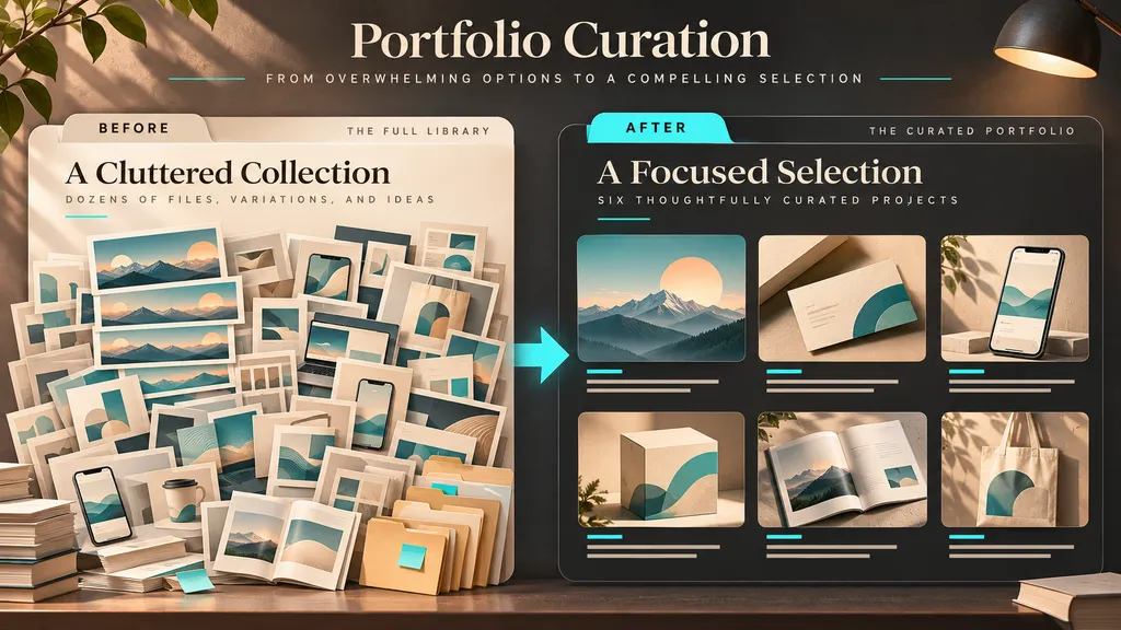
Start with roughly four to eight strong projects, then adjust for your experience, specialization, and target role. This is a practical starting point, not an industry rule. Some excellent portfolios display fewer projects, while broad, established practices can maintain larger searchable archives.
For a student, four well-developed projects can be stronger than twelve rushed exercises. For a branding designer, six projects showing distinct identity problems may establish range. For a UX candidate, three or four substantial case studies may take more time to review than ten image-only pieces. Select work that shows different relevant capabilities without repeating the same solution.
If you have hundreds of assets from one campaign, group them as one project. Show a hero image, a small selection of representative applications, and the decisions that connect them. A dozen banner sizes do not need a dozen portfolio entries.
How to Create Your Own Design Portfolio
Step 1: Define the Audience
Write down the jobs, clients, or collaborations you want. Choose a headline that names your specialty: for example, “Brand Designer for Consumer Products” or “Product Designer Focused on Healthcare UX.” This helps you decide what belongs in the portfolio.
Step 2: Audit and Shortlist Your Work
Collect your project images and notes. Rate each project for visual quality, relevance to your target work, personal contribution, and the strength of its story. Remove duplicates and weak filler. Include student or personal work when it demonstrates a needed skill, clearly labeled.
Step 3: Write a Compact Case-Study Brief
For each selected project, prepare a short description, your role, the assignment, key decisions, deliverables, and any validated result. For UX, add research and iteration where appropriate. For packaging and identity, show the design in context, such as a label system or a series of applications.
Step 4: Explore Portfolio Layouts
Try a gallery, a project-index layout, or story-led case-study pages. If arranging everything manually feels overwhelming, the Virse AI Design Portfolio Generator accepts work images, personal positioning, and optional project notes to generate a coordinated visual draft. You can compare layouts on the Infinite Canvas, then refine project order and presentation. Treat the generated layout as a starting point: double-check every caption, project attribution, and image before publishing.
Step 5: Publish, Test, and Keep Improving
Choose an appropriate publishing platform—such as Behance for a hosted project showcase or a personal website builder for more control over presentation and contact. Check the mobile view, load speed, working links, image clarity, readability, and contact form. Ask a designer or hiring manager to find your strongest project and explain your role without prompting. Their hesitation can reveal what to fix.
Common Design Portfolio Mistakes to Avoid
- Too many similar projects: choose the strongest example of a repeated skill and combine related assets into one case.
- Only showing final mockups: explain the brief, role, and decisions where context is needed.
- Unclear ownership: credit teams, agencies, clients, and collaborators accurately.
- Presenting concept work as client work: label coursework and self-initiated projects.
- A visually impressive but confusing site: keep navigation, thumbnails, and contact information obvious.
- No role targeting: reorder or select projects for the positions and clients you want.
- Unsupported success claims: report only outcomes you can substantiate, and never promise that a portfolio style will get someone hired.
FAQ
What should a beginner design portfolio include?
Include a small collection of your strongest relevant projects, a brief introduction, clear descriptions of your role, and an easy way to contact you. Coursework and personal projects are acceptable if labeled honestly and presented with thoughtful reasoning.
Is four projects enough for a design portfolio?
Yes, four strong and varied projects may be enough for an entry-level portfolio. Prioritize quality, relevance, and explanation over hitting an arbitrary number. Add projects when they demonstrate a meaningful skill not already represented.
Should I use Behance or my own portfolio website?
Behance can be useful for publishing and discovering projects quickly. A personal site offers more control over your story, layout, navigation, and client contact journey. You can use both: a focused personal website for applications and Behance for additional exposure.
Do UX portfolios need case studies?
For most UX and product-design applications, case studies help reviewers assess problem framing, research, decisions, collaboration, and outcomes. Screens alone rarely explain these elements. Keep the overview scannable and let readers expand into the details.
Conclusion
The most useful design portfolio examples are not necessarily the most elaborate websites. They make the designer's strengths apparent, select projects deliberately, and offer the right amount of context for the type of work. Study the examples above for specific choices—an effective grid, a clear case-study opening, a transparent project label, or an obvious contact route—then apply only what serves your goals. With a focused shortlist and a thoughtful structure, you can use Virse to explore visual directions and build a more coherent presentation of your own work.