
How to Choose Design Layouts When You Don’t Know Where to Start
 Yifan Zhao11 min de leitura ·
The best way to choose a design layout is to start with the content, define the visual hierarchy, understand the format and viewing constraints, and then choose the simplest structure that supports those relationships. Strong graphic design composition comes from organizing the elements of design around what people need to notice first—not from picking the most complicated grid.
The problem starts when designers choose structure before understanding the message. A technically aligned layout can still feel crowded, generic, or difficult to read, and repeated revisions become more likely when hierarchy, typography, and spacing have no shared logic. Building around design thinking and a reusable design system makes those decisions easier to explain, test, and scale.
Virse gives designers a faster way to explore layouts, references, imagery, and creative directions without giving up control of the final system. Its paid plans include unlimited use of 40+ models, including Nano Banana 2 and GPT Image 2, plus unlimited seats; new users also receive signup credits for up to 10 Nano Banana 2 images or one Seedance 2.0 video, and Seedance 2.5, Seedance 2.0, and MiniMax H3 are already available in its model lineup.
How to Choose a Design Layout Based on Content
Choose a layout by identifying content relationships before deciding how the page should look. The amount, type, and priority of information should determine the composition.
Start With a Content Inventory
Before building a grid, list everything the design must contain.
For a poster, that may include:
- headline
- hero image
- date
- location
- description
- CTA
- logo
For an editorial spread, the inventory may include body text, captions, imagery, pull quotes, page numbers, and side notes.
This step turns an abstract layout problem into a concrete information problem.
Case Study: Why a Poster Grid Became Irrelevant
A recurring pattern in our review of design questions is that designers create a grid first, then repeatedly break or modify it once real content enters the composition.
The ineffective workflow is:
Grid first → add content → adjust constantly → abandon the grid
A stronger workflow is:
Content first → hierarchy → viewing conditions → grid
For a poster viewed from several meters away, the title and dominant visual may need most of the visual weight. Smaller event information can then be grouped into one supporting area.
The grid becomes useful because it reflects the communication problem rather than forcing the content into an arbitrary structure.
How to Build Visual Hierarchy Before Choosing a Grid
Visual hierarchy determines the reading order that the grid must support. If every element receives equal emphasis, the audience has to decide where to look instead of being guided by the design.
Rank Information by Priority
A useful hierarchy model is:
Priority | Typical Content | Design Role |
|---|---|---|
Primary | Hero image, headline, product | Creates the focal point |
Secondary | Subheading, key benefit | Supports the primary message |
Tertiary | Body copy, features | Provides detail |
Utility | Captions, metadata, legal text | Remains accessible without competing |
The exact number of levels can change, but the principle remains the same: important information does not need identical visual weight.
Case Study: When Everything Competes
Imagine a product poster containing a product image, name, four features, promotional message, CTA, and logo.
If the title, features, and CTA are all equally bold, the page has no clear entry point.
A stronger layout might make the product image dominant, use the product name as the main text element, combine features into one secondary block, and reduce supporting information to a lower visual level.
The content stays the same. The hierarchy changes the reading experience.
How to Choose the Right Grid System for a Design Layout
The right grid is the simplest structure that can organize the content and support the variations the project requires.
A grid is not a visual style. It is a system for controlling alignment, proportion, rhythm, and consistency.
Use Simple Grids for Simple Layouts
A poster with one hero image, one title, and one information block may only need:
- margins
- a primary alignment
- two or three major divisions
- a consistent spacing rhythm
Using a complex 12-column system for a very simple composition may create more decisions without improving the result.
Use More Flexible Grids for Complex Systems
Editorial work, presentations, dashboards, and multi-page documents need more structural flexibility because they must support several content widths.
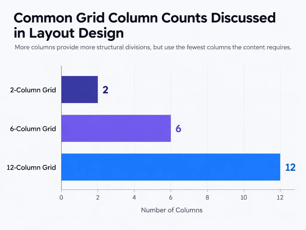
A 6-column grid can support combinations such as 3 + 3, 2 + 4, and 2 + 2 + 2.
A 12-column grid provides even more combinations because 12 divides evenly by 2, 3, 4, and 6.
The advantage is flexibility, not superiority.
How Many Columns Should a Design Layout Use?
Use the fewest columns that can support the relationships and layout variations your project needs.
When to Use 2 Columns
Two columns work well for simple relationships such as:
- image and text
- comparison A and B
- navigation and content
- project summary and visual
If the design does not need additional span combinations, more columns may add unnecessary complexity.
When to Use 6 or 12 Columns
More columns become useful when several content types must coexist.
An editorial system may contain:
- body copy
- full-width images
- captions
- side notes
- pull quotes
- diagrams
A 6- or 12-column structure allows different pages to vary while still belonging to the same visual system.
More columns are most valuable when the design needs repeatability, not simply because the layout looks more advanced.
Grid Mathematics Should Follow Content
Professional grids do not always begin with a mathematical formula.
Designers often work backward from:
- page dimensions
- desired text width
- margins
- image proportions
- gutters
- repeated modules
For example, a comfortable body-text width may become the first constraint, with the remaining page area divided into supporting units.
How Typography Affects the Best Design Layout
Typography and layout must be designed together because correct alignment does not guarantee good readability.
Common layout problems include:
- tight leading
- excessive line length
- weak heading contrast
- poor text rag
- cramped blocks
- inconsistent spacing
Case Study: A Correct Grid With Poor Reading Experience
Consider an editorial composition built on a 6- or 12-column grid.
The elements may align correctly, but the page can still feel uncomfortable if the body copy is too dense or the line length is too wide.
The correct solution may not be a new grid.
It may be:
- more leading
- narrower text columns
- stronger heading contrast
- better paragraph spacing
This is an important professional distinction: not every layout problem is a grid problem.
Test Layouts With Real Copy
Placeholder rectangles can make almost any grid look clean.
Real text reveals whether the structure works.
Test representative copy early and check line length, line height, heading scale, paragraph rhythm, and density before finalizing the composition.
How to Use White Space in Design Layouts
White space creates hierarchy by separating information, grouping related elements, and giving important content room to attract attention.
White Space Is Structural
The distance between objects communicates their relationship.
A small gap suggests connection.
A larger gap suggests separation.
This means spacing can perform some of the same work as cards, borders, or dividers without adding visual noise.
Case Study: When Empty Space Gets Filled
A common production problem occurs when empty areas are treated as wasted space.
Additional icons, graphics, infographics, or oversized text are added simply to fill the canvas.
The result may look busier without becoming clearer.
A useful test is:
If this element is removed, does the message become harder to understand?
If not, the layout may become stronger without it.
How to Make a Grid Layout Look Less Generic
A grid creates consistency; visual interest comes from how you vary scale, density, imagery, and column spans inside that system.
Increase Scale Contrast
Layouts often feel generic when every element has similar visual weight.
Instead of combining a medium headline, medium image, and medium text block, create a stronger contrast between dominant and supporting elements.
Change Column Spans
A 12-column grid can produce very different layouts without changing the underlying system.
One page may use an 8-column image and 4-column text area. Another may use three 4-column modules. A third may use a full-width image above smaller content blocks.
Consistency does not require visual repetition.
Break the Grid Intentionally
A grid can be broken when the deviation improves hierarchy or creates meaningful tension.
An image might extend beyond its normal columns. A headline may cross a gutter. A pull quote may interrupt a predictable rhythm.
These choices work because the underlying structure remains visible.
When Should You Use a Grid in Layout Design?
The more repeated, complex, or collaborative a project becomes, the more valuable a grid becomes.
Grids are especially useful for:
- books
- reports
- editorial systems
- campaign templates
- presentations
- dashboards
- brand assets
Case Study: Multi-Page Consistency
Without a shared grid, a designer may repeatedly decide where titles begin, how wide images should be, where captions belong, and how body copy aligns.
A grid converts those recurring decisions into reusable rules.
This does more than improve consistency. It lets the designer spend more time on hierarchy and creative variation.
When a Formal Grid Is Unnecessary
A simple social graphic or one-off poster may only need margins, alignment guides, and spacing rules.
The better question is not “Should I always use a grid?”
It is:
Will a formal grid reduce meaningful decisions across this project?
How to Choose Layouts for Posters, Editorial Design, and Web Design
Different media require different layouts because audiences consume them differently.
Poster Layouts Prioritize Recognition
A poster usually needs:
- one dominant focal point
- one supporting message
- grouped secondary information
It should communicate the primary message before the viewer begins detailed reading.
Editorial Layouts Prioritize Reading Rhythm
Editorial work benefits from structured relationships between body copy, imagery, captions, pull quotes, and page furniture.
This is where 6- and 12-column systems can provide useful variation while preserving consistency.
Web Layouts Need Structural Flexibility
Web layouts must also adapt to changing screen sizes.
CSS Grid is typically useful for coordinated rows and columns, while Flexbox works well for simpler one-dimensional alignment.
Modern interfaces often combine both.
How to Choose a Design Layout From a Blank Canvas
The most reliable way to overcome blank-canvas paralysis is to turn layout into a sequence of smaller decisions.
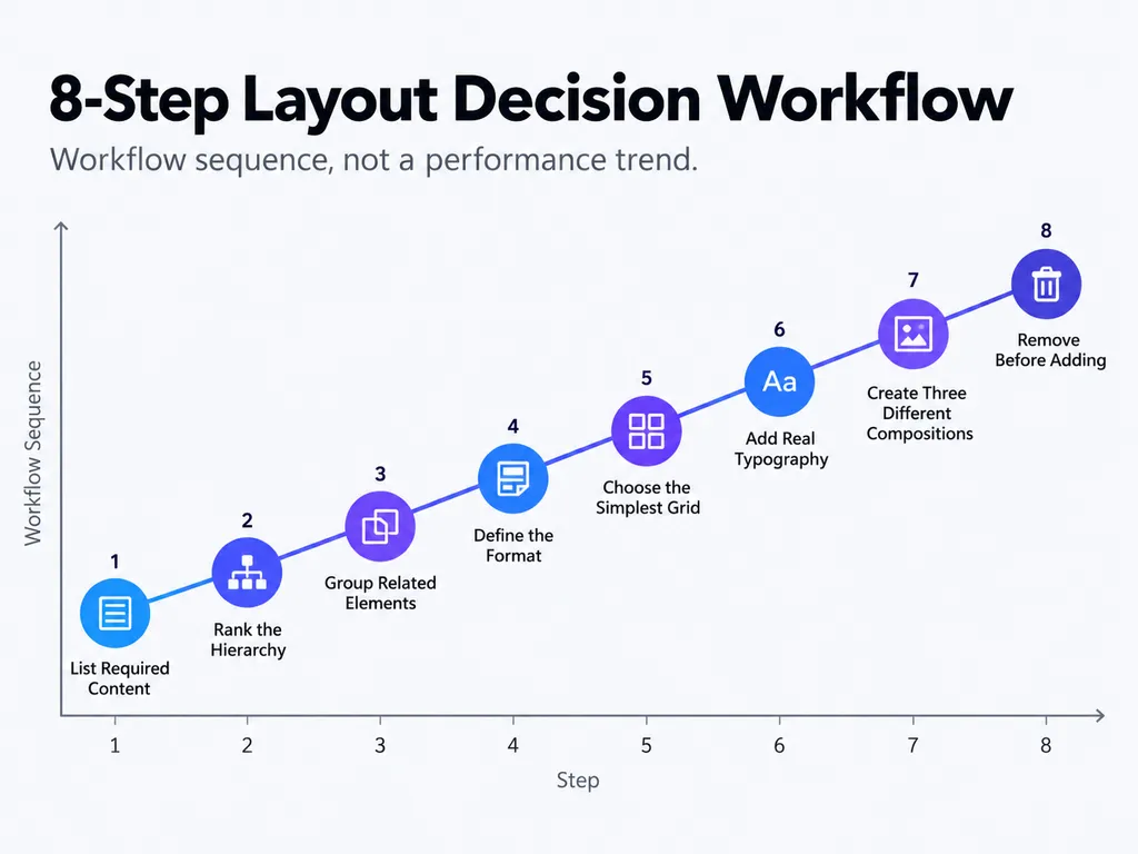
Step 1: List the Required Content
Identify every required element before styling.
Step 2: Rank the Hierarchy
Decide what should be noticed first, second, and third.
Step 3: Group Related Elements
Use proximity before adding visual containers.
Step 4: Define the Format
Confirm size, orientation, viewing distance, device, and production requirements.
Step 5: Choose the Simplest Grid
Use only as much structure as the content requires.
Step 6: Add Real Typography
Replace placeholders with realistic text early.
Step 7: Create Three Different Compositions
Test genuinely different directions such as image-dominant, type-dominant, and asymmetric layouts.
Step 8: Remove Before Adding
If the composition still feels weak, remove unnecessary visual signals before adding decoration.
How to Evaluate Whether a Design Layout Is Working
A layout works when viewers can identify what matters, understand which elements belong together, read comfortably, and move through the composition without unnecessary effort.
Problem | Check First |
|---|---|
No focal point | Scale, contrast, position |
Feels crowded | White space, grouping, content volume |
Feels generic | Scale variation, imagery, asymmetry |
Text is difficult | Line length, leading, rag, hierarchy |
Pages feel inconsistent | Grid, margins, spacing rules |
This prevents random redesign.
If the page feels crowded, the problem may be spacing rather than columns.
If the page feels boring, the problem may be weak hierarchy rather than the grid itself.
Diagnose the problem before changing the structure.
Conclusion
Choosing a design layout is not about memorizing layout types or deciding whether 6 columns or 12 columns look more professional. Strong layouts come from understanding the content, defining hierarchy, identifying format and viewing constraints, and building the simplest structure that supports those relationships. Grids create consistency, typography controls reading rhythm, white space clarifies grouping, and variation prevents systems from becoming repetitive. Whether you are designing a poster, editorial spread, multi-page document, or web interface, the most reliable principle is simple: do not force the content into a layout; build the layout around the information.
FAQ
How do I choose a layout when I already have all the copy?
Start by ranking the copy according to what the audience needs to understand first, second, and third. Group related information, define the viewing conditions, and then choose a grid. A common reason layouts fail is that the grid is created before the designer understands the content relationships it needs to support.
Should I use a 2, 6, or 12 column grid?
Use the fewest columns that support the variations your design requires. Two columns suit simple relationships, six provide moderate editorial flexibility, and twelve support more combinations because 12 divides evenly by 2, 3, 4, and 6. Column count should follow content complexity, not design trends.
Why does my grid layout still look boring or crowded?
A grid solves alignment and consistency, but it does not automatically create hierarchy. If the layout feels boring, increase differences in scale, typography, imagery, and column spans. If it feels crowded, inspect white space, grouping, line height, margins, and unnecessary elements before changing the grid.
When should I break the grid?
Break the grid when the deviation improves communication, such as emphasizing a hero image, creating visual tension, separating a quote, or marking a new section. Intentional grid-breaking works because viewers can still perceive the underlying system. Without that structure, the same deviation usually looks accidental.
Mais do blogue da Virse
Fluxo de trabalho
How to Master Grid-Based Design: Choose the Right Grid, Use It Well, and Know When to Break It
7 de outubro de 2026 by Yifan Zhao
Fluxo de trabalho
How to Design Packaging: From Dieline to Print-Ready Production
7 de outubro de 2026 by Yifan Zhao
Fluxo de trabalho
What Are the 7 Elements of Design? Examples and How to Use Them
7 de outubro de 2026 by Yifan Zhao