
GPT Image 2.5 Editing Drift: Why Images Get Blurry, Cropped or Worse After Multiple Edits
 Yifan Zhao10분 읽기 ·
Quick Answer
If a GPT Image 2.5 result looks worse after several edits, first identify what changed. Soft detail, altered materials, missing linework, and unwanted cropping require different fixes.
In my Sunburst packaging test, the first edit slightly softened the image. The second noticeably changed the paper texture. After five edits, the requested revisions were present, but several surfaces no longer matched the original.
The strongest result came from applying the complete revision brief to the original image. A repair pass on the latest version provided only partial improvement. Framing remained stable throughout the test.
To reduce drift, keep clean checkpoints, define what may change, and inspect untouched areas after each edit. When degradation becomes visible, reconsider the input before adding another correction.
Why Can Images Get Worse After Multiple Edits?
A Small Request Can Affect Untouched Details
A request to change a background does not guarantee that the product in front of it stays visually identical. The output may preserve the subject and layout while changing its surface detail.
That happened in my first edit. I changed only the backdrop, yet the pouch and label looked slightly softer. The requested change succeeded, but the untouched product was not fully preserved.
The practical distinction is between keeping an object recognizable and retaining its exact appearance. A preservation prompt can describe the second goal, but the result still needs inspection.
Each New Edit Starts From the Previous Version
In a consecutive edit chain, the latest output becomes the next input. Any unwanted texture or softened detail in that version is therefore carried into the next editing step.
This creates an opportunity for changes to accumulate. If the input already contains an unnatural paper pattern, another edit may retain or alter that pattern instead of returning to the original finish.
This explains why the condition of the source matters. It does not establish the model’s internal cause of blur or artifacts. The images alone cannot prove a specific compression, resampling, or generation mechanism.
Pixel Dimensions Do Not Measure Detail Fidelity
An image can keep the same dimensions while losing fine detail or gaining incorrect texture.
My original and five consecutive outputs all measured 1024 × 1360 pixels. The visible material changes happened without a reduction in file dimensions.
Likewise, more noticeable texture does not necessarily mean better detail. A fine paper surface can become covered in large patterns and still look less faithful to the source.
Diagnose the Problem Before Trying to Fix It
Compare the latest image with the original or a clean approved version. View both at the same display scale, then inspect matching detail areas.
Symptom | What to check | What the check tells you |
The image looks blurry | Compare fine grain, seams, small text, and edge definition; check actual file dimensions | Whether detail softened, output size changed, or the preview is misleading |
Lines look softer or disappear | Inspect the same printed graphic, line spacing, and line count | Whether the artwork lost definition or changed structure |
The subject looks cropped | Compare the top, bottom, outer edges, subject size, and margins | Whether content disappeared, framing shifted, or the canvas ratio changed |
Materials look worse despite visible texture | Compare texture scale, pattern, gloss, and uneven shading | Whether the material has been reinterpreted rather than simply blurred |
Earlier revisions disappear | Check the output against the approved revision list | Whether the latest edit preserved the complete design brief |
Do not use "blurry" as a catch-all diagnosis. Paper that develops web-like patterns needs a material-fidelity check. Missing content at the edge needs a framing check.
In my test, the semicircular graphic remained distinct and the packaging stayed fully visible. The main failure was material drift. I did not reproduce missing linework or obvious cropping.
Which Edits Deserve the Closest Drift Checks?
My test does not establish a reliable ranking of edit types. Each change happened at a different point in the chain, so edit type and accumulated history were not separated.
However, the results identify useful inspection priorities.
Background and Color Changes Around Detailed Products
Check untouched products even when the request concerns a simple color change.
In my test, changing the backdrop was followed by slight softening. Changing the pouch side panel was followed by a clearer difference in the front paper texture.
That does not prove side-panel edits are inherently riskier than background edits. It shows that neither request was too small to require a material check.
Small Additions to an Already Edited Image
Adding a badge or a short word may seem harmless. Still, the source may already contain degradation from earlier edits.
My fourth and fifth revisions added a circle and then NEW. Those outputs retained the requested design, but the pouch, label, swatch, and surrounding surfaces showed more conspicuous drift.
The edit request and the condition of its input are separate issues. A tiny final change does not make a degraded source clean.
Broad Cleanup, Lighting, and Reframing Requests
Requests such as "make it sharper," "improve the lighting," or "make it more polished" leave the desired change less clearly defined.
For troubleshooting, replace them with specific defects and preservation constraints. If lighting is changing, decide which shadows and reflections should change with it. If reframing is intended, define which objects must remain fully visible.
These are inspection and prompting recommendations, not a measured finding that these edit categories fail most often.
What My Sunburst Packaging Test Revealed
I created a campaign image for a fictional brand, FOLD Coffee. It included an ivory paper pouch, a cream label, a blue side panel, a blue paper swatch, and a white ceramic cup.
I used GPT Image 2.5 Sunburst with a 3:4 portrait setting. The downloaded files measured 1024 × 1360 pixels. Each consecutive edit used the previous output and included explicit preservation instructions.
Version | Requested revision | Observed result |
A1 | Change the backdrop to pale sage green | Revision completed; slight softening appeared on the pouch and label |
A2 | Change the side panel to deep forest green | Revision completed; wavy and web-like paper patterns became more noticeable |
A3 | Change the cup to terracotta orange | Earlier revisions remained; pouch and swatch textures continued to depart from the source |
A4 | Add a blank burnt-orange circle | Circle appeared; uneven surface patterns remained across the design |
A5 | Add NEW inside the circle | Text appeared; material drift was conspicuous on the pouch, label, swatch, and surrounding surfaces |
By A5, the pouch looked more embossed or crumpled than the original. The label had blotchy shading, and the blue swatch carried an unwanted patterned texture. The cup also looked less evenly rendered.
Yet the pouch silhouette, readable label text, and overall composition remained relatively stable. The top seal, bottom corners, cup, and swatch stayed inside the frame.
The original prompt requested five semicircular lines, but the base image contained six. Those six remained in later versions. This was consistency with an imperfect source, not proof of initial accuracy. You can also try a GPT Image 2.5 Sunburst editing workflow in Virse.
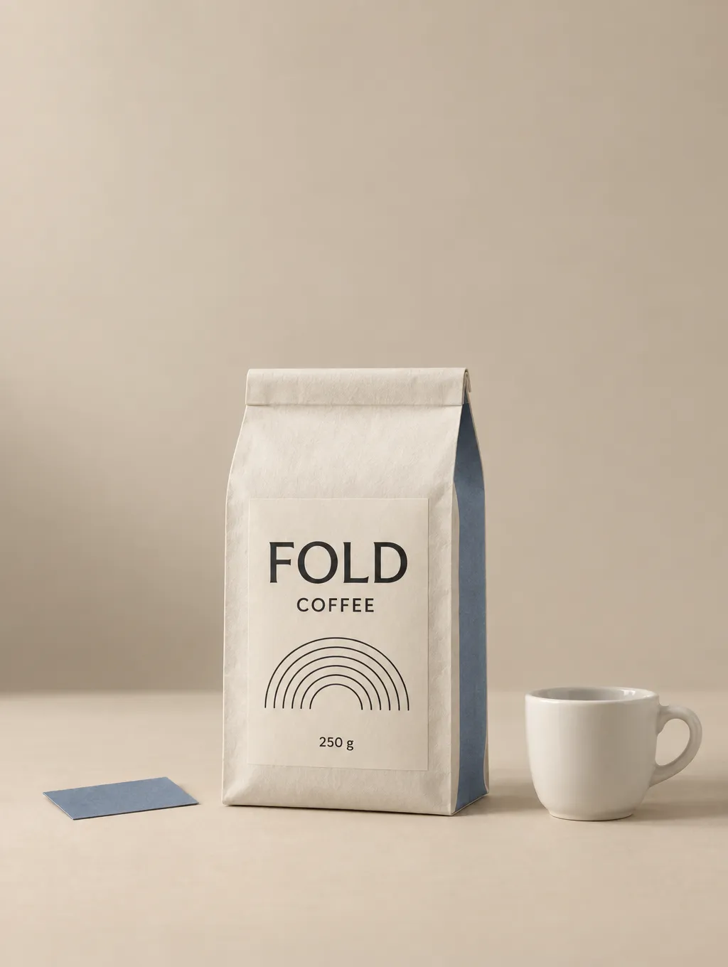
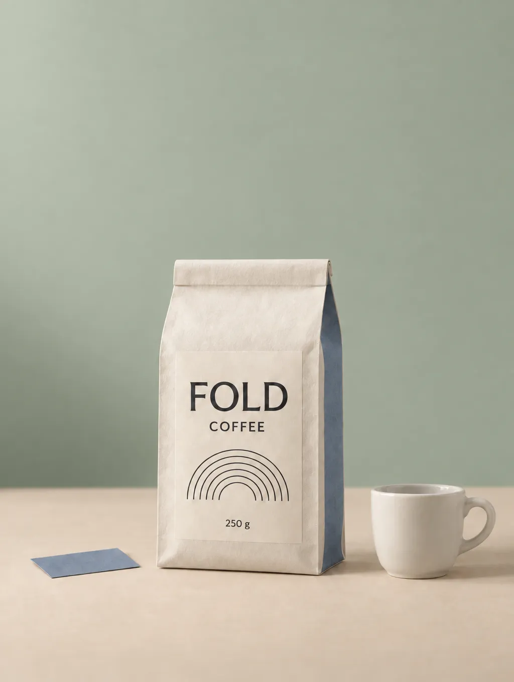
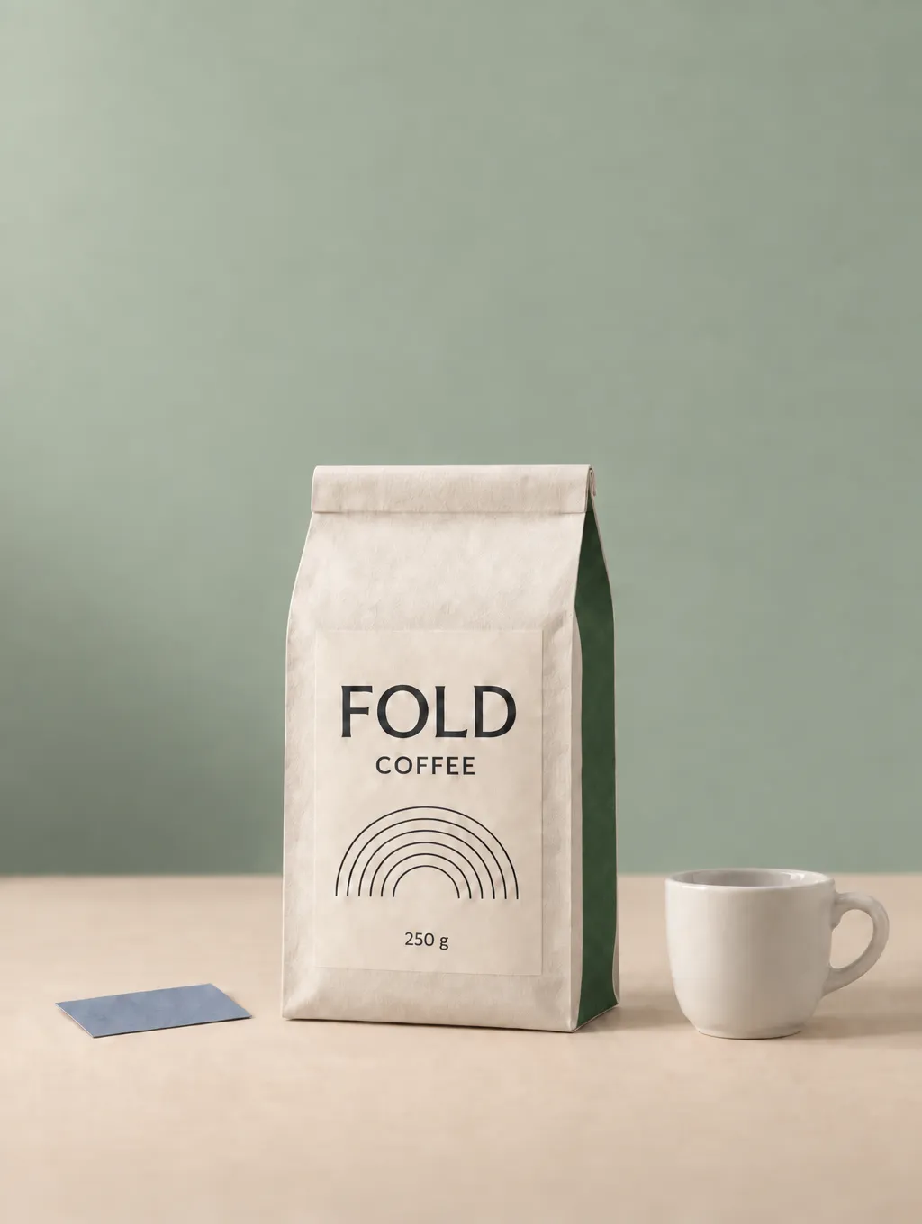
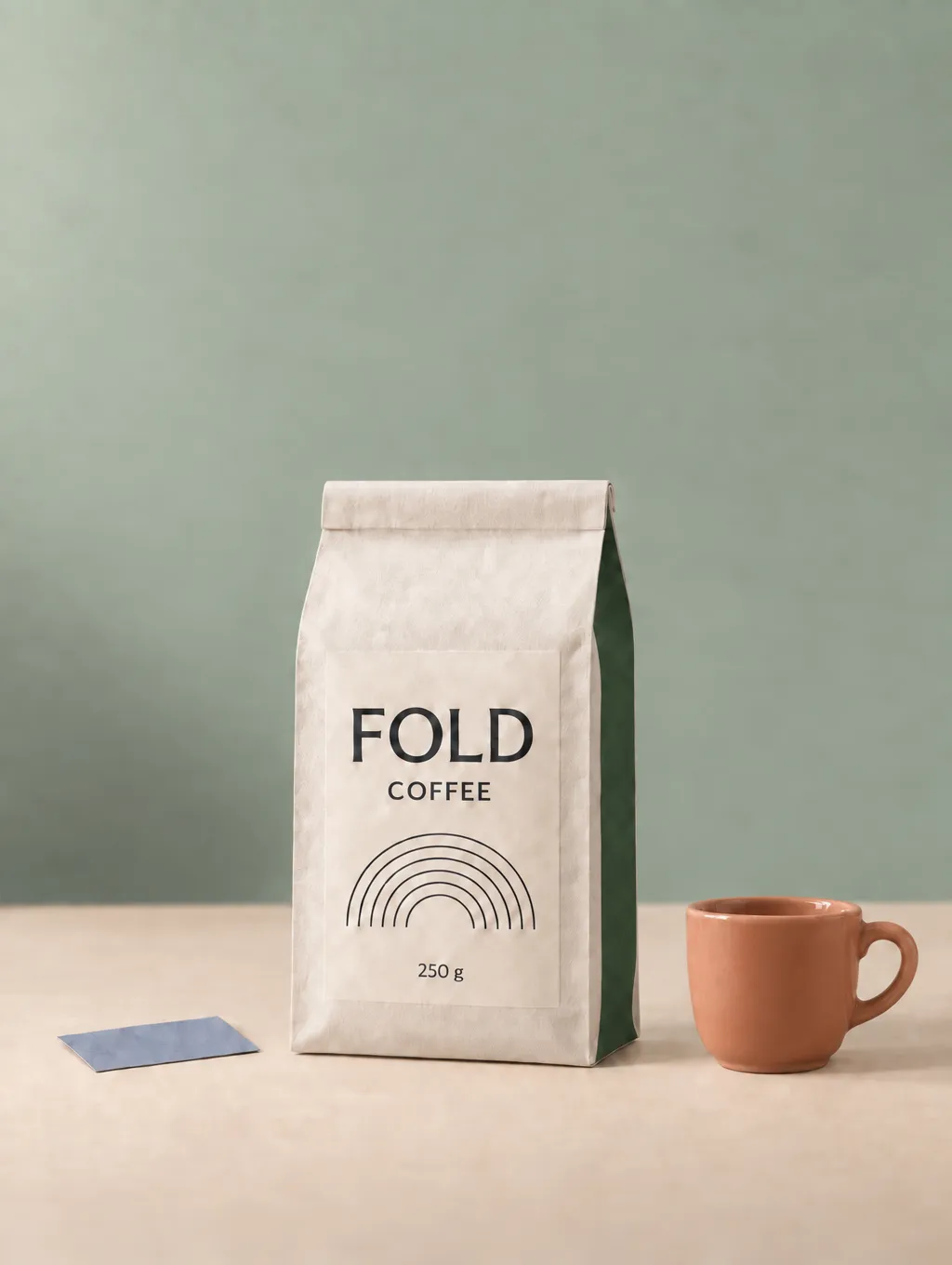
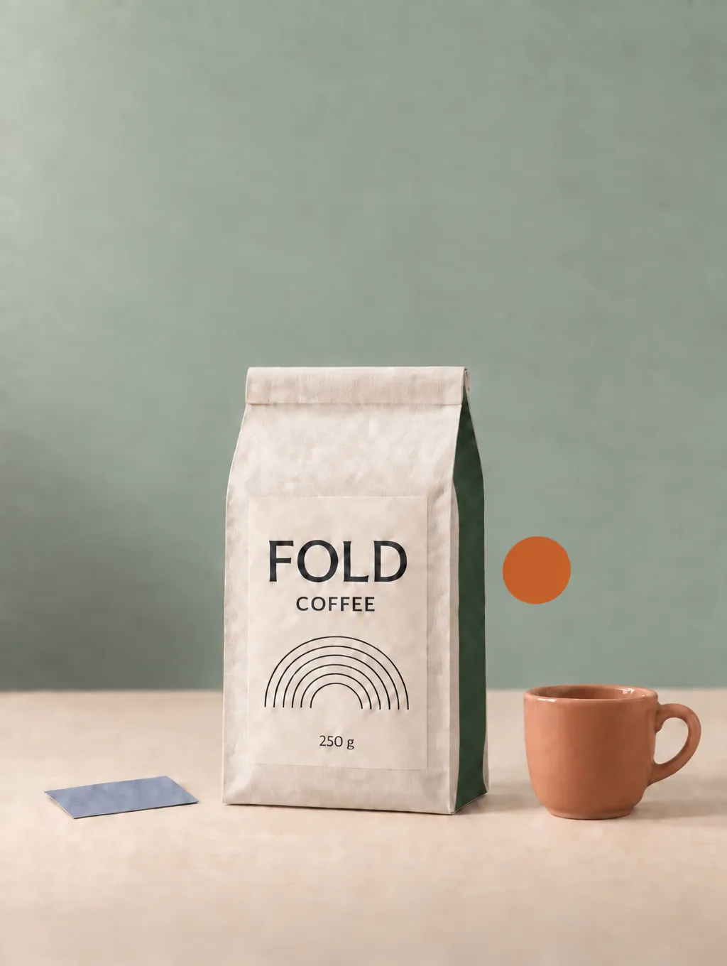
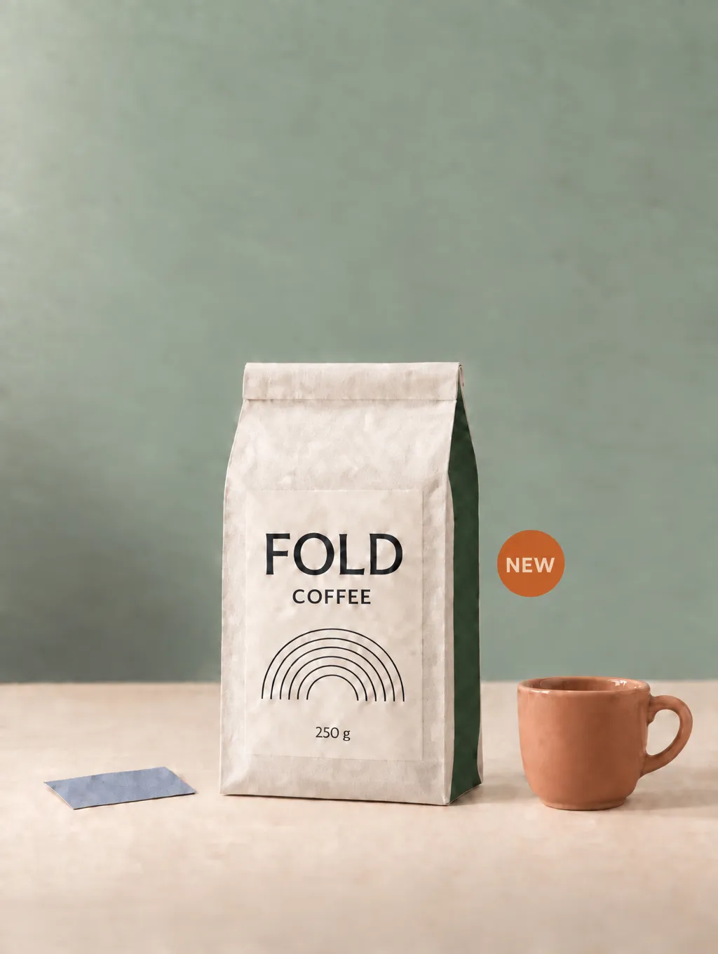
[Insert image: v0–A5 sequence with matching close-ups of the pouch and blue swatch.]
How to Reduce Drift and Recover a Usable Image
1. Keep the Original and Clean Approved Checkpoints
Save an untouched copy of the original. Retain later versions only as approved checkpoints after inspecting their materials, text, and framing.
Keep the original downloads for comparison and reuse. Avoid introducing screenshots or unnecessary resizing into the edit chain.
The latest image may contain the most complete brief while preserving the least faithful texture. A checkpoint gives you another starting point.
2. Separate the Requested Change From the Preservation Rules
State the target first, then list the design decisions that must survive.
For a packaging color edit, a useful instruction is:
Change only the pouch’s right side panel to deep forest green. Preserve the front paper finish, label text, printed graphic, pouch geometry, camera angle, lighting, framing, and all other objects.
Specify the output ratio or dimensions through the available settings. If framing must stay fixed, also say that the full product, existing margins, and empty space must remain.
My consecutive prompts included such constraints. They helped communicate the intended boundaries, but they did not prevent material drift in this run. Do not treat a longer preservation list as a complete quality guarantee.
3. Use a Targeted Repair for a Specific Defect
If the image is still mostly clean, describe the defect rather than requesting a general quality upgrade.
For Path B, I edited A5 and asked for reduced web-like patterns, finer matte paper grain, and more even surfaces. I also protected the text, approved colors, badge, and layout. A5 was the only image input.
The label’s large blotchy areas became less noticeable, and the background looked somewhat more even. However, the pouch and swatch retained unwanted patterns.
The cup still had mottled shading and a broken-looking rim highlight. Those issues were already present in A5, so the repair did not convincingly resolve them.
A partial cleanup is useful only if the repaired material meets the brief. A smoother image is not automatically a faithful restoration.
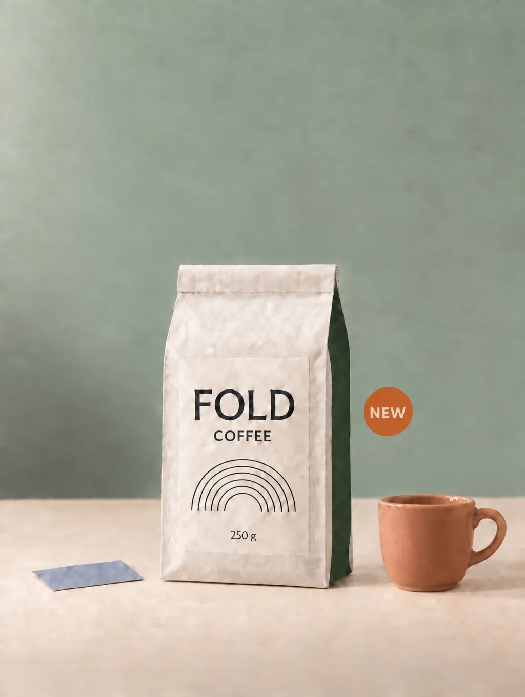
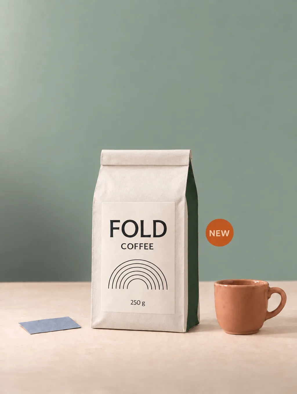
[Insert image: A5 and B comparison, showing the label, pouch, and cup.]
4. Consolidate Known Revisions From a Cleaner Source
If the complete brief is known and the current materials have drifted, try applying the approved changes to the original or another clean checkpoint.
For Path C, I returned to v0 and requested the same five revisions in one edit. The pouch, label, and swatch looked closer to their original finishes. The background was more even, and the cup had a cleaner ceramic appearance.
All requested changes were present. However, the badge differed from A5 in position, size, and typography. That layout still needed review.
Approach | Outcome in this project |
Continue through five edits | Completed the revisions but accumulated material changes |
Repair the latest result | Improved some areas without restoring the original finish |
Apply the full brief to v0 | Preserved the closest material appearance, with badge differences to check |
I would choose C as the stronger delivery candidate for this packaging brief. This was one source image and one run of each approach, so it does not prove that combined edits always win.
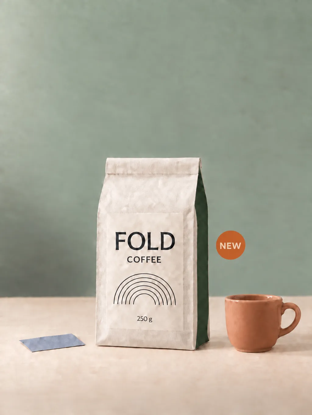
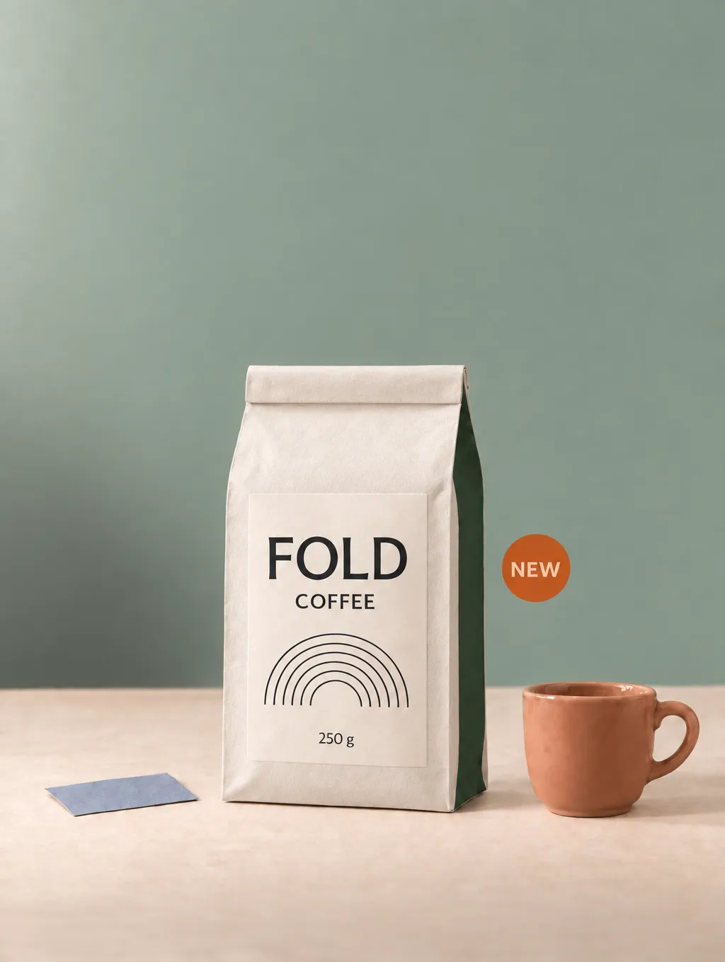
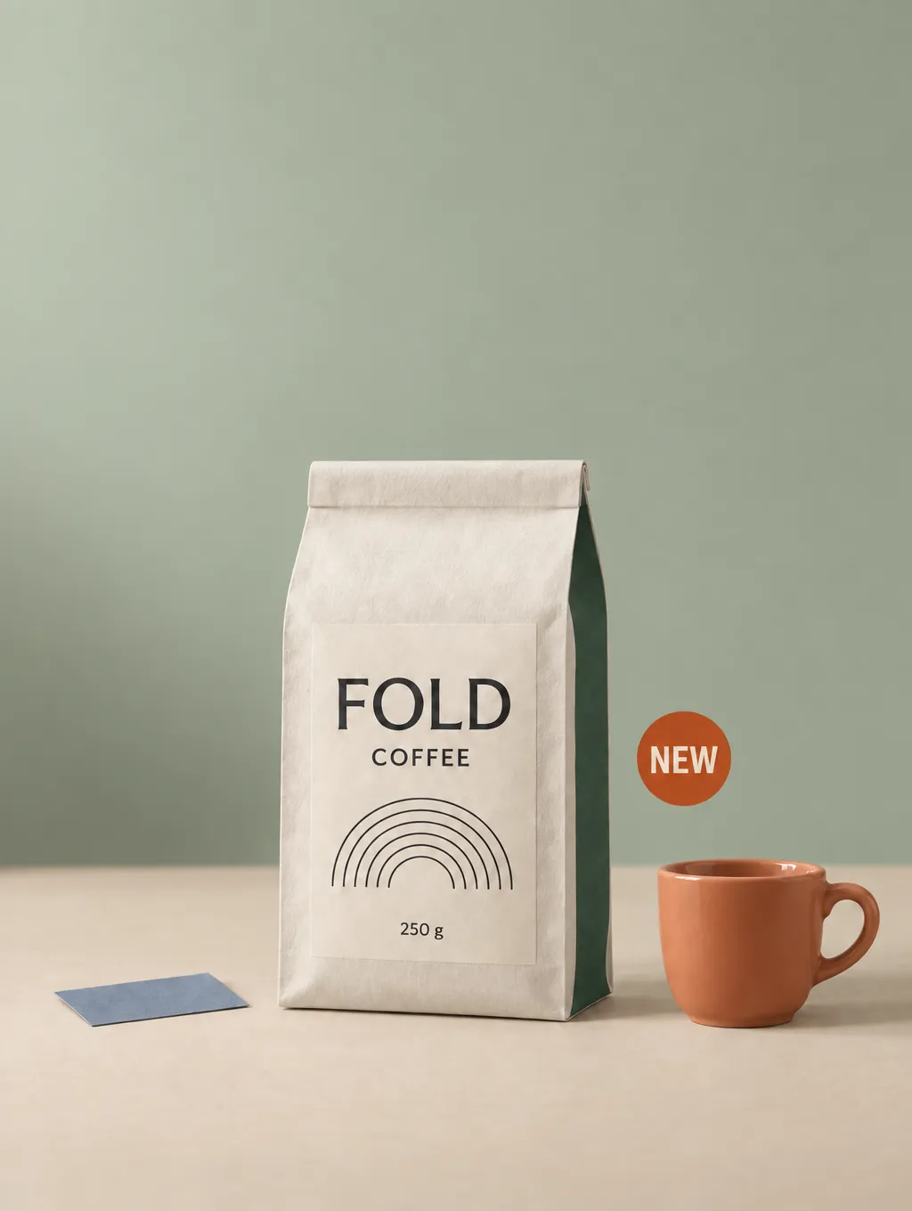
[Insert image: A5, B, and C final comparison]
5. Handle Cropping and Missing Artwork Separately
If cropping occurs, compare earlier versions to find the last image with complete boundaries. Reapply the remaining changes from that version, while explicitly preserving framing and subject size.
If changing formats, decide whether you need background expansion, a new layout, or an intentional crop. Those are different operations.
When the original boundary content is unavailable, generating replacement content should be treated as reconstruction. Check it against the design brief rather than assuming it restores the missing pixels.
For softened text or missing printed lines, use the approved artwork where possible. A controlled layer or compositing edit provides a way to retain that source artwork without asking the model to recreate it.
My test did not evaluate these cropping or line-restoration methods. They address different failure modes from the material problem shown here.
FAQ
How Many Edits Can I Make Before Quality Drops?
This test does not establish a safe limit. I noticed slight softening after the first edit and clearer material drift after the second. Inspect each result instead of relying on a fixed number of rounds.
Can Upscaling Fix Editing Drift?
A larger file does not prove that lost details or original materials have been recovered. Compare the enlarged result with the source. Incorrect texture can remain incorrect at a higher resolution.
Should I Put Every Revision in One Prompt?
Combine revisions when the brief is clear and the source is clean. If requirements are still arriving or one change depends on another, consecutive edits may remain practical. Check that a combined result completes every requirement.
When Should I Stop Trying to Repair the Latest Image?
Reconsider the source when a repair leaves the same defects or changes other approved details. In this project, B did not restore the material finish, while C offered a cleaner candidate. Further repair was not needed to identify the stronger result.
Virse 블로그의 다른 글
워크플로

GPT Image 2.5 Noise and Oversharpening: Why Some Images Still Look AI-Generated
2026년 10월 9일 by Yifan Zhao
워크플로
GPT Image 2.5 Keeps Changing My Image: How to Use a "Keep List" for Reliable Edits
2026년 10월 9일 by Yifan Zhao
워크플로

How to Master Grid-Based Design: Choose the Right Grid, Use It Well, and Know When to Break It
2026년 10월 7일 by Yifan Zhao