40 Book Cover Ideas: Creative Designs & How to Design Your Own
 Yifan Zhao23분 읽기 ·
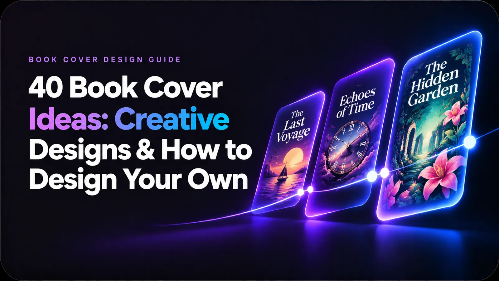
The best book cover ideas combine genre-appropriate visuals, memorable typography, and a clear focal point to attract the right readers. Whether you're publishing a fantasy novel, designing a romance ebook, or creating a nonfiction book, your cover should communicate the book's identity before someone reads its description.
You don't need professional illustration skills to design an attractive book cover. You can use design software, licensed artwork, or AI image generation to explore creative directions and develop your own visual concept.
This guide covers 40 book cover ideas across eight genres, practical AI prompts for exploring different styles, a seven-step design workflow, and the technical requirements to prepare your cover for digital and print publishing.
40 Creative Book Cover Ideas by Genre
The best way to find book cover inspiration is to start with your genre. Different categories have recognizable visual conventions, from magical landscapes in fantasy to bold typography in nonfiction.
Use these ideas as starting points rather than fixed templates. The goal is to create a cover that feels familiar enough to attract genre readers but distinctive enough to be remembered.
Fantasy Book Cover Ideas
<PRIVATE_PERSON>Fantasy book covers often feature magical environments, mythical creatures, ancient symbols, and dramatic lighting.
- Magical Kingdom: An elaborate castle surrounded by glowing mountains, floating islands, or mysterious clouds.
- Dragon Fantasy: A powerful dragon overlooking a medieval kingdom, with cinematic lighting and dramatic scale.
- Enchanted Forest: A mysterious woodland filled with glowing plants, magical particles, and hidden pathways.
- Dark Fantasy: A lone character standing before a gothic castle, surrounded by shadowy architecture.
- Mythical Symbols: An intricate magical emblem, ancient artifact, or mysterious rune as the central visual element.
Visual direction: Deep emerald, midnight blue, antique gold, atmospheric fog, and detailed fantasy illustration.
Romance Book Cover Ideas
Romance covers should communicate emotional connection and the particular atmosphere of the relationship.
- Floral Romance: Soft flowers surrounding elegant typography and a delicate central composition.
- Minimalist Romance: Two silhouettes or simple shapes against a clean pastel background.
- Couple Silhouette: Two characters standing close together against a sunset or city skyline.
- Vintage Romance: Muted colors, decorative borders, and classic editorial typography.
- Contemporary Romance: Modern photography, expressive colors, and clean sans-serif lettering.
Visual direction: Warm pink, cream, muted red, soft lighting, elegant typography, and expressive character photography.
Thriller and Mystery Book Cover Ideas
Thriller and mystery covers rely on suspense, contrast, and carefully controlled visual details.
- Dark Silhouette: A mysterious figure standing in a dimly lit environment.
- Hidden Face: A partially obscured portrait that creates uncertainty about the character.
- Crime Scene: An isolated object, symbolic clue, or mysterious location.
- Minimalist Thriller: A single striking object against a dark background.
- Psychological Mystery: Distorted reflections, fragmented portraits, or unusual perspectives.
Visual direction: Black, charcoal, deep red, dramatic shadows, and strong negative space.
Horror Book Cover Ideas
Horror covers work particularly well when they create an unsettling atmosphere without revealing too much.
- Gothic Architecture: An abandoned mansion or ancient building surrounded by darkness.
- Distorted Portrait: An unsettling human face with unusual proportions or fragmented features.
- Dark Forest: A lonely pathway disappearing into an ominous forest.
- Creepy Typography: Distressed, irregular, or distorted lettering that becomes part of the visual concept.
- Surreal Horror: Unexpected combinations of familiar objects that create psychological discomfort.
Visual direction: Desaturated green, dark red, black, aged textures, and unsettling visual compositions.
Science Fiction Book Cover Ideas
Science fiction covers communicate futuristic environments, technological change, exploration, and unfamiliar worlds.
- Cyberpunk City: Neon-lit streets, futuristic architecture, and atmospheric urban environments.
- Space Exploration: A spacecraft approaching a distant planet or unknown celestial object.
- Futuristic Portrait: A character portrait combined with technological details and digital textures.
- Dystopian World: An abandoned city, industrial landscape, or futuristic society in decline.
- Abstract Technology: Geometric patterns, digital structures, and luminous visual elements.
Visual direction: Electric blue, violet, cyan, neon lighting, futuristic architecture, and geometric compositions.
Nonfiction Book Cover Ideas
Nonfiction covers should prioritize clarity, credibility, and a strong visual hierarchy.
- Bold Typography: An oversized title that becomes the primary design element.
- Minimalist Geometry: Simple shapes, structured layouts, and restrained color palettes.
- Editorial Photography: A strong photograph that directly communicates the book's subject.
- Illustrated Concepts: A visual metaphor that explains the central idea of the book.
- Geometric Patterns: Repeating shapes and organized compositions that create a recognizable identity.
Visual direction: Neutral colors, strong typography, editorial photography, structured layouts, and intentional whitespace.
Children's Book Cover Ideas
Children's book covers should be approachable, expressive, and visually engaging for their intended age group.
- Whimsical Illustration: Playful environments with imaginative shapes and colors.
- Cute Characters: Friendly animals or memorable illustrated characters.
- Fantasy Adventure: A young protagonist exploring an imaginative world.
- Animal Characters: Expressive animals presented in a distinctive illustration style.
- Colorful Storybook: Bright compositions with layered illustrations and playful typography.
Visual direction: Bright colors, rounded shapes, expressive characters, playful lettering, and imaginative environments.
General and Creative Book Cover Ideas
These concepts work across multiple genres, especially when you want a more experimental visual direction.
- Collage Design: Combine photographs, textures, illustrations, and typography into one composition.
- Typography-Only: Use lettering, scale, and spacing instead of a dominant illustration.
- Vintage Texture: Add aged paper, grain, distressed surfaces, and retro visual elements.
- Abstract Art: Use unusual shapes, colors, and visual relationships to create an emotional impression.
- Photographic Composition: Build the cover around a carefully framed photograph with strong visual storytelling.
Visual direction: Experiment with mixed media, unusual textures, unexpected color combinations, and unconventional layouts.
AI Book Cover Prompts: 8 Styles to Explore
AI image generation makes it easier to explore book cover concepts before committing to a final design. Instead of generating random artwork, define the genre, subject, composition, lighting, and visual style.
Here are eight prompts you can adapt to your own book.
1. Fantasy Book Cover Prompt
Prompt:
"Create a sophisticated dark fantasy book cover illustration featuring an ancient castle surrounded by an enchanted forest. A mysterious glowing artifact appears in the foreground, with atmospheric fog, dramatic cinematic lighting, deep emerald and midnight-blue tones, intricate environmental details, and a premium fantasy publishing aesthetic. Vertical composition, strong central focal point, no text, no lettering."
2. Romance Book Cover Prompt
Prompt:
"Design an elegant contemporary romance book cover featuring two people standing close together beneath a warm sunset. Soft floral details, delicate atmospheric lighting, muted blush pink and cream colors, emotional visual storytelling, sophisticated editorial photography, balanced negative space, vertical composition, no text."
3. Thriller Book Cover Prompt
Prompt:
"Create a psychological thriller cover featuring a mysterious human silhouette standing at the end of a dark urban corridor. Strong directional shadows, subtle red lighting, cinematic contrast, minimalist composition, unsettling atmosphere, professional bestselling thriller visual style, vertical layout, no text."
4. Horror Book Cover Prompt
Prompt:
"Create an atmospheric supernatural horror book cover featuring an abandoned gothic mansion hidden inside a dark forest. A narrow path leads toward the entrance, surrounded by twisted trees and subtle atmospheric mist. Desaturated green, charcoal black, muted crimson accents, eerie cinematic lighting, detailed visual storytelling, vertical composition, no text."
5. Science Fiction Book Cover Prompt
Prompt:
"Create a cinematic science fiction book cover featuring a futuristic megacity illuminated by electric-blue and violet neon lights. A small human silhouette stands in the foreground, looking toward an enormous technological structure. Atmospheric depth, sophisticated cyberpunk visual language, strong perspective, intricate architecture, vertical composition, no text."
6. Nonfiction Book Cover Prompt
Prompt:
"Create a premium nonfiction business book cover concept about leadership and strategic thinking. Use bold geometric shapes, clean editorial composition, restrained navy blue and warm beige colors, subtle abstract visual metaphors, modern minimalist design, strong negative space for a large title, vertical layout, no text."
7. Children's Book Cover Prompt
Prompt:
"Create a colorful illustrated children's adventure book cover featuring a curious young fox exploring a magical forest filled with oversized flowers, floating stars, and whimsical creatures. Friendly character design, expressive shapes, warm lighting, vibrant colors, charming storybook illustration style, vertical composition, no text."
8. Minimalist Typography Book Cover Prompt
Prompt:
"Create a sophisticated minimalist book cover background using a carefully balanced geometric composition. Large abstract architectural shapes, subtle paper texture, restrained black, cream, and muted orange palette, editorial art direction, intentional negative space for a prominent book title, premium contemporary publishing aesthetic, vertical composition, no text."
Prompt tip: Ask the image model to generate artwork without text. Add the actual book title, subtitle, and author name separately in your design application. This gives you better control over spelling, font selection, and layout.
What Makes a Good Book Cover?
A good book cover communicates the book's identity quickly, attracts its intended audience, and remains recognizable at different sizes.
Five design principles matter most.
Clear Visual Hierarchy
Readers should immediately recognize the title and understand the main visual concept.
A useful hierarchy typically includes:
- Book title: The most prominent text element in many cover designs.
- Author name: Clearly visible without competing unnecessarily with the title.
- Main artwork: Supports the book's subject, genre, or emotional atmosphere.
- Additional text: Subtitles and series information should remain secondary.
Avoid giving every element equal visual importance.
Genre-Appropriate Visual Language
A beautiful design can still be ineffective if it communicates the wrong genre.
Genre | Common Visual Direction | Design Elements |
|---|---|---|
Fantasy | Magical and atmospheric | Castles, mythical creatures, symbols |
Romance | Emotional and expressive | Couples, flowers, soft colors |
Thriller | Suspenseful and dramatic | Shadows, silhouettes, contrast |
Horror | Dark and unsettling | Gothic imagery, distorted portraits |
Sci-Fi | Futuristic and experimental | Technology, space, geometric forms |
Nonfiction | Clean and authoritative | Typography, photography, geometry |
Children's | Playful and colorful | Characters, illustrations, bright colors |
These are conventions rather than mandatory rules. A distinctive cover can challenge genre expectations while remaining recognizable to its intended readers.
Strong Typography
Typography affects readability, personality, and perceived professionalism.
- Font personality: Serif fonts can suggest tradition or literary sophistication, while sans-serif fonts often communicate a contemporary aesthetic.
- Font pairing: Combine fonts with complementary characteristics instead of using several competing typefaces.
- Readability: Make sure the title remains legible against the background and at smaller sizes.
Effective Color Combinations
Color helps establish mood and genre recognition.
Color Direction | Possible Mood | Suitable Applications |
|---|---|---|
Black and red | Danger, tension | Horror, thriller |
Blue and purple | Mystery, imagination | Fantasy, sci-fi |
Pink and pastel | Warmth, romance | Contemporary romance |
Gold and dark green | Luxury, tradition | Historical fiction |
White and neutral tones | Clarity, simplicity | Nonfiction, minimalist designs |
Use color intentionally. A limited palette often produces a more coherent result than combining too many unrelated colors.
Thumbnail Readability
Your cover may appear as a small thumbnail in an online bookstore rather than as a full-size image.
To test your design:
- Reduce the cover to a small preview.
- Check whether the title remains readable.
- Confirm that the main visual concept is recognizable.
- Remove details that become distracting at smaller sizes.
A cover that only works when viewed at full size may struggle in digital shopping environments.
How to Design a Book Cover in 7 Steps
You can design an attractive book cover without drawing skills. The key is to separate concept development, visual creation, typography, and publishing preparation.
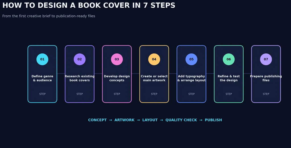
Step 1: Define Your Book's Genre and Audience
Before opening a design tool, identify what your cover needs to communicate.
Write down:
- Your book's genre and subgenre.
- The intended reader.
- The emotional atmosphere.
- The main character, setting, or concept.
- The visual impression you want readers to remember.
For example, a dark paranormal romance may need a different visual direction from a contemporary romance, even though both belong to the romance category.
Step 2: Research Existing Book Covers
Explore successful books in your genre.
Pay attention to:
- Common color palettes.
- Typography styles.
- Illustration techniques.
- Composition and image placement.
- How authors and titles are positioned.
Create a moodboard with references that communicate the desired atmosphere.
The objective isn't to copy another author's cover. It's to understand the visual language readers already associate with your genre.
Step 3: Develop Multiple Design Concepts
Instead of committing to the first idea, explore several directions.
For example, a fantasy novel might use:
- A character-focused illustrated cover.
- A dramatic castle landscape.
- A symbolic magical artifact.
- A minimalist title with an enchanted background.
Compare the concepts based on genre fit, visual clarity, originality, and readability.
AI image generation can help explore these directions quickly. You can experiment with different compositions, lighting, environments, and artistic styles before choosing a final concept.
Step 4: Create or Select Your Main Artwork
Your artwork should support the story rather than simply fill the available space.
Possible approaches include:
- Original illustrations.
- Licensed stock photography.
- Custom artwork from an illustrator.
- AI-generated visual concepts.
- Abstract shapes and graphic elements.
When using AI, provide specific instructions about the subject, environment, composition, lighting, and visual style.
For example, instead of writing "fantasy castle book cover," describe the castle's architecture, surrounding landscape, camera perspective, atmospheric conditions, and color palette.
Generate the artwork without relying on AI to produce the final title typography. Add and refine text separately in a design or publishing application.
Step 5: Add Typography and Arrange the Layout
Once the artwork is ready, build the cover layout.
Focus on:
- Making the title immediately visible.
- Choosing fonts that fit the genre.
- Positioning the author's name consistently.
- Maintaining sufficient contrast.
- Leaving enough negative space.
- Avoiding unnecessary decorative elements.
If the artwork is visually complex, use a simpler title treatment. If the background is minimal, typography can become the central creative feature.
Step 6: Refine and Test the Design
Before finalizing, evaluate the cover from multiple perspectives.
Use this checklist:
- Does the cover communicate the correct genre?
- Is the title readable at thumbnail size?
- Does the artwork have a clear focal point?
- Are the colors visually consistent?
- Do the fonts complement each other?
- Is the design distinctive without becoming confusing?
- Are the images and fonts properly licensed?
Ask someone familiar with your target genre to review the design. Feedback can reveal problems that are difficult to notice after repeatedly working on the same composition.
Step 7: Prepare Your Final Publishing Files
A finished ebook image and a complete print cover are not necessarily the same file.
For an ebook, you generally need a front-cover image that meets the publishing platform's requirements.
For a paperback or hardcover, you may need:
- Front cover.
- Back cover.
- Spine.
- Bleed and safe margins.
- Barcode placement where required.
- Correct dimensions and resolution.
- A print-ready PDF or another accepted format.
Always download the latest cover template from your publishing platform or printer. Spine width, trim size, bleed, and export requirements depend on the book's specifications and provider.
Best Fonts and Colors for Different Book Genres
Choosing typography and colors is easier when you start with the atmosphere of the book.
Genre | Font Direction | Color Direction | Design Recommendation |
|---|---|---|---|
Fantasy | Decorative serif | Deep blue, gold, purple | Use expressive titles and symbolic artwork |
Romance | Elegant serif or script accents | Pink, cream, red | Emphasize emotional imagery |
Thriller | Bold condensed sans-serif | Black, red, gray | Prioritize contrast and tension |
Horror | Distressed or irregular fonts | Black, dark red, muted green | Use typography to reinforce atmosphere |
Sci-Fi | Geometric sans-serif | Blue, violet, neon | Experiment with futuristic compositions |
Nonfiction | Modern sans-serif | Neutral, blue, green | Prioritize clarity and hierarchy |
Children's | Rounded and playful fonts | Bright and varied | Make characters and titles approachable |
A useful principle is to choose typography that complements the artwork rather than competes with it.
For example, a detailed fantasy illustration may benefit from restrained typography, while a minimalist nonfiction cover may rely on bold lettering to establish its identity.
Best Tools for Designing a Book Cover
Different tools support different parts of the book cover design process.
Tool | Best For | Advantages | Limitations |
|---|---|---|---|
Canva | Beginner-friendly cover layouts | Templates and accessible editing | Designs can look generic without customization |
Adobe Photoshop | Image editing and compositing | Advanced visual manipulation | Requires design skills |
Adobe InDesign | Complete publishing layouts | Precise page and print layout control | More complex for beginners |
Adobe Illustrator | Vector artwork and typography | Flexible graphic design | Not always the easiest complete-cover workflow |
Procreate | Original illustrations | Flexible digital drawing | Requires drawing skills and compatible hardware |
AI Image Generators | Concept exploration and artwork | Rapid visual experimentation | Require further refinement and typography work |
Which Tool Should You Choose?
- For beginners: Canva is a practical starting point for combining artwork and text.
- For experienced image editors: Photoshop provides greater control over image composition and visual effects.
- For print publishing: InDesign is useful for preparing complete cover layouts.
- For illustrators: Procreate supports original hand-drawn artwork.
- For exploring creative directions: AI image generation helps you compare visual concepts before committing to a design.
You don't necessarily need to use just one tool. A practical workflow might involve generating artwork with an AI tool, refining it in Photoshop, and assembling the final print layout in InDesign.
AI vs. DIY vs. Professional Book Cover Design
Choosing a design method depends on your budget, creative skills, publishing goals, and desired level of control.
Approach | Best For | Advantages | Limitations |
|---|---|---|---|
AI-Assisted Design | Exploring visual concepts | Fast experimentation and multiple creative directions | Requires human refinement and quality control |
DIY Design | Independent authors | Creative control and flexibility | Requires time to learn design principles |
Professional Designer | Authors seeking custom publishing artwork | Specialized design expertise and tailored execution | Higher cost and communication requirements |
Premade Covers | Authors seeking an established design | Faster production and predictable presentation | Less flexibility and potential design overlap |
When Should You Use AI?
AI is particularly useful during the early creative stages.
You can use it to:
- Explore alternative cover compositions.
- Experiment with different artistic styles.
- Generate background illustrations.
- Develop moodboards.
- Compare lighting and color directions.
- Refine visual concepts through iterative editing.
For example, you could explore a dark fantasy cover using a castle illustration, a dragon silhouette, and a magical emblem before selecting the strongest direction.
How to Avoid Generic AI Book Covers
Generating an attractive image is not the same as designing an effective book cover.
To improve the result:
- Use a specific visual concept rather than a generic genre prompt.
- Define the composition before generating artwork.
- Explore multiple visual directions.
- Keep the main subject and background visually balanced.
- Add typography separately.
- Review the result at thumbnail size.
- Check image licensing, platform rules, and applicable publishing requirements.
AI should support creative decision-making rather than replace it.
8. Book Cover Size and Printing Requirements: Ebook vs. Paperback vs. Hardcover
Book cover dimensions depend on the format, trim size, page count, paper specifications, and publishing platform.
A common mistake is assuming that one front-cover image can be used directly for every publishing format.
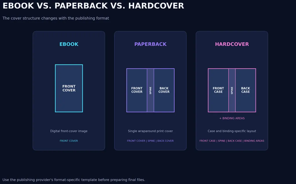
Ebook Cover Requirements
Ebook covers generally use a front-cover image rather than a full wraparound layout.
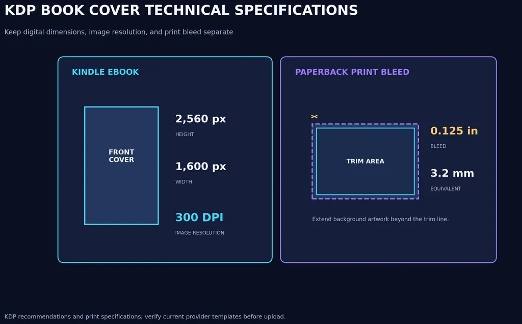
For Amazon Kindle Direct Publishing (KDP), the recommended ebook cover dimensions are:
2,560 pixels high × 1,600 pixels wide.
KDP also specifies accepted image formats, including JPEG and TIFF, and recommends a minimum resolution of 300 DPI/PPI.
Before exporting, check:
- Required image dimensions.
- Accepted file formats.
- Aspect ratio.
- Image quality.
- File size.
- Rights to use the artwork.
These are KDP-specific recommendations, not universal requirements for every ebook retailer.
Paperback Cover Requirements
A paperback cover normally includes three connected sections:
- Front cover: The main artwork, title, and author information.
- Spine: The narrow section containing the book title and author name when permitted.
- Back cover: The book description, author information, and barcode area.
For KDP paperback covers, the total cover dimensions are calculated using:
Cover Width = Bleed + Back Cover Width + Spine Width + Front Cover Width + Bleed
Cover Height = Bleed + Trim Height + Bleed
KDP requires 0.125 inches (3.2 mm) of bleed on all outside edges. Images and backgrounds that reach the edge must extend beyond the trim line.
KDP also specifies that:
- Cover files should be submitted as a single PDF containing the back cover, spine, and front cover.
- Cover images should have at least 300 DPI.
- Fonts should be embedded.
- Layers and transparencies should be flattened.
- Content that should not be trimmed should remain within the specified safe area.
- Spine width must be calculated using the actual page count and paper type.
Do not estimate spine width using the front-cover dimensions. Use the official KDP cover calculator and template generator.
Hardcover Cover Requirements
Hardcover covers require a separate layout from paperback covers.
Depending on the printer and binding method, the design may need to account for:
- Front and back case panels.
- Spine dimensions.
- Wraparound artwork.
- Hinge and joint areas.
- Turn-in areas.
- Additional production margins.
Do not simply stretch a paperback cover to fit a hardcover. Download the appropriate hardcover template after selecting the binding, trim size, paper, and final page count.
Ebook vs. Paperback vs. Hardcover: Key Differences
Requirement | Ebook | Paperback | Hardcover |
|---|---|---|---|
Main artwork | Front cover | Front cover | Front cover |
Back cover | Usually not required | Required | Required |
Spine | Not required | Required | Required |
Bleed | Platform-dependent image specifications | Required for KDP print covers | Follow hardcover template |
Final format | JPEG or TIFF for KDP ebook | Single print-ready PDF for KDP | Print-ready file according to provider |
Dimensions | Digital image dimensions | Trim size + spine + bleed | Case and binding specifications |
Official KDP resources:
- Kindle eBook Cover Image Guidelines
- Create a Paperback Cover
- KDP Paperback Submission Guidelines
- Prepare Your Cover
Always verify the latest specifications before uploading. Different publishing platforms and printing providers may have different requirements.
How to Create Better Book Covers with an AI Design Workflow
AI-assisted design becomes more useful when you treat it as an iterative creative workflow rather than a one-time image-generation task.
A structured process helps maintain consistency between the initial concept and the final artwork.
Step 1: Explore Multiple Visual Directions with Different Models
Start with the same book description and develop different visual interpretations.
For example, a science fiction novel could explore:
- A futuristic cityscape.
- A mysterious spacecraft.
- A character-centered composition.
- An abstract technological environment.
Different image-generation models may interpret the same prompt differently. Comparing their outputs helps you evaluate composition, lighting, detail, and artistic style instead of relying on the first result.
With Virse, creators can explore multiple image-generation models within one creative workspace, making it easier to compare visual directions without fragmenting the ideation process across separate tools.
Step 2: Build and Organize Concepts on an Infinite Canvas
Once you have several promising concepts, organize them into a visual moodboard.
Include:
- Reference book covers.
- Color palettes.
- Character references.
- Background environments.
- Typography inspiration.
- Generated artwork variations.
An Infinite Canvas provides room to organize these elements together, compare alternatives, and develop a coherent visual direction.
This is particularly useful when designing a book series, where different covers need to maintain a recognizable visual identity.
Step 3: Refine Your Artwork Through Targeted Editing
The first generated image rarely contains every detail you need.
Instead of regenerating the entire composition, identify the specific elements that need improvement.
For example:
Design Problem | Refinement Direction |
|---|---|
Background looks too busy | Simplify environmental details |
Main subject lacks emphasis | Improve lighting and visual contrast |
Colors feel inconsistent | Apply a more controlled color palette |
Character placement is awkward | Adjust subject position and composition |
Artwork looks generic | Introduce more distinctive visual elements |
Series covers lack consistency | Reuse visual references and style conventions |
Targeted visual refinement helps preserve the overall concept while improving specific details.
Virse's canvas-based workflow supports organizing creative assets and iterating on visual directions. The actual result still depends on the selected model, prompt, and editing operation.
Step 4: Keep Your Book Series Visually Consistent
For authors publishing multiple books, visual consistency is particularly important.
Create a reusable design system that defines:
- Typography.
- Color palette.
- Character illustration style.
- Logo placement.
- Decorative elements.
- Layout conventions.
Individual covers can introduce new artwork while retaining recognizable elements from the wider series.
Step 5: Complete the Cover in a Publishing Application
Once the artwork is ready, move into a layout application to finish the cover.
Use Canva, Photoshop, Illustrator, or InDesign to:
- Add the actual title and author name.
- Refine font sizes and spacing.
- Create the back-cover layout.
- Calculate and position the spine.
- Add required publishing information.
- Export files according to the printer's specifications.
AI-generated artwork is not automatically a complete, print-ready book cover. Typography, layout, licensing, and technical preparation still require separate attention.
Why Use Virse for Book Cover Exploration?
Virse is useful when the creative challenge involves exploring multiple visual directions and refining artwork rather than simply generating one image.
Its workflow supports:
- Multiple AI Models: Explore different visual interpretations within one workspace.
- Infinite Canvas: Organize references, concepts, and generated assets together.
- Iterative Editing: Refine backgrounds, compositions, colors, and visual details.
- Creative Collaboration: Paid plans support unlimited seats, making shared creative work easier.
- Flexible Exploration: Registered users receive credits to try the creative workflow before choosing a paid plan.
For authors, illustrators, and creative teams, this makes Virse a useful environment for developing book cover concepts before moving into final publishing layout.
Common Book Cover Design Mistakes to Avoid
Even attractive artwork can become an ineffective book cover when important design decisions are overlooked.
Mistake | Why It Doesn't Work | How to Fix It |
|---|---|---|
Too many visual elements | Creates unnecessary complexity | Establish one primary focal point |
Poor font combinations | Makes the cover feel inconsistent | Use complementary typefaces |
Weak title contrast | Reduces readability | Adjust typography and background contrast |
Wrong genre signals | Attracts the wrong audience | Research comparable books |
Generic AI artwork | Makes the design less distinctive | Develop a more specific visual concept |
Ignoring thumbnail size | Important details disappear | Test the cover at smaller sizes |
Unlicensed images | Creates potential publishing risks | Verify commercial usage rights |
Incorrect print dimensions | Can lead to production problems | Use the printer's official template |
One particularly common mistake is designing a cover around personal aesthetic preferences without considering the intended reader.
A book cover should reflect the author's creative vision while remaining understandable and appealing to its target audience.
Conclusion: Turn Book Cover Inspiration into a Finished Design
The best book cover ideas combine genre recognition, visual storytelling, typography, and practical publishing requirements.
Start by exploring references that match your book's audience. Develop multiple concepts, select artwork that supports the story, and refine the composition until it works at both full size and thumbnail scale.
AI can make the early creative process more flexible by helping you explore visual directions, compare different models, and iterate on artwork. However, typography, licensing, layout, and print preparation still require careful attention.
A successful book cover isn't simply an attractive image. It's a visual introduction to the story that helps the right readers recognize why they should open the book.
Frequently Asked Questions
1. How do I come up with ideas for my book cover?
Start by identifying your book's genre, target audience, and emotional atmosphere. Research comparable books, collect visual references, and create a moodboard. Experiment with different compositions, color palettes, and typography before selecting a final direction. AI image generation can also help you explore concepts without needing advanced illustration skills.
2. How do I design a professional book cover without hiring a designer?
You can create your own book cover using tools such as Canva, Photoshop, or AI image generators. Start with genre research, choose a strong visual concept, create or source the artwork, and add readable typography. Test the design at thumbnail size and verify all publishing specifications before exporting.
3. Is Canva good enough for designing a book cover?
Canva can be sufficient for many ebook covers and straightforward DIY projects. It provides templates, typography controls, and image-editing features. However, more complex illustrations, advanced image compositing, and detailed print layouts may require Photoshop, Illustrator, or InDesign.
4. Can AI generate a complete book cover?
AI can generate cover artwork and explore different visual directions, but the output may still need substantial editing. In particular, titles, author names, and other text are generally better added separately using a design tool. You should also verify licensing and ensure the final layout meets publishing requirements.
5. What makes a book cover look professional instead of amateur?
Professional-looking covers typically have a clear visual hierarchy, readable typography, consistent colors, and a strong focal point. They also communicate the correct genre and avoid unnecessary visual elements. Testing the design at thumbnail size is an effective way to identify problems before publication.
6. How many book cover concepts should I create before choosing one?
There is no universal number. The important thing is to compare genuinely different visual directions rather than generating many nearly identical versions. Explore variations in composition, imagery, and atmosphere, then refine the strongest concept based on genre fit, readability, and originality.
7. How do I make a book cover that stands out as a thumbnail?
Use a strong focal point, high-contrast typography, and a simple composition. Avoid relying on small decorative details that disappear when the image is reduced. Preview the design at the approximate size readers will encounter in online bookstore listings.
8. Do I need different cover designs for ebooks and printed books?
Not necessarily. You can often adapt the same visual identity for both formats, but their technical layouts differ. Ebook covers generally require a front-cover image, while printed editions need additional space for the spine and back cover, along with appropriate bleed and safe margins. Always use the relevant publishing template.