40 Hoodie Design Ideas for Streetwear, Brands, and Custom Apparel
 Yifan Zhao10 menit baca ·
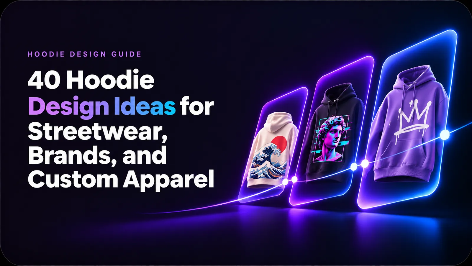
The best hoodie design ideas combine a clear visual concept with practical placement, readable details, and reliable production. A small chest logo with a larger back graphic is often effective, but the right layout depends on your audience, hoodie style, printing method, and how the design appears in product thumbnails.
Before choosing colors, graphics, or typography, it helps to create a clear AI design workflow from initial concept exploration to final production. This guide covers 40 creative hoodie directions, layout strategies, printing methods, and testing steps for streetwear brands, independent artists, and custom apparel creators.
What Makes a Good Hoodie Design?
A strong hoodie design usually has one clear visual focus, a layout that respects the garment structure, and enough contrast to remain readable at different sizes.
Before designing, decide:
- What should viewers notice first?
- Is the hoodie meant for daily wear, streetwear, sports, or merchandise?
- Will the design be embroidered, screen printed, or digitally printed?
- Does the artwork remain clear in a small product thumbnail?
- Can the front, back, and sleeve details work as one system?
Community design feedback frequently highlights the problem of overcrowding. Designs that combine too many logos, slogans, sleeve marks, and decorative elements can make the main visual difficult to identify.
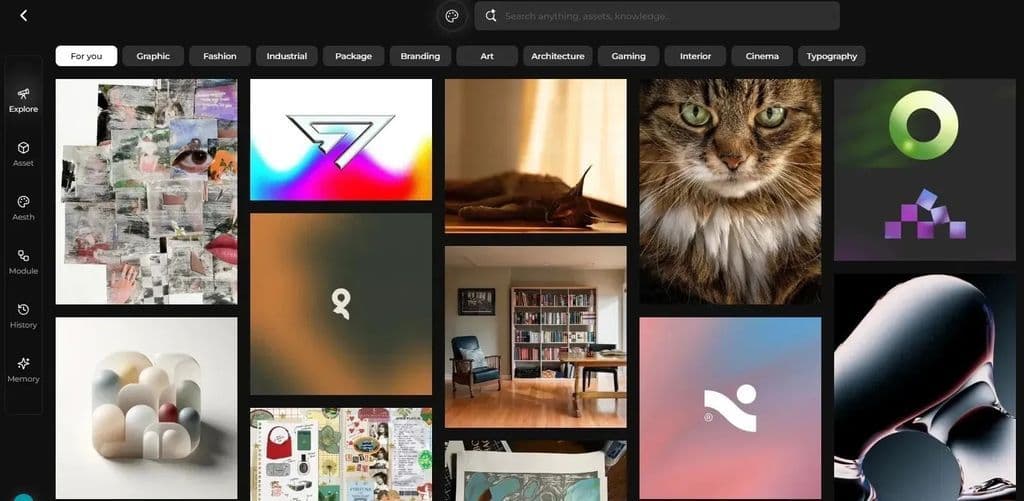
A moodboard can help organize references before you begin. Learn more about what a moodboard is and use it to collect colors, textures, typography, garment references, and visual themes.
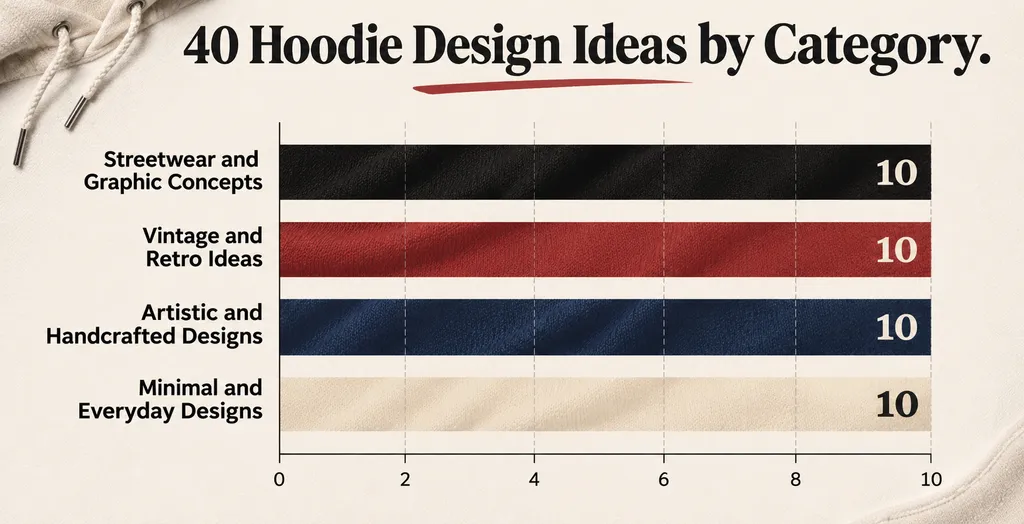
40 Hoodie Design Ideas to Explore
Streetwear and Graphic Concepts
- Oversized back graphic with a small chest emblem
- Hand-drawn graffiti typography
- Distressed vintage sports logo
- Monochrome urban illustration
- Abstract geometric streetwear print
- Gothic lettering with minimal symbols
- Sketched city map design
- Deconstructed newspaper collage
- Futuristic barcode and serial-number graphic
- Bold mascot with a short slogan
Vintage and Retro Ideas
- 1970s sunset and landscape graphic
- Retro racing-inspired hoodie
- Faded collegiate lettering
- Vintage travel poster design
- Old-school comic panel illustration
- Washed-out botanical artwork
- Distressed concert-poster layout
- Retro computer interface graphic
- Analog camera and film theme
- Classic workwear badge design
Artistic and Handcrafted Designs
- Original painting converted into a back print
- Rough pencil portrait
- Abstract brushstroke composition
- Handwritten quote with imperfect lettering
- One-line face illustration
- Textile-inspired folk pattern
- Layered ink and paint textures
- Custom sleeve embroidery
- Asymmetrical collage of personal symbols
- Limited-edition numbered artwork
Minimal and Everyday Designs
- Small embroidered monogram
- Single-word typography
- Tonal logo matching the hoodie color
- Minimal symbol near the heart
- Coordinates representing a meaningful place
- Small icon on the cuff
- Clean geometric chest mark
- Hidden message inside the hood
- Minimal front logo paired with a tonal back print
- Small design paired with a contrasting drawstring
For additional fashion directions, explore this guide to AI fashion design concept development before selecting a final visual style.
How Should You Place a Hoodie Design?
Small Chest Logo and Large Back Graphic
A small chest mark with a larger back graphic is one of the most flexible hoodie layouts. The front stays simple while the back creates a stronger visual statement.
This approach is frequently recommended in streetwear design feedback because a large front graphic can compete with the pocket, zipper, or other garment details. One highly engaged discussion received more than 1,200 upvotes for the preference toward a small chest design paired with a larger back graphic.
Source: Reddit streetwear discussion
Use this structure when you want:
- A clean and wearable front
- Clear brand recognition
- Space for a detailed back illustration
- A design that works well with jackets and layers
Large Front Graphic
A large front print works well for bold artwork, band-style graphics, mascots, and statement typography. Leave sufficient space around the pocket, zipper, and seams so the artwork does not appear interrupted.
Sleeve and Cuff Details
Sleeves are useful for dates, coordinates, symbols, short phrases, or secondary branding. Embroidery is often suitable for small sleeve marks because it adds texture and remains visible from the side.
Pocket-Safe Designs
Do not place important text, faces, or small details directly over a kangaroo pocket. The pocket opening can distort the artwork or make it difficult to print. Keep the most important elements above the pocket line.
Should the Main Graphic Go on the Front or Back?
The front is usually better for compact, instantly recognizable graphics. The back provides more space for detailed artwork, storytelling, and larger compositions.
Layout | Best For | Main Advantage | Common Risk |
|---|---|---|---|
Small front logo | Brand identity | Easy to wear and recognize | May feel too plain alone |
Large front graphic | Statement designs | Strong immediate impact | Can look crowded |
Large back graphic | Illustrations and storytelling | More space and visual depth | Less visible from the front |
Sleeve graphic | Secondary details | Adds interest from different angles | Small text may become unreadable |
Front and back set | Brand collections | Creates a complete design system | Easy to overdesign |
For many streetwear concepts, a small front mark with a large back graphic offers a strong balance between branding and everyday wearability.
How Do You Make a Hoodie Design Look Original?
A design can use familiar elements without looking generic if it has a clear concept and controlled visual hierarchy.
Start with one central idea. A rose, skull, or rainbow becomes more distinctive when connected to a specific story, place, phrase, or visual system. Avoid combining unrelated symbols simply because they look attractive individually.
Community feedback also shows that familiar motifs can quickly make a hoodie look like a generic fast-fashion product. Common floral graphics, overused slogans, and predictable streetwear fonts need a distinctive treatment to feel original.
Source: Reddit streetwear design discussion
Typography also affects originality. Instead of using a common streetwear font without modification, adjust the spacing, proportions, outlines, or letter placement. A custom wordmark can create stronger recognition than a complex illustration.
A useful design test is to remove one element at a time. If the composition becomes clearer, the removed element was probably competing with the main idea.
How Do You Choose Between Embroidery and Printing?
The production method should influence the design from the beginning.
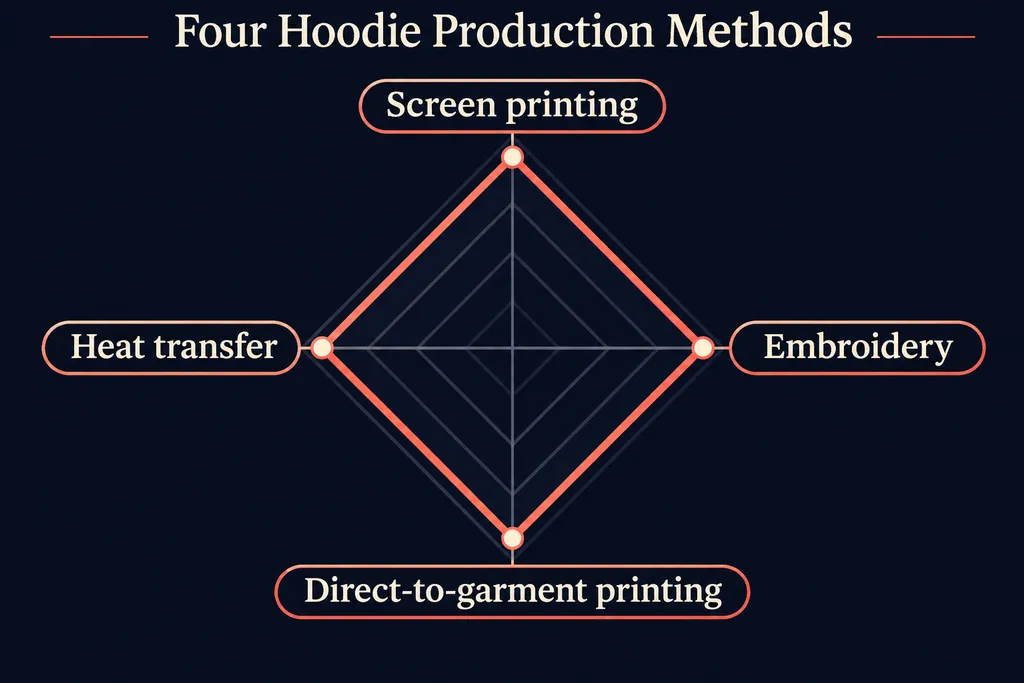
Screen Printing
Screen printing is suitable for bold graphics, large back prints, and limited-color artwork. Distressed textures can reduce the heavy appearance of large ink areas, especially when using white ink on dark fabric.
A screen-printing professional noted in a design critique that large areas of white ink can feel thick or heavy on fabric. Textured or distressed artwork can help reduce that visual and physical weight.
Source: Reddit screen-printing discussion
Embroidery
Embroidery works well for small chest logos, initials, symbols, and short sleeve text. Avoid extremely thin lines, tiny lettering, and highly detailed illustrations because they may lose clarity when stitched.
Direct-to-Garment Printing
Direct-to-garment printing supports gradients, detailed illustrations, and multicolor artwork. It can be useful for original paintings or photographic designs, although the finished result should be checked on the chosen fabric color.
Heat Transfer
Heat transfers are practical for small batches and custom names or numbers. Check the finish, flexibility, and durability before using them for a premium clothing line.
How Can You Test a Hoodie Design Before Production?
A mockup helps compare layouts, colors, and garment styles, but it should be treated as a planning tool rather than a perfect preview of the finished product.
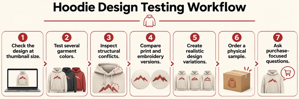
Use this workflow:
- Check the design at thumbnail size. Make sure the main shape and message remain visible on a phone screen.
- Test several garment colors. A graphic that works on black may lose contrast on brown, navy, or washed gray.
- Inspect structural conflicts. Look for pockets, seams, zippers, hood overlap, and sleeve movement.
- Compare print and embroidery versions. Fine details may work digitally but fail when stitched.
- Create realistic design variations. Compare front-only, back-only, and front-and-back layouts before selecting one.
- Order a physical sample. Check color, ink thickness, placement, fabric weight, and readability.
- Ask purchase-focused questions. Ask whether people would wear or buy the hoodie, rather than only whether they think it looks attractive.
A physical sample is particularly important because a digital mockup may not accurately show embroidery texture, ink thickness, fabric color, or the effect of pockets and seams. These limitations are frequently raised in apparel design discussions.
Source: Reddit clothing production discussion
Virse can help you explore hoodie concepts with different references, layouts, color treatments, and visual styles before choosing a production-ready direction. Use the AI design platform to compare variations, then validate the final design with a physical sample.
How Do You Avoid a Hoodie Looking Like Fast Fashion?
The strongest way to avoid a generic result is to build a coherent design system instead of adding more decoration.
Use a limited color palette, one dominant concept, and a consistent relationship between the front, back, and sleeve details. Replace generic slogans with language connected to your brand or audience. If you use familiar motifs such as roses, flames, or stars, give them a distinctive treatment through illustration style, composition, texture, or narrative.
A premium hoodie often feels restrained. The goal is not to show every idea at once, but to make the most important idea easy to remember.
What Should You Check in a Final Hoodie Design?
Before sending the artwork to a manufacturer, confirm:
- The main graphic is readable at thumbnail size
- The logo is not too complex for its intended size
- The pocket, hood, seams, and zipper do not interrupt key details
- The artwork works on the selected hoodie color
- The front and back layouts feel connected
- The printing method matches the level of detail
- The design still looks appealing without the mockup lighting
- The final sample matches the intended placement and scale
FAQ
What is the most popular hoodie design layout?
A small chest logo combined with a larger back graphic is one of the most versatile layouts. It gives the garment a clean front while leaving enough space for detailed artwork on the back.
What size should a hoodie graphic be?
The size depends on the garment and placement. A chest logo should remain compact and readable, while a back graphic can be significantly larger. Always account for pockets, seams, and hood overlap before finalizing dimensions.
Is embroidery or screen printing better for hoodies?
Embroidery is usually better for small logos and short text. Screen printing is better for large illustrations, bold graphics, and distressed textures. The best choice depends on the level of detail, fabric, order quantity, and budget.
How do I make a hoodie design look less generic?
Focus on one clear concept, reduce unnecessary text, customize familiar symbols, and use a consistent visual language across the front, back, and sleeves. Testing the design at thumbnail size can also reveal whether the main idea is distinctive.
Can AI help create hoodie design ideas?
AI can help generate visual directions, explore compositions, compare color palettes, and develop references. The final design still requires human review for readability, garment placement, production limits, and brand suitability.
Should I order a sample before selling a hoodie?
Yes. A physical sample reveals issues that digital mockups may hide, including ink thickness, color shifts, embroidery detail, pocket interference, and placement problems. A sample is especially important when working with a new printing or embroidery supplier.
Conclusion
A successful hoodie design balances originality, readability, placement, and production reality. Start with one strong concept, choose a layout that supports the garment, test it at small size, and confirm the final result on a physical sample before launching. With the right workflow, you can turn a simple idea into a hoodie that people actually want to wear.