
32,000-Token Context
Hand over a full brief rather than a paragraph.
Black Forest Labs' production model reads briefs up to 32,000 tokens, so brand rules, colour values, and compositional constraints can all go in at once.
Ouvrez cette page sur un navigateur de bureau pour commencer à créer.
FLUX 2 Pro is an AI image generation and editing model developed by Black Forest Labs. It pairs a rectified-flow transformer backbone with a Mistral-class vision-language model, handling generation and editing inside one unified architecture rather than as two separate systems.
The model is built around three major strengths:
Output reaches up to 4 megapixels with fine detail in faces, hands, and textures. The model adheres to brand constraints stated as exact hex colour values, which is what makes it viable for work governed by a style guide rather than a mood.
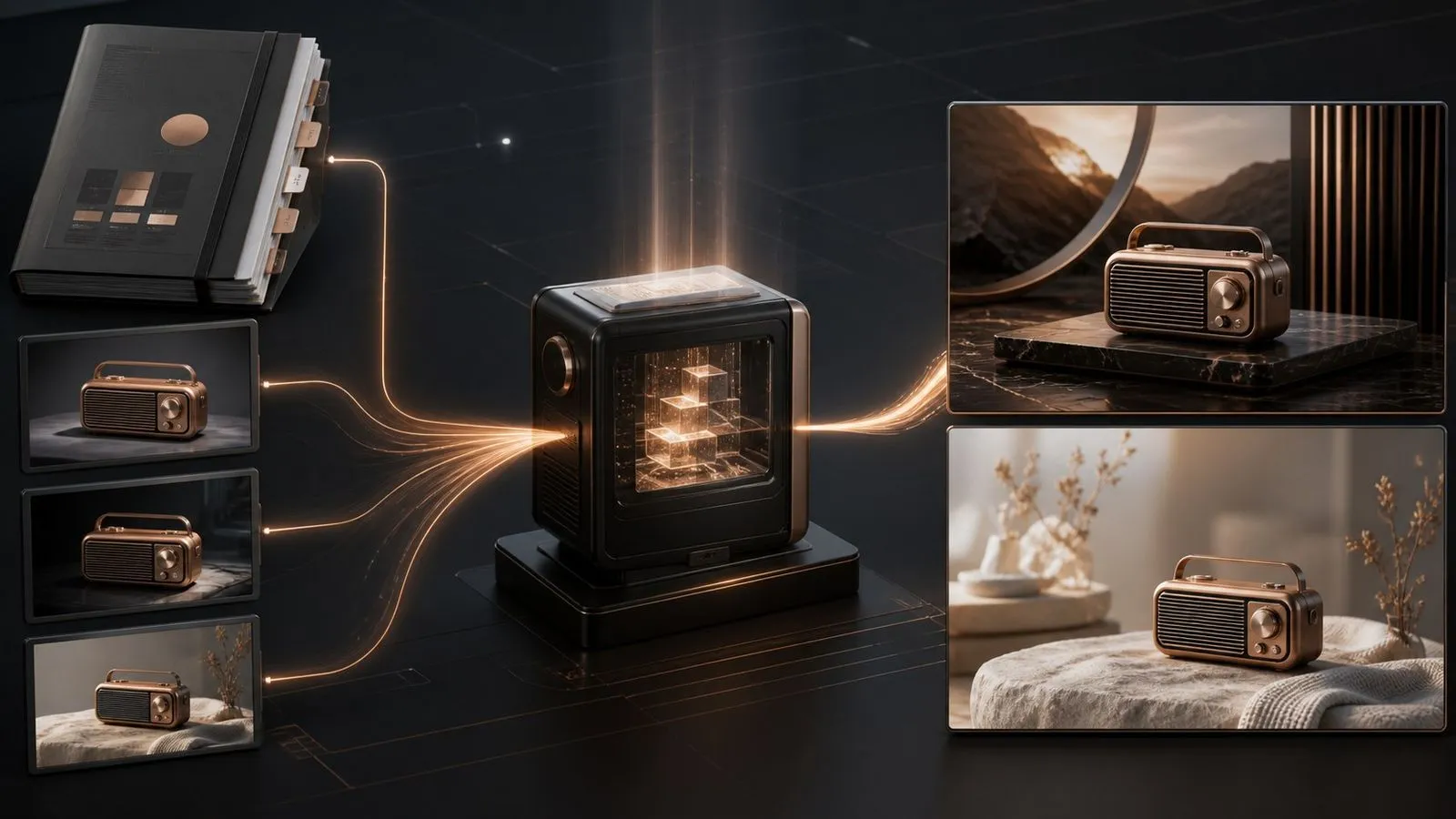
FLUX 2 Pro is Black Forest Labs' production-grade image model, and its most unusual specification is not resolution or speed. It is a 32,000-token context window.
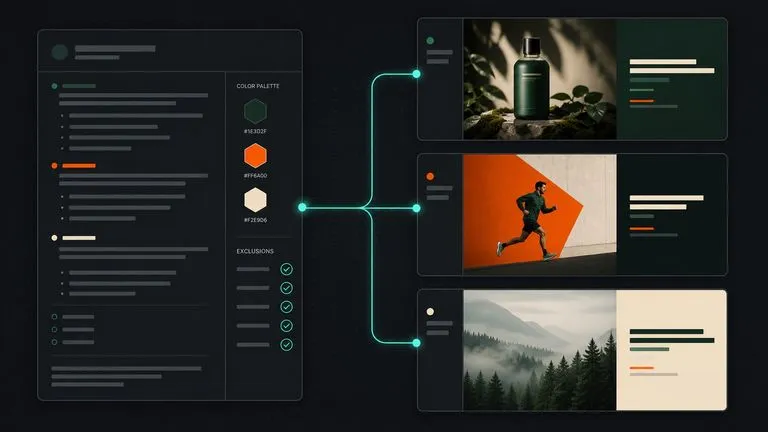
That number changes what a prompt can be. Most models take a paragraph and average anything beyond it into a general impression. This one accepts a document — the brand palette in hex, the tone-of-voice notes, the list of what must never appear, the compositional rules, the copy that has to be legible — and treats the whole thing as the specification for a single image.
Use FLUX 2 Pro when the constraints are written down somewhere. Produce brand-governed campaign visuals, product photography that must match a spec, infographics and UI mockups with legible fine text, and any asset a reviewer will check against a document.
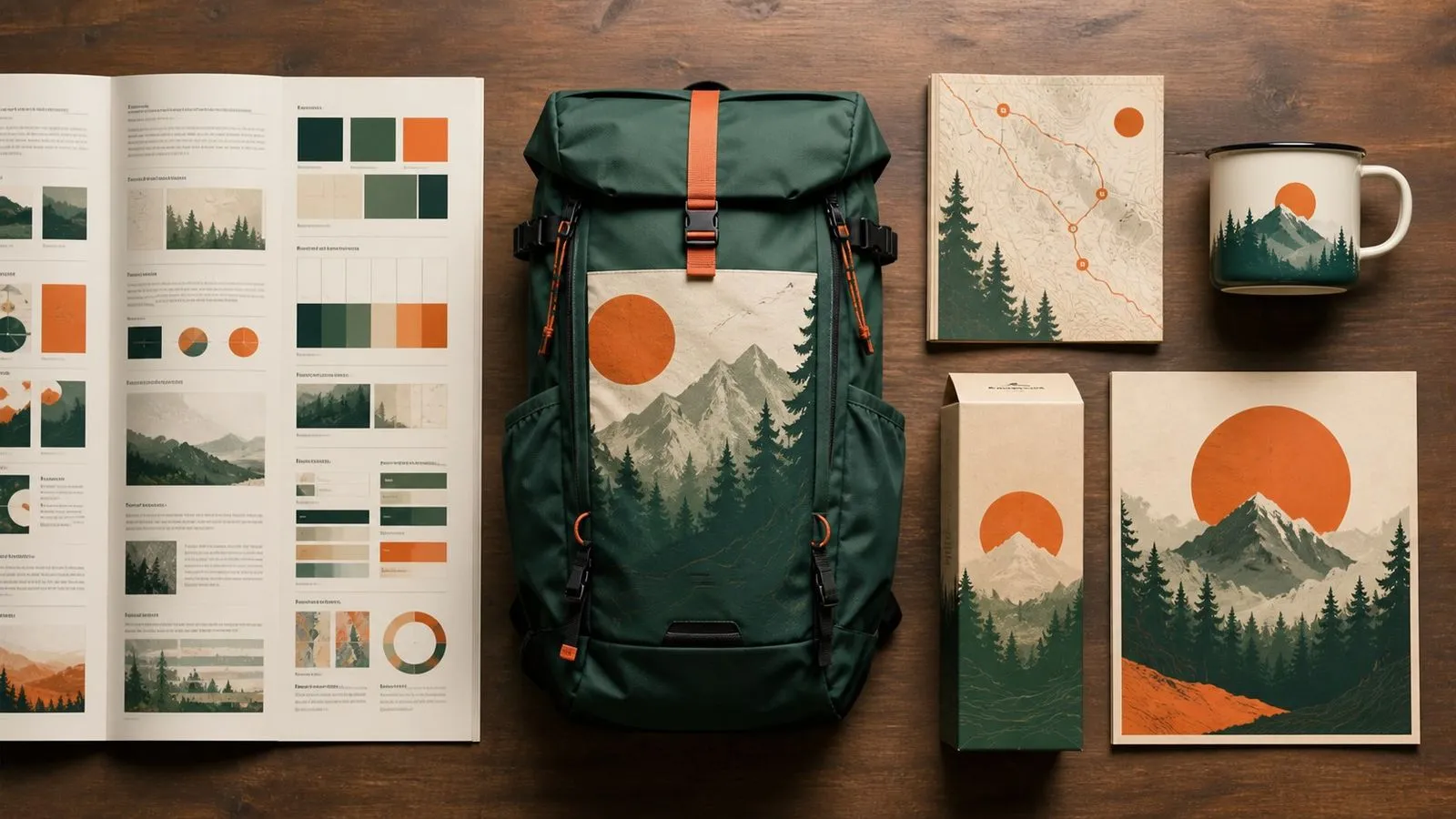
Hand over a full brief rather than a paragraph.
Production-grade output for commercial and print use.
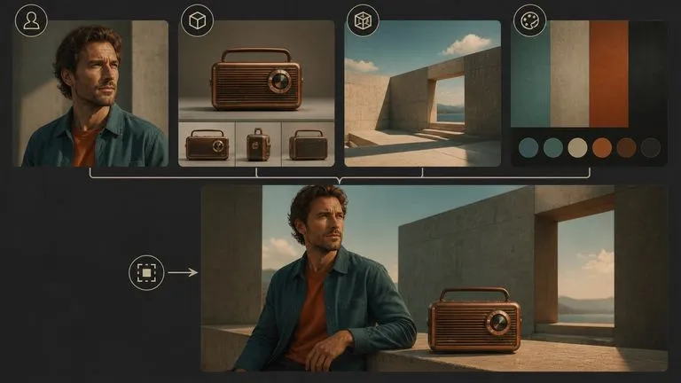
Hold characters and products steady across several reference images.
State a brand colour by value rather than describing it.
Typography, infographics, memes, and UI mockups with readable small type.
One architecture handles both, rather than bolting editing onto a generator.
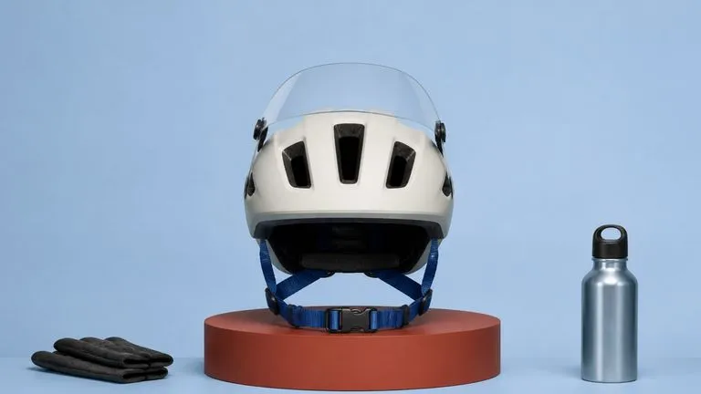
The 32,000-token window means constraints do not have to be summarised before they are handed over. Brand rules, exclusions, copy, and composition notes all go in together and are treated as one specification.
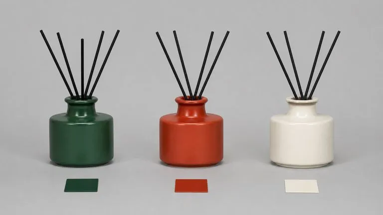
Naming a hex code produces that colour rather than an interpretation of it. For brand work this removes the round trip where a designer explains that the blue is not the right blue.
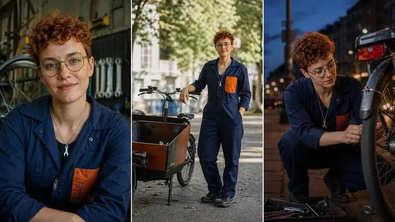
Characters and products stay recognisable across multiple supplied references, which is what makes a campaign read as one campaign rather than as several attempts at it.
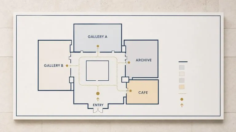
Fine type in infographics, interface mockups, and packaging comes back legible, putting a category of layout work within reach that most generators cannot attempt.
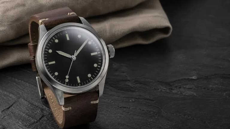
At up to 4 megapixels, faces, hands, and material textures hold up under the inspection that product and campaign photography receives.
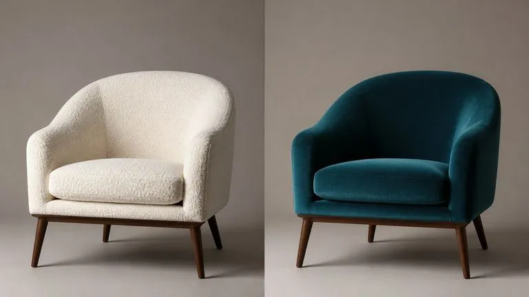
Because the architecture is unified, moving from creating an image to modifying it does not mean changing models or losing the context you established.
A 32,000-token brief is not something you type into a box from memory. It gets assembled from a style guide, a product spec, a set of references, and whatever the last review round changed. Virse gives that assembly somewhere to happen. The brief, the reference images it points at, and every generation against it live on one canvas, so the specification and the output stay attached to each other.
Park the written specification beside the renders it produced, so a reviewer can check one against the other in place.
Generate or import the character and product references first, then point the brief at them without exporting anything.
Move between FLUX 2 Pro and 30+ other image and video models without leaving the canvas or rewriting the brief.
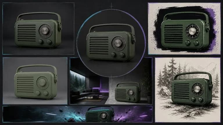
Hand an approved frame to Seedance 2.0, Kling 3.0, or Veo 3.1 so the video inherits the same visual direction.
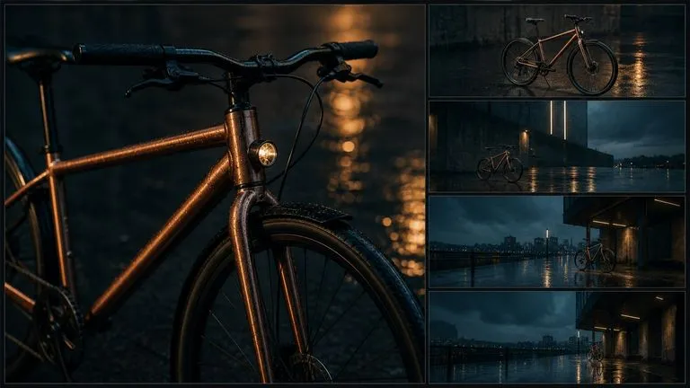

Key art built to a written style guide, down to specified colour values.
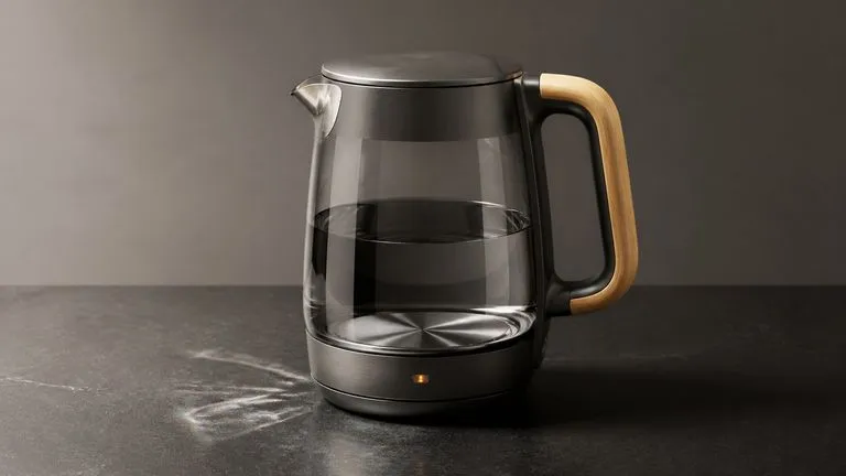
Commercial-grade renders with credible material, lighting, and detail.
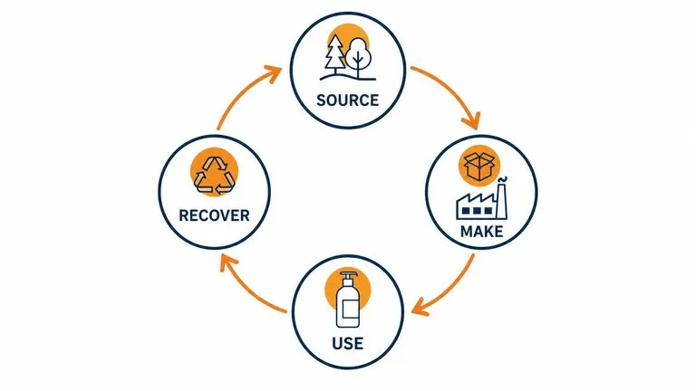
Explanatory layouts whose small labels stay readable.
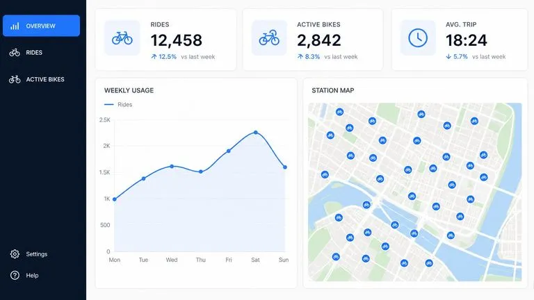
Product UI shown in context with legible on-screen type.
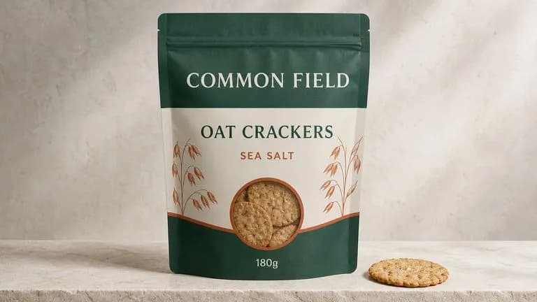
Front-of-pack designs carrying exact copy and brand colours.

Sets where a person or mascot appears repeatedly and has to stay the same.
Bring the style rules, colour values, copy, and exclusions together as one written specification.
Add the character, product, or environment images the brief refers to.
Submit the full brief rather than a trimmed version. Length is the capability you are paying for.
Check the output clause by clause, then amend the brief rather than rewriting it from scratch.
A useful FLUX 2 Pro prompt usually includes five elements:
Au lieu d’écrire
A clean modern product shot for our brand, on-brand colours, minimal, premium feel.
Écrivez
A matte ceramic diffuser standing upright on a plain seamless background in #E8E2D9. Shot straight on at object height, the diffuser occupying the central third with equal margins either side. Soft even light from the front left, one short shadow to the right. Brand accent #1F4B3F appears only in the printed band around the base. No props, no plants, no reflections, no gradient in the background. Any visible type in a light-weight geometric sans.
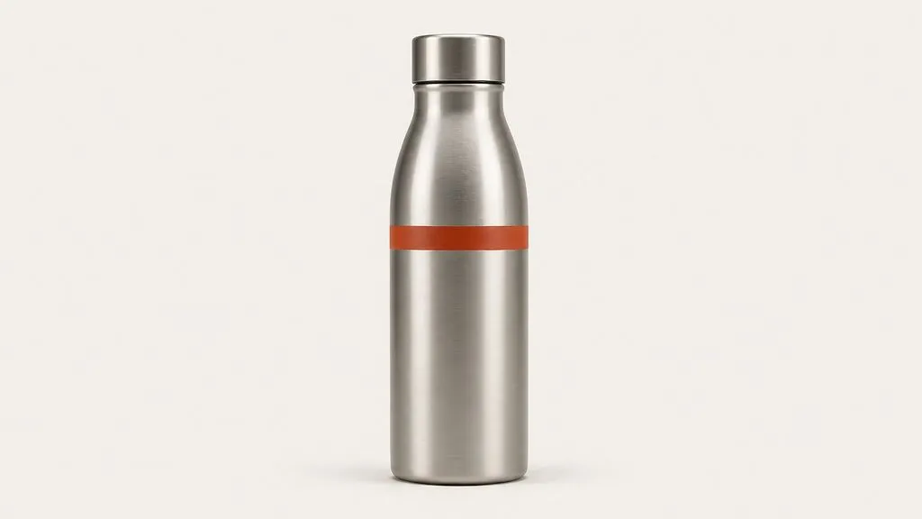
A brushed aluminium water bottle standing upright on a seamless background in #F2F0EB. Shot straight on at object height, bottle centred, occupying the middle third of the frame with equal margin either side. Two soft sources at 45 degrees, no top light, one short shadow falling directly back. The brand mark on the bottle is a single horizontal band in #C24A2B, no other colour anywhere in the frame. No props, no water droplets, no gradient in the background.
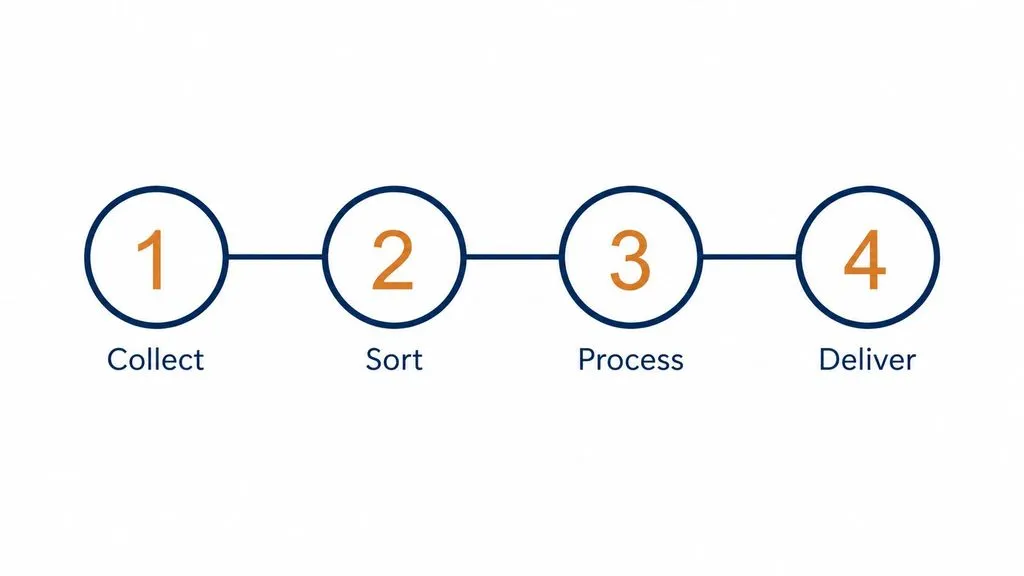
A flat infographic explaining a four-stage process, arranged left to right across a single row. Each stage is a numbered circle with a short label beneath it: Collect, Sort, Process, Deliver. Thin connecting line running through all four. Two colours only: #16324F for the circles and connectors, #D9822B for the numerals. Background plain white. All labels in the same small geometric sans at consistent size, no shading, no icons beyond the numerals.
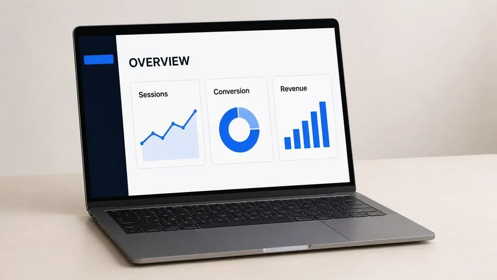
A laptop shown at a three-quarter angle on a plain desk surface, screen facing the viewer and legible. The interface on screen is a dashboard with a left sidebar, a header reading OVERVIEW, and three stat cards labelled Sessions, Conversion, and Revenue. Interface colours limited to #0E1726 for the sidebar, white for the content area, and #3B82F6 for the single accent. Soft ambient room light, no screen glare obscuring the type, nothing else on the desk.
| Critère | FLUX 1.1 Pro | FLUX 2 Pro |
|---|---|---|
| Generation | Previous generation of the line | Current production model |
| Brief length | Paragraph-scale prompts | Up to 32,000 tokens |
| Reference consistency | Single-reference oriented | Held across multiple references |
| Colour control | Described in words | Specified as hex values |
| Fine text | Limited | Legible in infographics and UI |
| Where it fits | Continuing an established series | New brand-governed work |
If a rule exists in writing somewhere, put it in the brief. The context window is the feature, and trimming the brief throws it away.
"#C24A2B" is executable. "Warm terracotta" is an invitation to interpret.
Listing what must not appear is as load-bearing as describing what should, particularly for brand work with prohibitions.
When a review round changes one rule, edit that clause and re-run. Rewriting the whole brief changes variables you did not mean to touch.
Explore focused tools for creating, editing, and preparing design assets.
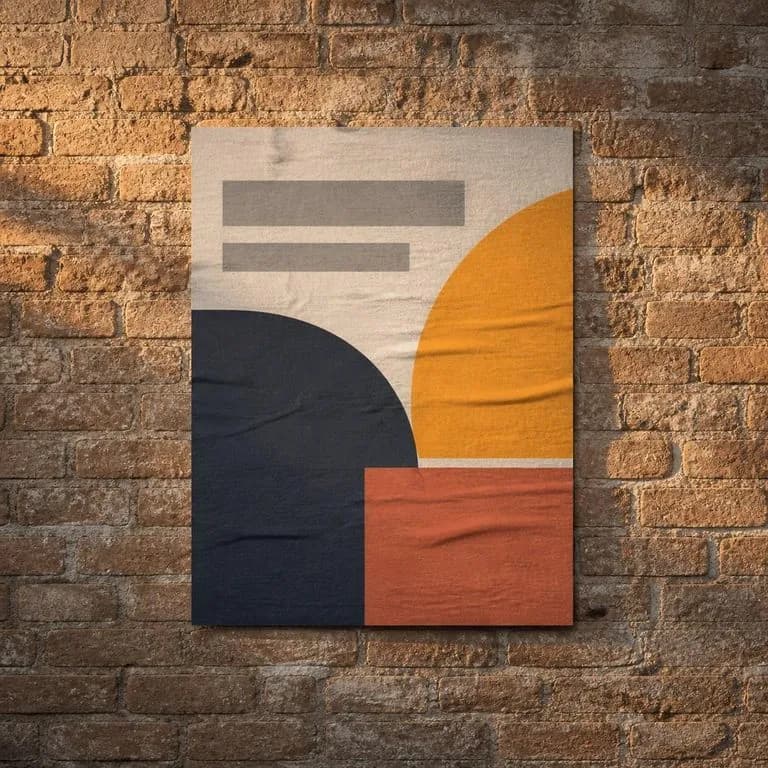
Importez l’affiche et les photos des lieux où elle doit apparaître. Un mur, un caisson lumineux, un abribus, un écran. Vous obtenez un placement photoréaliste par scène, avec une œuvre fidèle au pixel près sous la lumière et la perspective propres à cette scène.
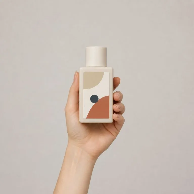
Importez une photo de modèle et une photo produit. Vous obtenez une image commerciale soignée du modèle tenant le produit, avec une prise en main naturelle, une échelle et une perspective correctes, ainsi qu’une lumière unifiée. Le visage et le produit restent tous deux exactement tels qu’ils ont été photographiés.
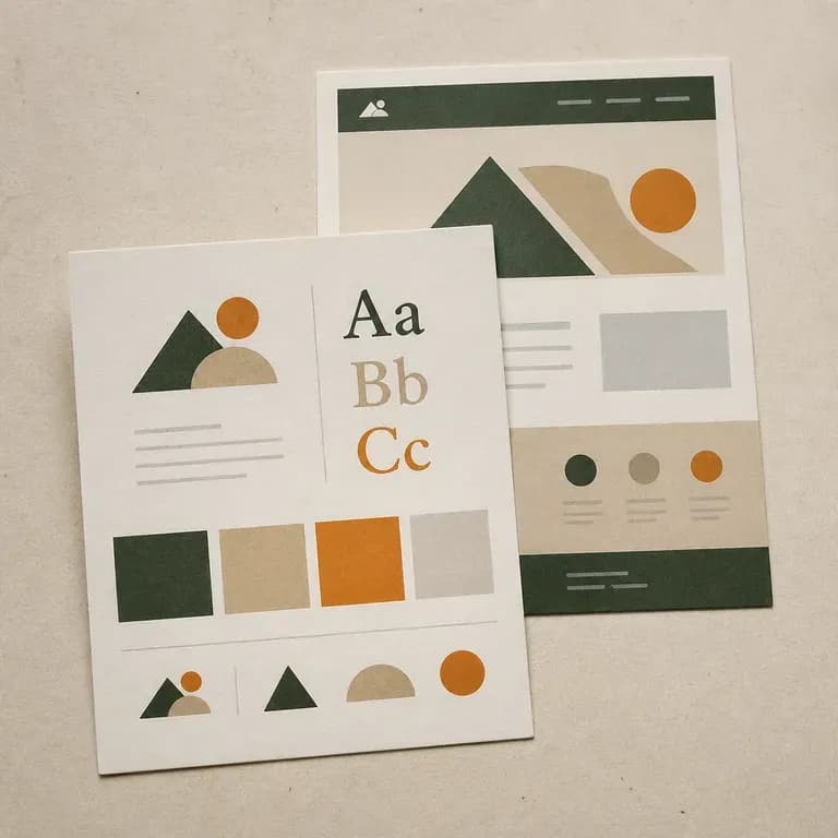
La plupart des travaux d’identité partent de rien ; celui-ci part de ce qui existe déjà. Indiquez-lui un site en ligne, ou décrivez la marque à partir de zéro, et obtenez une planche couvrant une direction de logo, de couleurs et de typographie, tirée de ce qui est réellement présent. Les crédits gratuits suffisent pour voir la première lecture.
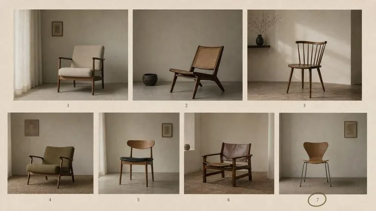
La génération de la gamme FLUX de Black Forest Labs qui a précédé FLUX 2, maintenue disponible sous deux entrées — le modèle standard et Ultra.
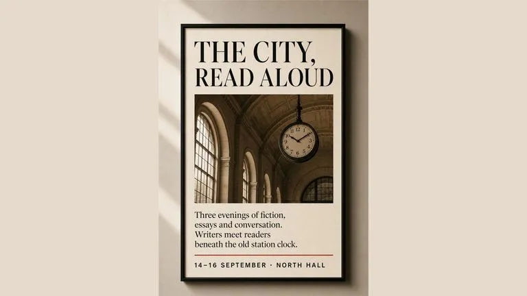
Generate studio-grade 4K images with Nano Banana Pro, blending multiple references while holding characters, products, and typography consistent.
OpenAI's GPT Image 2.0 reads a hundred-word brief and attempts all of it, with independent quality and resolution controls from 1K to 4K.
A model that reads 32,000 tokens does not need your brief summarised. Give it the specification and review the output against it.