
Monogram Design: Ideas, Fonts & How to Make One
 Yifan Zhao13 min de lecture ·
A monogram design combines two or more letters into a single visual symbol, usually using personal initials, business initials, or a shared surname. You can create one by overlapping letters, interlocking their strokes, arranging them vertically, or using negative space to connect their shapes.
The challenge isn't simply putting letters together. Some combinations naturally complement each other, while others have conflicting curves, awkward proportions, or overlapping strokes that make the final design difficult to recognize. A successful monogram needs to balance creativity, readability, and practical usability, while establishing a consistent visual identity.
This guide covers how to create a monogram from scratch, solve difficult letter combinations, choose the right fonts and layouts, and use AI tools for graphic design to explore original concepts.
What Is Monogram Design?
Monogram design is the process of combining individual letters into one cohesive visual identity. Unlike a traditional wordmark that displays a complete name, a monogram focuses on a small number of initials arranged into a distinctive graphic symbol.
Monograms are commonly used for:
- Business branding: Company logos, personal brands, and professional identities.
- Wedding stationery: Invitations, menus, napkins, and reception decorations.
- Fashion and luxury products: Clothing, handbags, accessories, and packaging.
- Personalized gifts: Towels, stationery, jewelry, and embroidered items.
- Digital identities: Website icons, social media avatars, and profile images.
Common Types of Monogram Designs
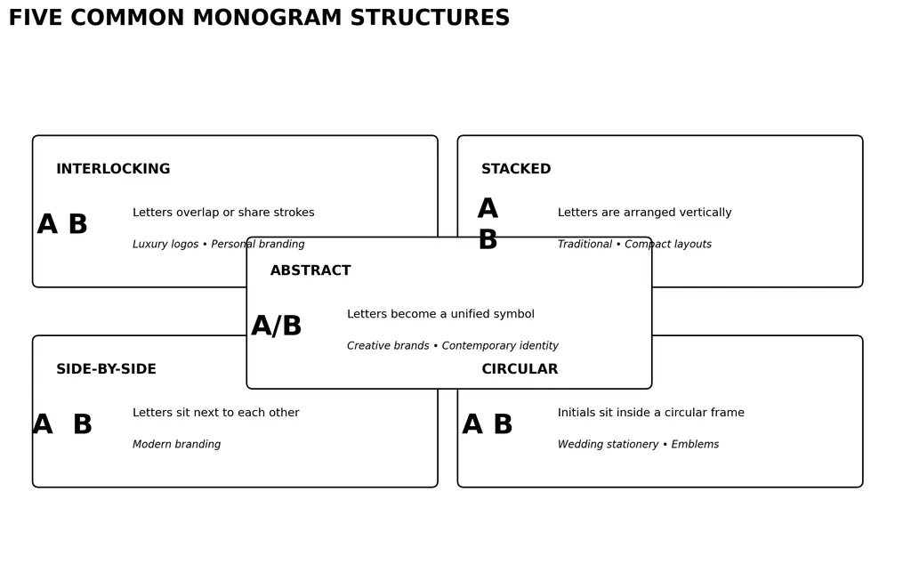
Monogram Style | Design Structure | Best Application |
|---|---|---|
Interlocking | Letters share or overlap strokes | Luxury logos and personal branding |
Stacked | Letters arranged vertically | Traditional monograms and compact layouts |
Side-by-side | Letters placed next to each other | Modern branding |
Circular | Initials arranged inside a circular frame | Wedding stationery and emblems |
Abstract | Letters transformed into a unified symbol | Creative brands and contemporary identities |
The right structure depends on the actual initials, the desired visual personality, and where the design will appear.
How Do You Create a Monogram Design?
Creating a professional monogram involves six main steps: selecting initials, exploring letter arrangements, choosing typography, refining proportions, testing readability, and exporting the final artwork.
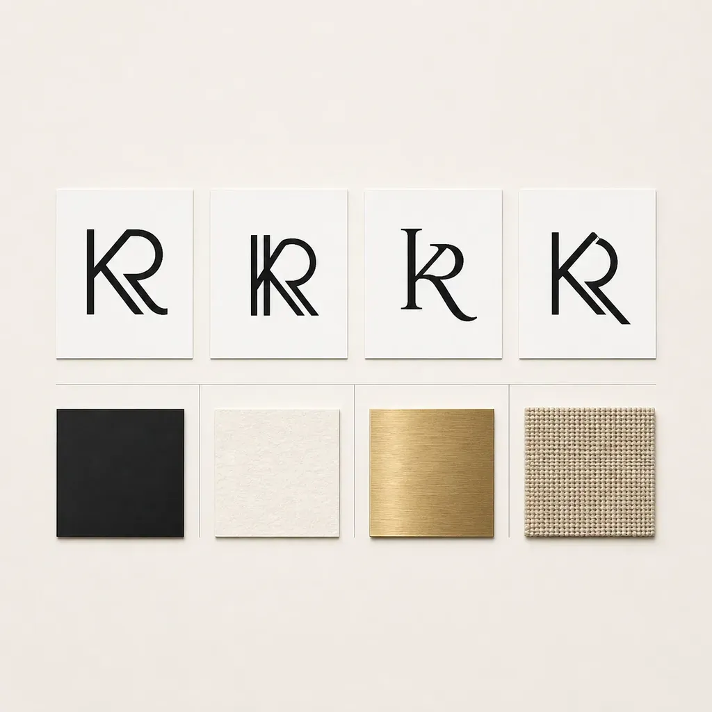
Step 1: Choose Your Initials
Start by deciding which letters your monogram should contain.
Common combinations include:
- Two initials for a couple or personal brand.
- Three initials for a traditional personal monogram.
- Two or three business initials for a company identity.
- Four letters for more experimental compositions.
Think about the purpose before choosing the arrangement.
For a business logo, you may want to emphasize the most recognizable brand initials. For a wedding monogram, you may need to consider both partners' names and their shared surname.
Step 2: Experiment With Different Letter Arrangements
There are several ways to combine initials.
Arrangement | How It Works | Best For |
|---|---|---|
Overlapping | Letters partially occupy the same space | Compact, connected designs |
Interlocking | Individual strokes connect to form one symbol | Custom luxury monograms |
Mirrored | Selected letterforms face each other | Symmetrical compositions |
Stacked | Letters are arranged vertically | Traditional and compact designs |
Negative space | Empty areas create secondary letter shapes | Minimalist and abstract logos |
Don't settle on the first arrangement that looks attractive. Create multiple variations and compare how clearly each initial can be recognized.
Step 3: Choose a Suitable Monogram Font
Typography determines much of a monogram's personality.
Font Style | Visual Characteristics | Best For |
|---|---|---|
Serif | Elegant, structured, traditional | Luxury brands and wedding monograms |
Sans Serif | Clean, geometric, minimal | Technology companies and modern branding |
Script | Flowing, connected strokes | Weddings and personalized gifts |
Decorative | Elaborate shapes and details | Formal and ornamental designs |
Geometric | Consistent proportions and simple shapes | Contemporary brand identities |
One important consideration is that a font that works for one combination may not work for another.
For example, a decorative script font might create an elegant AB monogram but make a CW combination difficult to distinguish.
Step 4: Refine Spacing and Negative Space
Once you have selected an arrangement, refine the relationships between the letters.
Focus on:
- Stroke thickness and consistency.
- Letter alignment and visual balance.
- Overlapping areas and intersections.
- Negative space between individual strokes.
- Optical balance rather than mathematical symmetry.
A useful technique is to identify one dominant letter and let the remaining initials support its structure. This creates a visual hierarchy without making the composition feel crowded.
Step 5: Test the Design at Different Sizes
A monogram that looks impressive on a large screen may become unreadable when reduced.
Test it in three contexts:
- Large: Signage, packaging, and presentation covers.
- Medium: Business cards and wedding invitations.
- Small: Website icons, social avatars, and embroidery.
Ask someone unfamiliar with the design to identify the initials without giving them hints.
If they consistently interpret the symbol as another letter, the composition needs further refinement.
Step 6: Export the Correct File Format
Choose an output format based on the intended application.
Format | Best Application | Important Consideration |
|---|---|---|
SVG | Logos and scalable digital graphics | Editable vector paths |
PNG | Digital applications | Supports transparent backgrounds |
Professional printing | Can preserve vector elements | |
EPS | Professional design workflows | Compatibility depends on receiving software |
PES / DST | Machine embroidery | Requires stitch-based digitization |
Important: SVG and PNG files are not automatically suitable for machine embroidery. Embroidery requires stitch information, density settings, underlay, and compatible machine formats.
How Do You Design Difficult Letter Combinations?
Some initials are naturally more difficult to combine than others. The problem usually comes from conflicting stroke directions, similar visual shapes, unusual proportions, or insufficient negative space.
Instead of forcing every letter into one composition, choose an arrangement that accommodates the individual geometry of each character.
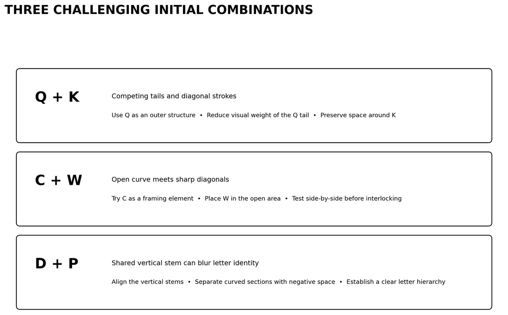
Combining Q and K
Q and K have very different visual structures. Q contains a dominant rounded form and a distinctive tail, while K relies on strong diagonal strokes.
Design challenge: The diagonal strokes of K can compete with Q's tail, making the composition look crowded.
Possible solutions:
- Use Q as the outer structure and position K within its open interior.
- Reduce the visual weight of the Q tail.
- Align one diagonal stroke of K with an existing structural line.
- Preserve enough negative space to distinguish both letters.
Combining C and W
C is an open curve, while W has multiple sharp diagonal strokes.
Design challenge: The angular structure of W may visually overpower the open shape of C.
Possible solutions:
- Use C as an enclosing or framing element.
- Position W inside the open area of C.
- Avoid forcing the letters into symmetrical proportions.
- Test a side-by-side composition before attempting interlocking.
Combining D and P
D and P share a vertical stem and curved elements, which creates opportunities for integration.
Design challenge: Excessive overlap can make the two letters appear like one unfamiliar character.
Possible solutions:
- Align their vertical stems.
- Explore sharing a structural stroke.
- Separate the curved sections through negative space.
- Use different visual weights to establish letter hierarchy.
A Practical Framework for Difficult Initials
Use this comparison before selecting a final composition.
Design Challenge | Recommended Technique | What to Check |
|---|---|---|
Conflicting diagonals | Rotate or reposition one letter | Stroke intersections |
Similar curves | Adjust scale and spacing | Letter recognition |
Different proportions | Establish a dominant letter | Visual balance |
Excessive overlap | Introduce negative space | Clarity |
Awkward symmetry | Use an asymmetrical layout | Overall composition |
The key principle is simple: design around the geometry of the actual letters instead of forcing every combination into the same template.
What Are the Best Monogram Design Ideas and Styles?
The best monogram style depends on the identity you want to communicate.
Here are six visual directions to explore.
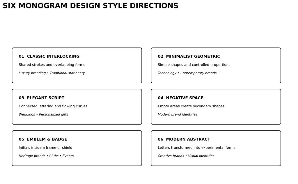
1. Classic Interlocking Monograms
Classic interlocking monograms combine letters through shared strokes and overlapping structures.
They work particularly well for luxury branding, traditional wedding stationery, and personalized accessories.
Use consistent stroke weights and avoid excessive overlapping that makes the initials difficult to distinguish.
2. Minimalist Geometric Monograms
Geometric monograms use simple shapes, clean lines, and controlled proportions.
They are suitable for technology companies, creative agencies, and contemporary personal brands.
A minimalist approach is especially useful when the symbol needs to remain recognizable at small sizes.
3. Elegant Script Monograms
Script monograms use connected lettering, flowing strokes, and decorative curves.
They are popular for wedding invitations, personalized gifts, and event stationery.
However, elaborate script can become difficult to reproduce in small formats or embroidery.
4. Negative Space Monograms
Negative space designs use empty areas around or inside letters to create secondary shapes.
This approach can make a monogram more distinctive without adding unnecessary decorative elements.
It is particularly effective for modern brand identities.
5. Emblem and Badge Monograms
Emblem monograms place initials inside a frame, shield, circle, or decorative border.
They are suitable for heritage-inspired brands, hospitality businesses, clubs, and formal events.
6. Modern Abstract Monograms
Abstract monograms transform letters into experimental visual forms.
They can create distinctive identities, but there is an important trade-off: the more abstract the composition becomes, the more difficult it may be to recognize the original initials.
For commercial branding, preserve enough recognizable letter structure to communicate the intended identity.
How Do You Design a Wedding Monogram?
Wedding monograms combine the initials of two partners, sometimes incorporating a shared surname. They are commonly used on invitations, reception decorations, napkins, menus, and personalized gifts.
Which Initial Goes First?
There is no universal rule that applies to every couple. Traditional arrangements often depend on naming conventions and the desired visual style.
Arrangement | Example | Typical Application |
|---|---|---|
First initials | A + J | Modern couple monograms |
First initials with surname | A S J | Traditional three-letter layouts |
Shared surname initial | A + S | Minimalist wedding branding |
Combined initials | ASJ | Custom wedding identity |
Before finalizing the design, confirm the preferred name order with both partners.
How to Make a Wedding Monogram Look Elegant
Consider these design choices:
- Use script or serif typography for a traditional appearance.
- Introduce subtle floral or ornamental elements.
- Keep decorative details secondary to the initials.
- Check how the design looks on light and dark backgrounds.
- Test the mark on actual stationery sizes before printing.
A wedding monogram should also be versatile enough to work across multiple materials without requiring a completely different design for each application.
What Are the Best Tools for Creating a Monogram?
Different tools suit different levels of design experience and production requirements. If you are comparing creative platforms, this guide to the best AI design tools provides additional context.
Tool | Best For | Advantages | Limitations |
|---|---|---|---|
Adobe Illustrator | Professional monogram logos | Precise vector editing and typography control | Learning curve |
Inkscape | Free vector design | Vector paths and SVG export | Requires manual design work |
Canva | Beginner-friendly designs | Templates and simple editing | Template-based designs can look generic |
PowerPoint | Basic initial arrangements | Familiar text and shape tools | Limited professional vector workflow |
AI design platforms | Exploring creative directions | Rapid visual experimentation | Generated lettering requires inspection |
Embroidery software | Machine-ready monograms | Embroidery-specific workflows | Requires proper digitization |
Can AI Help You Create a Monogram Design?
AI can help explore visual directions before committing to a final design. Rather than manually testing every possible arrangement, you can use generative design tools to explore different compositions, typography styles, and visual identities.
A practical AI-assisted workflow involves five stages:
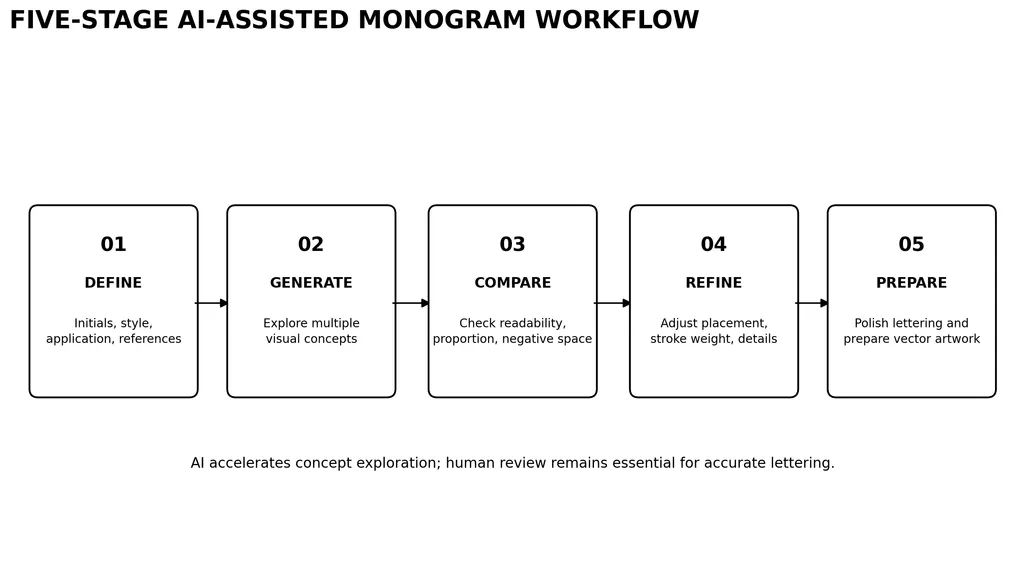
1. Define the creative direction.
Specify the initials, desired style, intended application, and visual references.
2. Generate multiple concepts.
Explore interlocking, stacked, minimalist, geometric, and decorative arrangements.
3. Compare the results.
Evaluate readability, proportions, negative space, and visual balance.
4. Refine the strongest concept.
Make targeted adjustments to letter placement, stroke weight, and decorative elements.
5. Prepare the final artwork.
Refine the lettering and convert the selected design into clean vector artwork.
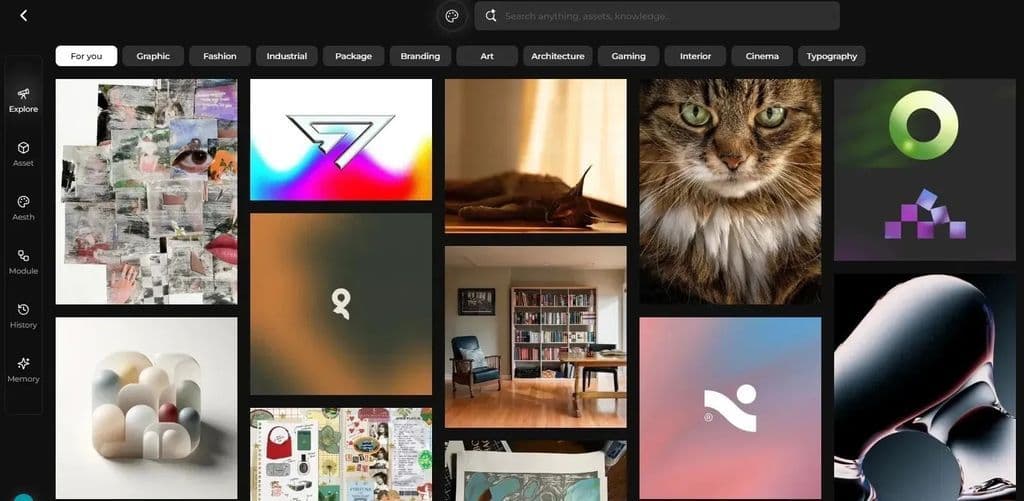
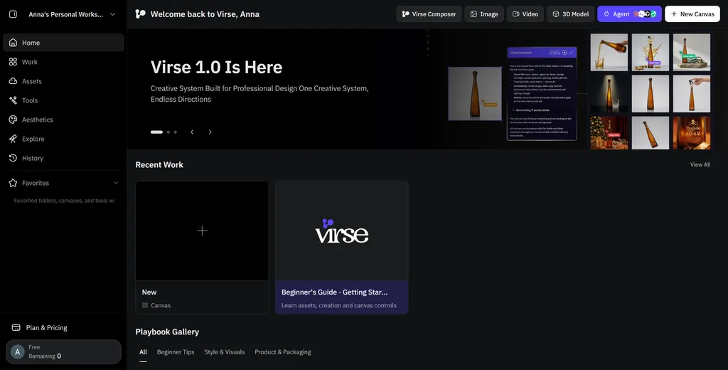
Platforms such as Virse can support this process through a multimodel creative workspace where designers can explore different AI-generated directions, organize visual references, and iterate on concepts within an infinite canvas.
The advantage of this approach is that you can compare several creative directions before committing to one design.
However, AI-generated lettering should not be treated as finished logo artwork. Generated characters can contain distorted strokes, inaccurate initials, or unintended visual associations. Always inspect the final composition and refine the letterforms before commercial use.
Common Monogram Design Mistakes to Avoid
Even a visually attractive monogram can fail when it does not communicate clearly or work in its intended environment.
Mistake | Why It Happens | How to Fix It |
|---|---|---|
Unreadable initials | Excessive overlapping | Preserve recognizable letter structures |
Inconsistent strokes | Different font weights | Standardize stroke thickness |
Poor visual balance | Unequal visual weight | Adjust proportions optically |
Excessive decoration | Too many ornamental elements | Simplify the composition |
Generic appearance | Overreliance on templates | Customize letterforms and spacing |
Small-size failure | Fine details disappear | Create simplified versions |
Unintended associations | Letter combinations resemble other symbols | Review from multiple perspectives |
Incorrect export | Wrong format for the application | Match the format to the production workflow |
One particularly important step is checking for unintended interpretations. Certain letter combinations can resemble unrelated symbols when strokes overlap or negative spaces create unexpected shapes.
A professional review should consider not only whether the designer understands the intended initials, but also what an unfamiliar viewer actually sees.
Conclusion
Good monogram design balances typography, visual identity, and practical usability. The strongest designs make specific initials feel like one cohesive symbol without sacrificing readability.
Start with the actual letters, experiment with multiple arrangements, and pay particular attention to difficult combinations. Choose typography that supports the letter structure, test the finished mark at different sizes, and prepare the correct export format for its intended application.
AI can accelerate visual exploration and help generate more creative directions, but careful refinement remains essential for a professional result.
Frequently Asked Questions
What is the difference between a monogram and a logo?
A monogram is a type of logo that combines initials into a single visual mark. A logo is a broader category that can include symbols, wordmarks, emblems, and abstract graphics. Monograms are particularly useful when a brand or individual wants to create a recognizable identity using a small number of letters.
How many letters should a monogram have?
Most monograms use two or three letters, although custom designs can contain more. Two-letter monograms are common for couples and businesses, while traditional personal monograms often use three initials. The ideal number depends on the identity being represented and how much space is available.
What is the best font for monogram design?
There is no universally best monogram font. Serif fonts are suitable for elegant and traditional designs, sans-serif fonts work well for contemporary branding, and script fonts are popular for weddings and personalized gifts. The most important consideration is whether the selected font makes the actual initials visually balanced and recognizable.
Can I create a monogram for free?
Yes. Tools such as Canva and Inkscape offer ways to create monograms without purchasing professional design software. You can arrange initials, experiment with typography, and export digital artwork. However, more complex vector editing and machine embroidery workflows may require additional tools.
How do I make a monogram with three initials?
Start by identifying the three letters and deciding their hierarchy. A traditional personal monogram often places the surname initial in the center, with the first initials on either side. You can also use equal-sized letters in a horizontal or stacked arrangement. Test multiple layouts before selecting the final composition.
How do I make a monogram logo look professional?
Focus on letter recognition, consistent strokes, balanced spacing, and simplicity. Avoid adding too many decorative elements. Test the design at different sizes and ask people unfamiliar with it to identify the initials. Finally, create a clean vector version for professional applications.
Can AI generate a custom monogram?
AI design tools can help generate visual concepts, explore typography directions, and compare different compositions. However, generated lettering may contain inaccurate characters or distorted geometry. For a professional logo, use AI for ideation and refine the selected concept with vector editing tools before exporting the final design.
What file format should I use for a monogram?
SVG is generally suitable for scalable digital logos, PNG is useful for digital applications requiring transparent backgrounds, and PDF or EPS can support professional print workflows. For machine embroidery, use a compatible stitch-based format such as PES or DST after proper digitization. Choose the format based on the final production method.
Plus d’articles du blog Virse
Inspiration
40 Hoodie Design Ideas for Streetwear, Brands, and Custom Apparel
8 novembre 2026 by Yifan Zhao
Inspiration
Fashion Design Sketches: 40 Ideas & How to Draw Your Own
8 novembre 2026 by Yifan Zhao
Inspiration
40 T-Shirt Design Ideas: Creative Styles & Examples for 2026
8 novembre 2026 by Yifan Zhao