GPT Image 2.5 Quality Settings Explained: Low vs Medium vs High vs XHigh vs Max
 Yifan Zhao9분 읽기 ·
Quick Answer
Start with Medium, then raise quality when you can identify a specific problem. Try High if glass edges, material texture, fine lines, or small text need closer attention. Reserve Max for an important image with unresolved details that justify a longer wait.
In my GPT Image 2.5 Sunburst test, Medium produced results close to higher settings at the full-image viewing size. High changed some glass and refraction details. XHigh and Max took longer without becoming clear overall winners.
Low remained useful for quick previews. The practical choice was the lowest setting that met the design brief, including text accuracy and composition.
How I Compared the Five Quality Settings
The project was a VESPER perfume campaign. It included a clear glass bottle with amber liquid, a brushed silver cap, an ivory packaging box, and an "AFTER HOURS" headline.
I used GPT Image 2.5 Sunburst for all three tasks:
- Generate the campaign from the same prompt at each quality setting.
- Change the pale gray background to midnight navy.
- Rotate the bottle toward a subtle three-quarter view while preserving the surrounding design.
Every output measured 1024 × 1360 pixels. For both editing tasks, each setting received the same original High image. The edits began independently, so this comparison did not include accumulated drift from sequential editing.
I chose that High image because its bottle, packaging, and layout worked well as a shared reference. That choice does not establish High as the best setting for every generation.
Each task had one output per setting. I recorded waiting time and compared visible detail, layout preservation, and instruction accuracy. This is a project comparison, not a repeatability benchmark. You can also try GPT Image 2.5 Sunburst in Virse.
Speed: How Much Longer Did Each Setting Take?
Quality | Initial generation | Background edit | Bottle rotation |
Low | 13 seconds | 14 seconds | 18 seconds |
Medium | 15 seconds | 16 seconds | 20 seconds |
High | 39 seconds | 40 seconds | 41 seconds |
XHigh | 60 seconds | 61 seconds | 62 seconds |
Max | 103 seconds | 103 seconds | 104 seconds |
Low and Medium were close in waiting time. Moving from Medium to High added a noticeable delay. XHigh took about a minute, while Max took more than a minute and a half in every task.
The more demanding bottle edit took slightly longer at Low and Medium. At the higher settings, the recorded times stayed close across tasks. These are the waits from this session, rather than fixed processing times.
The speed difference was much easier to see than the quality difference. That matters when a design needs several options before anyone approves a direction.
Image Quality: What Actually Changed?
Initial Generation: Different Rendering, No Clear Overall Winner
All five settings produced a recognizable perfume campaign with readable main text. The differences included bottle proportions, glass highlights, metal reflections, paper texture, and headline styling.
Low already retained substantial product detail. Medium produced a usable design without a large visual jump. The selected High image had a balanced bottle and box arrangement, with clear reflections and packaging details.
XHigh showed brighter glass and metal highlights, but its packaging circles looked lower in contrast. Max changed the headline weight and layout, while the circle graphic remained faint. Those changes did not make it an obvious improvement.
The liquid also appeared higher than the requested fill level across the initial outputs. Raising quality did not visibly resolve that shared instruction mismatch.
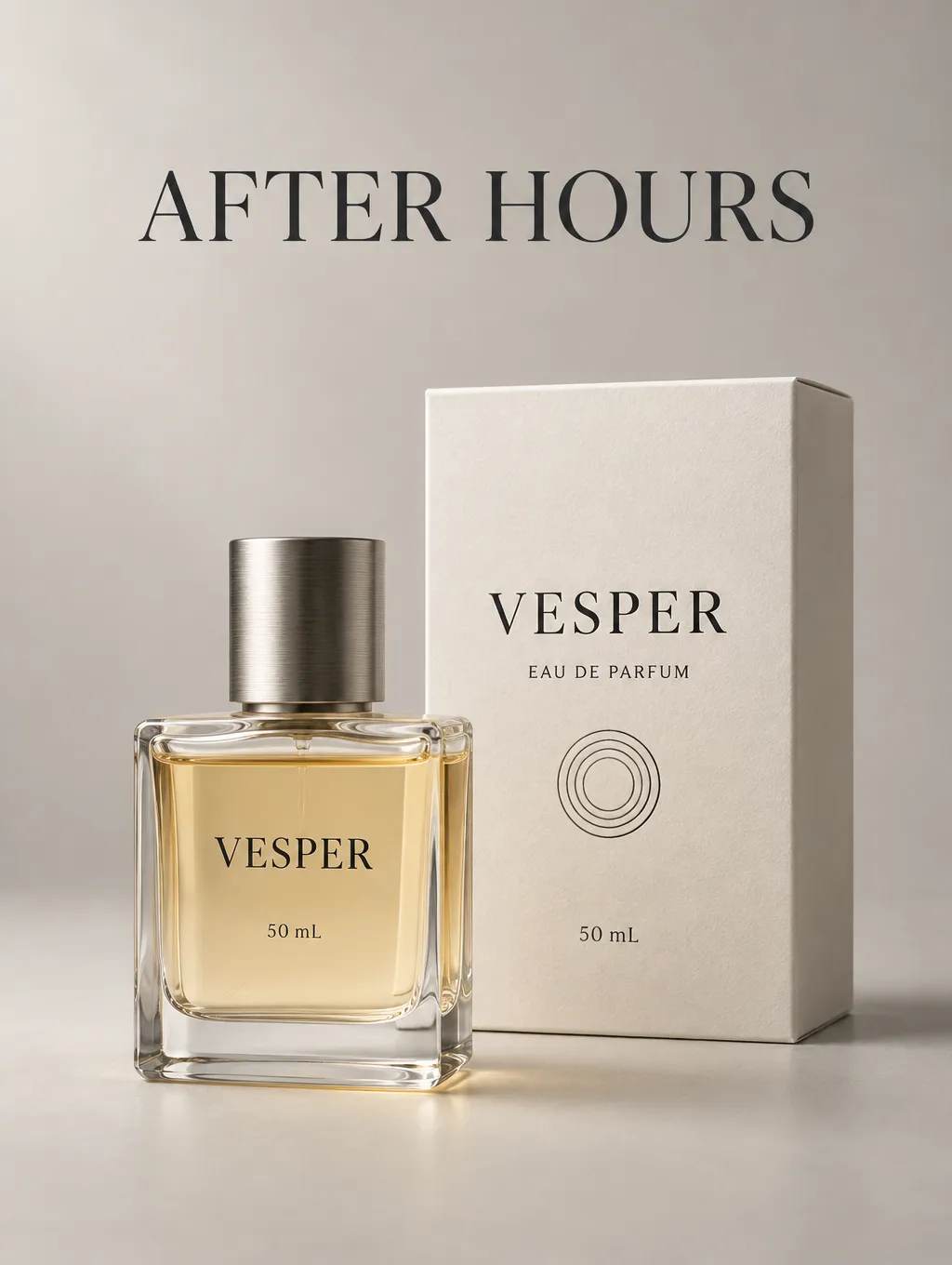
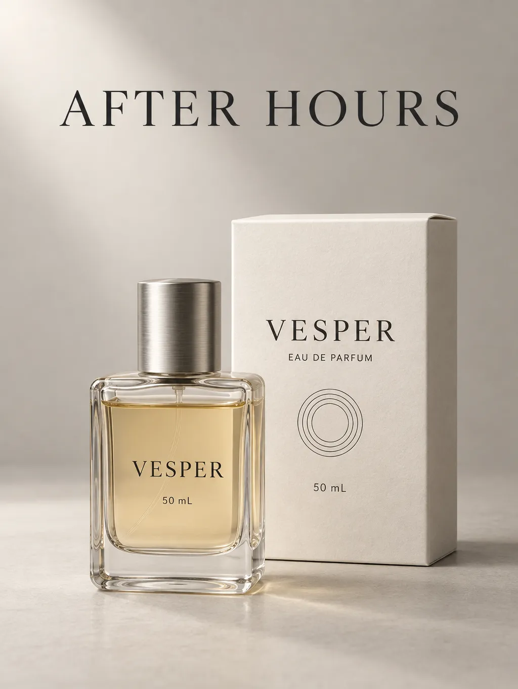
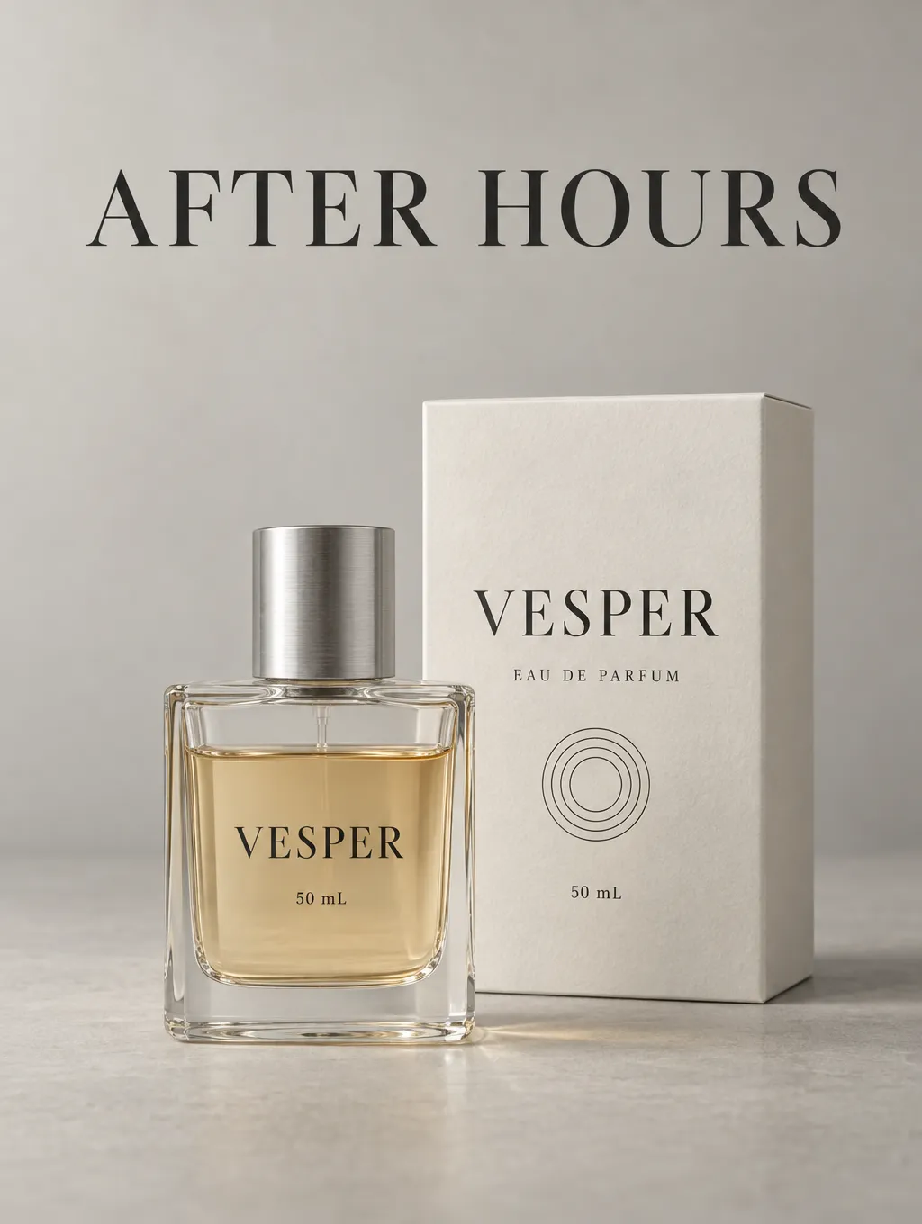
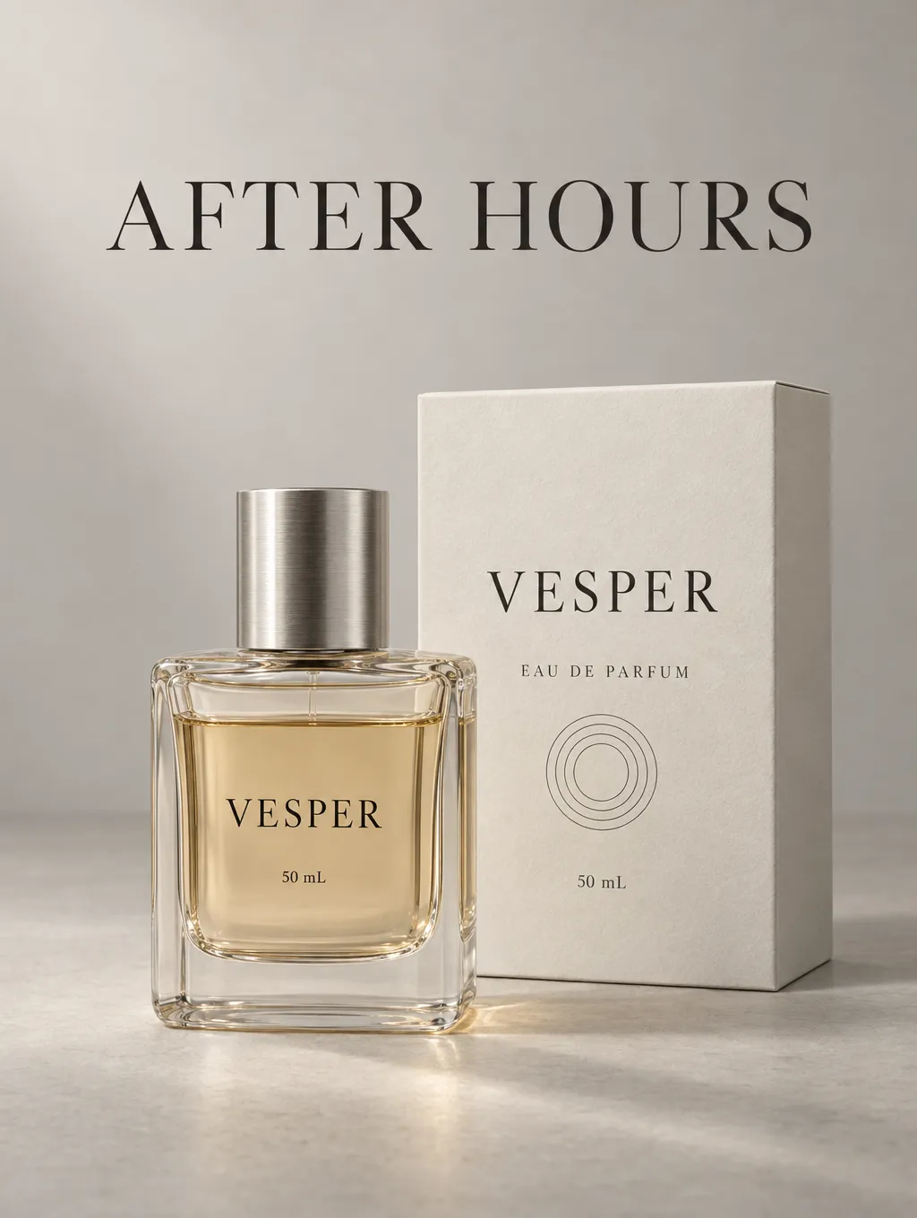
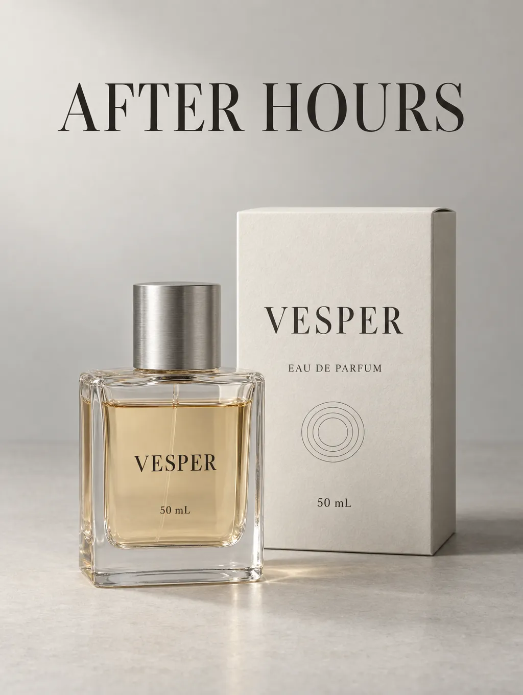
[Insert image: the five initial campaign images]
Background Editing: Medium Was Already Close to Higher Settings
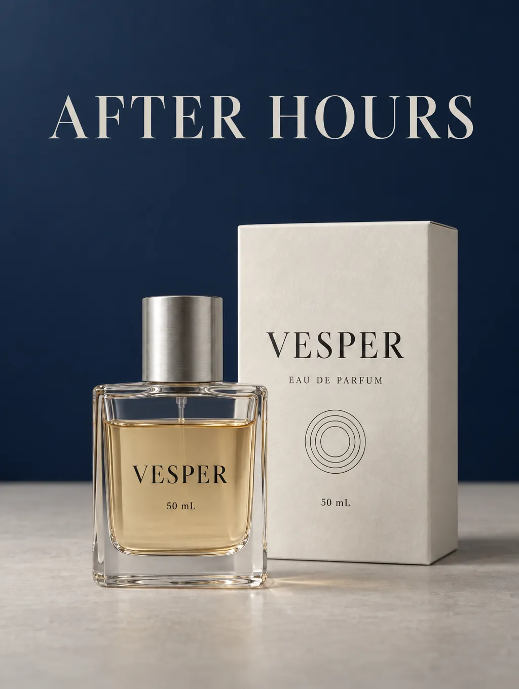
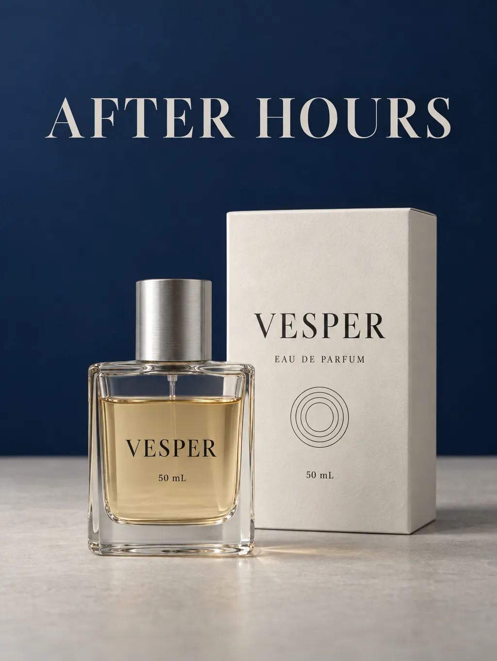
Changing the background was a relatively narrow edit. The bottle, packaging, typography, and gray tabletop were supposed to remain in place.
All five results retained a clear product image. Low did not show obvious full-image blur. Medium, High, and XHigh looked especially close at the full-image viewing size.
The higher settings did not reveal a strong overall advantage in this task. For this background change, the shorter wait at Medium was easier to justify than the longer wait at Max.
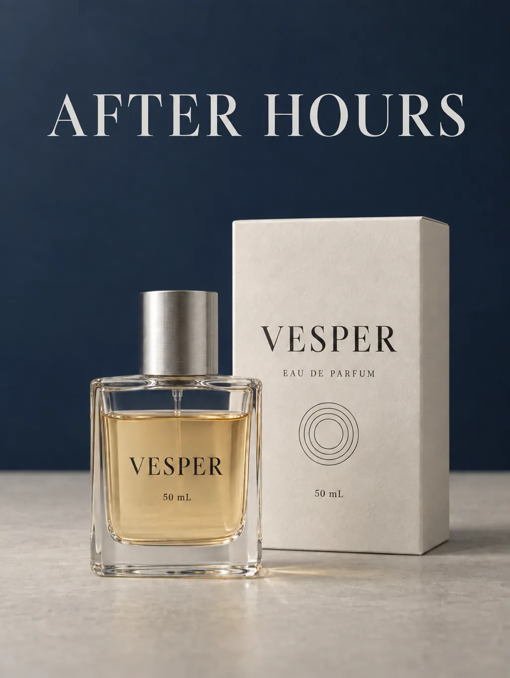
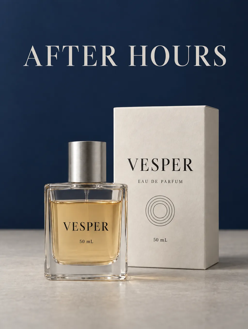
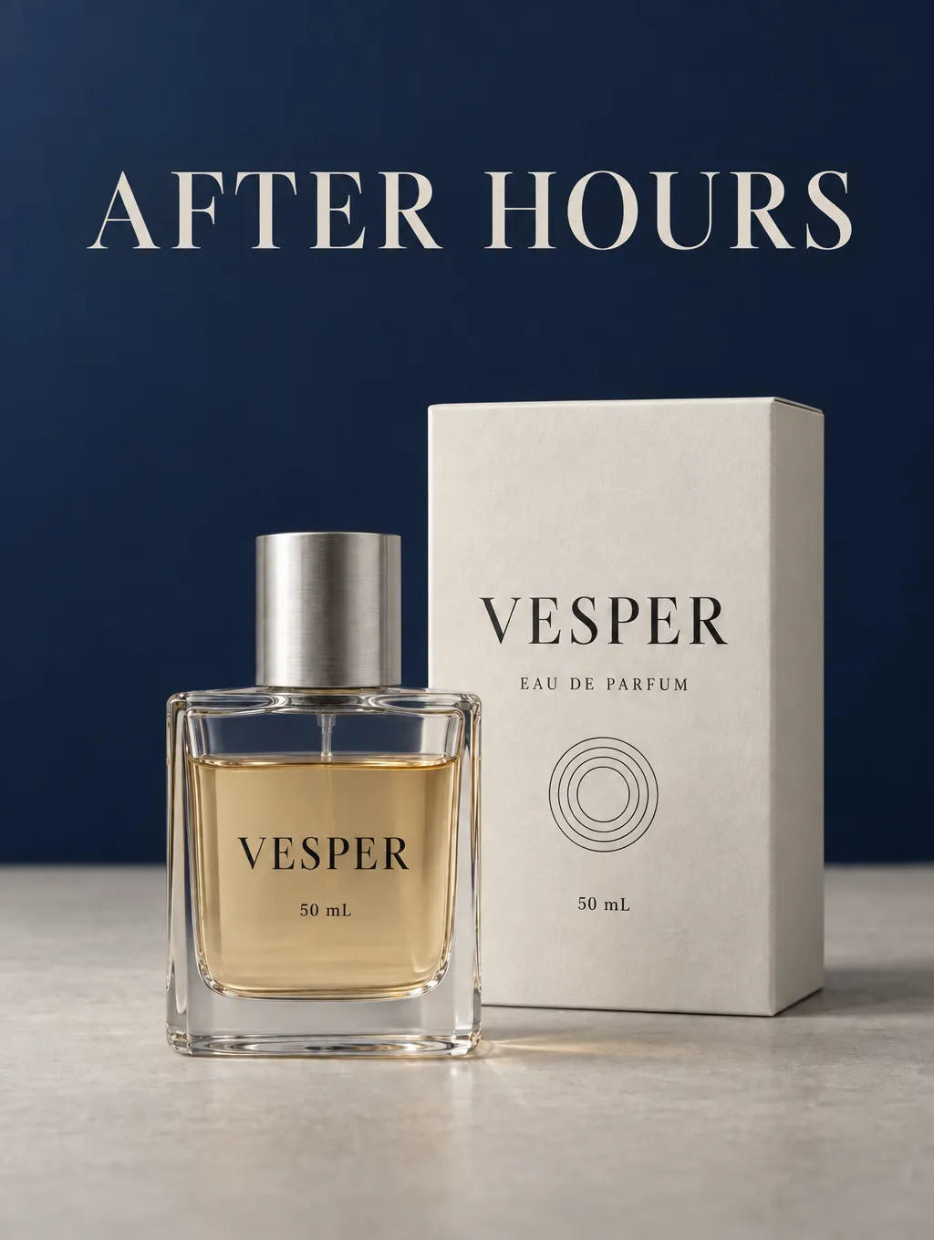
[Insert image: the five navy-background edits]
Bottle Rotation: The Differences Were in Glass and Refraction
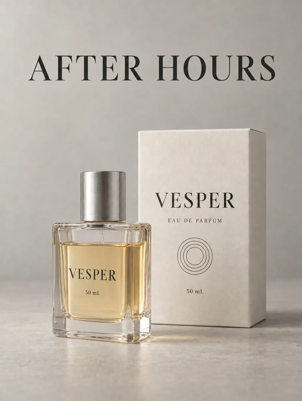
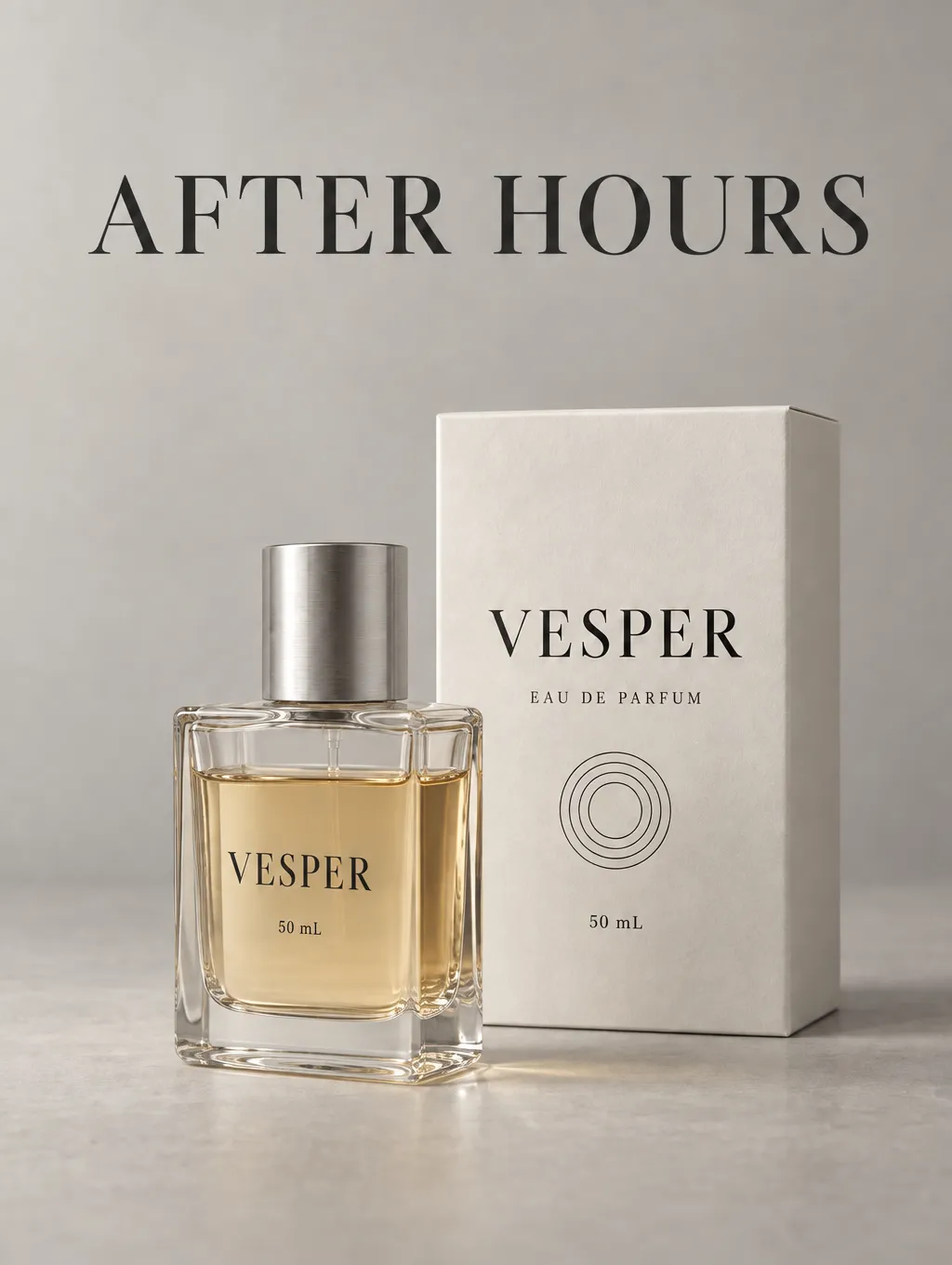
Rotating the bottle required more than recoloring an area. Its visible side, glass edges, liquid, reflections, and base needed to work together.
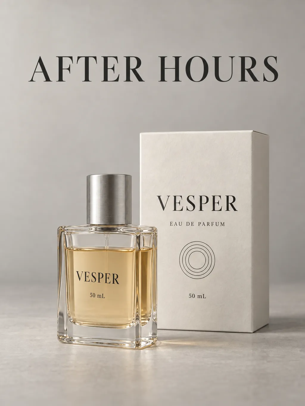
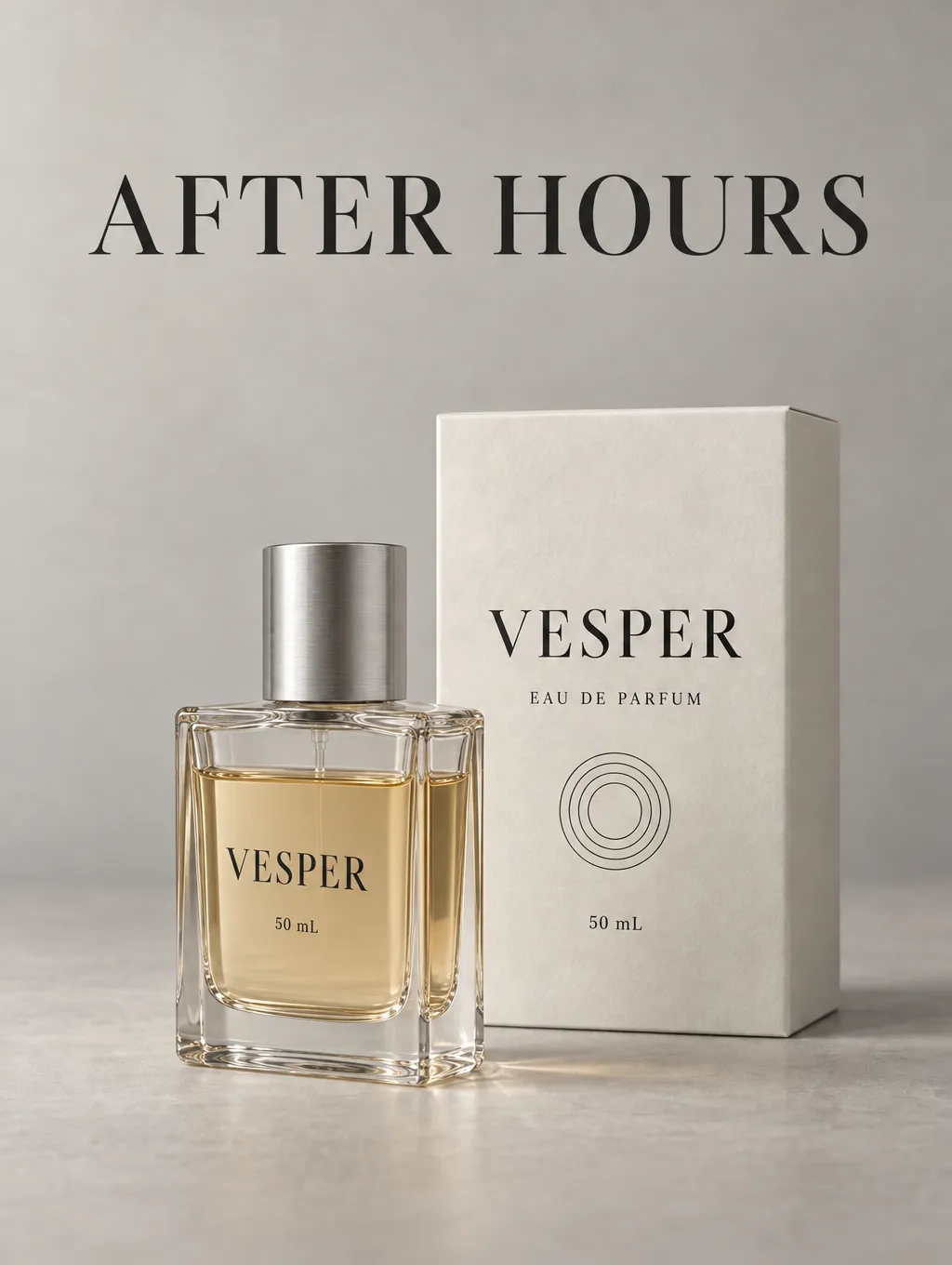
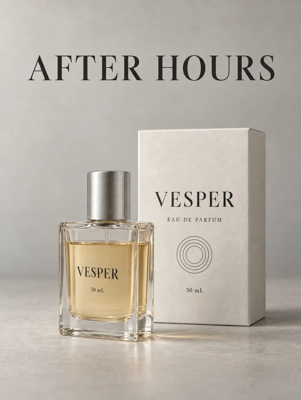
Low retained clear glass, but the lower-right corner developed a pronounced wavy refraction contour. The issue was local distortion rather than general softness.
Medium kept a smooth liquid area and a recognizable thick glass base. High made the right side and base corner more distinct, with a darker amber area along the side. This was a change in depth and rendering, rather than a dramatic increase in sharpness.
XHigh remained close to Medium and High. Max had somewhat more restrained highlight lines and an even-looking front liquid area. Its bottle width and position also changed slightly, so the entire difference cannot be counted as better material quality.
[Insert image: the five rotation edits]
Composition and Edit Accuracy: Did Higher Quality Preserve More?
A polished bottle can still be the wrong edit. I checked the requested change separately from the appearance of the materials.
In the background task, every setting changed the dark headline to a light color. That made it easier to read against navy, but the prompt had asked to preserve its original appearance. Max also showed a small shift in the product and headline positions.
In the rotation task, all outputs exposed more of the bottle’s right side. However, they remained close to a front view. None showed an unmistakable match to the requested approximately 25-degree turn, and the bottle text stayed largely front-facing.
One prompt detail also needed to be excluded from scoring. It referred to an existing ivory label, but the source had lettering directly on the glass. That mismatch came from the prompt and could not fairly distinguish the quality settings.
The packaging text and four concentric circles remained recognizable. There was no obvious cropping in either editing task. Still, small geometry and position changes meant that "largely preserved" was more accurate than "unchanged."
This test did not show that higher quality consistently preserved composition better. It also did not show that longer processing corrected an incomplete instruction.
When to Choose Medium, High, or Max
Choose Medium When the Result Already Meets the Brief
Medium is a reasonable starting point for design exploration, internal review, and simple edits. In this campaign, it retained usable materials and readable text with a short wait.
Check the image at the size where people will actually see it. If the important details already look clear and the requested edit is correct, there may be little reason to upgrade.
This makes Medium a practical choice for comparing background colors or reviewing several campaign directions. The next useful improvement may come from the design decision rather than the quality setting.
Try High When You Can Name a Specific Defect
High becomes worth trying when you can point to an issue: a distorted glass corner, an unclear material boundary, a weak thin line, or text that needs closer inspection.
The bottle test gives a concrete example. High made the visible side and base corner more distinct. That is a relevant difference when the product itself is the focus of the image.
Keep the source, prompt, and output dimensions fixed when upgrading. Then judge whether that particular defect improves. High should earn its place through a visible benefit, rather than being an automatic requirement for a finished image.
Reserve Max for Unresolved Details in an Important Image
Max is an option when a lower setting still leaves a specific problem in a key deliverable. It is easier to justify the wait when the image will receive close scrutiny and there is time to compare the result.
The acceptance criterion should be concrete. For example, the glass base should look cleaner without moving the bottle or changing its proportions.
In this project, Max did not provide a decisive overall advantage. I would not select it solely because the task was difficult or the image was final. Its output still needed the same design and accuracy checks.
Setting | Practical role | What to check before choosing it |
Low | Fast previews and early direction checks | Whether it already retains the details needed for review |
Medium | Starting point for usable designs and straightforward edits | Whether any visible defect remains at the intended viewing size |
High | Targeted attempt to improve a specific detail | Whether the extra wait produces a relevant improvement |
XHigh | An intermediate upgrade to evaluate | Whether it adds anything meaningful over High |
Max | Another attempt at unresolved details in an important image | Whether the improvement survives checks for layout and accuracy |
How to Decide Whether an Upgrade Is Worth It
Use a short acceptance check before changing settings:
- View the current image at its intended display size.
- Name the defect that would prevent approval.
- Keep the other inputs fixed and raise quality.
- Compare that defect, then inspect text, proportions, and composition.
- Keep the approved result if the new image adds no useful improvement.
If the problem is an incorrect instruction or unclear prompt, fix that issue before relying on a higher setting. The shared headline change and limited bottle rotation show why visual polish alone is not enough.
All quality settings in this test produced the same pixel dimensions. The comparison therefore concerned rendering and edit behavior, not a larger exported image.
FAQ
Can Medium Be Used for a Finished Image?
Yes, if the output passes the requirements for its actual use. A finished image needs acceptable text, materials, composition, and product details. The setting name is not an approval standard.
What If Max Looks Different but Not Better?
Separate the changes before choosing. A different bottle proportion or stronger reflection may change the design without fixing the original defect. Keep the version that meets the brief more accurately.
What Does This Test Say About Print or Higher-Resolution Output?
It does not establish their quality. All images here measured 1024 × 1360 pixels, and the comparison did not include a print test. Evaluate the actual export required for that use.
Do These Results Also Apply to GPT Image 2.5 Flare?
This comparison used Sunburst only. It does not establish the same speed, rendering differences, or quality trade-offs for Flare.